Icon Tutorial #9 -Clipping Masks, Scanlines, Big Borders
This was a tutorial request from therapy. This is also my favorite icon out of this bunch so I was a bit hesitant to share but I decided why not. :D As a note, I did not save the .psd so I will try my best to get it as close to the icon as possible :)
We are going from
to
Using Photoshop CS 2.
Curves Layers, Selective Coloring, Color balancing and Clipping Masks.
These are mostly a guideline. Please use your own images and know that steps will vary with each image.
Step One
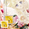
I started out with this image. Sharpened it about three times in high resolution. Cropped it down to how I wanted it. Fit the image size so that it was 100x60, this one in particular is 100x62, but it's no big deal. I sharpened it once again then went to Edit>Fade Sharpen 80%. I adjusted the coloring (Auto Contrast, Auto Color, Auto Levels) and now I have this:

Not a big difference, but I see it ^_^
Step Two
Go to File>New (Ctrl+N) Make sure the background is white and it's at a 72 pixels/inch RGB. :) Select your base (Ctrl+A). Copy (Ctrl+V) your base and paste (Ctrl+V) in the new white icon.

The black border is there to define that it is a white background :)
Step Three
I followed the steps from this previous tutorial. Yes all those steps from 2 through 5 stop after the gaussian blur part.
Now this is a bit tricky. In your Layers Menu you will see all your adjustment layers. While holding the Alt Key between your first Mandy Base and the Curves layer and click. Do this all the way to the gaussian blur layer. This is also known as Group with Previous in the older versions of Photoshop. Your Layers Pallet should look something like this. Now click your Mandy base and hit Ctrl+E or Layers>Merge Clipping Mask

If confused with this step, please comment :)
Step Four
Next I made a New Layer under Mandy.
Paste
(credit goes to me ;) ) onto that new layer under Mandy. Opacity 15%.

Step Five
Holding the Shift Key, move Mandy Layer down a bit so you have more space at the top of the icon. This will keep Mandy centered. :)

Step Six
Now the text! :D
I used Carnivalee Freakshow Size 18 in #F88CC7 Spelled out MANDY of course. Then I right clicked the text layer in the palette and clicked "Rasterize". Select the Layer Ctrl+A and pasted Ctrl+V into the same layer to make sure it was in the center of the icon. Held my Shift key again to keep it centered and moved it to the top part of the icon.

Step Seven
I felt the bottom part needed a little something so I used:

brush. I'm pretty sure it's gender's. I love her tiny text brushes :) If you don't know how to make images in to Brushes, this is a help. ^.^
New Layer (Crtl+Shift+N) then stamp your new brush in #F88CC7 into the icon so that it's all there. Select All (Ctrl+A) then Paste (Ctrl+V) it in the same layer. Again hold Shift key to keep it centered and moved it to the bottom part of the icon.

Step Eight
Layers>Flatten Image then to save, which I normally save in .png. File>Save As... and save it to you liking! :D
---------------
Original:
Tutorial:
Some difference, but not a huge one :) Icons are up for grabs with proper credit to luckygrphx
Confused? Here's the .psd located here (Right Click, "Save As) Please feel free to comment if you have any questions.
Other Tutorials
Icons not shown actual size :)


We are going from
to
Using Photoshop CS 2.
Curves Layers, Selective Coloring, Color balancing and Clipping Masks.
These are mostly a guideline. Please use your own images and know that steps will vary with each image.
Step One
I started out with this image. Sharpened it about three times in high resolution. Cropped it down to how I wanted it. Fit the image size so that it was 100x60, this one in particular is 100x62, but it's no big deal. I sharpened it once again then went to Edit>Fade Sharpen 80%. I adjusted the coloring (Auto Contrast, Auto Color, Auto Levels) and now I have this:
Not a big difference, but I see it ^_^
Step Two
Go to File>New (Ctrl+N) Make sure the background is white and it's at a 72 pixels/inch RGB. :) Select your base (Ctrl+A). Copy (Ctrl+V) your base and paste (Ctrl+V) in the new white icon.
The black border is there to define that it is a white background :)
Step Three
I followed the steps from this previous tutorial. Yes all those steps from 2 through 5 stop after the gaussian blur part.
Now this is a bit tricky. In your Layers Menu you will see all your adjustment layers. While holding the Alt Key between your first Mandy Base and the Curves layer and click. Do this all the way to the gaussian blur layer. This is also known as Group with Previous in the older versions of Photoshop. Your Layers Pallet should look something like this. Now click your Mandy base and hit Ctrl+E or Layers>Merge Clipping Mask
If confused with this step, please comment :)
Step Four
Next I made a New Layer under Mandy.
Paste
(credit goes to me ;) ) onto that new layer under Mandy. Opacity 15%.
Step Five
Holding the Shift Key, move Mandy Layer down a bit so you have more space at the top of the icon. This will keep Mandy centered. :)
Step Six
Now the text! :D
I used Carnivalee Freakshow Size 18 in #F88CC7 Spelled out MANDY of course. Then I right clicked the text layer in the palette and clicked "Rasterize". Select the Layer Ctrl+A and pasted Ctrl+V into the same layer to make sure it was in the center of the icon. Held my Shift key again to keep it centered and moved it to the top part of the icon.
Step Seven
I felt the bottom part needed a little something so I used:
brush. I'm pretty sure it's gender's. I love her tiny text brushes :) If you don't know how to make images in to Brushes, this is a help. ^.^
New Layer (Crtl+Shift+N) then stamp your new brush in #F88CC7 into the icon so that it's all there. Select All (Ctrl+A) then Paste (Ctrl+V) it in the same layer. Again hold Shift key to keep it centered and moved it to the bottom part of the icon.
Step Eight
Layers>Flatten Image then to save, which I normally save in .png. File>Save As... and save it to you liking! :D
---------------
Original:
Tutorial:
Some difference, but not a huge one :) Icons are up for grabs with proper credit to luckygrphx
Confused? Here's the .psd located here (Right Click, "Save As) Please feel free to comment if you have any questions.
Other Tutorials
Icons not shown actual size :)