Tutorial 6
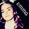
we're going from 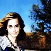
to
Made with Photoshop CS v.8
Easy to translate :)
I personally like this purple effect :) in certain spots. That's what the coloring does to it.
First Step
Choose an image and crop it to 100x100. Adjust your coloring. I used Auto Contrast, Auto Color, then Auto Levels. The order mattered for my icon.
It's all nice and even in my opinion. You can keep your usual base set up if you want.
Second Step
Create 4 new raster layers. This is so that you can have your four different colors.
Third Step(s)
(yes this part taken from giraffe_kisses
Flood fill the first layer with #07014b set to exclusion
Flood fill the second layer with #fec689 set to multiply
Flood fill the third layer with #009fe4 set to soft light
Flood fill the fourth layer with #07014b set to exclusion
All these are at 100%
This coloring gives the icon a nice blue feel that's been popular lately.

Now onto my spin.
Fourth Step
Duplicate your base layer and desaturate it. Drag to the top of the raster layers and set it to Overlay Opacity/Fill 100%. This keeps the faces shadows.

Fifth Step
Again, duplicate your base layer. Drag so that it's on the very top of all your layers. Set it to Saturation Opacity/Fill 80%
And you're done! :D Simple huh?
Icons are up for grabs with credit.
Other Samples


Note: The Opacity/Fill really depends on the base you're using. For the Keira one, i had the Saturation Base set at 40% instead of 80% and the Scarlette one was at 70% :)
Comments make me happy.
If you don't understand something please don't hesitate to ask.
You might be asking a question someone else might have.
I would love to see what you have done.
Please don't follow exactly.
This was more of a guideline on what you can do with giraffe_kisses' daniel radcliffe coloring tutorial :) I worship the coloring ground she walks on and she'll probably call me a dork after this.
Be sure to play with them ^.^
to
Made with Photoshop CS v.8
Easy to translate :)
I personally like this purple effect :) in certain spots. That's what the coloring does to it.
First Step
Choose an image and crop it to 100x100. Adjust your coloring. I used Auto Contrast, Auto Color, then Auto Levels. The order mattered for my icon.
It's all nice and even in my opinion. You can keep your usual base set up if you want.
Second Step
Create 4 new raster layers. This is so that you can have your four different colors.
Third Step(s)
(yes this part taken from giraffe_kisses
Flood fill the first layer with #07014b set to exclusion
Flood fill the second layer with #fec689 set to multiply
Flood fill the third layer with #009fe4 set to soft light
Flood fill the fourth layer with #07014b set to exclusion
All these are at 100%
This coloring gives the icon a nice blue feel that's been popular lately.
Now onto my spin.
Fourth Step
Duplicate your base layer and desaturate it. Drag to the top of the raster layers and set it to Overlay Opacity/Fill 100%. This keeps the faces shadows.
Fifth Step
Again, duplicate your base layer. Drag so that it's on the very top of all your layers. Set it to Saturation Opacity/Fill 80%
And you're done! :D Simple huh?
Icons are up for grabs with credit.
Other Samples
Note: The Opacity/Fill really depends on the base you're using. For the Keira one, i had the Saturation Base set at 40% instead of 80% and the Scarlette one was at 70% :)
Comments make me happy.
If you don't understand something please don't hesitate to ask.
You might be asking a question someone else might have.
I would love to see what you have done.
Please don't follow exactly.
This was more of a guideline on what you can do with giraffe_kisses' daniel radcliffe coloring tutorial :) I worship the coloring ground she walks on and she'll probably call me a dork after this.
Be sure to play with them ^.^