Icon Tutorial 8 -Curves, Selective Coloring, Color Balancing
This tutorial was a request from mcrftw from my Mandy Moore batch located here. To request any other tutorials, please pick an icon from either luckygrphx or shamrockicons since I don't have a lot of icon posts here yet :) and post a comment to this post.
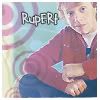
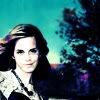
We are going to be going from
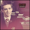
to
Using Photoshop CS2. I'm using Curves Layers, Selective Coloring and Color Balance Layers so I'm not sure if it's transferable. It's also best that you're familiar with your program. :)
- Please take each step as a new layer.
- The steps are set up from the bottom layer to the top layer.
- I am using Photoshop CS 2 so if you're on an older version of Photoshop, the downloadables will probably not work in your version. This has not be clarified yet.
Step One
Find your image and copy it down to 100x100. Adjust the settings to your liking (ie. sharpening, auto contrast, auto color, auto levels). For this particular icon, I pasted the base twice into a new 100x100 pixel image. and moved Mandy's face to the edge, then lined up the second layer so that the wallpaper connected. Honestly, I got lucky on that part. But I do remember that she was in the center of the icon and not the side as it seems when I cropped it. That's not in the .psd at the bottom, sorry.
Result:
Oh No! Mine doesn't look like that! Help!
Sorry, I can't explain my cropping technique. I just go by what's pleasing to me and what I think works for an icon. Someday I'll write a tutorial on my cropping, but remembering focal points helps.
Step Two
Now go to Layer>New Adjustment Layer>Curves This part really depends on the brightness/contrast of your icon! Play with the settings, but I'll give you mine for the time being.
Each part has two points.
RGB = 44 : 73 // 126 : 164
RED = 68 : 82 // 191 : 175
GREEN = 68 : 43 // 164 : 161
BLUE = 82 : 117 // 150 : 173

Download curves layer here (Right Click "Save As"). I seriously recommend playing with the curves though :)
Step Three
Again go to Layer>New Adjustment Layer>Selective Color I literally played with everything from the menu except black and white. Do the same to fit your icon. Again here's what I did:
The numbers are in the following order: Cyan // Magenta // Yellow // Black.
RED = +43 // +33 // -28 // 0
YELLOW = +27 // -24 // +28 // 0
GREEN = +30 // -31 // +19 // 0
CYAN = +22 // -12 // +15 // 0
BLUE = +22 // -20 // +11 // +15
MAGENTA = +24 // -23 // +15 // -11
NEUTRALS = +19 // -15 // +16 // 0

Download selective color layer here (Right Click "Save As"). Again, I seriously recommend playing with the curves though :)
Step Four
Last Adjustment Layer. I promise. :) Layer>New Adjustment Layer>Color Balance Again play with everything to fit your icon.
Midtones = -22 // -58 // +17
Shadows = -38 // +16 // -48
Highlights = -15 // -10 // +10

Step Five
This is the last thing I did. Duplicate your base and bring it to the top of the three layers. Go to Filter>Blur>Gaussian Blur. Set it to Radius 2 pixels. This gave it a little more depth to her skin and a little glow.
Finally to save; Layer>Flatten Image then File>Save As...
I usually save my icons as .png because they looking a lot nicer in my opinion.
Result:
Icon is up for grabs with credit to luckygrphx of course :) Please don't hesitate to ask for help. There's always this (Right Click "Save As") .psd in case you really want to see everything.
Other Tutorials


We are going to be going from
to
Using Photoshop CS2. I'm using Curves Layers, Selective Coloring and Color Balance Layers so I'm not sure if it's transferable. It's also best that you're familiar with your program. :)
- Please take each step as a new layer.
- The steps are set up from the bottom layer to the top layer.
- I am using Photoshop CS 2 so if you're on an older version of Photoshop, the downloadables will probably not work in your version. This has not be clarified yet.
Step One
Find your image and copy it down to 100x100. Adjust the settings to your liking (ie. sharpening, auto contrast, auto color, auto levels). For this particular icon, I pasted the base twice into a new 100x100 pixel image. and moved Mandy's face to the edge, then lined up the second layer so that the wallpaper connected. Honestly, I got lucky on that part. But I do remember that she was in the center of the icon and not the side as it seems when I cropped it. That's not in the .psd at the bottom, sorry.
Result:
Oh No! Mine doesn't look like that! Help!
Sorry, I can't explain my cropping technique. I just go by what's pleasing to me and what I think works for an icon. Someday I'll write a tutorial on my cropping, but remembering focal points helps.
Step Two
Now go to Layer>New Adjustment Layer>Curves This part really depends on the brightness/contrast of your icon! Play with the settings, but I'll give you mine for the time being.
Each part has two points.
RGB = 44 : 73 // 126 : 164
RED = 68 : 82 // 191 : 175
GREEN = 68 : 43 // 164 : 161
BLUE = 82 : 117 // 150 : 173
Download curves layer here (Right Click "Save As"). I seriously recommend playing with the curves though :)
Step Three
Again go to Layer>New Adjustment Layer>Selective Color I literally played with everything from the menu except black and white. Do the same to fit your icon. Again here's what I did:
The numbers are in the following order: Cyan // Magenta // Yellow // Black.
RED = +43 // +33 // -28 // 0
YELLOW = +27 // -24 // +28 // 0
GREEN = +30 // -31 // +19 // 0
CYAN = +22 // -12 // +15 // 0
BLUE = +22 // -20 // +11 // +15
MAGENTA = +24 // -23 // +15 // -11
NEUTRALS = +19 // -15 // +16 // 0
Download selective color layer here (Right Click "Save As"). Again, I seriously recommend playing with the curves though :)
Step Four
Last Adjustment Layer. I promise. :) Layer>New Adjustment Layer>Color Balance Again play with everything to fit your icon.
Midtones = -22 // -58 // +17
Shadows = -38 // +16 // -48
Highlights = -15 // -10 // +10
Step Five
This is the last thing I did. Duplicate your base and bring it to the top of the three layers. Go to Filter>Blur>Gaussian Blur. Set it to Radius 2 pixels. This gave it a little more depth to her skin and a little glow.
Finally to save; Layer>Flatten Image then File>Save As...
I usually save my icons as .png because they looking a lot nicer in my opinion.
Result:
Icon is up for grabs with credit to luckygrphx of course :) Please don't hesitate to ask for help. There's always this (Right Click "Save As") .psd in case you really want to see everything.
Other Tutorials