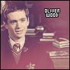
Dark Icons with Gradient Blends PS 6
Go from to 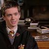
to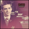
Setting Up the Base
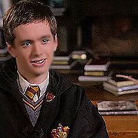
First you start with your image. I used this:

Then I used the Rectangle Select Tool. Set the Style to Constrained Aspect Ratio Width: 1 Height: 1
Picked a part of the image I wanted. Then I went to Image>Crop
Which is now this:
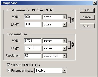
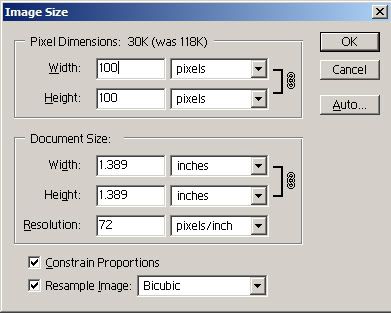
Next I went Image>Image Size... Make sure your measurements look like this:
So now we have this:
Now you're going to make his skin look better :)
Go to Filter>Sharpen>x2

Next take your Blur Tool
(if you can't find it Click and Hold down on the Smudge Tool and the Droplet should be the Blur Tool)
Brush: 10px Round
Mode: Normal
Pressure: 40%
Like so: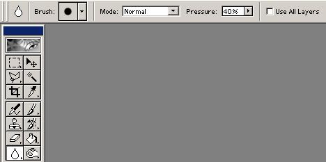
Blur his face avoiding lips and eyes.

Filter>Sharpen
Just once!
It looks odd, but now it's time to size it to an icon :)
Image>Image Size... 100pixels by 100pixels
Now you have this:
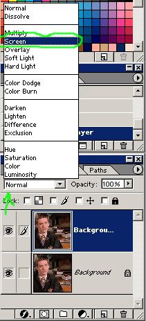
Right Click Duplicate your background layer

Set it to Screen
Icon should look like this:
That's a bit bright for me so on with the next step.
Image>Adjust...>Desaturate
Now that's a bit washed out.
So Duplicate the Screened Desaturated Layer
This time Set it to Soft Light
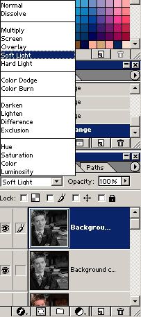
Now the icon should look like this:
Much better :)
Onward with the darkening.
Darkening The Icon
Ctrl+Shift+N to make a New Layer
Use your Bucket Fill Tool
If you can't find it hold down on your gradient button and the small bucket should appear.
To Fill the New Layer with Color #011637
Like So:

Set that layer to Exclusion:

This is what your icon should look like now:
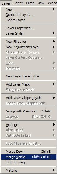
Next Go to Layer>Merge Visible
It should be one icon now :)
Now Ctrl+Shift+N to make a New Layer.
Bucket Fill it with the Color #30271F

Set the Layer to:
Hard Light
Opacity: 40%
![]()
Icon Look:
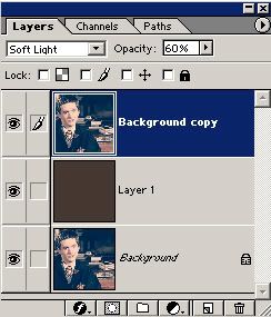
Now that's a bit too dark so Duplicate your background Layer.
Move it Above the Hard Light Layer
Set that layer to:
Soft Light
Opacity: 60%
Like so:
Now the icon is dark enough for us.

Onto the blends :)
Gradient Blending
From here all gradients and blends are from ellipsisicons
Opened this:
Set it to:
Hard Light
Opacity: 50%
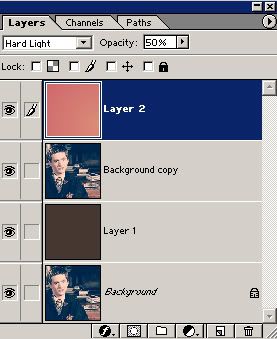
Now your icon should look like this:
He's a bit pinkish.
So I took this:
Set it to: Screen
Icon: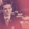
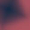
That's a bit better, but I'm not happy with it so then I took this:

Set it to:
Darken
opacity: 65%
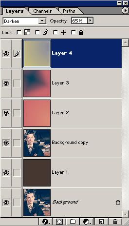
Icon:
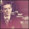
Much better.
Then I took the Background Layer
Duplicated It
Set It To: Lighten

Icon:
There we go :)
Borders
Now I'm a fan of borders.
So I take my Rectangle Tool
Set it to W: 100px H: 100px

Then I Select the icon.
The Shape should automatically come up.
Next I go to Layer>Rasterize>Layer

It's easier for me to make sure it's covering the entire icon.
Now I go back to my Rectangle Select Tool
Set it to:
Style: Fixed Size
Width: 98px
Height: 98px

Select the part of your icon where you want the border.
Note: You will have to move it around to make sure all the border is even.
Now that you've selected the area
Ctrl+X to Cut it out.
You can erase it, but Cutting is faster.
Deselect by Switching the Style back to Normal.
Put it all together by Layer>Merge Visible
Now you can leave it like that or add Text like I am.
Text
I am going to use a small pixel font.
It's easier to read and I like them.
Remember if you're using pixel fonts to have Anti-Alias None

Now this part is tricky.
I created the first Layer and Set it to the Above pic.
Text: Ernest
Size: 10pt
Color: #FFFFFF
Words: Oliver
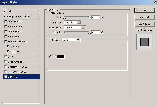
Next I went to Layer>Layer Style>Stroke
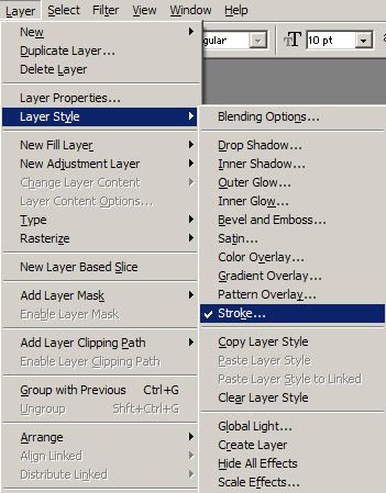
Size: 1px
Color: #000000
Like so:
I made another Text Layer
Text: Ernest
Size: 10pt
Color: #FFFFFF
Words: Wood
Stroke this layer the same way as previous.
.
.
Too Plain, but readable.
Layer>Merge Visible
!NOTE!: DO NOT MERGE VISIBLE IF YOU WANT TO SPICE UP THE TEXT!!

Spice Up Text
I took this gradient:

I don't know who made this. I would like to know for proper credit.
Paste(Ctrl+V)x2 onto my layers.
Move the New Gradient Layers so that 1 is above each text layer.
Like So: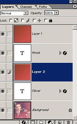
The tricky part.
Hold down your Alt key and move it so that the arrow looks like an arrow with circles around it.
I can't get a picture of this sorry v.v.
Moving on.
Now as you're holding the Alt key, move the arrow so that you're pointing it between the gradient and the text layer.
Note: It will only show up as an Arrow with a Dark Circle and Grayish one when you do so.
Click it once and the gradient became apart of the text.
Do the same for the next gradient and text layer.
Your Layers Box should look like this: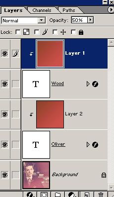
Pay attention to this.
To make the colors look more Gryffindor I played with the opacity.
For the gradient attached to OLIVER
Set Opacity to 80%
For the gradient attached to WOOD
Set Opacity to 50%
Now it should look like this:
And now I'm happy with this icon :)
Layer>Merge Visible
File>Save As...
Save it how you like it and bam! You are now done.
The ones listed above are all up for grabs with proper credit to either shadowshamrock or faeriepagan =)
Comments and questions all appreciated ^.^
to
Setting Up the Base
First you start with your image. I used this:
Then I used the Rectangle Select Tool. Set the Style to Constrained Aspect Ratio Width: 1 Height: 1
Picked a part of the image I wanted. Then I went to Image>Crop
Which is now this:
Next I went Image>Image Size... Make sure your measurements look like this:
So now we have this:
Now you're going to make his skin look better :)
Go to Filter>Sharpen>x2
Next take your Blur Tool
(if you can't find it Click and Hold down on the Smudge Tool and the Droplet should be the Blur Tool)
Brush: 10px Round
Mode: Normal
Pressure: 40%
Like so:
Blur his face avoiding lips and eyes.
Filter>Sharpen
Just once!
It looks odd, but now it's time to size it to an icon :)
Image>Image Size... 100pixels by 100pixels
Now you have this:
Right Click Duplicate your background layer
Set it to Screen
Icon should look like this:
That's a bit bright for me so on with the next step.
Image>Adjust...>Desaturate
Now that's a bit washed out.
So Duplicate the Screened Desaturated Layer
This time Set it to Soft Light
Now the icon should look like this:
Much better :)
Onward with the darkening.
Darkening The Icon
Ctrl+Shift+N to make a New Layer
Use your Bucket Fill Tool
If you can't find it hold down on your gradient button and the small bucket should appear.
To Fill the New Layer with Color #011637
Like So:
Set that layer to Exclusion:
This is what your icon should look like now:
Next Go to Layer>Merge Visible
It should be one icon now :)
Now Ctrl+Shift+N to make a New Layer.
Bucket Fill it with the Color #30271F
Set the Layer to:
Hard Light
Opacity: 40%
Icon Look:
Now that's a bit too dark so Duplicate your background Layer.
Move it Above the Hard Light Layer
Set that layer to:
Soft Light
Opacity: 60%
Like so:
Now the icon is dark enough for us.
Onto the blends :)
Gradient Blending
From here all gradients and blends are from ellipsisicons
Opened this:
Set it to:
Hard Light
Opacity: 50%
Now your icon should look like this:
He's a bit pinkish.
So I took this:
Set it to: Screen
Icon:
That's a bit better, but I'm not happy with it so then I took this:
Set it to:
Darken
opacity: 65%
Icon:
Much better.
Then I took the Background Layer
Duplicated It
Set It To: Lighten
Icon:
There we go :)
Borders
Now I'm a fan of borders.
So I take my Rectangle Tool
Set it to W: 100px H: 100px
Then I Select the icon.
The Shape should automatically come up.
Next I go to Layer>Rasterize>Layer
It's easier for me to make sure it's covering the entire icon.
Now I go back to my Rectangle Select Tool
Set it to:
Style: Fixed Size
Width: 98px
Height: 98px
Select the part of your icon where you want the border.
Note: You will have to move it around to make sure all the border is even.
Now that you've selected the area
Ctrl+X to Cut it out.
You can erase it, but Cutting is faster.
Deselect by Switching the Style back to Normal.
Put it all together by Layer>Merge Visible
Now you can leave it like that or add Text like I am.
Text
I am going to use a small pixel font.
It's easier to read and I like them.
Remember if you're using pixel fonts to have Anti-Alias None
Now this part is tricky.
I created the first Layer and Set it to the Above pic.
Text: Ernest
Size: 10pt
Color: #FFFFFF
Words: Oliver
Next I went to Layer>Layer Style>Stroke
Size: 1px
Color: #000000
Like so:
I made another Text Layer
Text: Ernest
Size: 10pt
Color: #FFFFFF
Words: Wood
Stroke this layer the same way as previous.
.
.
Too Plain, but readable.
Layer>Merge Visible
!NOTE!: DO NOT MERGE VISIBLE IF YOU WANT TO SPICE UP THE TEXT!!
Spice Up Text
I took this gradient:
I don't know who made this. I would like to know for proper credit.
Paste(Ctrl+V)x2 onto my layers.
Move the New Gradient Layers so that 1 is above each text layer.
Like So:
The tricky part.
Hold down your Alt key and move it so that the arrow looks like an arrow with circles around it.
I can't get a picture of this sorry v.v.
Moving on.
Now as you're holding the Alt key, move the arrow so that you're pointing it between the gradient and the text layer.
Note: It will only show up as an Arrow with a Dark Circle and Grayish one when you do so.
Click it once and the gradient became apart of the text.
Do the same for the next gradient and text layer.
Your Layers Box should look like this:
Pay attention to this.
To make the colors look more Gryffindor I played with the opacity.
For the gradient attached to OLIVER
Set Opacity to 80%
For the gradient attached to WOOD
Set Opacity to 50%
Now it should look like this:
And now I'm happy with this icon :)
Layer>Merge Visible
File>Save As...
Save it how you like it and bam! You are now done.
The ones listed above are all up for grabs with proper credit to either shadowshamrock or faeriepagan =)
Comments and questions all appreciated ^.^