tutorial
GENERAL TUTORIAL ON MAKING ICONS
INTRODUCTION
I’ve been asked a lot of questions on livejournal about my icons & generally icon-making. There have been people who have expressed an interest for me to make a tutorial and things like that. I feel bad most of the time as when I respond to those questions I never properly answer them, hence I made a tutorial about everything I know about icons.
This tutorial mainly contains my opinions about icons, thus it is not a universal guide to perfect icon-making. Furthermore, I personally don’t think the icons that I make are that special, however I have improved since I first started making icons so I do have some experience, one of my first posts can be found here. It is not very spectacular, is it? I posted that around five months ago, so I slow in improvement. The point I’m trying to make is that I’m not the greatest icon-maker in the world & that people adapt to trends, therefore this is a collection of these trends that I have noticed in the world of icon-making.
DISCLAIMER
The opinions expressed in this post are those of myself only and may not reflect those of the icon-makers mentioned in this post. Having referred to a number of icon-makers and their posts in this tutorial please tell me if this is not alright with you, and I will remove it.
note: I apologise to some icon-makers who are WONDERFUL, however they are not mentioned in this post, purely because I couldn’t fit everyone that I know into it.
CONTENTS
Text
Cropping
Inspiration
Find a style
Trends in Stillness communities
Trends in Awards communities
Comments
Crediting
Promotions
Icon tutorial
TEXT
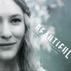
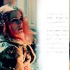
[1] In my opinion you should only use text when necessary, sometimes even tiny text can take away from the image. My advice here is to rarely use text.
[2] Of course don’t move away from the idea to never use text again as some livejournal users have mastered it! That is, they have used it appropriately OR they have chosen/thought of a very funny quote.
Examples:

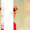
_milz_

Mirkwoodforest
lost_xcentric

chouchoune
[3] The typical fonts that I use on icons are:
Popsies, dot matrix, Odessa LET and Garamond
Good font guides have been produced by
__paperdreams here &
theoldvicarage here.
CROPPING
[1] Interesting cropping is vital, and honestly it is not that difficult to master.
[2] The only advice I have here is that when you produce a batch of icons, combine unusual cropping with regular cropping.
Examples (the masters of cropping, very Lost orientated):
unconfessed
__paperdreams
tihana

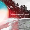
Another note here: notice the colouring? Colours make people happy, executing a perfect black & white icon is extremely difficult in my opinion. Furthermore, DO NOT USE gradients visably. What I mean by this can be seen in an icon I made a long time ago below:
never_frugal:
it's is very obvious that this icon has been "coated" with a gradient improperly, and thus looks washed out. In the above examples of cropping, all of those three examples have used a gradient or texture of some sort, BUT THEY WERE USED inconspicuously & in my opinion, properly as they enhanced the picture.
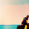
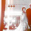
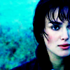
[3] Remember that centering a person is a crop too, like here:
never_frugal
INSPIRATION
[1] The best way to improve your icon skills is to find an icon-style that you like. Use those icons as inspiration because this is what professional designers do in the industry, and thus it progresses this world of design or rather icon-making.
[2] Examples from myself:
Recently I found some icons by
iconofilth and used them as inspiration
iconofilth
my icon
iconofilth
my icon
See? They are similar but different because they were used as inspiration ONLY. Later I found icons by
peopleareshapes and decided to use these ideas to make my own icon.
peopleareshapes
my icon

My icon just above is an unreleased icon, so no stealing and :P at
laura4lad.
Once again, I have used a different fandom and have created a non identical icon although the icon I have made is clearly inspired by the style!
[3] DON’T COPY!
This is majorly important as it can make icon-makers very annoyed. For example, take this icon by
iamalreadyinuse:

You wouldn’t copy that would you? Par exemple, copying would be taking that exact same style and just altering the Sawyer image to a person from another fandom*. That is copying and just don’t do it! The keyword here is inspiration.
[* note: that was an “in joke” for all of Goldy’s friends. But still, I’m very serious DON’T COPY.]
FIND YOUR STYLE
[1] Successful icon-makers stick to one style. Haha, not me, I’m everywhere…
[2] Examples of this can be found in the icon posts by the following:
_chocobox

(wonderful at tiny text & imaginative use of white space, colouring is always stunning)
Belleve

(uses the exclusion layer & saturation tool A LOT creating beautiful effects)
Mata090680
(hilarious text, amazing sense of cropping, uses & blends new/unused images)
Iamalreadyinuse

(darkened, very creative text & coloured shapes, absolutely fantastic at superimposing images)
Two_five
(crops & places images in unusual and uncontextualised places - it makes for imaginative icons)
Liianna

(uses textures, colours & text amazingly).
Chaoticpictures
(creative use of white space, always fantastic colouring & has mastered the sharpening tool)
Loleiabits
(best brushwork always will go to
loleia, icon style is always presented in a fresh way with text & shapes)
brasaremean
(i haven't updated myself with her new style, but she did do a series of star wars icons in one batch. These included having a beautifully cropped image with colouring along with an added varied text, find out what i mean at the post here.)
These users have fans of their style, and you can expect a good quality icon from them through their personal creative style as they are never disillusioned by the trends of the times.
[3] Generally, for interests sake, my style is usually minimal. One of my favourite communities on livejournal is
minimal_icons, check it out!
Side note - The freakishly talented at making icons are
toastandtea &
houseoficons.
TRENDS IN STILLNESS COMMUNITIES
Before I start this I want to say that, I don't follow every stillness community. The stillness communities that I do follow are
lotrstillness,
padme_stillness,
swiconstillness,
travel_icontest... these kind of places in general. There are many many others, and before I decided what constitutes a "winning icon" I looked around at Gilmore Girls, Buffy, Lost, Harry Potter, etc. and I have come up with a few key features that I see in winning icons. Please remember that there are ALWAYS EXCEPTIONS to the rules.
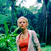
[1] Here are some icons that I made which won first place at three various stillness challenges.
.
.
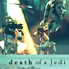
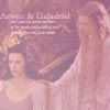
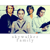
(as you can see I love star wars & lord of the rings)
What is common to all three icons? They use the font Garamond. OKAY, problem solved. No need to continue, Garamond is the winning ingredient!
.....sorry no. Firstly the images are clear & are not affected by gradients or brushes - clean icons can win challenges.
[2] Here are the results of one icon challenge at
lotrstillness:
1st Place
deadwillwalk
2nd Place
pokecharm
3rd Place
heffalump_x
ALL OF THESE ICONS HAVE DONE SOMETHING WITH THE GIVEN IMAGE. What I mean by this is that very rarely do icons containing the whole picture win icontests, as these icons above have all cropped the picture accordingly and left some white/black space. I recommend that you do this.
For example this icon here which I made for
prideprej05 :

will not win best icon, as it may look mildly pretty with some interesting cropping but this is not enough and not what voters prefer. Usually, icontest voters like brushes & like text used well... but sparingly.
[3] As you can see in all winning icons shown above they all have text! Tiny text or an interesting few words will take you far in an icontest but make sure if it is not tiny text that you are able to READ THE WORDS.
[4] I want to stress this idea about having white/grey/black/coloured space around your image in an icon. Here are a few more examples of first place winners:
kizzmon
dobv

andraste_tree .
[5] The most popular winning icons are those which use lighting effects well! If you don't have any, a great source to pick some up is
tihana who made these beautiful light textures here. Here are two examples of icons which have used light textures properly:
arbuus &
chiibambino
[6] To sum up: be creative in icontests, these are not like your regular icon posts, they involve thinking up interesting ways to present a picture. Although you can creative in a normal icon-post anyway.
TRENDS IN AWARDS COMMUNITIES
[1] Be daring but not that daring.
[2] Did that sound ambiguous? It’s because I really don’t know how to answer this question, it is best to ask to mods of each community as they will know the trends.
[3] Personally, I think award communities are random as I can never find a pattern.
HOW DO I GET MORE COMMENTS?
Okay….pause….comments?! Alright, a few people have been concerned with the comments they are receiving on icon-posts & how to receive more comments. Firstly, I want to be honest with everyone, the more comments you receive the more beautiful your icons are or it's due to the more friends you have.
Secondly, I personally make icons for enjoyment, it is the way I relax. Obviously I post my icons on livejournal because I want to know what people think about them. I want feedback, because basically, livejournal is an art sharing community and we want to know how to improve. Thus, wanting feedback IS receiving comments. So, the question we are asking here is:
Within this art sharing community how do I receive more constructive criticism or opinions about my icons?
That sounds a lot more diplomatic and proper than: I want more people to comment.
So, these are the “commenting” trends I have noticed on livejournal.
[x] Make a lot of icons for one post. HUGE icon posts have been executed by
houseoficons.
[x] Do a post which focuses on one movie. For example this post by
_chocobox on Brokeback Mountain.
[x] The lovely
sheld0n makes posts with a wide variety of subject matter therefore the post is able to be promoted in more communities. For example, this icon post on numerous actresses. Also remember your icons need to be stunning to receive comments (like those actress ones by
sheld0n), as no one is willing to leave you a bad comment or an opinionated comment, as this can sometimes be considered as unacceptable by most mods in communities.
[x]
sheld0n also makes funny and popular icons…so there…more feedback. This is the same with
laura4lad too.
[x] umm, cross over fandoms in one icon post. For example make a post with Lord of the Rings and Star Wars icons. BUT DON’T just say I’ll make some star wars icons just because I want some more promoting opportunities, make the star wars icons because you are inspired to do it!
[x] MAKE FRIENDS! Your friends on livejournal will sometimes give you the sympathy vote and leave a comment for you. Yeah, I know you don’t really like my icons f-list!
FINALLY: The best place to get feedback is to apply at “good icon” communities like
good_losticons or even
minimal_icons. Always ask for constructive criticism and this really helps! And don't feel nervous about applying, I have been rejected at
good_losticons and I had to apply twice to be accepted at
minimal_icons. But I embraced the feedback and now I feel that I have improved.
CREDITING
[1] Credit the icon maker who made the icon and not the community in which you found it in. For example credit
unconfessed for a lost icon that she made and not
losticons.
[2] Learn how to do the “fancy” credit technique here.
PROMOTION
Recommended tutorials:
x x x x x x x x
Affiliates: here
Communities:
lost_awards -
simplelimit -
permapink_icons -
lotr_awards -
sw_awards -
arwen_aragorn -
lock___down -
lotr_fandom -
paper_mornings
BASIC TUTORIAL
For Photoshop Elements 4 (equivalent to Photoshop 8 or 9). Unfortunately, I believe that NO-ONE else on livejournal has Photoshop Elements 4.0 but the process is very similiar to what can be achieved on any recent photoshop version (anything from 7 higher).
why i rarely do tutorials
[x] when i make icons I don't follow a set pattern or procedure I go off and play around with all the buttons and options until i get something that I like. therefore it is hard for me to remember what to do when people ask me about writing a tutorial.
[x] tutorials are kind of boring to make & i'm convinced that nobody else uses Elements.
[x] NOT EVERY TUTORIAL WORKS FOR EVERY PICTURE. This is vital to remember, you need to mess around with things a bit.
[x] i'm not talented enough
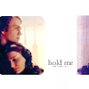
[x] a very obvious example is below:
i want to make a tutorial about this icon here:

however, when trying to write a tutorial for it, i couldn't remember how i made it and the closes icon i could come up with is here:
as you can see, the icon above is MUCH BETTER.
Anyway here is the very basic tutorial:
THIS:
to THIS:
Step 1:
set your cropped layer to 'soft light'
Step 2:
on your soft light layer increase brightness 40+ and increase contrast 30+
Step 3:
on the base increase brightness 30+ and increase contrast 20+
Step 4: It's a good idea at this stage to toggle with the Saturation of both layers, this makes everything more colourful
Step 5: Add this to the top layer

and set it to exclusion
Step 6: Increase the Brightness & Contrast on each layer to about 20+
Step 7: If this icon is too dark for you, increase the Brightness& Contrast once again:
I apologise, I feel that was a terrible tutorial, and I hope to make it up soon with a tutorial that has much more detail & an icon with a better result.
FINAL NOTE
[x] it is best to stay away from gradients and brushes as they are evil... sometimes.
[x[ use interesting & handwriting fonts
[x] save your icons as .png when possible, this is allows for the icon to remain high quality.
[x[ this tutorial took me exactly four hours to put together, if you could comment to say that you read it, or somehow let me know if you took something from it, it would be very much appreciated!
Coming up next - a decent resource list & a decent tutorial.
EDIT: That decent tutorial can be found here.
If you have any questions please do not hesitate to ask! :)