tutorial #02
This is a detailed tutorial on how I make most of my icons, especially the LOST ones. Since it has been requested a lot, I decided to make a tutorial for the icon of Jack expertly falling off the cliff. This icon was made using PHOTOSHOP ELEMENTS 4.0, however I'm sure it can easily be adapted to any fairly recent version of Photoshop (i think anything from 7.0 up).
How to make this icon: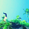
Step 1:
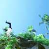
Crop your base to how you wish.
Step 2:
Duplicate your base and set the new layer to "screen".
Step 3:
Duplicate the base layer again and set it to "screen".
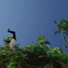
Step 4:
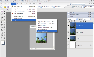
Under "enhance" on the top menu, select "adjust color" and then "color variations..." (Make sure your top screen layer is selected).
Step 5:
In the "Color variations" options I clicked "Increase Blue" once and "Decrease Red" twice.
Step 6:
Still using the top screen layer, I increased the Saturation by +50. In Photoshop Elements "saturation" can be found under "enhance" and then "adjust color".
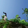
Step 7:
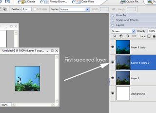
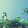
Now, select the first screened layer, as shown above.
Step 8:
Using this layer I increased the brightness by +30 and the contrast by +40.
Step 9:

Next I added this layer on top of all my other layers.
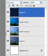
So now my layer view looks like this.
Step 10:
I set that new layer (or "layer 2" as seen in the screencapture) to "exclusion".
Step 11:
Flatten all the layers.
This can be found under the menu bar "layer" then "flatten image".
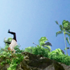
Step 12:
Now you have a new base. Duplicate that base and set the new layer to "soft light".
Step 13:
Increase the saturation on the "soft light" layer by +60.
Step 14:
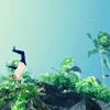
I didn't like the icon being this dark so I increased the brightness on the soft light layer by +20. But you may prefer it to be darker.
YOU HAVE FINISHED!!! If you have made any icons using this tutorial I would love to see them!
If you have any questions feel free to ask! :)
How to make this icon:
Step 1:
Crop your base to how you wish.
Step 2:
Duplicate your base and set the new layer to "screen".
Step 3:
Duplicate the base layer again and set it to "screen".
Step 4:
Under "enhance" on the top menu, select "adjust color" and then "color variations..." (Make sure your top screen layer is selected).
Step 5:
In the "Color variations" options I clicked "Increase Blue" once and "Decrease Red" twice.
Step 6:
Still using the top screen layer, I increased the Saturation by +50. In Photoshop Elements "saturation" can be found under "enhance" and then "adjust color".
Step 7:
Now, select the first screened layer, as shown above.
Step 8:
Using this layer I increased the brightness by +30 and the contrast by +40.
Step 9:
Next I added this layer on top of all my other layers.
So now my layer view looks like this.
Step 10:
I set that new layer (or "layer 2" as seen in the screencapture) to "exclusion".
Step 11:
Flatten all the layers.
This can be found under the menu bar "layer" then "flatten image".
Step 12:
Now you have a new base. Duplicate that base and set the new layer to "soft light".
Step 13:
Increase the saturation on the "soft light" layer by +60.
Step 14:
I didn't like the icon being this dark so I increased the brightness on the soft light layer by +20. But you may prefer it to be darker.
YOU HAVE FINISHED!!! If you have made any icons using this tutorial I would love to see them!
If you have any questions feel free to ask! :)