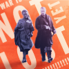
Icon Progression 2018
Here's my progression post for 2018! (click here for: [ 2017 LJ | 2017 DW ] [ 2016 LJ | 2016 DW ])
Every icon post is linked separately, by clicking on the icon if the link is not within the text. But you can also click on the month names for that month's calendar with links to all my posts. The links go to LJ if the post was made to a challenge on LJ, and to DW if the challenge was on DW or if it was an icon drop post.
->
->
January
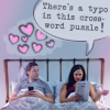
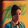
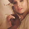
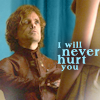
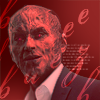
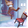
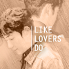
There was a single icon post in January, for a holiday bag challenge with provided textures and other resources. It was very challenging and produced some icons that were not my usual style, as well as some that were exactly my go-to style at the time, pastel character studies with text:
February
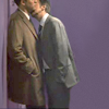
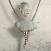
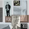
Three posts in February: A storybook for monthlyinspo, my 2017 Icon Remakes and an Icon Drop post. The storybook was very much fun, trying to find actors/characters to play the novel characters, and representing parts of the plot in an icon set. It involved a ton of manipping! (and I got a comment by the book author for it. O_O)
The icon remakes were fun, too, and I got a few really good results out of it:

->

->

->
->
Here are some of my fave icons from the drop post. I just found myself picking the ones that were most out of my comfort zone, made for jsfunction's random character project:

March
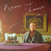
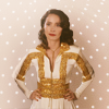
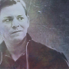
There were 5 (!) icon posts in March. Some have experiments with bright light gradients, in some I experimented with the copper gradient map, but most of them are still my current pastel style with text. Click on the icons to get to the posts:


April
April saw four posts (click on the icons to get to the post). They seem like normal icons to me. :) The Timeless icons especially use a lot of geometrical textures in pastel colors, which is something I didn't used to do before. I feel like I'm finally getting the sharpness right with the low-contrast pastel subjects.


May
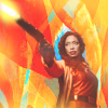
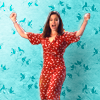
Five icon posts again in May. I can't believe how productive I was that first half of the year! O_o First, an Icon Drop post, where the icons seem to get a little more vibrant again:

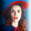
The complementary color set is vibrant per definition, but I really like how that set turned out. The next two sets that month don't really feel special to me anymore now: the pastel icons in the Timeless set were too forced into looking pastel, and the Lucy Preston set looks rushed, there is barely any text in it.

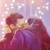
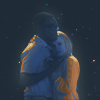
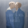
The last one, the 10variations Chidi and Eleanor set, was more fun again. I'd done one for John Silver in March, but I really only did that one so I could move on to Chidi and Eleanor. I was very into them and that scene that month, and I think it shows:
June
I "only" made three icon posts in June, because a lot of time got used up on Ask The Maker. The posts I made were strangely greenish/muted for me:

July
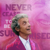
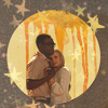
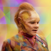
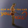
Another month with five posts! And none of them a drop post. The Dark Blue and Moonlight icons were all dark blue and had stars or sky on them, so they're not really representative of my style. The mood ring icons were also thematically either very vibrant or b/w. The Star Trek icons were done with the express goal not to spend more than a minute on each, so those don't count anyway (but I admit it was a good experience to see that I can do that) :


August
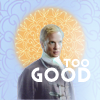
An icon drop post from May/June/July, from which I picked the flattest examples here but they are really all over the place. And two small challenges in August. This marks the end of my Fyra År Till phase. Looking back, my icons for that fandom never had a consistent style. There was lots of lavender and beige and black, but also some very cracky vibrant ones. And it's the start of my Guardian obsession, which doesn't show a style yet (but that may be because the set theme was "orange" and omg that color does not go with Guardian at all :)).


September
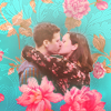
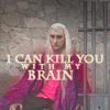
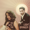
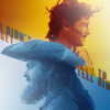
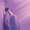
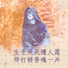
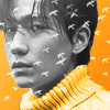
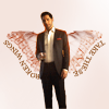
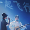
Three posts in September: all very Zhu-Yilong-heavy and all for challenges on LJ (which is rare - I usually have about a 50/50 mix between LJ and DW). The first was "Painted" for monthlyinspo, which reminded me how much I love to do painted style. They're of course not representative (but I love them!). And then an episode-focused B99 set and 20 Shen Wei icons.
That post seems to be the most popular amongst the Guardian fandom. (I am so incredibly pleased that a lot of people in the Guardian fandom on DW are using my icons! <3 I realize that there are barely any people making them, but still. This has never happened and will probably never happen again, but it feels great!)

October
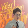
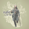
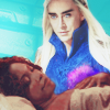
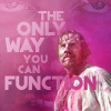
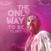
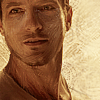
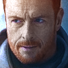
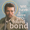
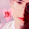
One single icon post in October (like last year, hee), and it's more Zhu Yilong, of course. I'm seeing a disturbing pattern here. ;)
I only actually made 5 of them new at that time, and used an older unfinished set to complete the ten-icon requirement. It shows that I am slowly running into fandom overload with Guardian and all my icons are pure id-thirsty things without text and a pretty face on it. Style-wise, of course also nothing new happens. I think it's obvious that Guardian stopped my iconing evolution cold.


I'm going to list the next icon drop here, even though the icons were made in August/September and the drop post made in November. Oops. I'm also going to put my favorite icon of the year here, which is one of my usericons that I didn't make for a challenge. I love it dearly.
November
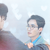
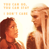
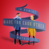
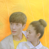
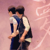
All the icons were of Zhu Yilong and Bai Yu, shapes for fandom10in30 and seasons for monthlyinspo. I really like everything I did that month. Stylistically, there is no change, but even though a lot of them are textless, they weren't simple or easy. I started making quite a few gifs again, too (which are never ever easy).


December
Another set for monthlyinspo, this time about music. And an icon drop with the remaining icons from November and December. Again, the style seems pretty consistent, still all pastel, mostly crops of a single person with some kind of background and light effects, sometimes text. I kept wanting to put Chinese text on them so that limited it a bit. :)


Closing Thoughts and Resolutions
My style in the first half of the year narrowed in on the light flat pastel style some more and then stayed there. There is a lot of variation with older styles and experiments mixed in there, and I enjoyed challenging myself. I can't see a visible progression.
My iconmaking towards the end of the year was very emotion-driven, so there's a lot of my favorite colors and images and not much intellectual purpose behind them. I am totally okay with that. When I get swallowed up by a new fandom, that's what happens, I guess. :) It also means that there wasn't any huge change or progress that I can see.
The number of icons in 2018 is pretty much equal to last year. If I count the Star Trek ones, it's higher, otherwise, it's about the same. I know you love the graph ;) :

I'm not surprised that the Guardian-related things take first place. I am a bit surprised that Brooklyn Nine-Nine comes in second before Fyra År Till. It is fun to see that I had several big fandoms with over 100 icons each, but that it spread out quite a bit nonetheless.
My resolutions are:
- again: try more different and more complex compositions (once I'm out of Guardian and can think properly again)
- again: try new techniques
- again: prioritize my icon communities better. They kinda fell off my radar a bit, but I don't intend to give them up.
x-posted from dw (comments:
)
Every icon post is linked separately, by clicking on the icon if the link is not within the text. But you can also click on the month names for that month's calendar with links to all my posts. The links go to LJ if the post was made to a challenge on LJ, and to DW if the challenge was on DW or if it was an icon drop post.
->
->
January
There was a single icon post in January, for a holiday bag challenge with provided textures and other resources. It was very challenging and produced some icons that were not my usual style, as well as some that were exactly my go-to style at the time, pastel character studies with text:
February
Three posts in February: A storybook for monthlyinspo, my 2017 Icon Remakes and an Icon Drop post. The storybook was very much fun, trying to find actors/characters to play the novel characters, and representing parts of the plot in an icon set. It involved a ton of manipping! (and I got a comment by the book author for it. O_O)
The icon remakes were fun, too, and I got a few really good results out of it:
->
->
->
->
Here are some of my fave icons from the drop post. I just found myself picking the ones that were most out of my comfort zone, made for jsfunction's random character project:
March
There were 5 (!) icon posts in March. Some have experiments with bright light gradients, in some I experimented with the copper gradient map, but most of them are still my current pastel style with text. Click on the icons to get to the posts:
April
April saw four posts (click on the icons to get to the post). They seem like normal icons to me. :) The Timeless icons especially use a lot of geometrical textures in pastel colors, which is something I didn't used to do before. I feel like I'm finally getting the sharpness right with the low-contrast pastel subjects.
May
Five icon posts again in May. I can't believe how productive I was that first half of the year! O_o First, an Icon Drop post, where the icons seem to get a little more vibrant again:
The complementary color set is vibrant per definition, but I really like how that set turned out. The next two sets that month don't really feel special to me anymore now: the pastel icons in the Timeless set were too forced into looking pastel, and the Lucy Preston set looks rushed, there is barely any text in it.
The last one, the 10variations Chidi and Eleanor set, was more fun again. I'd done one for John Silver in March, but I really only did that one so I could move on to Chidi and Eleanor. I was very into them and that scene that month, and I think it shows:
June
I "only" made three icon posts in June, because a lot of time got used up on Ask The Maker. The posts I made were strangely greenish/muted for me:
July
Another month with five posts! And none of them a drop post. The Dark Blue and Moonlight icons were all dark blue and had stars or sky on them, so they're not really representative of my style. The mood ring icons were also thematically either very vibrant or b/w. The Star Trek icons were done with the express goal not to spend more than a minute on each, so those don't count anyway (but I admit it was a good experience to see that I can do that) :
August
An icon drop post from May/June/July, from which I picked the flattest examples here but they are really all over the place. And two small challenges in August. This marks the end of my Fyra År Till phase. Looking back, my icons for that fandom never had a consistent style. There was lots of lavender and beige and black, but also some very cracky vibrant ones. And it's the start of my Guardian obsession, which doesn't show a style yet (but that may be because the set theme was "orange" and omg that color does not go with Guardian at all :)).
September
Three posts in September: all very Zhu-Yilong-heavy and all for challenges on LJ (which is rare - I usually have about a 50/50 mix between LJ and DW). The first was "Painted" for monthlyinspo, which reminded me how much I love to do painted style. They're of course not representative (but I love them!). And then an episode-focused B99 set and 20 Shen Wei icons.
That post seems to be the most popular amongst the Guardian fandom. (I am so incredibly pleased that a lot of people in the Guardian fandom on DW are using my icons! <3 I realize that there are barely any people making them, but still. This has never happened and will probably never happen again, but it feels great!)
October
One single icon post in October (like last year, hee), and it's more Zhu Yilong, of course. I'm seeing a disturbing pattern here. ;)
I only actually made 5 of them new at that time, and used an older unfinished set to complete the ten-icon requirement. It shows that I am slowly running into fandom overload with Guardian and all my icons are pure id-thirsty things without text and a pretty face on it. Style-wise, of course also nothing new happens. I think it's obvious that Guardian stopped my iconing evolution cold.
I'm going to list the next icon drop here, even though the icons were made in August/September and the drop post made in November. Oops. I'm also going to put my favorite icon of the year here, which is one of my usericons that I didn't make for a challenge. I love it dearly.
November
All the icons were of Zhu Yilong and Bai Yu, shapes for fandom10in30 and seasons for monthlyinspo. I really like everything I did that month. Stylistically, there is no change, but even though a lot of them are textless, they weren't simple or easy. I started making quite a few gifs again, too (which are never ever easy).
December
Another set for monthlyinspo, this time about music. And an icon drop with the remaining icons from November and December. Again, the style seems pretty consistent, still all pastel, mostly crops of a single person with some kind of background and light effects, sometimes text. I kept wanting to put Chinese text on them so that limited it a bit. :)
Closing Thoughts and Resolutions
My style in the first half of the year narrowed in on the light flat pastel style some more and then stayed there. There is a lot of variation with older styles and experiments mixed in there, and I enjoyed challenging myself. I can't see a visible progression.
My iconmaking towards the end of the year was very emotion-driven, so there's a lot of my favorite colors and images and not much intellectual purpose behind them. I am totally okay with that. When I get swallowed up by a new fandom, that's what happens, I guess. :) It also means that there wasn't any huge change or progress that I can see.
The number of icons in 2018 is pretty much equal to last year. If I count the Star Trek ones, it's higher, otherwise, it's about the same. I know you love the graph ;) :
I'm not surprised that the Guardian-related things take first place. I am a bit surprised that Brooklyn Nine-Nine comes in second before Fyra År Till. It is fun to see that I had several big fandoms with over 100 icons each, but that it spread out quite a bit nonetheless.
My resolutions are:
- again: try more different and more complex compositions (once I'm out of Guardian and can think properly again)
- again: try new techniques
- again: prioritize my icon communities better. They kinda fell off my radar a bit, but I don't intend to give them up.
x-posted from dw (comments:
)