Icon Progression 2017
Here's my progression post for 2017! (click here for last year's: [ LJ | DW ])
I have linked the different posts in those comments, but you can also click on the month names for that month's calendar with links to all my posts. (All the links are on LJ, because I was too lazy to do them all twice.)

->

->
January
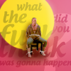
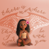
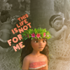
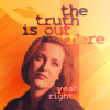
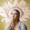
I posted no icons at all in January except the 2016 remakes and these two Moana icons I made for the Snowflake challenge. I have nothing to say on their style or quality except that they kinda suck. I remember not being happy with them at the time, either.


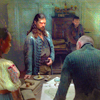
I made quite a few more icons, but only posted them later in April in my Icon Drop post. Some of those were quite good, but they're all so different, it's really hard to say anything relevant about them. I chose a few of the most complex ones here:


February
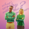
February looks a lot more productive here. I finished my remakes, some of which I was particularly proud of, because I went with complex compositions. The change from vibrant natural contrasted coloring to flat pastel is particularly noticeable in them that year. (I wonder how this year's are going to turn out and if there'll be much difference in style...)


I posted two challenge sets: a) monthlyinspo: I made a ton of Hit The Floor icons in early 2017 (50, to be exact), and I still love them for the subject matter more than anything. A lot of them seem to have cool and creative text work, but most of them just have a lot of naked skin. :)


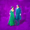
And b) Lucifer: I find it's obvious that I'm trying to achieve flat pastel coloring but mostly failing (the left example is okay, but the right one... not so much). My fave thing was that I made a panorama icon for that challenge, which was something I'd never done before but was a lot of fun. Every single one is a standalone icon, but together they spell "Lucifer":


March
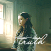
Only one icon post: "Diverse Representation" for monthlyinspo, but it's one I still really love. I concentrated on vibrant coloring again (fitting the rainbow theme), so those came out pretty well, but there were no complex compositions and the text work isn't my favorite, either. What can be said in their favor is that I seem to have the sharpness thing down by now (after two years of struggling with it). If anything, I think I still err on the side of too blurry.


April
April saw three posts: the calendarsquares rumble review, which yielded one of my fave icons of the year (which has not been nominated for bestof_icons, sadly) :

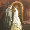
Then there was a Timeless Wyatt Logan set, where the most interesting thing are the ones where I experimented with bright light around the subject:


And a monthlyinspo set with Timeless and The Expanse icons. The painted-look ones were of varying quality, and the chiaroscuro as well. Both styles I should practice more, which I think would be fun. Both not my goto-styles, but ones I still have a lot of ideas about. I'd have fun experimenting with them, I'm sure.


May
Technical aside: I switched from LJ image hosting to abload.de in May . So far, they're great (but they also ask you to pay something if you can, so they can cover their server costs). Let's hope they can stay alive for as long as this journal exists.
There were two posts in May: One with a bunch of artwork crops that I'm going to skip here because they involved no actual iconmaking skills, and Spring icons for theseasonwheel, which was a mix of styles, but notably had three grungy texture icons in a kind of throwback to my favorite style from the year before (and weird white light blobs that I don't like anymore) :

June
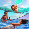
I made barely any icons in June, but there's one post with icons from May and June. It contains the Moana lims I participated in, and it is always such a pain for me to make icons with provided screenshots for fandoms I barely know. Still, I put in a lot of effort because it was a lims - and I really liked Moana, too. Unfortunately, I also got two of these icons chosen for my remakes (but also some in my bestof_icons voting). I feel no motivation to revisit that fandom, and I really liked the results the first time around. I'll have to think of something else for those remakes.
Style-wise, the drop post was all over the place, with two clear types of icons:
The ones that were a lot of work:


And the rumble and lims icons that were even more work:
July
Ask The Maker time! I made one guide, which explains the dearth of icons in that month. Click on the header to get to the guide:
But I participated in an icon battle at
timetobegin's in July: battle here.
Looking back, I don't really like any of my own icons from that battle anymore. Either I must have been really uninspired, or it was just that July was a really busy month and I was exhausted. They all look badly colored and blurry to me now, even the ones where I chose the caps myself:

August
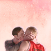
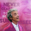
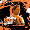
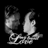
I did a battle with nightbulbs, where we made Black Sails and Doctor Who icons. One of the Doctor Who icons is one of my faves from last year. I'm usually too lazy to use two caps, but it makes for such easy and cool results:
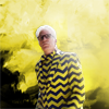
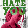
I made 20 more Black Sails icons for monthlyinspo. The coloring for these was all over the place, but I think these mark the switch to more pastel that year. I'd been trying it for a while, but this is where it started to click. I think that may be caused by Black Sails as a fandom itself. It's the period look that started influencing me, I think. I still try to make them vibrant when I can, but I don't think the vibrant ones work as well as the muted ones. See for yourself:

September
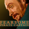
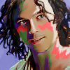
I organized my own battle in August: the Pirate Battle, which ran into September and I of course made Black Sails icons for that. Then I entered two 20in20s with Black Sails, and another 10-icon challenge, also Black Sails. I made 55 Black Sails icons in September alone! I'm actually proudest of the hair painting I did in these. Flint's season 1 and 2 hair is just wonderful. :D
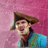
The Silver icon with the face paint was an experiment - I was trying to figure out how longerthanwedo does it, and failing spectacularly. I am actually happy that someone chose this icon for a remake this year, because I really want to play around more with that style. I'm really happy with the pop-art look of the Woodes Rogers icon. It feels like I've never made an icon like that before, but it looks good. I don't usually make icons monochrome, because it somehow feels too easy. :)
October
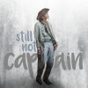
One single icon post in October, more Black Sails, of course. I'm still using a variant of the first icon. The others don't look very good to me anymore now, they feel a bit too blurry. I can't really see a coherent style, except that the less vibrant trend is continuing.
The other 20 challenge icons I made in October were posted in November. Black Sails, no surprise there. I actually like that set a lot better than the other one, and I have no idea why. Iconmaking is so muse-dependent, it's just impossible to predict the icon quality from one week to the next.
November
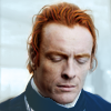
Another Black Sails set in November for character20n20. The first time I chose John Silver instead of Flint, and bam! more vibrance again. At this point, Silver is not quite as depressed as Flint, which I blame for the resurging color. (Although that last one really would look better in muted tones, I'm sure of it.)
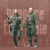
And I made an icon drop that month, which has other icons than Black Sails, and they're also getting a bit more pastel, but of course these icons were made in September/October, and I didn't even choose them as examples here. I added that first Black Sails icon again here because I love that shot so much and it was completely impossible to icon. *sigh* The second one was a try to get neatmonster's close crop look, but I still have trouble with close crop. Not sure what it is, exactly. I think close crop requires some skills I don't practice enough. The third is one of the manually painted ones I love to do, with my signature style of text, and the last one is like that pop-art icon from September - a rare look but I love the results. Maybe I should try it more often, after all.
December
20 more Black Sails icons for character20n20 again, by far the most fun set, and it shows. I personally would vote the first one as my best icon of the year. I did a ton of gifs of that one scene, and I think it's my favorite icon of that scene, too. The ton of work it always takes to make gifs was totally worth it in this case.
I'm going to skip the last post of the year, because I was so stressed nearing the end of the year. So they were all minimal-effort icons and I don't like them much.
Closing Thoughts and Resolutions
The number of icons in 2017 is a little lower than the previous years, which were each over 1000, but I almost cracked the 1K mark again, at 929 icons. Here's a graph:

I am actually a bit surprised that only a quarter of those icons are Black Sails. :D
In terms of technique, I exhausted the vibrant style and progressed to trying something more pastel. It's fun to see that progression, which wasn't a conscious decision. I'm actually happy to see some kind of shift, since it sometimes felt like I was stuck in a rut and not changing (let alone improving) at all.
My resolutions, accordingly, are:
- again: try more different and more complex compositions
- again: try new techniques
- and one more community-oriented goal: keep all the icon communities running smoothly. I have two own comms now and two more I am helping out with, and that's something I wouldn't have seen coming last year at all, either. I still love the iconmaker community, and even though it's been on the verge of dying for years, it never quite did die. I'll do my part to keep it going as long as I'm having fun fiddling with screencaps and PS. I don't see that ending any time soon.
x-posted from dw (comments:
)
I have linked the different posts in those comments, but you can also click on the month names for that month's calendar with links to all my posts. (All the links are on LJ, because I was too lazy to do them all twice.)
->
->
January
I posted no icons at all in January except the 2016 remakes and these two Moana icons I made for the Snowflake challenge. I have nothing to say on their style or quality except that they kinda suck. I remember not being happy with them at the time, either.
I made quite a few more icons, but only posted them later in April in my Icon Drop post. Some of those were quite good, but they're all so different, it's really hard to say anything relevant about them. I chose a few of the most complex ones here:
February
February looks a lot more productive here. I finished my remakes, some of which I was particularly proud of, because I went with complex compositions. The change from vibrant natural contrasted coloring to flat pastel is particularly noticeable in them that year. (I wonder how this year's are going to turn out and if there'll be much difference in style...)
I posted two challenge sets: a) monthlyinspo: I made a ton of Hit The Floor icons in early 2017 (50, to be exact), and I still love them for the subject matter more than anything. A lot of them seem to have cool and creative text work, but most of them just have a lot of naked skin. :)
And b) Lucifer: I find it's obvious that I'm trying to achieve flat pastel coloring but mostly failing (the left example is okay, but the right one... not so much). My fave thing was that I made a panorama icon for that challenge, which was something I'd never done before but was a lot of fun. Every single one is a standalone icon, but together they spell "Lucifer":
March
Only one icon post: "Diverse Representation" for monthlyinspo, but it's one I still really love. I concentrated on vibrant coloring again (fitting the rainbow theme), so those came out pretty well, but there were no complex compositions and the text work isn't my favorite, either. What can be said in their favor is that I seem to have the sharpness thing down by now (after two years of struggling with it). If anything, I think I still err on the side of too blurry.
April
April saw three posts: the calendarsquares rumble review, which yielded one of my fave icons of the year (which has not been nominated for bestof_icons, sadly) :
Then there was a Timeless Wyatt Logan set, where the most interesting thing are the ones where I experimented with bright light around the subject:
And a monthlyinspo set with Timeless and The Expanse icons. The painted-look ones were of varying quality, and the chiaroscuro as well. Both styles I should practice more, which I think would be fun. Both not my goto-styles, but ones I still have a lot of ideas about. I'd have fun experimenting with them, I'm sure.
May
Technical aside: I switched from LJ image hosting to abload.de in May . So far, they're great (but they also ask you to pay something if you can, so they can cover their server costs). Let's hope they can stay alive for as long as this journal exists.
There were two posts in May: One with a bunch of artwork crops that I'm going to skip here because they involved no actual iconmaking skills, and Spring icons for theseasonwheel, which was a mix of styles, but notably had three grungy texture icons in a kind of throwback to my favorite style from the year before (and weird white light blobs that I don't like anymore) :
June
I made barely any icons in June, but there's one post with icons from May and June. It contains the Moana lims I participated in, and it is always such a pain for me to make icons with provided screenshots for fandoms I barely know. Still, I put in a lot of effort because it was a lims - and I really liked Moana, too. Unfortunately, I also got two of these icons chosen for my remakes (but also some in my bestof_icons voting). I feel no motivation to revisit that fandom, and I really liked the results the first time around. I'll have to think of something else for those remakes.
Style-wise, the drop post was all over the place, with two clear types of icons:
The ones that were a lot of work:
And the rumble and lims icons that were even more work:
July
Ask The Maker time! I made one guide, which explains the dearth of icons in that month. Click on the header to get to the guide:
But I participated in an icon battle at
timetobegin's in July: battle here.
Looking back, I don't really like any of my own icons from that battle anymore. Either I must have been really uninspired, or it was just that July was a really busy month and I was exhausted. They all look badly colored and blurry to me now, even the ones where I chose the caps myself:
August
I did a battle with nightbulbs, where we made Black Sails and Doctor Who icons. One of the Doctor Who icons is one of my faves from last year. I'm usually too lazy to use two caps, but it makes for such easy and cool results:
I made 20 more Black Sails icons for monthlyinspo. The coloring for these was all over the place, but I think these mark the switch to more pastel that year. I'd been trying it for a while, but this is where it started to click. I think that may be caused by Black Sails as a fandom itself. It's the period look that started influencing me, I think. I still try to make them vibrant when I can, but I don't think the vibrant ones work as well as the muted ones. See for yourself:
September
I organized my own battle in August: the Pirate Battle, which ran into September and I of course made Black Sails icons for that. Then I entered two 20in20s with Black Sails, and another 10-icon challenge, also Black Sails. I made 55 Black Sails icons in September alone! I'm actually proudest of the hair painting I did in these. Flint's season 1 and 2 hair is just wonderful. :D
The Silver icon with the face paint was an experiment - I was trying to figure out how longerthanwedo does it, and failing spectacularly. I am actually happy that someone chose this icon for a remake this year, because I really want to play around more with that style. I'm really happy with the pop-art look of the Woodes Rogers icon. It feels like I've never made an icon like that before, but it looks good. I don't usually make icons monochrome, because it somehow feels too easy. :)
October
One single icon post in October, more Black Sails, of course. I'm still using a variant of the first icon. The others don't look very good to me anymore now, they feel a bit too blurry. I can't really see a coherent style, except that the less vibrant trend is continuing.
The other 20 challenge icons I made in October were posted in November. Black Sails, no surprise there. I actually like that set a lot better than the other one, and I have no idea why. Iconmaking is so muse-dependent, it's just impossible to predict the icon quality from one week to the next.
November
Another Black Sails set in November for character20n20. The first time I chose John Silver instead of Flint, and bam! more vibrance again. At this point, Silver is not quite as depressed as Flint, which I blame for the resurging color. (Although that last one really would look better in muted tones, I'm sure of it.)
And I made an icon drop that month, which has other icons than Black Sails, and they're also getting a bit more pastel, but of course these icons were made in September/October, and I didn't even choose them as examples here. I added that first Black Sails icon again here because I love that shot so much and it was completely impossible to icon. *sigh* The second one was a try to get neatmonster's close crop look, but I still have trouble with close crop. Not sure what it is, exactly. I think close crop requires some skills I don't practice enough. The third is one of the manually painted ones I love to do, with my signature style of text, and the last one is like that pop-art icon from September - a rare look but I love the results. Maybe I should try it more often, after all.
December
20 more Black Sails icons for character20n20 again, by far the most fun set, and it shows. I personally would vote the first one as my best icon of the year. I did a ton of gifs of that one scene, and I think it's my favorite icon of that scene, too. The ton of work it always takes to make gifs was totally worth it in this case.
I'm going to skip the last post of the year, because I was so stressed nearing the end of the year. So they were all minimal-effort icons and I don't like them much.
Closing Thoughts and Resolutions
The number of icons in 2017 is a little lower than the previous years, which were each over 1000, but I almost cracked the 1K mark again, at 929 icons. Here's a graph:
I am actually a bit surprised that only a quarter of those icons are Black Sails. :D
In terms of technique, I exhausted the vibrant style and progressed to trying something more pastel. It's fun to see that progression, which wasn't a conscious decision. I'm actually happy to see some kind of shift, since it sometimes felt like I was stuck in a rut and not changing (let alone improving) at all.
My resolutions, accordingly, are:
- again: try more different and more complex compositions
- again: try new techniques
- and one more community-oriented goal: keep all the icon communities running smoothly. I have two own comms now and two more I am helping out with, and that's something I wouldn't have seen coming last year at all, either. I still love the iconmaker community, and even though it's been on the verge of dying for years, it never quite did die. I'll do my part to keep it going as long as I'm having fun fiddling with screencaps and PS. I don't see that ending any time soon.
x-posted from dw (comments:
)