tutorial #13-- the trio, again
second tutorial from my last HP batch! requested by zeta0497.

all of this was done in PS7. uses selective coloring, so it's not completely translatable. sorry, PSP & GIMP users :( BUT! it's not all i use, so you can still get some neat effects out of it, even if you don't have SC. and of course, feel free to check my tutorials guide-- some other talented graphic maker might've made a tutorial that's able to replicate this effect in other programs.
if you DO have photoshop and CAN use selective coloring, keep in mind that this still does not work with every picture. everything depends on the quality of your original image and its inherent coloring. this one only really works with images that have very balanced coloring and are somewhat contrasty. i don't recommend it if it seems like foreground and background are one in the same.
this is longer and more involved than many of my previous tutorials, because there are so many variations. sorry if i seem too verbose ^^;;;
***PLEASE DON'T COPY THIS EXACTLY!*** try to learn what i think while i'm making these instead of just copying and pasting every single layer onto your images, ok? remember it might not work for every single image out there, fiddle with the settings if you have to.
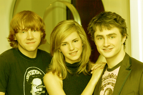
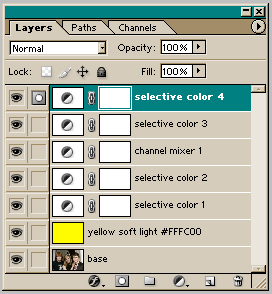
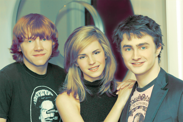
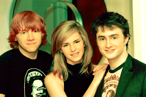
base_ my base for this was an image of the trio from the london press conference for the OotP movie. now, remember that to get good coloring, having a good original image is half the battle. these images of the conference were very HQ, which is why i used them so much. anyway, i rotated it a bit, cropped it, and resized it. then i ran auto contrast (image> adjustments> auto contrast) and auto color (image> adjustments> auto color) until i got something i liked for my base; this is completely at your discretion. i also went over the skin with the blur tool, using a soft round brush at about 30-50 strength. this is very useful to even out the skin tones, hide blemishes and get rid of the baggies under their eyes ^^ don't sharpen yet, it gets funky when you use selective color on sharpened images. always leave it 'til the end. and this was my final base.
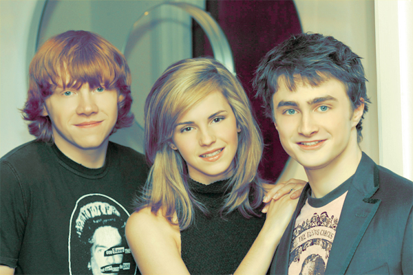
yellow soft light_ a good thing to start with when you know you're going to use selective coloring, is with a yellow base set to soft light. i used #FFFC00. this helps because later on, when you do use the SC layer, you can simply lower the yellows in the neutral setting by a LOT and this makes the other colors stand out beautifully. here's my result. not a big deal, basically they just look... yellow xD
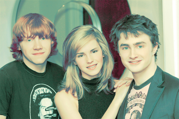
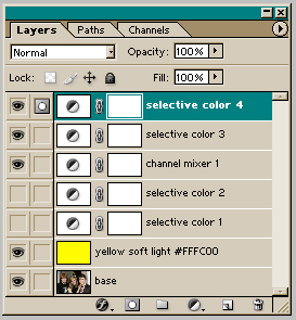
selective color 1_ now, to start on the coloring. i used a selective coloring layer (layer> new adjustment layer> selective color). these were my settings:
reds: -100/100/100/0
yellows: -25/0/-20/0
neutrals: 70/-20/-80/15
okay, so what does this mean? well, this layer is pretty standard, really; i've seen a lot of icon-makers using something very similar. first the reds: you reduce the cyan by a lot-- this means the dominant colors are magenta and yellow, which make orange. this basically makes the red parts of the image to still be red, like rupert's hair and the blush on their faces, which is why i call it the "blush factor." increasing the yellows on it only makes it pop out a bit more. increasing the magentas is optional, it really depends on if you want your reds to be more orange-y or pinkish. i was going for the latter, so i increased the magentas. the settings in the yellows don't make much of a difference, i just diminished the cyans and yellows a bit so their skin would have a healthy cream color instead of it being too yellow; when you tinker with the neutrals afterwards, this is almost unnoticeable. as for the neutrals, i increased the cyans so the background and the lowlights in their hair became darker, then decreased the magentas a bit so they'd be blueish and not too purple. the -80 for the yellows is, as i explained in the last step, to get rid of the overall yellow coloring given by the previous layer. and increasing the blacks only adds a little more contrast. here's my result for this step.
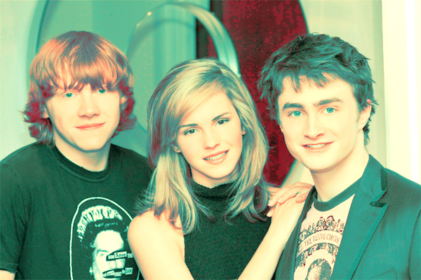
selective color 2_ the result i got from the last layer was very nice, but you see, i'm a bit of a variations-whore ^^;;; at times i just like to sit back, look at my graphic and go "hmmm, what can i do to make this look completely different?" at this point i thought it would look good if it was less purplish and more green. so i used another selective color layer with these settings:
reds: -100/15/-15/10
yellows: -100/-100/-100/-100
neutrals: 25/0/15/-20
now, one thing to keep in mind with selective coloring is that the neutrals setting affects the whole image (in most cases). this means that if you tinker with the other settings first, no matter how drastically you alter them, when you change the neutrals, what you altered previously will fade, sometimes a lot. so, since i wanted my neutrals to lean towards the green side of the spectrum (that meant increasing the cyan and the yellow), i had to make sure they didn't end up looking like little green martians. so i did my usual "blush factor" thing with the reds-- reduced the cyan, increased the magentas a bit. since i was adding yellow in the neutrals, i didn't want the yellows to overpower the image, so i took all the colors in the yellows all the way down. this is also why i reduced the yellows in the reds-- if i had a +100 instead of that -15 there, and THEN added more yellow in the neutrals, it would've been too orange; i wanted them to look on the paler side, without them looking like zombies. so here you have 'em.
channel mixer_ score another nice result with the previous layer. now where to go? i have a few adjustment layers saved up in my computer that i like to throw around when i'm out of ideas. i thought adding some brightness and saturation to the colors would be a nice change, so i used one of these layers, a channel mixer layer (layer> new adjustment layer> channel mixer) this time. these were my settings:
red: 180/-80/15/0
green: -15/115/10/0
blue: -15/15/100/-10
channel mixer layers are really neat, i've used them before. in fact, i've explained them before! so as i'm feeling lazy, i'll just quote myself =P
"the channel mixer is a really easy tool to understand. in each channel, increasing or decreasing the amount of the channel color will make that color dominate in the image (that is, i increased the red on the red channel by a lot, so the image turned out more red). the opposite is also true. on the other hand, decreasing the other two colors in each channel will make those colors dominate in the image (that means, decreasing the green or the blue in the red channel will make the image more green or blue, while increasing either will make the image more red)." --from my sirius tutorial.
so basically, i increased the reds in the red channel by a lot, which made the image majorly red; then to balance it, i decreased the greens by a lot, and then increased the blues by a little, to get rid of some pesky greenish tint. in the green channel, i increased the greens by a little... this made the image a little greener, so i balanced it out by decreasing the reds, and then adding a bit of blue to even out the reddish tint. i didn't touch the blues in the blue channel, because i liked the overall green tones, so to make them pop out i decreased the reds, and then increased the greens to get rid of the yellowish tone that took over for a sec. here's what it looked like. looks cool, doesn't it? almost looks like selective coloring, but it's not ^-^
selective color 3_ again, i liked what i had, but i wanted to try more variations, so i added another SC layer:
reds: -100/0/100/0
yellows: -15/0/-30/0
neutrals: 30/0/-40/0
quick explanation this time (this is a pretty simple layer): what i did for the reds was only for the "blush factor" (you should have that one memorized by now!); i reduced cyans and yellows in the yellow to make them less green; and i increased the cyans in the neutrals, while lowering the yellows, because i was going for a bluer look instead of the green i had. here's my result.
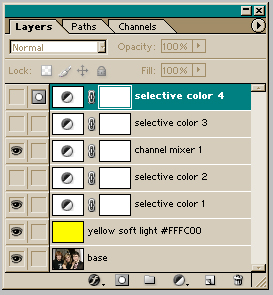
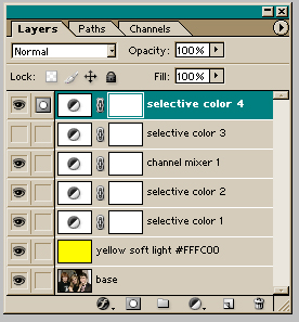
selective color 4_ i threw another one of my saved adjustment layers in there, just for kicks. it was another selective coloring layer, with these settings:
reds: -100/0/100/0
yellows: 100/0/-100/0
neutrals: 95/20/40/10
blacks: 0/0/0/85
basically what this did was that it darkened the whole image. red settings for the "blush factor," yellow settings to make the yellows bluer, then the 95% cyan increase in the neutrals to make the overall thing bluer. i also added a bit of magenta and yellow to make it darker (it's the mix of colors which produces black; what i mean is, increasing all three colors by a 100 usually has the same effect as increasing the black by a 100, it goes darker). same goes for the black setting in the blacks. there you have the finished product!
A NOTE (please read!): you may have noticed that the graphics i presented here are not exactly those in my batch. these are more sharp and pixel-y while those look softer and a bit more blurred. there's a reason for that-- often when you use SC layer over SC layer, you get that pixel-y effect; it's why i recommend you not sharpen until the end, because that can make this worse. to get them to look the way they look in the batch, what i did was that i left visible only the necessary layers for the variation i was going for (see below), then copy-merged the whole thing (edit> copy merged), then pasted it as a new layer. then i gaussian-blurred it (filter> blur> gaussian blur) with a radius of 4.0 and reduced the opacity of that layer to something between 20 and 40 until i liked the look. if it was still pixelated, i went back, copy-merged and pasted again, then used the blur tool to manually blur the more pixelated parts; THEN i duplicated that layer and ran gaussian blur on it, like i explained before. i did this with almost every variation i explain in the next paragraph, so i figured i shouldn't have to repeat it eight times. it's tedious, yeah, but when you see that nice glowy feeling in your final result, you'll see it's usually worth it ^____^
uhhh... i also might've added a black layer at the top, with a reduced opacity (10-20) to make the colors a little less blinding in some of the variations. i honestly don't remember if i did (it's not in the PSD) but it might explain the differences a bit more. *shurgs* only use it if you think your image needs it.
making a bit of a recap:
_to make this, use every layer, like so.
_to make this, use the first six layers, up to the third selective coloring, like so.
_to make this, use the first five layers, up to the channel mixer layer, like so.
_to make this, use the first three layers, up to the first selective coloring, like so.
_to make this, use the first three layers, up to the first selective coloring, and the channel mixer layer, like so.
_to make this, use the first five layers, up to the channel mixer layer, and the fourth selective coloring, like so.
_to make this, use the first two layers, up to the yellow soft light layer, as well as the channel mixer layer and the third selective color, like so.
_to make this, use the first two layers, up to the yellow soft light layer, as well as the channel mixer layer, and the third and fourth selective color layers, like so.
whoo, that was long and involved! *sigh* i hope you found this tutorial useful, and i would love to see your results, so please comment! and if you like my icons/graphics and/or want to know how i made them, be sure to step by wakizashi_. i'd be glad to help you with anything.
all of this was done in PS7. uses selective coloring, so it's not completely translatable. sorry, PSP & GIMP users :( BUT! it's not all i use, so you can still get some neat effects out of it, even if you don't have SC. and of course, feel free to check my tutorials guide-- some other talented graphic maker might've made a tutorial that's able to replicate this effect in other programs.
if you DO have photoshop and CAN use selective coloring, keep in mind that this still does not work with every picture. everything depends on the quality of your original image and its inherent coloring. this one only really works with images that have very balanced coloring and are somewhat contrasty. i don't recommend it if it seems like foreground and background are one in the same.
this is longer and more involved than many of my previous tutorials, because there are so many variations. sorry if i seem too verbose ^^;;;
***PLEASE DON'T COPY THIS EXACTLY!*** try to learn what i think while i'm making these instead of just copying and pasting every single layer onto your images, ok? remember it might not work for every single image out there, fiddle with the settings if you have to.
base_ my base for this was an image of the trio from the london press conference for the OotP movie. now, remember that to get good coloring, having a good original image is half the battle. these images of the conference were very HQ, which is why i used them so much. anyway, i rotated it a bit, cropped it, and resized it. then i ran auto contrast (image> adjustments> auto contrast) and auto color (image> adjustments> auto color) until i got something i liked for my base; this is completely at your discretion. i also went over the skin with the blur tool, using a soft round brush at about 30-50 strength. this is very useful to even out the skin tones, hide blemishes and get rid of the baggies under their eyes ^^ don't sharpen yet, it gets funky when you use selective color on sharpened images. always leave it 'til the end. and this was my final base.
yellow soft light_ a good thing to start with when you know you're going to use selective coloring, is with a yellow base set to soft light. i used #FFFC00. this helps because later on, when you do use the SC layer, you can simply lower the yellows in the neutral setting by a LOT and this makes the other colors stand out beautifully. here's my result. not a big deal, basically they just look... yellow xD
selective color 1_ now, to start on the coloring. i used a selective coloring layer (layer> new adjustment layer> selective color). these were my settings:
reds: -100/100/100/0
yellows: -25/0/-20/0
neutrals: 70/-20/-80/15
okay, so what does this mean? well, this layer is pretty standard, really; i've seen a lot of icon-makers using something very similar. first the reds: you reduce the cyan by a lot-- this means the dominant colors are magenta and yellow, which make orange. this basically makes the red parts of the image to still be red, like rupert's hair and the blush on their faces, which is why i call it the "blush factor." increasing the yellows on it only makes it pop out a bit more. increasing the magentas is optional, it really depends on if you want your reds to be more orange-y or pinkish. i was going for the latter, so i increased the magentas. the settings in the yellows don't make much of a difference, i just diminished the cyans and yellows a bit so their skin would have a healthy cream color instead of it being too yellow; when you tinker with the neutrals afterwards, this is almost unnoticeable. as for the neutrals, i increased the cyans so the background and the lowlights in their hair became darker, then decreased the magentas a bit so they'd be blueish and not too purple. the -80 for the yellows is, as i explained in the last step, to get rid of the overall yellow coloring given by the previous layer. and increasing the blacks only adds a little more contrast. here's my result for this step.
selective color 2_ the result i got from the last layer was very nice, but you see, i'm a bit of a variations-whore ^^;;; at times i just like to sit back, look at my graphic and go "hmmm, what can i do to make this look completely different?" at this point i thought it would look good if it was less purplish and more green. so i used another selective color layer with these settings:
reds: -100/15/-15/10
yellows: -100/-100/-100/-100
neutrals: 25/0/15/-20
now, one thing to keep in mind with selective coloring is that the neutrals setting affects the whole image (in most cases). this means that if you tinker with the other settings first, no matter how drastically you alter them, when you change the neutrals, what you altered previously will fade, sometimes a lot. so, since i wanted my neutrals to lean towards the green side of the spectrum (that meant increasing the cyan and the yellow), i had to make sure they didn't end up looking like little green martians. so i did my usual "blush factor" thing with the reds-- reduced the cyan, increased the magentas a bit. since i was adding yellow in the neutrals, i didn't want the yellows to overpower the image, so i took all the colors in the yellows all the way down. this is also why i reduced the yellows in the reds-- if i had a +100 instead of that -15 there, and THEN added more yellow in the neutrals, it would've been too orange; i wanted them to look on the paler side, without them looking like zombies. so here you have 'em.
channel mixer_ score another nice result with the previous layer. now where to go? i have a few adjustment layers saved up in my computer that i like to throw around when i'm out of ideas. i thought adding some brightness and saturation to the colors would be a nice change, so i used one of these layers, a channel mixer layer (layer> new adjustment layer> channel mixer) this time. these were my settings:
red: 180/-80/15/0
green: -15/115/10/0
blue: -15/15/100/-10
channel mixer layers are really neat, i've used them before. in fact, i've explained them before! so as i'm feeling lazy, i'll just quote myself =P
"the channel mixer is a really easy tool to understand. in each channel, increasing or decreasing the amount of the channel color will make that color dominate in the image (that is, i increased the red on the red channel by a lot, so the image turned out more red). the opposite is also true. on the other hand, decreasing the other two colors in each channel will make those colors dominate in the image (that means, decreasing the green or the blue in the red channel will make the image more green or blue, while increasing either will make the image more red)." --from my sirius tutorial.
so basically, i increased the reds in the red channel by a lot, which made the image majorly red; then to balance it, i decreased the greens by a lot, and then increased the blues by a little, to get rid of some pesky greenish tint. in the green channel, i increased the greens by a little... this made the image a little greener, so i balanced it out by decreasing the reds, and then adding a bit of blue to even out the reddish tint. i didn't touch the blues in the blue channel, because i liked the overall green tones, so to make them pop out i decreased the reds, and then increased the greens to get rid of the yellowish tone that took over for a sec. here's what it looked like. looks cool, doesn't it? almost looks like selective coloring, but it's not ^-^
selective color 3_ again, i liked what i had, but i wanted to try more variations, so i added another SC layer:
reds: -100/0/100/0
yellows: -15/0/-30/0
neutrals: 30/0/-40/0
quick explanation this time (this is a pretty simple layer): what i did for the reds was only for the "blush factor" (you should have that one memorized by now!); i reduced cyans and yellows in the yellow to make them less green; and i increased the cyans in the neutrals, while lowering the yellows, because i was going for a bluer look instead of the green i had. here's my result.
selective color 4_ i threw another one of my saved adjustment layers in there, just for kicks. it was another selective coloring layer, with these settings:
reds: -100/0/100/0
yellows: 100/0/-100/0
neutrals: 95/20/40/10
blacks: 0/0/0/85
basically what this did was that it darkened the whole image. red settings for the "blush factor," yellow settings to make the yellows bluer, then the 95% cyan increase in the neutrals to make the overall thing bluer. i also added a bit of magenta and yellow to make it darker (it's the mix of colors which produces black; what i mean is, increasing all three colors by a 100 usually has the same effect as increasing the black by a 100, it goes darker). same goes for the black setting in the blacks. there you have the finished product!
A NOTE (please read!): you may have noticed that the graphics i presented here are not exactly those in my batch. these are more sharp and pixel-y while those look softer and a bit more blurred. there's a reason for that-- often when you use SC layer over SC layer, you get that pixel-y effect; it's why i recommend you not sharpen until the end, because that can make this worse. to get them to look the way they look in the batch, what i did was that i left visible only the necessary layers for the variation i was going for (see below), then copy-merged the whole thing (edit> copy merged), then pasted it as a new layer. then i gaussian-blurred it (filter> blur> gaussian blur) with a radius of 4.0 and reduced the opacity of that layer to something between 20 and 40 until i liked the look. if it was still pixelated, i went back, copy-merged and pasted again, then used the blur tool to manually blur the more pixelated parts; THEN i duplicated that layer and ran gaussian blur on it, like i explained before. i did this with almost every variation i explain in the next paragraph, so i figured i shouldn't have to repeat it eight times. it's tedious, yeah, but when you see that nice glowy feeling in your final result, you'll see it's usually worth it ^____^
uhhh... i also might've added a black layer at the top, with a reduced opacity (10-20) to make the colors a little less blinding in some of the variations. i honestly don't remember if i did (it's not in the PSD) but it might explain the differences a bit more. *shurgs* only use it if you think your image needs it.
making a bit of a recap:
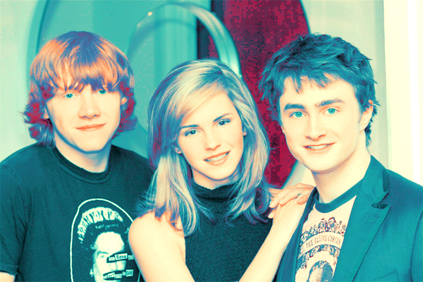
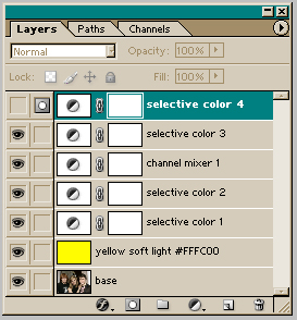
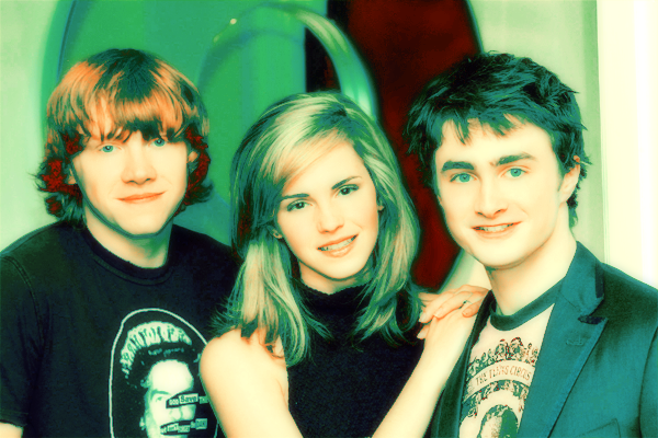
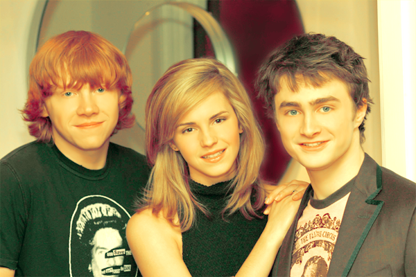
_to make this, use every layer, like so.
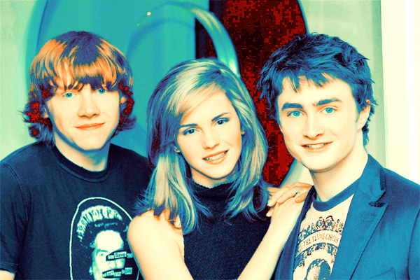
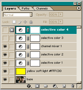
_to make this, use the first six layers, up to the third selective coloring, like so.
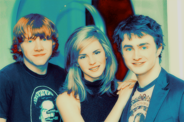
_to make this, use the first five layers, up to the channel mixer layer, like so.
_to make this, use the first three layers, up to the first selective coloring, like so.
_to make this, use the first three layers, up to the first selective coloring, and the channel mixer layer, like so.
_to make this, use the first five layers, up to the channel mixer layer, and the fourth selective coloring, like so.
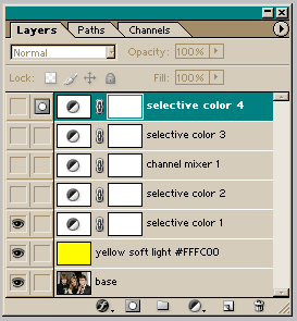
_to make this, use the first two layers, up to the yellow soft light layer, as well as the channel mixer layer and the third selective color, like so.
_to make this, use the first two layers, up to the yellow soft light layer, as well as the channel mixer layer, and the third and fourth selective color layers, like so.
whoo, that was long and involved! *sigh* i hope you found this tutorial useful, and i would love to see your results, so please comment! and if you like my icons/graphics and/or want to know how i made them, be sure to step by wakizashi_. i'd be glad to help you with anything.