tutorial #12-- the trio
zeta0497 asked me to write a couple tutorials from my last HP graphics batch. so here's the first one!

all of this was done in PS7. uses selective coloring, so it's not translatable. sorry, PSP & GIMP users :( if you check out my other tutorials, you might find something for you.
if you DO have photoshop and CAN use selective coloring, keep in mind that this still does not work with every picture. everything depends on the quality of your original image and its inherent coloring. i find this type of color works better on images that have both saturated and unsaturated colors, like pale people with darker hair, and such. you don't want your image to be too light, because then the detail will disappear.
***PLEASE DON'T COPY THIS EXACTLY!*** try to learn what i think while i'm making these instead of just copying and pasting every single layer onto your images, ok? remember it might not work for every single image out there, fiddle with the settings if you have to.
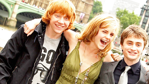
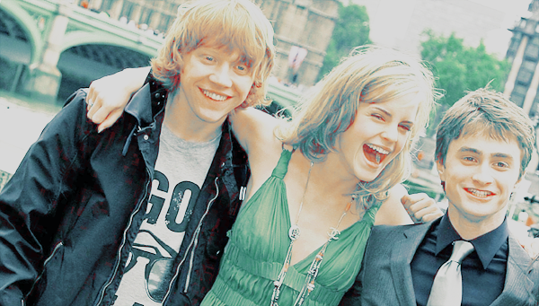
base_ my base for this was an image of the trio from the london photocall for the OotP movie. now, remember that to get good coloring, having a good original image is half the battle. these images of the photocall were very HQ, which is why i used them so much. anyway, i rotated it a bit, cropped it, and resized it. then i ran auto contrast (image> adjustments> auto contrast) and auto color (image> adjustments> auto color) until i got something i liked for my base; this is completely at your discretion. don't sharpen yet, it gets funky when you use selective color on sharpened images. always leave it 'til the end. and this was my final base.
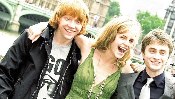
screen_ i thought it was a bit too darkish for my taste, so i duplicated the base and set it on the blend mode screen. here's my result. looks much better, doesn't it? ;)
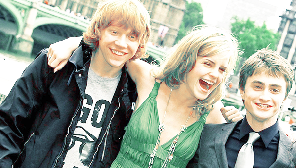
selective color 1_ now, to start on the coloring. for this one, i was going for a greyish/marble-like look; but i wanted to get it while keeping a light blush on their faces-- wouldn't want them to end up looking like zombies. fastest way i know to do this is by using a selective coloring layer (layer> new adjustment layer> selective color). these were my settings:
reds: 50/0/0/-10
yellows: 100/-30/-20/0
whites: 0/0/0/-70
neutrals: 5/-5/-5/-5
okay, so what does this mean? increasing the cyan in the reds & yellows made parts like their hair, emma's clothes, the tree behind them and such, a little less red and a bit lighter. notice i reduced the magentas & yellows in the yellow, as well as increasing the cyans a lot more than the red? that's because there's mostly red in their faces (natural blush), but yellow in their hair-- so i want my yellows to look yellow, not orange; that way, their hair and skin (mostly rupert's) don't look like they're the same hue. and the decrease of black in the whites did just what it sounds like: made the whites whiter. it made the overall image look less yellow and provided a lot more contrast against their hair & clothes. if i hadn't done this, the pic would've looked a little washed out and plain. here's my result for this step.
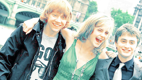
selective color 2_ looking at the last step, i decided i wanted my colors to pop out more. it's all the tree's fault-- i felt the leaves looked a little too blueish to seem natural ^^;;; yes, that's the kind of wacky stuff i take into consideration when coloring graphics. i'm a freak, i know. but anyway, to make green you add yellow, right? so i used another selective color layer with these settings:
reds: -100/0/100/0
yellows: 40/-40/0/0
that was a very simple SC layer that had a big effect: reduce the cyan in the red so that my red doesn't disappear altogether, and then increasing the yellows. this made the red parts (hair, skin) become a little more yellow, without looking weird. the settings in the yellow worked a bit like it did in the first SC layer, only since i didn't reduce the yellows, it didn't go completely cyan this time-- et voilà, the tree leaves are back to their nice green coloring ;)
you're wondering why i didn't use the green setting directly? simple: when i'm coloring people i ALWAYS tinker with the reds and yellows first, to make sure i can keep the blush on their faces and the tone of their hair, as i've mentioned. by the time i was done with the reds and yellows, i found it looked good, so i didn't bother enhancing the greens anymore.
selective color 3_ that was all good and nice, but i lost my "marble-like" feeling. i wanted something... greek. yeah, i'm aware this only makes sense in my head, but bear with me here. i wanted them to look like they were carved in stone, or like a painting. the yellow was a bit too warm for my tastes (i had to tell myself to stop looking at the goddamn leaves in the background!), so i decided to make it more cyanish/greyish with another SC layer, and worked the yellows & neutrals:
reds: -100/0/100/0
yellows: 40/-40/-100/0
neutrals: 20/0/-10/-10
the reds are there purely for the "blush factor," again. i took the yellow all the way down, as well as making it more cyan and reducing the magenta a bit (they would've had a purple tinge had i not added in that -40). the neutrals were added just to balance out the coloring-- the neutrals setting basically affects the whole icon, so i was careful to just tweak with them a little bit. wouldn't want them to end up with blue hair. i decreased the blacks in the neutrals because i found myself liking the idea of the graphic looking a bit washed-out. here's what it looked like.
selective color 4_ they were still missing a bit of that "painting" feeling, so i added another SC layer:
reds: -100/15/100/0
yellows: -45/0/-30/-20
neutrals: 15/-10/-20/-20
this was just more of the same, really. i could have, in essence, simply duplicated the previous layer and gotten a very similar result. the only difference is in the yellows: this time i decreased the cyans instead of increasing them. i did this because i wanted rupert's hair to pop out; if i increased the cyans it would simply be a bit too neutral for my taste. it also made emma's hair pop out as well, which was a nice side-effect. but it seriously only depends on your pic. here's my result.
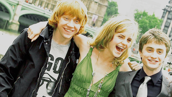
black layer_ now i thought the coloring was perfect, just a little too bright. so i used a trick i often use: created a new layer, flood-filled it with black, and reduced the opacity until i got something nice. in this case i settled for 15%. it was enough to bring back the grayish, greek look i'd wanted for the graphic in the beginning xD anyway, there you have the finished product!
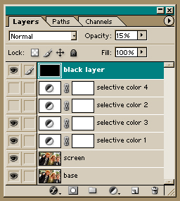
making a bit of a recap, to make this, use the first four layers, up to the second selective coloring, and the black layer, like so. and to make this, use every layer, like so.
i hope you found this tutorial useful, and i would love to see your results, so please comment! i've still got one more tut coming up for zeta0197, so stay tuned! and if you like my icons/graphics and/or want to know how i made them, be sure to step by wakizashi_. i'd be glad to help you with anything.
all of this was done in PS7. uses selective coloring, so it's not translatable. sorry, PSP & GIMP users :( if you check out my other tutorials, you might find something for you.
if you DO have photoshop and CAN use selective coloring, keep in mind that this still does not work with every picture. everything depends on the quality of your original image and its inherent coloring. i find this type of color works better on images that have both saturated and unsaturated colors, like pale people with darker hair, and such. you don't want your image to be too light, because then the detail will disappear.
***PLEASE DON'T COPY THIS EXACTLY!*** try to learn what i think while i'm making these instead of just copying and pasting every single layer onto your images, ok? remember it might not work for every single image out there, fiddle with the settings if you have to.
base_ my base for this was an image of the trio from the london photocall for the OotP movie. now, remember that to get good coloring, having a good original image is half the battle. these images of the photocall were very HQ, which is why i used them so much. anyway, i rotated it a bit, cropped it, and resized it. then i ran auto contrast (image> adjustments> auto contrast) and auto color (image> adjustments> auto color) until i got something i liked for my base; this is completely at your discretion. don't sharpen yet, it gets funky when you use selective color on sharpened images. always leave it 'til the end. and this was my final base.
screen_ i thought it was a bit too darkish for my taste, so i duplicated the base and set it on the blend mode screen. here's my result. looks much better, doesn't it? ;)
selective color 1_ now, to start on the coloring. for this one, i was going for a greyish/marble-like look; but i wanted to get it while keeping a light blush on their faces-- wouldn't want them to end up looking like zombies. fastest way i know to do this is by using a selective coloring layer (layer> new adjustment layer> selective color). these were my settings:
reds: 50/0/0/-10
yellows: 100/-30/-20/0
whites: 0/0/0/-70
neutrals: 5/-5/-5/-5
okay, so what does this mean? increasing the cyan in the reds & yellows made parts like their hair, emma's clothes, the tree behind them and such, a little less red and a bit lighter. notice i reduced the magentas & yellows in the yellow, as well as increasing the cyans a lot more than the red? that's because there's mostly red in their faces (natural blush), but yellow in their hair-- so i want my yellows to look yellow, not orange; that way, their hair and skin (mostly rupert's) don't look like they're the same hue. and the decrease of black in the whites did just what it sounds like: made the whites whiter. it made the overall image look less yellow and provided a lot more contrast against their hair & clothes. if i hadn't done this, the pic would've looked a little washed out and plain. here's my result for this step.
selective color 2_ looking at the last step, i decided i wanted my colors to pop out more. it's all the tree's fault-- i felt the leaves looked a little too blueish to seem natural ^^;;; yes, that's the kind of wacky stuff i take into consideration when coloring graphics. i'm a freak, i know. but anyway, to make green you add yellow, right? so i used another selective color layer with these settings:
reds: -100/0/100/0
yellows: 40/-40/0/0
that was a very simple SC layer that had a big effect: reduce the cyan in the red so that my red doesn't disappear altogether, and then increasing the yellows. this made the red parts (hair, skin) become a little more yellow, without looking weird. the settings in the yellow worked a bit like it did in the first SC layer, only since i didn't reduce the yellows, it didn't go completely cyan this time-- et voilà, the tree leaves are back to their nice green coloring ;)
you're wondering why i didn't use the green setting directly? simple: when i'm coloring people i ALWAYS tinker with the reds and yellows first, to make sure i can keep the blush on their faces and the tone of their hair, as i've mentioned. by the time i was done with the reds and yellows, i found it looked good, so i didn't bother enhancing the greens anymore.
selective color 3_ that was all good and nice, but i lost my "marble-like" feeling. i wanted something... greek. yeah, i'm aware this only makes sense in my head, but bear with me here. i wanted them to look like they were carved in stone, or like a painting. the yellow was a bit too warm for my tastes (i had to tell myself to stop looking at the goddamn leaves in the background!), so i decided to make it more cyanish/greyish with another SC layer, and worked the yellows & neutrals:
reds: -100/0/100/0
yellows: 40/-40/-100/0
neutrals: 20/0/-10/-10
the reds are there purely for the "blush factor," again. i took the yellow all the way down, as well as making it more cyan and reducing the magenta a bit (they would've had a purple tinge had i not added in that -40). the neutrals were added just to balance out the coloring-- the neutrals setting basically affects the whole icon, so i was careful to just tweak with them a little bit. wouldn't want them to end up with blue hair. i decreased the blacks in the neutrals because i found myself liking the idea of the graphic looking a bit washed-out. here's what it looked like.
selective color 4_ they were still missing a bit of that "painting" feeling, so i added another SC layer:
reds: -100/15/100/0
yellows: -45/0/-30/-20
neutrals: 15/-10/-20/-20
this was just more of the same, really. i could have, in essence, simply duplicated the previous layer and gotten a very similar result. the only difference is in the yellows: this time i decreased the cyans instead of increasing them. i did this because i wanted rupert's hair to pop out; if i increased the cyans it would simply be a bit too neutral for my taste. it also made emma's hair pop out as well, which was a nice side-effect. but it seriously only depends on your pic. here's my result.
black layer_ now i thought the coloring was perfect, just a little too bright. so i used a trick i often use: created a new layer, flood-filled it with black, and reduced the opacity until i got something nice. in this case i settled for 15%. it was enough to bring back the grayish, greek look i'd wanted for the graphic in the beginning xD anyway, there you have the finished product!
making a bit of a recap, to make this, use the first four layers, up to the second selective coloring, and the black layer, like so. and to make this, use every layer, like so.
i hope you found this tutorial useful, and i would love to see your results, so please comment! i've still got one more tut coming up for zeta0197, so stay tuned! and if you like my icons/graphics and/or want to know how i made them, be sure to step by wakizashi_. i'd be glad to help you with anything.