tutorial #10-- OotP's sirius
hey guys! citygirlamandab asked me to write up a couple of tutorials for icons from my last batch, so here's the first one.
make this -->
or this -->
...in PS7. uses selective coloring, so it's not completely translatable, but read on even if you don't have that tool, that's not ALL i use on it ^-^ you can still find some neat tricks inside.
***PLEASE DON'T COPY THIS EXACTLY!*** try to learn what i think while i'm making these instead of just copying and pasting every single layer onto your images, ok? remember it might not work for every single image out there, fiddle with the settings if you have to.
base_ so i took that image of sirius from the OotP posters, right? (i love those posters, they're so cool...) anyway, i cropped it as desired, resized to 100x100. then i ran auto contrast (image> adjustments> auto contrast) and auto color (image> adjustments> auto color) until i got something i liked for my base. tweak around with these tools at different fade opacities, it's different for each base, really. i didn't sharpen it yet, because that + selective coloring can give me some really icky results. my base looked like this.
saturation_ good ol' padfoot was looking a bit pale and blah, so i added a hue/saturation layer (layer> new adjustment layer> hue/saturation) and increased the master saturation by about 30. it was looking much better now.
selective color 1_ since the base is mainly blue anyway, i decided to play with those settings (layer> new adjustment layer> selective color) to see if i could get it to pop out more. my settings were:
reds: -100/-25/-35/35
yellows: -80/-30/25/-45
neutrals: 100/15/-30/10
make sure the method is set to "relative." i was trying to bring out some pink on his face, hence the really low value of cyan in the reds, and the slight increase of magenta in the neutrals. it didn't go as well as i'd hoped for, though, he was still looking very pale and now completely surrounded by blue, like so.
selective color 2_ i didn't want to give up on bringing in some red into the icon, so i tried again. this time i went all out on the magentas and yellows. my settings were:
reds: -100/100/100/0
neutrals: 0/100/100/-50
again, make sure the method is set to "relative." that worked a bit better. he's looking a bit more rosy now, which is what i wanted.
channel mixer_ now i wanted to enhance the redness without losing my cyan background, so i went ahead and tried a channel mixer layer (layer> new adjustment layer> channel mixer). if you want to go for funky effects-- and i'm ALWAYS up for funky xD-- the channel mixer is a really quick and neat tool to use; just try adjusting the default settings back and forth until you come across something you like. these were my settings:
red: 180/-80/15/0
green: -15/115/10/0
blue: -15/15/100/0
the channel mixer is a really easy tool to understand. in each channel, increasing or decreasing the amount of the channel color will make that color dominate in the image (that is, i increased the red on the red channel by a lot, so the image turned out more red). the opposite is also true. on the other hand, decreasing the other two colors in each channel will make those colors dominate in the image (that means, decreasing the green or the blue in the red channel will make the image more green or blue, while increasing either will make the image more red). anyway, the point is that i could finally make the red in sirius' face-- the one i had gotten with the last SC layer, i finally made it pop, without losing much of the blue in the background, like this.
base copy 1_ after the last layer, he was looking a bit too... fluorescent, so i duplicated the base layer, brought it to the top and reduced its opacity to 20%. that calmed down the brightness a bit.
sharpened copy merged 1_ i thought this was a good stopping place, so i copy-merged everything (edit> copy merged), pasted it as a new layer at the top, and sharpened that as desired. then i saved it and there you have the first of the two sirius icons.
difference_ i thought i could still do stuff to it and get some variations, so i made the last layer (sharpened copy merged 1) invisible and inserted a new layer at the top. i did this because of what i mentioned above about selective coloring and sharpening-- i thought about using selcol again, so i didn't want the image to be sharpened for that. i didn't use any more selcol anyway, i decided to go with a difference layer. ah, yes, those cool difference layers that i love so much... though i seem to be the only one who uses them, haha ^^;;; but i find them really awesome. i decided to use one in this icon because it was predominantly blue. when i get an icon that's predominantly blue, or orange, or something similar, i start itching to use a difference layer. i tried to use a saturated orange layer here, but it didn't work out that well, so i went with the trusty saturated blue difference layer. i flood-filled my new layer with #0101FE and set it to difference. and now, everybody, say hello to alien-sirius! xD
hard light_ well, of course i wasn't gonna leave him like THAT! i made my last layer invisible (difference), copy-merged it again, and pasted as a new layer. then i set this new copy to hard light. that definitely brought him back to a normal appearance, and with some nifty green and yellowish tones to it, as well, which was good, because i was looking for something different than my original icon. here's what it looked like.
sharpened copy merged 2_ and then, as a last step, i copy-merged everything again, pasted it as a new layer, and sharpened it until i liked the result ^_^ et voilà, we get the finished second sirius icon! wasn't it a cool trip? =^^=
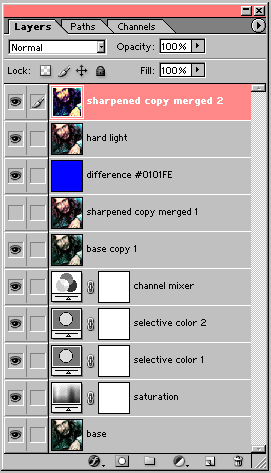
here's the layers palette, just in case you got lost somewhere in there. i hope you found this tutorial useful, and i would love to see your results, so please comment! i have one more tutorial coming soon, as requested by citygirlamandab, so wait for it. and if you like my icons/graphics and/or want to know how i made them, be sure to step by wakizashi_. i'd be glad to help you with anything.
make this -->
or this -->
...in PS7. uses selective coloring, so it's not completely translatable, but read on even if you don't have that tool, that's not ALL i use on it ^-^ you can still find some neat tricks inside.
***PLEASE DON'T COPY THIS EXACTLY!*** try to learn what i think while i'm making these instead of just copying and pasting every single layer onto your images, ok? remember it might not work for every single image out there, fiddle with the settings if you have to.
base_ so i took that image of sirius from the OotP posters, right? (i love those posters, they're so cool...) anyway, i cropped it as desired, resized to 100x100. then i ran auto contrast (image> adjustments> auto contrast) and auto color (image> adjustments> auto color) until i got something i liked for my base. tweak around with these tools at different fade opacities, it's different for each base, really. i didn't sharpen it yet, because that + selective coloring can give me some really icky results. my base looked like this.
saturation_ good ol' padfoot was looking a bit pale and blah, so i added a hue/saturation layer (layer> new adjustment layer> hue/saturation) and increased the master saturation by about 30. it was looking much better now.
selective color 1_ since the base is mainly blue anyway, i decided to play with those settings (layer> new adjustment layer> selective color) to see if i could get it to pop out more. my settings were:
reds: -100/-25/-35/35
yellows: -80/-30/25/-45
neutrals: 100/15/-30/10
make sure the method is set to "relative." i was trying to bring out some pink on his face, hence the really low value of cyan in the reds, and the slight increase of magenta in the neutrals. it didn't go as well as i'd hoped for, though, he was still looking very pale and now completely surrounded by blue, like so.
selective color 2_ i didn't want to give up on bringing in some red into the icon, so i tried again. this time i went all out on the magentas and yellows. my settings were:
reds: -100/100/100/0
neutrals: 0/100/100/-50
again, make sure the method is set to "relative." that worked a bit better. he's looking a bit more rosy now, which is what i wanted.
channel mixer_ now i wanted to enhance the redness without losing my cyan background, so i went ahead and tried a channel mixer layer (layer> new adjustment layer> channel mixer). if you want to go for funky effects-- and i'm ALWAYS up for funky xD-- the channel mixer is a really quick and neat tool to use; just try adjusting the default settings back and forth until you come across something you like. these were my settings:
red: 180/-80/15/0
green: -15/115/10/0
blue: -15/15/100/0
the channel mixer is a really easy tool to understand. in each channel, increasing or decreasing the amount of the channel color will make that color dominate in the image (that is, i increased the red on the red channel by a lot, so the image turned out more red). the opposite is also true. on the other hand, decreasing the other two colors in each channel will make those colors dominate in the image (that means, decreasing the green or the blue in the red channel will make the image more green or blue, while increasing either will make the image more red). anyway, the point is that i could finally make the red in sirius' face-- the one i had gotten with the last SC layer, i finally made it pop, without losing much of the blue in the background, like this.
base copy 1_ after the last layer, he was looking a bit too... fluorescent, so i duplicated the base layer, brought it to the top and reduced its opacity to 20%. that calmed down the brightness a bit.
sharpened copy merged 1_ i thought this was a good stopping place, so i copy-merged everything (edit> copy merged), pasted it as a new layer at the top, and sharpened that as desired. then i saved it and there you have the first of the two sirius icons.
difference_ i thought i could still do stuff to it and get some variations, so i made the last layer (sharpened copy merged 1) invisible and inserted a new layer at the top. i did this because of what i mentioned above about selective coloring and sharpening-- i thought about using selcol again, so i didn't want the image to be sharpened for that. i didn't use any more selcol anyway, i decided to go with a difference layer. ah, yes, those cool difference layers that i love so much... though i seem to be the only one who uses them, haha ^^;;; but i find them really awesome. i decided to use one in this icon because it was predominantly blue. when i get an icon that's predominantly blue, or orange, or something similar, i start itching to use a difference layer. i tried to use a saturated orange layer here, but it didn't work out that well, so i went with the trusty saturated blue difference layer. i flood-filled my new layer with #0101FE and set it to difference. and now, everybody, say hello to alien-sirius! xD
hard light_ well, of course i wasn't gonna leave him like THAT! i made my last layer invisible (difference), copy-merged it again, and pasted as a new layer. then i set this new copy to hard light. that definitely brought him back to a normal appearance, and with some nifty green and yellowish tones to it, as well, which was good, because i was looking for something different than my original icon. here's what it looked like.
sharpened copy merged 2_ and then, as a last step, i copy-merged everything again, pasted it as a new layer, and sharpened it until i liked the result ^_^ et voilà, we get the finished second sirius icon! wasn't it a cool trip? =^^=
here's the layers palette, just in case you got lost somewhere in there. i hope you found this tutorial useful, and i would love to see your results, so please comment! i have one more tutorial coming soon, as requested by citygirlamandab, so wait for it. and if you like my icons/graphics and/or want to know how i made them, be sure to step by wakizashi_. i'd be glad to help you with anything.