❝ 215 ❞ ► icon tutorials #24 and blocking guide
TUTORIAL #24 for ask the maker 3.0
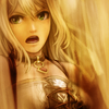
WARNING: IMAGE HEAVY
deternot asked me how I achieved a brown coloring like this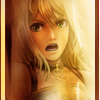
. I tried to write a general guide but failed so I decided to semi recreate the icon and write a tutorial. Hope you enjoy it and find it helpful.
TUTORIAL #24

█ STEP #01
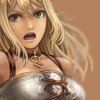
● First let's start with the base. Creating a new layer to fill with a brownish color (#b58260 | R:181 G:130 B:96). This is going to be the base for the brownish color together with the main image.

-
█ STEP #02
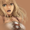
● Now let's add the subject in a new layer. I blurried the side to hide some problems with the extraction and to add some fake depth that will be helpful to work with the textures layer.

-
█ STEP #03
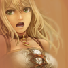
● Duplicate your brownish base layer and put it above the subject layer. You'll not work with opacity and the blend mode but you'll add a mask layer here. Use it to erase parts covering the subject.
The mask layer should look something like this:


-
█ STEP #04
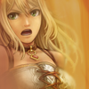
● Now add this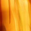
texture by midnight_road in a new layer and set it to Soft Light and Opacity 33%.

-
█ STEP #05
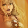
● Duplicate the texture layer or just add the texture again in a new layer. Set it to Soft Light and Opacity 66%. This time we're going to add a mask to it since we don't want the icon to be too orangeish. With the mask layer erase basically all the left side of the texture.
It should look something like this:


-
█ STEP #06
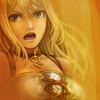
● Create a new layer. With a darker brown than the base fill the left side using the Round Brush Tool. Try to not cover the face of the subject but cover the lines surrounding the subject. Set it to Soft Light and Opacity 75%.

-
█ STEP #07
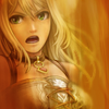
● Add a new Vibrance Layer. Vibrance +93.

-
█ STEP #08
● Add this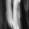
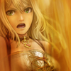
texture made by midnight_road and set it to Soft Light. Again you'll need a add a mask layer to erase a small bit around the face.
It should look like this:


-
█ STEP #09
● Now add this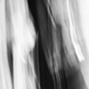
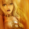
texture made by midnight_road and set it to Soft Light too. And another mask will be needed to blend it with the subject. This time you're going to erase a line over the subject.
It should look like this:


-
█ STEP #10
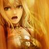
● Copy Merged the icon and paste into a new layer. Use the Box Blur - Radius 3-5. Set it to Soft Light and 55% of Opacity.

-
█ STEP #011
● Add a Gradient Map layer. Pick a Black to White gradient and set this layer to Soft Light and 54% of Opacity.

-
█ STEP #012
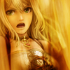
● Add another Vibrance Layer. Vibrance +54.

-
█ STEP #013
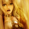
● Duplicate STEP #09 layer and put it above everything. The only change you'll make is in the mask part. Now you'll just want to erase blobs over the face and over the chest of the subject.
It should look something like this:


-
█ STEP #014
● Add another Gradient Map layer like the one in step #11 and Set it to Normal and Opacity 18%. You'll need a mask layer to erase everything over the subject.

-
█ STEP #015
● Now the base is going to finish the icon. Duplicate the bronwish base again (the one from step #01) and put it above everything. Set it to Color and Opacity 20-25%. Another mask layer will be needed over the subject's face.
Both mask layers (from step #14 and #15) should look something like this:

Again deternot asked me maybe a blocking guide. My last "official" tutorial for this community was a general tutorial + a blocking tutorial requested by rizuka. I decided it's a bit old and even if the technique is basically (only changing the overall eye on it and method) the same I wanted to write a general guide in how I do blocking and different types of blocking I use/I like to use.
BLOCKING GUIDE
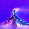
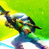
For this Blocking Guide I'll be using two icons as base for every type of blocking I'll try to explain. These are pretty simple but if anyone wants I can make a tutorial for both. I'll use these bases because I always apply the blocking with the composition/coloring finished.
█ BASEs:
BLOCKING - Take #01
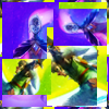
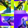
Let's start with the style I usually do most. Let's start by filling half of one icon and half with another.
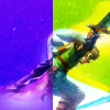
This is the start. Now we're going to cut off some retangles from the original bases and paste over the half-half. Let's to this again and duplicate each retangle. At the end we already should have some kind of blocking.
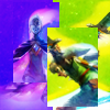
-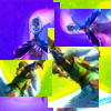
For this I want to add a final touch and add a border. I used copy merged and pasted into a new layer. Used Filter - Offset. Horizontal and Vertical - 50 and erased everything in the middle (a square) and left 2px of border in each side.
-
BLOCKING - Take #02
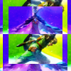
Now let's do something more simple and less messy. Again let's start filling the composition with half and half of our bases.
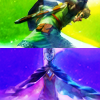
Duplicating both and placing over the original and erasing the middle we're going to create borders with the opposite icon.
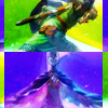
We're going to finish with a duplication and a resize from the original placed over everyting.

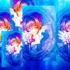
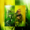
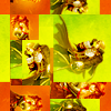
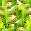
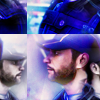
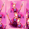
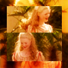
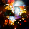
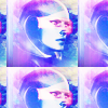
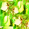
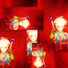
Basically my tip for this is: Use squares and retangles of the original composition and go wild. Just be careful for not making the blocking too messy and confusing. Offset is your best friend filter ever for this too. You can try using it for different results or something you can't achieve just placing retangles. With this I achieved the many blocking icons I made this past year:


Ask The Maker || My Thread
► COMMENTS ARE NICE → ♥
► CREDITS ARE LOVE → twinstrike or twinstrikeish;
► RESOURCES → ( here );
► AFFILIATES → ( here );
► UPDATES → ( watch );

WARNING: IMAGE HEAVY
deternot asked me how I achieved a brown coloring like this
. I tried to write a general guide but failed so I decided to semi recreate the icon and write a tutorial. Hope you enjoy it and find it helpful.
TUTORIAL #24

█ STEP #01
● First let's start with the base. Creating a new layer to fill with a brownish color (#b58260 | R:181 G:130 B:96). This is going to be the base for the brownish color together with the main image.

-

█ STEP #02
● Now let's add the subject in a new layer. I blurried the side to hide some problems with the extraction and to add some fake depth that will be helpful to work with the textures layer.

-

█ STEP #03
● Duplicate your brownish base layer and put it above the subject layer. You'll not work with opacity and the blend mode but you'll add a mask layer here. Use it to erase parts covering the subject.
The mask layer should look something like this:


-

█ STEP #04
● Now add this

texture by midnight_road in a new layer and set it to Soft Light and Opacity 33%.

-

█ STEP #05
● Duplicate the texture layer or just add the texture again in a new layer. Set it to Soft Light and Opacity 66%. This time we're going to add a mask to it since we don't want the icon to be too orangeish. With the mask layer erase basically all the left side of the texture.
It should look something like this:


-

█ STEP #06
● Create a new layer. With a darker brown than the base fill the left side using the Round Brush Tool. Try to not cover the face of the subject but cover the lines surrounding the subject. Set it to Soft Light and Opacity 75%.

-

█ STEP #07
● Add a new Vibrance Layer. Vibrance +93.

-

█ STEP #08
● Add this

texture made by midnight_road and set it to Soft Light. Again you'll need a add a mask layer to erase a small bit around the face.
It should look like this:


-

█ STEP #09
● Now add this

texture made by midnight_road and set it to Soft Light too. And another mask will be needed to blend it with the subject. This time you're going to erase a line over the subject.
It should look like this:


-

█ STEP #10
● Copy Merged the icon and paste into a new layer. Use the Box Blur - Radius 3-5. Set it to Soft Light and 55% of Opacity.

-

█ STEP #011
● Add a Gradient Map layer. Pick a Black to White gradient and set this layer to Soft Light and 54% of Opacity.

-

█ STEP #012
● Add another Vibrance Layer. Vibrance +54.

-

█ STEP #013
● Duplicate STEP #09 layer and put it above everything. The only change you'll make is in the mask part. Now you'll just want to erase blobs over the face and over the chest of the subject.
It should look something like this:


-

█ STEP #014
● Add another Gradient Map layer like the one in step #11 and Set it to Normal and Opacity 18%. You'll need a mask layer to erase everything over the subject.

-

█ STEP #015
● Now the base is going to finish the icon. Duplicate the bronwish base again (the one from step #01) and put it above everything. Set it to Color and Opacity 20-25%. Another mask layer will be needed over the subject's face.
Both mask layers (from step #14 and #15) should look something like this:


Again deternot asked me maybe a blocking guide. My last "official" tutorial for this community was a general tutorial + a blocking tutorial requested by rizuka. I decided it's a bit old and even if the technique is basically (only changing the overall eye on it and method) the same I wanted to write a general guide in how I do blocking and different types of blocking I use/I like to use.
BLOCKING GUIDE
For this Blocking Guide I'll be using two icons as base for every type of blocking I'll try to explain. These are pretty simple but if anyone wants I can make a tutorial for both. I'll use these bases because I always apply the blocking with the composition/coloring finished.
█ BASEs:
BLOCKING - Take #01

Let's start with the style I usually do most. Let's start by filling half of one icon and half with another.

This is the start. Now we're going to cut off some retangles from the original bases and paste over the half-half. Let's to this again and duplicate each retangle. At the end we already should have some kind of blocking.

-

For this I want to add a final touch and add a border. I used copy merged and pasted into a new layer. Used Filter - Offset. Horizontal and Vertical - 50 and erased everything in the middle (a square) and left 2px of border in each side.

-

BLOCKING - Take #02

Now let's do something more simple and less messy. Again let's start filling the composition with half and half of our bases.

Duplicating both and placing over the original and erasing the middle we're going to create borders with the opposite icon.

We're going to finish with a duplication and a resize from the original placed over everyting.

Basically my tip for this is: Use squares and retangles of the original composition and go wild. Just be careful for not making the blocking too messy and confusing. Offset is your best friend filter ever for this too. You can try using it for different results or something you can't achieve just placing retangles. With this I achieved the many blocking icons I made this past year:

Ask The Maker || My Thread
► COMMENTS ARE NICE → ♥
► CREDITS ARE LOVE → twinstrike or twinstrikeish;
► RESOURCES → ( here );
► AFFILIATES → ( here );
► UPDATES → ( watch );