Icon Evolution Meme
Last month a flister and iconmaker favourite, emily_reich, put together her Icon Evolution "table", a chronicle of her icon work over a period of a year and then some. You can find that post here.
I've decided to borrow the idea from her and talk about the very beginnings and the present state of my icon techique.
Phew! This is *huge*, guys. Not dial-up friendly.
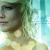
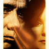
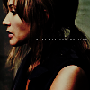
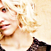
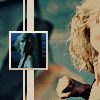
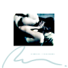
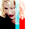
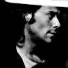
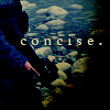
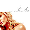
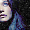
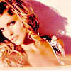
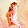
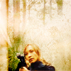
From
to
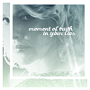
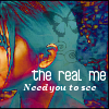
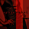
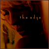
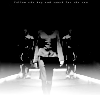
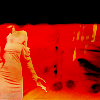
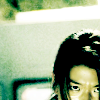
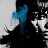
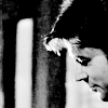
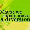
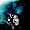
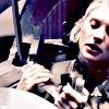
The Beginning aka 6th May, 2005:
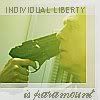
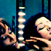
Ah, yes, my first try at icons. Like most people, I thought every icon needed text and a light effect and/or brightening. The GIMP glare function should not be my friend ever again.
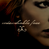
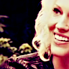
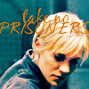
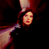
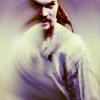
8th May, 2005
That Leoben icon is enough to rob anyone of their eyesight. I remember searching for a hand on Google to accomplish that "effect". Hmm, on the other hand, I think I was more creative with text when I started iconmaking but that was before I discovered my love of textless.
I think fourth icon has something going for it. The text at least matched the image and didn't stick out (oh yes, not like the last icon where I went for bad font *and* textures over the image - after all, who doesn't like boxes and lines over faces?).
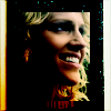
9th May, 2005
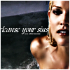
Oh noes (!!), I discovered stock text! An icon sin, indeed. Also, don't you love my complete lack of colour and contrast? I know, I know, it's a gift ;).
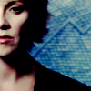
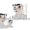
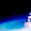
29 May, 2005
Generation X? Eh, what? This is around the time I started to heavily lighten images and really discover how to ruin an image. It also looks as though I have *no idea* how to position text and I can't define the word "intrusive".
18th June, 2005
Now we skip to the release of the season 2 BSG promo images. I think by then I learnt a little more about textures and how to use the layers feature. Icon #2 above doesn't scare me that much, although who knows why I didn't notice the left sidebar. At least these aren't super sharp, I suppose, and actually have *colour*.
21st/23rd June, 2005


I recall June 2005 as a good icon period, mostly because I dived into GIMP each day for hours. I'm still using stock text, but I have some creative cropping happening. I recall using these icons for what seemed like quite a while. The second icon - Six "Cry me a River" - was one of my favourites, as well as the Clouds Kara icon. Hmm, I particularly like the Six crop in #2, though the colouring does nothing.
4th/6th July, 2005
I now begin to enter weekly icon competitions, mostly bstg_icontest. I recall winning with that Roslin icon ('twas thrilling). On the downside, I somehow still think it's acceptable for people to have blue and purple skin colour.
Hee, the Tribbles icon I made for Carr. That's so cute.
14th/17th July, 2005
Look, the first of many Six "Pretty Hate Machine" icons! I wanted to showcase the beginning of my little tradition, as well as my Adama + orange snot icon. I didn't realise it looked as though Adama was having serious sinus issues until someone pointed it out.
27th/28th July, 2005
Oh noes, borders! More Special Hell! On the bright side, the first two icons were old favourites and I can see why. The use of colour is interesting, not something I'd try now, but eye-catching. I also like the use of text. I believe the text on the third icon is from "Iris" (Goo Goo Dolls), my all-time favourite song. But the box on Six? Painful.
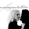
23rd/25th August, 2005
We've moved past my stock text stage, finally. I like the idea of "hold the line", but the execution is poor. Oh, FYI - the text on the Six icon comes from a wonderful song called "Knight Moves" by Suzanne Vega, a fantastic S1 Six song. Hmm, I still think the Boomer icon is pretty in an odd way (I mean, powerful blue hair?). I remember this was a favourite of koalathebear, so it'll always hold a place in my heart.
23rd September, 2005
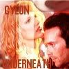
. Cylon Icon Set ., with so_spiffed. An interesting look back, particularly given the very S1 style descriptions of the Cylons (ah, good times).
9th/10th October, 2005
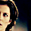
My first SGA icons, along with two old BSG favourites! Oi, the first icon has really happy-go-lucky text. I was such a Cylon supporter in my BSG days :D. Also, we have my first D'Anna icon (so oversharpened). Oh, man, that Weir icon is just horrible. That's an abuse to humanity right there.
15th/16th October, 2005

Ah, yes, my skin colour stage. I knew that was coming. Ick, horrible. I've obsessively smoothed her skin *everywhere*. Oversharpened and oversmoothed. That said, I loved that "bombshell" icon for a long time (oh, that cap brings back memories :D).
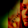
17th/28th October, 2005
A-ha! The Sexbomb icon! (I used to have a Six vid to that song.) If you were on my flist in 2005, you knew this icon because I used it all the damn time. Hmm, the Kara icon has a nice style and good use of orange, though I think I was still on my "overwhelm the icon with shit" kick, along with my overuse of the lighten only function (see #3).
24th/28th November, 2005

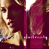
Oh, the ways in which I can't do text. I like the icon of the fourth icon, but that font is disgusting. Ick. Ooh, look, there's my Six electricity icon. I used that one fairly heavily in 2005/2006, too. Looking at this collection and the others after it, I can really see why I hate using lighten only now. It reminds me of the time when I'd eat nothing but corn fritters. Overdose and you're never seeing them again.
11th/15th December, 2005

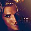

Hmm, that Six icon isn't half bad. #2 and #3 were created for the categories challenge over at bstg_icontest. Basically, the task was to classify characters by personality roles. I won well with those two, particularly the vixen icon.
My first Sam icon. Ta-da. I never got into iconning Sam heavily, however.
And then we have my next attempt at SGA icons, a considerably better attempt. Hmm, that Carson icon just might be my best Carson icon ever (if only because I've only iconned him three or four times since then). It makes Carson look pretty. Interesting colour on the other SGA choices (that's one of my favourite images of Weir because of her pose, but it's difficult to icon).
Early 2006 incomplete Six 100 icons table
. Link.
I think this is where my current icon style was first conceived. There are hints of better quality in this set, in particular the new Six skin colour icons (even as I look at them now, I think the pure white of the skin tone is beautiful). At the same time, I finally decided to experiment with textless icons and rely more on colour than textures.
29th January, 2006

My first two animation icons (not that there have been many since). I still see the first icon around lj. Hmm, the problem with the second is that I can see the shift between frames.
14th February, 2006


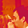
Here I am struggling to find my colour direction and my evolving style. Most of this batch is from the previous handful with a wavy brush added. I did a whole batch of Kara/Lee kiss icons but looking back on them now, they're extremely dark.
28th February/early March, 2006

A better effort with B&W in particular. These sets were just after the airing of "Downloaded", the most Cylon-focused episode up until that point. I had an affinity for focusing on faces and repeating images, which still carries over into my current work.
15th/18th March, 2006


Here we see an improvement in picture quality. The colours are soft and the icons are finally not overcrowded, and when text is used, it's not placed right over someone's face.
26th/31st March, 2006

These are the last two sets I posted in my personal journal due to the creation of serenehorizon. As you can see, there's a bit of repetition going on as well as the use of darkening edges using the burn function. I have to admit that I like some of my text (mostly when I'm not using tiny text and going for something simple but pretty).
6th/15th April, 2006


We have colour! style! proper iconmaking! *cheers* Certainly a few old favourites here, with a focus on colour and brushes. I have to comment on that Wraith icon because I kept it on my userpics for so long (hmm, it might still be there). I think the crop and the black brush is so pretty.
30th April/14th May, 2006

Interesting crops, along with my signature repetition and focus on colour. I particularly like the styles I attempted during this period. I felt they were very out of the box for me and helped me develop my abilities. Many of these icons came from a request post, if I remember correctly. I'm not sure if I ever managed to complete all the requests (I've done a request post 2/3 times and I suck them).
That Kara icon is catching my eye again and again. Probably one of my best Kara icons ever - and from a superb episode!
13th/28th June, 2006


Experiments in repetition with shapes. I think this is the set where I started using the curves function, which is why the colouring is flattering on the SGA icons. I remember being particularly proud of those three SGA icons for the simplicity of their style and their pretty colour.
2nd August, 2006

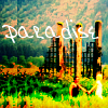
Here we have what is probably my last rehash of all the Kobol's Last Gleaming caps before I drifted away from BSG completely. The colouring looks natural and bright, though I'm not quite sure why I doubled the background of the 'paradise' icon. In this set, you can also see the beginnings of my affinity for centralised character crops (icon #3 - which I believe won me a place over at starttheclock). Then we have the B&W Teyla icon, which I consider to be the first of my "epic" Teyla icons.
29th August, 2007


I recall struggling with this set, mostly with the stills because I felt I wasn't getting the colours or the style I wanted (overdosed on the greens and reds, imo). That said, the Six icon is exempt from that because it's just so beautiful. I know it's weird to have green in her hair, but er, ignore that. Then we have the animated quote icons! They were a smash hit, imo, but difficult to make.
12th December, 2006

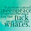

The Rodney Greenpeace icon = my best text icon. ever. Quite a few of my memorable icons here, which I still use. I like my use of textures and grunge effects here (I never really went through a grunge period). I recall being very pleased by the feedback here.
8th March, 2007

This is basically my current style, with the exception of that background phase I went through with the zoom blur feature (see icon #4). This set represents several months of iconmaking, so there are all different styles thrown in together - stuff for lantis_lims, a few oldies out of my incomplete file drenched up out of the black etc.
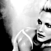
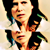
14th March, 2007

My best Tricia Helfer work. period. I love the earthy colours, the backgrounds, her skin colour, lovely. This was all day in a day or two. Icon spurt etc.
23rd April, 2007

The last icons to be made on my desktop prior to switching to Rodney the laptop. This set is mostly comprised of sticksandsnark Rodney/Teyla icons and LIMS entries. This set was made during my motion blur period, which is why we have the appearance of icons like #4. By this stage I'm fully into centralised character icons, so there isn't much face chopping going on - unless you're Ronon and half of your life face is a blur.
7th October, 2007


My most recent set. Plenty of experimentation with backgrounds and the curves function, mostly Teyla and Elizabeth focused. I have so, so many favourites in this batch. I have to say that my focus here is mainly on colouring and lighting. I want centralised crops, but I need the background to look bright and attractive.
Unreleased

I've decided to borrow the idea from her and talk about the very beginnings and the present state of my icon techique.
Phew! This is *huge*, guys. Not dial-up friendly.
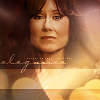
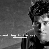
From
to
The Beginning aka 6th May, 2005:
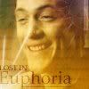
Ah, yes, my first try at icons. Like most people, I thought every icon needed text and a light effect and/or brightening. The GIMP glare function should not be my friend ever again.
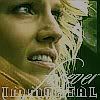
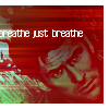
8th May, 2005
That Leoben icon is enough to rob anyone of their eyesight. I remember searching for a hand on Google to accomplish that "effect". Hmm, on the other hand, I think I was more creative with text when I started iconmaking but that was before I discovered my love of textless.
I think fourth icon has something going for it. The text at least matched the image and didn't stick out (oh yes, not like the last icon where I went for bad font *and* textures over the image - after all, who doesn't like boxes and lines over faces?).
9th May, 2005
Oh noes (!!), I discovered stock text! An icon sin, indeed. Also, don't you love my complete lack of colour and contrast? I know, I know, it's a gift ;).
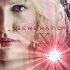
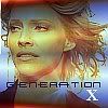
29 May, 2005
Generation X? Eh, what? This is around the time I started to heavily lighten images and really discover how to ruin an image. It also looks as though I have *no idea* how to position text and I can't define the word "intrusive".
18th June, 2005
Now we skip to the release of the season 2 BSG promo images. I think by then I learnt a little more about textures and how to use the layers feature. Icon #2 above doesn't scare me that much, although who knows why I didn't notice the left sidebar. At least these aren't super sharp, I suppose, and actually have *colour*.
21st/23rd June, 2005
I recall June 2005 as a good icon period, mostly because I dived into GIMP each day for hours. I'm still using stock text, but I have some creative cropping happening. I recall using these icons for what seemed like quite a while. The second icon - Six "Cry me a River" - was one of my favourites, as well as the Clouds Kara icon. Hmm, I particularly like the Six crop in #2, though the colouring does nothing.
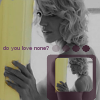
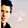
4th/6th July, 2005
I now begin to enter weekly icon competitions, mostly bstg_icontest. I recall winning with that Roslin icon ('twas thrilling). On the downside, I somehow still think it's acceptable for people to have blue and purple skin colour.
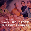
Hee, the Tribbles icon I made for Carr. That's so cute.
14th/17th July, 2005
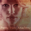
Look, the first of many Six "Pretty Hate Machine" icons! I wanted to showcase the beginning of my little tradition, as well as my Adama + orange snot icon. I didn't realise it looked as though Adama was having serious sinus issues until someone pointed it out.
27th/28th July, 2005
Oh noes, borders! More Special Hell! On the bright side, the first two icons were old favourites and I can see why. The use of colour is interesting, not something I'd try now, but eye-catching. I also like the use of text. I believe the text on the third icon is from "Iris" (Goo Goo Dolls), my all-time favourite song. But the box on Six? Painful.
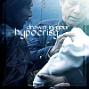
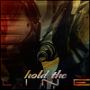
23rd/25th August, 2005
We've moved past my stock text stage, finally. I like the idea of "hold the line", but the execution is poor. Oh, FYI - the text on the Six icon comes from a wonderful song called "Knight Moves" by Suzanne Vega, a fantastic S1 Six song. Hmm, I still think the Boomer icon is pretty in an odd way (I mean, powerful blue hair?). I remember this was a favourite of koalathebear, so it'll always hold a place in my heart.
23rd September, 2005
. Cylon Icon Set ., with so_spiffed. An interesting look back, particularly given the very S1 style descriptions of the Cylons (ah, good times).
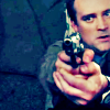
9th/10th October, 2005
My first SGA icons, along with two old BSG favourites! Oi, the first icon has really happy-go-lucky text. I was such a Cylon supporter in my BSG days :D. Also, we have my first D'Anna icon (so oversharpened). Oh, man, that Weir icon is just horrible. That's an abuse to humanity right there.
15th/16th October, 2005
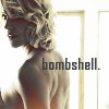
Ah, yes, my skin colour stage. I knew that was coming. Ick, horrible. I've obsessively smoothed her skin *everywhere*. Oversharpened and oversmoothed. That said, I loved that "bombshell" icon for a long time (oh, that cap brings back memories :D).
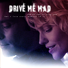
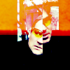
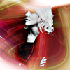
17th/28th October, 2005
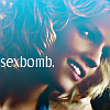
A-ha! The Sexbomb icon! (I used to have a Six vid to that song.) If you were on my flist in 2005, you knew this icon because I used it all the damn time. Hmm, the Kara icon has a nice style and good use of orange, though I think I was still on my "overwhelm the icon with shit" kick, along with my overuse of the lighten only function (see #3).
24th/28th November, 2005
Oh, the ways in which I can't do text. I like the icon of the fourth icon, but that font is disgusting. Ick. Ooh, look, there's my Six electricity icon. I used that one fairly heavily in 2005/2006, too. Looking at this collection and the others after it, I can really see why I hate using lighten only now. It reminds me of the time when I'd eat nothing but corn fritters. Overdose and you're never seeing them again.
11th/15th December, 2005
Hmm, that Six icon isn't half bad. #2 and #3 were created for the categories challenge over at bstg_icontest. Basically, the task was to classify characters by personality roles. I won well with those two, particularly the vixen icon.
My first Sam icon. Ta-da. I never got into iconning Sam heavily, however.
And then we have my next attempt at SGA icons, a considerably better attempt. Hmm, that Carson icon just might be my best Carson icon ever (if only because I've only iconned him three or four times since then). It makes Carson look pretty. Interesting colour on the other SGA choices (that's one of my favourite images of Weir because of her pose, but it's difficult to icon).
Early 2006 incomplete Six 100 icons table
. Link.
I think this is where my current icon style was first conceived. There are hints of better quality in this set, in particular the new Six skin colour icons (even as I look at them now, I think the pure white of the skin tone is beautiful). At the same time, I finally decided to experiment with textless icons and rely more on colour than textures.
29th January, 2006
My first two animation icons (not that there have been many since). I still see the first icon around lj. Hmm, the problem with the second is that I can see the shift between frames.
14th February, 2006
Here I am struggling to find my colour direction and my evolving style. Most of this batch is from the previous handful with a wavy brush added. I did a whole batch of Kara/Lee kiss icons but looking back on them now, they're extremely dark.
28th February/early March, 2006
A better effort with B&W in particular. These sets were just after the airing of "Downloaded", the most Cylon-focused episode up until that point. I had an affinity for focusing on faces and repeating images, which still carries over into my current work.
15th/18th March, 2006
Here we see an improvement in picture quality. The colours are soft and the icons are finally not overcrowded, and when text is used, it's not placed right over someone's face.
26th/31st March, 2006
These are the last two sets I posted in my personal journal due to the creation of serenehorizon. As you can see, there's a bit of repetition going on as well as the use of darkening edges using the burn function. I have to admit that I like some of my text (mostly when I'm not using tiny text and going for something simple but pretty).
6th/15th April, 2006
We have colour! style! proper iconmaking! *cheers* Certainly a few old favourites here, with a focus on colour and brushes. I have to comment on that Wraith icon because I kept it on my userpics for so long (hmm, it might still be there). I think the crop and the black brush is so pretty.
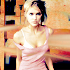
30th April/14th May, 2006
Interesting crops, along with my signature repetition and focus on colour. I particularly like the styles I attempted during this period. I felt they were very out of the box for me and helped me develop my abilities. Many of these icons came from a request post, if I remember correctly. I'm not sure if I ever managed to complete all the requests (I've done a request post 2/3 times and I suck them).
That Kara icon is catching my eye again and again. Probably one of my best Kara icons ever - and from a superb episode!
13th/28th June, 2006
Experiments in repetition with shapes. I think this is the set where I started using the curves function, which is why the colouring is flattering on the SGA icons. I remember being particularly proud of those three SGA icons for the simplicity of their style and their pretty colour.
2nd August, 2006
Here we have what is probably my last rehash of all the Kobol's Last Gleaming caps before I drifted away from BSG completely. The colouring looks natural and bright, though I'm not quite sure why I doubled the background of the 'paradise' icon. In this set, you can also see the beginnings of my affinity for centralised character crops (icon #3 - which I believe won me a place over at starttheclock). Then we have the B&W Teyla icon, which I consider to be the first of my "epic" Teyla icons.
29th August, 2007
I recall struggling with this set, mostly with the stills because I felt I wasn't getting the colours or the style I wanted (overdosed on the greens and reds, imo). That said, the Six icon is exempt from that because it's just so beautiful. I know it's weird to have green in her hair, but er, ignore that. Then we have the animated quote icons! They were a smash hit, imo, but difficult to make.
12th December, 2006
The Rodney Greenpeace icon = my best text icon. ever. Quite a few of my memorable icons here, which I still use. I like my use of textures and grunge effects here (I never really went through a grunge period). I recall being very pleased by the feedback here.
8th March, 2007
This is basically my current style, with the exception of that background phase I went through with the zoom blur feature (see icon #4). This set represents several months of iconmaking, so there are all different styles thrown in together - stuff for lantis_lims, a few oldies out of my incomplete file drenched up out of the black etc.
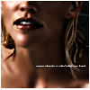
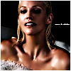
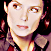
14th March, 2007
My best Tricia Helfer work. period. I love the earthy colours, the backgrounds, her skin colour, lovely. This was all day in a day or two. Icon spurt etc.
23rd April, 2007
The last icons to be made on my desktop prior to switching to Rodney the laptop. This set is mostly comprised of sticksandsnark Rodney/Teyla icons and LIMS entries. This set was made during my motion blur period, which is why we have the appearance of icons like #4. By this stage I'm fully into centralised character icons, so there isn't much face chopping going on - unless you're Ronon and half of your life face is a blur.
7th October, 2007
My most recent set. Plenty of experimentation with backgrounds and the curves function, mostly Teyla and Elizabeth focused. I have so, so many favourites in this batch. I have to say that my focus here is mainly on colouring and lighting. I want centralised crops, but I need the background to look bright and attractive.
Unreleased