Icon Evolution
I know, this isn't an icon post... my apologies. But I've been considering doing something like this for a while now, and since I've made a bunch of icons but am stuck in trying to finish the batch, I thought that perhaps I could get some inspiration by looking back.
Anyways, this is just a look, mostly for my own uses (but to share as well, obviously) at how my icon style has changed over the last year or so. Since it tends to change a little every icon post (for the most part), I'm just gonna pick a few from each and go from there. Hope this is as entertaining/informative for some of you as it is for me.
Just be warned, this is tons of pictures. And tons of me talking.
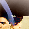
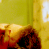
->
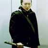
->
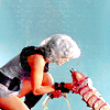
->
September 3, 2006:
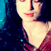
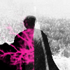
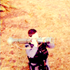


I decided to start with this post because really, not only was it about a year ago, but it was about when I first started to really experiment at all or have any icons that I can still look back on a think "hey, some of these weren't that bad" (I'm still using the Weir/Lorne icon).
Though you can't really see from the icons I chose, I was really into the "black bar on top and bottom" thing, mostly because I had not idea how to extend images to fill the space. Ah, good times.
September 12, 2006:
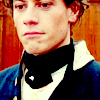
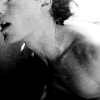
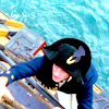
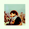
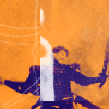
...and my experimenting didn't last all that long. My cropping was really boring, I got even more into the black bars thing, and my coloring was less than exciting. The occasional icon (like the fourth here) had some uniqueness, but for the most part it was kinda blah, lots of reddish-yellow skin, yellow highlights, and everything else dark.
As you can see with the fifth icon here, I also tried some weird stuff, and, well, wasn't entirely successful.
Also, started to overuse the solid-colored box border about here I think.
September 19, 2006:
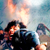
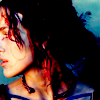
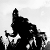
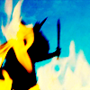
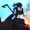
I really got into the bold colors for a while... lots of strong shadows and dark red/purple/yellow/teal on everything else. On my black and white icons, I was really into high contrast since I had no idea how to dull the whites at all.
I also got really into posting like once a week.
For about a year.
September 24, 2006:
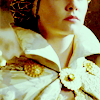
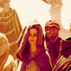
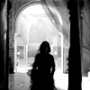
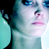
Aha, the beginning of my "exclusion layers can be cool" phase. I did lots of different exclusion layers combined with various contrast techniques and selective color/color balance. I also used a lot more white and color, so my icons weren't loaded down with dark anymore, which was somewhat influenced by the difference in caps I was using (HD, much brighter, more outside shots in the day, etc), but nevertheless a drasticish change from the previous post.
On the bright side, I still really like some of these.
September 30, 2006:
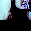
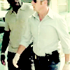
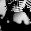
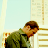

I still used a lot of exclusion layers, but played around with color even more, tried some new cropping, and made slightly less extreme on my black and white contrast. My color icons got more contrasted, though. Had some really extreme whites, though most of the time the white had some color to it. The darks were once again really dark, but unlike a few cycles back, the black didn't overwhelm the icons as a whole since there was way more color.
Overall, I actually managed to do quite a lot of color variety, but the colors were less strong and bright and more soft and blended. I still wasn't very good at picking out specific colors in different parts of the icon so my color contrast wasn't that great unless the image itself started bright and had some interesting colors in it.
October 15, 2006:
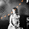
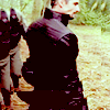

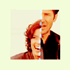
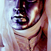
My first foray into the world of request icons. Needless to say, working with caps not chosen by me was really hard, and my inspiration was somewhat lacking for the most part.
I started to use the "double image" box thing, with a smaller version inside a bigger one (like my second one here).
I was still on the exclusion layers phase, I think, but for the most part I don't feel like I had much style at all for these request posts.
October 18, 2006:
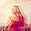
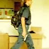
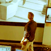
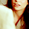
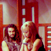
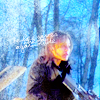
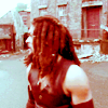
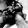
Because of the huge difference in style (or at least technique) between each fandom, due mostly to the difference in cap darkness/color/etc, I posted an example set from each, despite it being all one post. You'll see this in several other posts later, particularly when I felt my variety in style explanded a lot.
Anyway, for this post, I did a lot more color that was (for the most part) a lot less weird. I started to use way less exclusion layers and started to focus on other coloring methods, particularly color balance (I think). This also marks (for the most part) the end of the extreme darks, though I still made a lot of white and light colors and upped the brightness.
I started to experiment more with cropping again, with at least some success, though I did use the black bars of doom a few more times.
October 29, 2006:
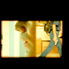
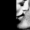

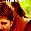
This was really a small, small batch, the second half of the requests that I did. As with the first half, I didn't feel like I had any style or much inspiration, so I don't really know what to talk about...
So moving on.
October 31, 2006:
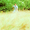

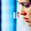
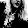
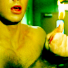
Aha! the weird color contrast phase. I was really into, whenever possible, upping the red and yellow in an icon, then going into the neutral colors in selective coloring and going like 80-90% cyan and blue. It worked for a few times... but yeah, only a few times.
I also got even more into variety of color, and making whole icons on one color pallette (yellow/green, yellow/red, yellow/yellow, red... etc) be a bit, well, better. Worked sometimes, didn't work sometimes. For the most part, though, finally got away from that and started making skin be one color and clothes be another, and so and and so forth. Or, well, I tried.
November 24, 2006:

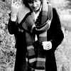
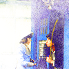
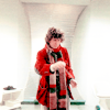
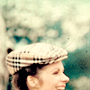
Old school Doctor Who images = evil. And really, really hard to icon. Especially for someone who was at my skill level of the time.
So yeah, not much variety happened. In an attempt to create variety, I made some really crappy.
Was really into a couple texture brushes, too, which only worked about half the time.
At this point I also stopped using much coloring-the-whole-icon techniques and started focusing on just brightening/altering the individual colors that were already there, so there was way less color and way less variety.
December 9/31, 2006:
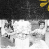

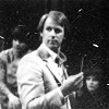
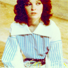
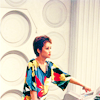
These were two batches that were just so ridiculously small that I couldn't bring myself to include a sample set from each by itself.
Mostly at this point, I was massively over-abusing the same few texture brushes, and half the time the icons turned out really over-busy.
Also tried to make extremely bright and saturated colors, was still into the orange/teal contrast thing, and generally was in a slump coloring-wise.
Some of the black and white ones I made turned out ok, though.
January 1, 2007:
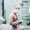
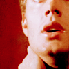
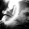
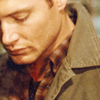
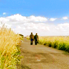
In a complete 360, went back to the coloring-the-whole-icon thing, this time even more sticking to the "single color pallette" method most of the time, making most of the icon one color and making just a few highlight objects a different color. I also really liked to make the blacks really black so it contrasted with the color more.
Was really into making black and white icons overall dark with a few white highlights.
January 14, 2007:



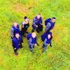
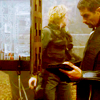
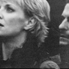
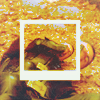
My yellow phase! For some reason, I was really into yellow... yellow, yellow-red, yellow-green, brown... used it a lot. At this point (I believe), I also discovered the art of lowering contrast in black and whites to make the whites less extreme. I've used such techniques in almost every single b&w icon I've made ever since, though to varying degrees. Dunno what else to really say, aside from "overall my coloring was improving".
Also, if I had to pick one single icon that I think I've gotten the most comments on/seen used the most/etc, it would have to be the Sammy "good in a crisis" icon... which I think is fairly ironic seeing as I didn't even make the text up (it came from someone on twop), but is nonetheless awesome.
February 6, 2007:
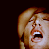
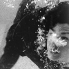


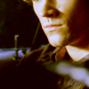
At this point, I did a lot more brown and a lot of reddish/orangeish/brownish overall and I started in on the blue highlights phase, pumping whites with blue in selective coloring and color balance.
Blacks were less extreme, overall the coloring was more subtle, and generally my contrasting wasn't quite as high. Again, lots of subtle, lots of brownish-yellow, and lots of blue.
February 22, 2007:

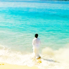
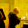

My first big batch of Heroes icons! Whoot. I didn't choose any to display (I mean, who would?), but there were some massive fugly ones in this batch. I distastrously over-used some white texture brushes on a couple icons. Fortunately, that wasn't the majority of them, but there were a few.
I started using some more naturalistic colors, like in the beach ones, using the colors from the image and enhancing them instead of going for more bizarre colors. I still used a bit of the reddish-brown/yellowish-brown coloring, but in way less of the icons. I also really went nuts with lowering contrast on black and white icons, to more or less success, with a few exceptions. I would lower the contrast, then darker the darks, lighten the mid-tones, and lighten the whites just a little, then repeat til I got something I liked... this really helped on some caps for which absolutely nothing was working, but then it was less successful on others.
But such is experimenting.
May 30, 2007:

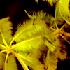

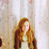
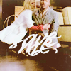
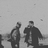
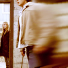
These two posts were both on the same day... they weren't the same post.
Post 1: Holy crap. This was my first batch after months and months of icon-making hiatus (for various reasons), and for some reason I decided to icon my own photos and make some text icons (some of which were ok, some of which were really crappy). A few of the "stock" icons worked out ok, but for the most part, I went for wtfextreme colors and it just really didn't work. That's what I get for letting myself get out of practice.
Oh well. Life goes on.
Post 2: I really have no good description for this phase other than "dull". I went for really subtle coloring. Lots of brown and blue again, but way less saturated than when I used the brown/blue scheme before. I went way overboard on the lack of contrast tecnhique on the black and whites and didn't use as much brightness and contrast in the colors. It worked for a few icons, but most of them were a bit on the blah side.
On the bright side, though, I did start getting back into cropping, trying out new stuff a little bit, slowly doing more tight crops and more wide-angle crops.
All in all, I hadn't done any iconning in a while, and it showed.
June 9, 2007:
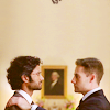
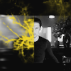
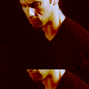

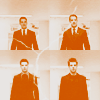
Yay coloring! My coloring skillz started to come back to me, which was a very good thing. I'm still rather happy with this batch. It was about at this point that I started to really work with expanding the icon space, doing some more creative stuff, using brushes without over-using them, and making icons overall simpler without lots of background junk. I think I was more or less successful... a few of the icons turned out a bit wtfweird, but for the most part, I still rather like this set.
I went for a lot more varied color, again using the colors from the image and going from there instead of trying to completely change the icon to all one color. I also started to do a bit more contrast on black and white icons.
This is really the post where I started to go a little more nuts and a little less plain and started the slow build toward where I'm at now, which I think is a good thing.
June 28, 2007:
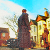
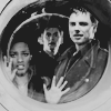


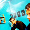
I think this is about where my creativity started its nice upward swing. This was also my first batch of new Doctor Who icons ever. The fact that show itself uses lots of nice colors already was massively helpful in experimenting with brighter colors. I did a lot more saturating and increasing of all the colors in the image in addition to my usual tweaking. I also acquired some new brushes at this point and started to play with brushes a lot more, and some of that shows in this set. It was also here where I started the technique in which I make an icon with really bright colors then put a solid white layer over the top at like 5-15% fill to soften it (a technique which I also use for black and white occasionally).
...Can you tell I'm running out of stuff to say for each post?
June 29, 2007:

These I made all in like one day and ran out of caps to icon so I just decided to post it. Not much extra to say except that I was really happy with how some of these turned out, with some really bright colors and brushwork that turned out well, and the fourth one I have here is still one of my favorite black and white ones that I've ever made.
July 9, 2007:
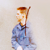
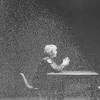
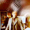
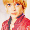
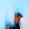
Once again I went for really brightening colors and improving my black and white style... unfortunately, a few didn't work out so well, but that's normal I suppose.
I also experimented with the "take a slice from the background, put it over half the icon subject, and erase part of it with a cool brush" technique, which I really liked in the first and last ones that I have in my example set here. I think it was about this time that I also started improving on my sharpening on icons, making them sharper and more crisp instead of just "not blurry". This might have been a few posts earlier, but it was around this time somewhere.
July 19, 2007:

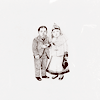
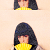
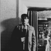
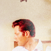
I didn't notice til I was collecting icons to use in this current post that I realized this set of icons is all like the same colors... Lots of really light/bright yellow/red/orange and then some black and white. There were a few blueish ones, but almost all the post was really light yellow. I did a bit more of the technique I experimented with before, but not as much.
Again, not much to really say. I was in a transitional phase... or something.
August 2, 2007:
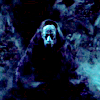
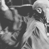

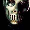


This was my first big icon post in a really long time, and again I split it into two sets of examples because the style difference was even bigger between the two fandoms in this post than in the last ones I split.
I definitely got way better at making icons nice and sharp (though not oversharp, I hope...) and I used a lot of color, making each icon way more unique than in some past sets, and definitely using brushes way more successfully on the whole than I ever had. In fact, there's not a single icon in this set that I cringe at. I was really happy with it.
I definitely from here on out stuck with a pretty simple, clean style, using lots of open space and lots of different colors in each icon without overloading. I started again with some brighter colors, definitely just generally improving my use of color, and using a lot more selective coloring as opposed to less precise tehcniques. However, as opposed to some of my most recent batches, I kept the colors bright but soft, saturated but subtle. Definitely not as in-your-face.
Also, I think I finally got a really nice balance on my black and white icons between brightness/darkness and contrast.
If I had to choose a favorite batch or two, this would definitely be one of them.
August 21, 2007:
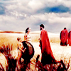
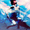
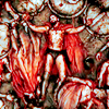

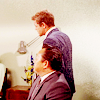

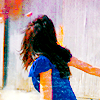
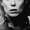
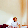
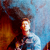
Bring on the experimentation!! Bring on the color!! There were a few icons in this batch that didn't turn out quite so well as the rest, but for the most part, I finally decided to take some risks and it worked pretty well. I did more work with brushes (particuarly with brushes that weren't white, which is pretty much a first), and did a lot more different coloring things from what I'd ever even attempted before.
I started really micro-adjusting colors, changing the colors of whites to be contrasting with the colors of the rest of the icon, did a lot more saturation, and even more work in sharpening. I did all this but still kept my style simple. I've never been good at doing lots of crazy creative things (like moving the image around, blending, adding elements aside from simple texture brushes, and other stuff like that) so instead I try to improve my coloring, cropping, and texture-brush work. I think a simple style has worked for me. I'm happy with it.
September 4, 2007:
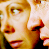
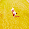
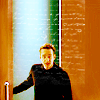
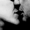

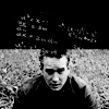
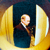
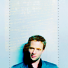
This post was all about bright, bold, saturated, and textured. Sure, compared the next few sets, these are rather natural and light in color, but nevertheless, this is the first time I ever went completely nuts with bold color, and I was helped in this by the caps I had, which were well colored to begin with.
I started to use some older brushes in new ways, once again used colored brushes (mostly on screen, sometimes with a duplicated layer on soft light to enhance the color), and started to use them for creativity instead of just texture.
These icons were much brighter, much more balanced, and used much richer color than even the post right before it. Basically it was using the same techniques and just improving on them and increasing them. Where I used selective color before, I used it even more, making each color brighter and bolder (to reuse the same words over and over) until I was finally satisfied with it. I also worked even more with open space, and particularly in coloring that open space.
September 27, 2007:
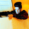
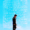
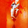
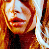
And almost back to the present at last. Needless to say, this set was basically everything I did in the previous set, only even more. More color, more contrast, more brightness, more colored whites, more sharpness... just, well, more. I did abuse red and yellow with blue and turquoise highlights, though. But that's ok, because it all worked. I don't really know what else to say, particularly because this was only one post ago.
I will say, though, that I'm amazed that I managed to make any good icons at all, let alone end up so happy with so many of them, because the caps I used were totally crappy... fortunately the show has a lot of color in it and isn't very dark, but the quality of the caps was just atrocious since I had to get them myself. I think that might be why I decided to go so insane with color... because I couldn't do much else.
Anyway, another one of my favorite batches
Present - Not yet posted:

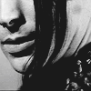
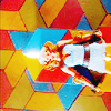
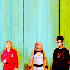

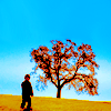
...And here we are, to where I am now. I have to say I'm overall quite happy with it. There's not much difference between these and the last set, though, so there isn't much to talk about. But again, I like it.
I'm a really picky person when it comes to icon quality (though obviously I love a wide range of styles by different icon-makers), so when I make icons that I'm happy with, my iconning soul is a happy bubbly one.
...or something.
I kinda lost track of what I was gonna say there. But whatevs.
Anyway...
There are still loads of fabulous icon-makers out there who I think make way better icons than me (particularly in terms of uniqueness/creativity, the one area I feel I fail at most) and there always will be, but compared to a year ago (or more) I'm much less ashamed to show my icons in public now :p
I just hope I continue to improve and evolve my style.
If you actually read through all this (or even skimmed it), I hope it was informative, or at least interesting. If you have any questions or comments, don't be shy! I'd love to hear them, and I'll try and answer any questions that I get.
Anyways, this is just a look, mostly for my own uses (but to share as well, obviously) at how my icon style has changed over the last year or so. Since it tends to change a little every icon post (for the most part), I'm just gonna pick a few from each and go from there. Hope this is as entertaining/informative for some of you as it is for me.
Just be warned, this is tons of pictures. And tons of me talking.
->
->

->

September 3, 2006:
I decided to start with this post because really, not only was it about a year ago, but it was about when I first started to really experiment at all or have any icons that I can still look back on a think "hey, some of these weren't that bad" (I'm still using the Weir/Lorne icon).
Though you can't really see from the icons I chose, I was really into the "black bar on top and bottom" thing, mostly because I had not idea how to extend images to fill the space. Ah, good times.
September 12, 2006:
...and my experimenting didn't last all that long. My cropping was really boring, I got even more into the black bars thing, and my coloring was less than exciting. The occasional icon (like the fourth here) had some uniqueness, but for the most part it was kinda blah, lots of reddish-yellow skin, yellow highlights, and everything else dark.
As you can see with the fifth icon here, I also tried some weird stuff, and, well, wasn't entirely successful.
Also, started to overuse the solid-colored box border about here I think.
September 19, 2006:
I really got into the bold colors for a while... lots of strong shadows and dark red/purple/yellow/teal on everything else. On my black and white icons, I was really into high contrast since I had no idea how to dull the whites at all.
I also got really into posting like once a week.
For about a year.
September 24, 2006:
Aha, the beginning of my "exclusion layers can be cool" phase. I did lots of different exclusion layers combined with various contrast techniques and selective color/color balance. I also used a lot more white and color, so my icons weren't loaded down with dark anymore, which was somewhat influenced by the difference in caps I was using (HD, much brighter, more outside shots in the day, etc), but nevertheless a drasticish change from the previous post.
On the bright side, I still really like some of these.
September 30, 2006:
I still used a lot of exclusion layers, but played around with color even more, tried some new cropping, and made slightly less extreme on my black and white contrast. My color icons got more contrasted, though. Had some really extreme whites, though most of the time the white had some color to it. The darks were once again really dark, but unlike a few cycles back, the black didn't overwhelm the icons as a whole since there was way more color.
Overall, I actually managed to do quite a lot of color variety, but the colors were less strong and bright and more soft and blended. I still wasn't very good at picking out specific colors in different parts of the icon so my color contrast wasn't that great unless the image itself started bright and had some interesting colors in it.
October 15, 2006:
My first foray into the world of request icons. Needless to say, working with caps not chosen by me was really hard, and my inspiration was somewhat lacking for the most part.
I started to use the "double image" box thing, with a smaller version inside a bigger one (like my second one here).
I was still on the exclusion layers phase, I think, but for the most part I don't feel like I had much style at all for these request posts.
October 18, 2006:
Because of the huge difference in style (or at least technique) between each fandom, due mostly to the difference in cap darkness/color/etc, I posted an example set from each, despite it being all one post. You'll see this in several other posts later, particularly when I felt my variety in style explanded a lot.
Anyway, for this post, I did a lot more color that was (for the most part) a lot less weird. I started to use way less exclusion layers and started to focus on other coloring methods, particularly color balance (I think). This also marks (for the most part) the end of the extreme darks, though I still made a lot of white and light colors and upped the brightness.
I started to experiment more with cropping again, with at least some success, though I did use the black bars of doom a few more times.
October 29, 2006:
This was really a small, small batch, the second half of the requests that I did. As with the first half, I didn't feel like I had any style or much inspiration, so I don't really know what to talk about...
So moving on.
October 31, 2006:
Aha! the weird color contrast phase. I was really into, whenever possible, upping the red and yellow in an icon, then going into the neutral colors in selective coloring and going like 80-90% cyan and blue. It worked for a few times... but yeah, only a few times.
I also got even more into variety of color, and making whole icons on one color pallette (yellow/green, yellow/red, yellow/yellow, red... etc) be a bit, well, better. Worked sometimes, didn't work sometimes. For the most part, though, finally got away from that and started making skin be one color and clothes be another, and so and and so forth. Or, well, I tried.
November 24, 2006:
Old school Doctor Who images = evil. And really, really hard to icon. Especially for someone who was at my skill level of the time.
So yeah, not much variety happened. In an attempt to create variety, I made some really crappy.
Was really into a couple texture brushes, too, which only worked about half the time.
At this point I also stopped using much coloring-the-whole-icon techniques and started focusing on just brightening/altering the individual colors that were already there, so there was way less color and way less variety.
December 9/31, 2006:
These were two batches that were just so ridiculously small that I couldn't bring myself to include a sample set from each by itself.
Mostly at this point, I was massively over-abusing the same few texture brushes, and half the time the icons turned out really over-busy.
Also tried to make extremely bright and saturated colors, was still into the orange/teal contrast thing, and generally was in a slump coloring-wise.
Some of the black and white ones I made turned out ok, though.
January 1, 2007:
In a complete 360, went back to the coloring-the-whole-icon thing, this time even more sticking to the "single color pallette" method most of the time, making most of the icon one color and making just a few highlight objects a different color. I also really liked to make the blacks really black so it contrasted with the color more.
Was really into making black and white icons overall dark with a few white highlights.
January 14, 2007:
My yellow phase! For some reason, I was really into yellow... yellow, yellow-red, yellow-green, brown... used it a lot. At this point (I believe), I also discovered the art of lowering contrast in black and whites to make the whites less extreme. I've used such techniques in almost every single b&w icon I've made ever since, though to varying degrees. Dunno what else to really say, aside from "overall my coloring was improving".
Also, if I had to pick one single icon that I think I've gotten the most comments on/seen used the most/etc, it would have to be the Sammy "good in a crisis" icon... which I think is fairly ironic seeing as I didn't even make the text up (it came from someone on twop), but is nonetheless awesome.
February 6, 2007:
At this point, I did a lot more brown and a lot of reddish/orangeish/brownish overall and I started in on the blue highlights phase, pumping whites with blue in selective coloring and color balance.
Blacks were less extreme, overall the coloring was more subtle, and generally my contrasting wasn't quite as high. Again, lots of subtle, lots of brownish-yellow, and lots of blue.
February 22, 2007:
My first big batch of Heroes icons! Whoot. I didn't choose any to display (I mean, who would?), but there were some massive fugly ones in this batch. I distastrously over-used some white texture brushes on a couple icons. Fortunately, that wasn't the majority of them, but there were a few.
I started using some more naturalistic colors, like in the beach ones, using the colors from the image and enhancing them instead of going for more bizarre colors. I still used a bit of the reddish-brown/yellowish-brown coloring, but in way less of the icons. I also really went nuts with lowering contrast on black and white icons, to more or less success, with a few exceptions. I would lower the contrast, then darker the darks, lighten the mid-tones, and lighten the whites just a little, then repeat til I got something I liked... this really helped on some caps for which absolutely nothing was working, but then it was less successful on others.
But such is experimenting.
May 30, 2007:


These two posts were both on the same day... they weren't the same post.
Post 1: Holy crap. This was my first batch after months and months of icon-making hiatus (for various reasons), and for some reason I decided to icon my own photos and make some text icons (some of which were ok, some of which were really crappy). A few of the "stock" icons worked out ok, but for the most part, I went for wtfextreme colors and it just really didn't work. That's what I get for letting myself get out of practice.
Oh well. Life goes on.
Post 2: I really have no good description for this phase other than "dull". I went for really subtle coloring. Lots of brown and blue again, but way less saturated than when I used the brown/blue scheme before. I went way overboard on the lack of contrast tecnhique on the black and whites and didn't use as much brightness and contrast in the colors. It worked for a few icons, but most of them were a bit on the blah side.
On the bright side, though, I did start getting back into cropping, trying out new stuff a little bit, slowly doing more tight crops and more wide-angle crops.
All in all, I hadn't done any iconning in a while, and it showed.
June 9, 2007:


Yay coloring! My coloring skillz started to come back to me, which was a very good thing. I'm still rather happy with this batch. It was about at this point that I started to really work with expanding the icon space, doing some more creative stuff, using brushes without over-using them, and making icons overall simpler without lots of background junk. I think I was more or less successful... a few of the icons turned out a bit wtfweird, but for the most part, I still rather like this set.
I went for a lot more varied color, again using the colors from the image and going from there instead of trying to completely change the icon to all one color. I also started to do a bit more contrast on black and white icons.
This is really the post where I started to go a little more nuts and a little less plain and started the slow build toward where I'm at now, which I think is a good thing.
June 28, 2007:


I think this is about where my creativity started its nice upward swing. This was also my first batch of new Doctor Who icons ever. The fact that show itself uses lots of nice colors already was massively helpful in experimenting with brighter colors. I did a lot more saturating and increasing of all the colors in the image in addition to my usual tweaking. I also acquired some new brushes at this point and started to play with brushes a lot more, and some of that shows in this set. It was also here where I started the technique in which I make an icon with really bright colors then put a solid white layer over the top at like 5-15% fill to soften it (a technique which I also use for black and white occasionally).
...Can you tell I'm running out of stuff to say for each post?
June 29, 2007:


These I made all in like one day and ran out of caps to icon so I just decided to post it. Not much extra to say except that I was really happy with how some of these turned out, with some really bright colors and brushwork that turned out well, and the fourth one I have here is still one of my favorite black and white ones that I've ever made.
July 9, 2007:


Once again I went for really brightening colors and improving my black and white style... unfortunately, a few didn't work out so well, but that's normal I suppose.
I also experimented with the "take a slice from the background, put it over half the icon subject, and erase part of it with a cool brush" technique, which I really liked in the first and last ones that I have in my example set here. I think it was about this time that I also started improving on my sharpening on icons, making them sharper and more crisp instead of just "not blurry". This might have been a few posts earlier, but it was around this time somewhere.
July 19, 2007:


I didn't notice til I was collecting icons to use in this current post that I realized this set of icons is all like the same colors... Lots of really light/bright yellow/red/orange and then some black and white. There were a few blueish ones, but almost all the post was really light yellow. I did a bit more of the technique I experimented with before, but not as much.
Again, not much to really say. I was in a transitional phase... or something.
August 2, 2007:


This was my first big icon post in a really long time, and again I split it into two sets of examples because the style difference was even bigger between the two fandoms in this post than in the last ones I split.
I definitely got way better at making icons nice and sharp (though not oversharp, I hope...) and I used a lot of color, making each icon way more unique than in some past sets, and definitely using brushes way more successfully on the whole than I ever had. In fact, there's not a single icon in this set that I cringe at. I was really happy with it.
I definitely from here on out stuck with a pretty simple, clean style, using lots of open space and lots of different colors in each icon without overloading. I started again with some brighter colors, definitely just generally improving my use of color, and using a lot more selective coloring as opposed to less precise tehcniques. However, as opposed to some of my most recent batches, I kept the colors bright but soft, saturated but subtle. Definitely not as in-your-face.
Also, I think I finally got a really nice balance on my black and white icons between brightness/darkness and contrast.
If I had to choose a favorite batch or two, this would definitely be one of them.
August 21, 2007:


Bring on the experimentation!! Bring on the color!! There were a few icons in this batch that didn't turn out quite so well as the rest, but for the most part, I finally decided to take some risks and it worked pretty well. I did more work with brushes (particuarly with brushes that weren't white, which is pretty much a first), and did a lot more different coloring things from what I'd ever even attempted before.
I started really micro-adjusting colors, changing the colors of whites to be contrasting with the colors of the rest of the icon, did a lot more saturation, and even more work in sharpening. I did all this but still kept my style simple. I've never been good at doing lots of crazy creative things (like moving the image around, blending, adding elements aside from simple texture brushes, and other stuff like that) so instead I try to improve my coloring, cropping, and texture-brush work. I think a simple style has worked for me. I'm happy with it.
September 4, 2007:


This post was all about bright, bold, saturated, and textured. Sure, compared the next few sets, these are rather natural and light in color, but nevertheless, this is the first time I ever went completely nuts with bold color, and I was helped in this by the caps I had, which were well colored to begin with.
I started to use some older brushes in new ways, once again used colored brushes (mostly on screen, sometimes with a duplicated layer on soft light to enhance the color), and started to use them for creativity instead of just texture.
These icons were much brighter, much more balanced, and used much richer color than even the post right before it. Basically it was using the same techniques and just improving on them and increasing them. Where I used selective color before, I used it even more, making each color brighter and bolder (to reuse the same words over and over) until I was finally satisfied with it. I also worked even more with open space, and particularly in coloring that open space.
September 27, 2007:


And almost back to the present at last. Needless to say, this set was basically everything I did in the previous set, only even more. More color, more contrast, more brightness, more colored whites, more sharpness... just, well, more. I did abuse red and yellow with blue and turquoise highlights, though. But that's ok, because it all worked. I don't really know what else to say, particularly because this was only one post ago.
I will say, though, that I'm amazed that I managed to make any good icons at all, let alone end up so happy with so many of them, because the caps I used were totally crappy... fortunately the show has a lot of color in it and isn't very dark, but the quality of the caps was just atrocious since I had to get them myself. I think that might be why I decided to go so insane with color... because I couldn't do much else.
Anyway, another one of my favorite batches
Present - Not yet posted:


...And here we are, to where I am now. I have to say I'm overall quite happy with it. There's not much difference between these and the last set, though, so there isn't much to talk about. But again, I like it.
I'm a really picky person when it comes to icon quality (though obviously I love a wide range of styles by different icon-makers), so when I make icons that I'm happy with, my iconning soul is a happy bubbly one.
...or something.
I kinda lost track of what I was gonna say there. But whatevs.
Anyway...
There are still loads of fabulous icon-makers out there who I think make way better icons than me (particularly in terms of uniqueness/creativity, the one area I feel I fail at most) and there always will be, but compared to a year ago (or more) I'm much less ashamed to show my icons in public now :p
I just hope I continue to improve and evolve my style.
If you actually read through all this (or even skimmed it), I hope it was informative, or at least interesting. If you have any questions or comments, don't be shy! I'd love to hear them, and I'll try and answer any questions that I get.