(no subject)
Dug up one of my oldest tutorials :) Not to fancy but hey, thought I would share
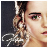
Learn to make this on PSP
to
Step 1
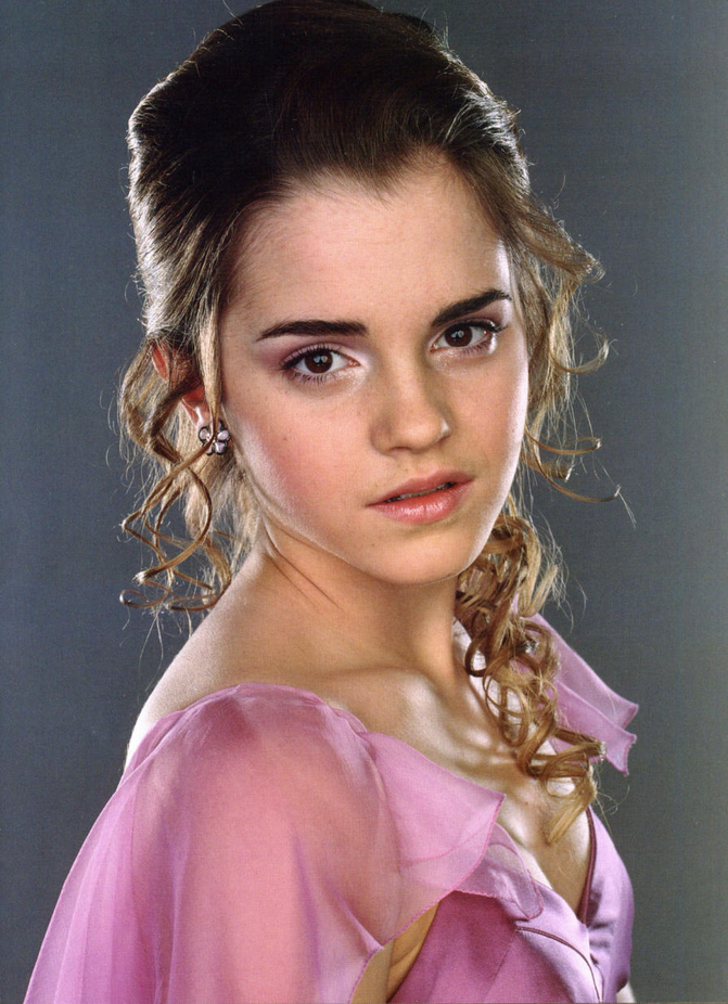
Crop you base to 96x96
Looks like this:
Use your softening tool at about 60% (or less) and smooth out her forhead, cheaks, nose and above her lip. Wherever the lovely Emma looks a little pixely or rough. This picture really didnt do much to hide blemishes.
Step 2
Duplicate this twice. Set them both to soft light at 100%
Desaturate the middle layer 100%
We have this :
Go in again with your softening tool and smooth out whatever is rough. I attacked the hair a bit and sharpening the lips and the eyes.
Step 3
Like my last tutorial set up a new raster layer between the 2nd and 3rd layer and flood fill it to #01082b
Looks like this:
Set it to exculsion at 100% but you can fiddle around with it if you want. I'd personally now go a tinge darker.
What we have:
Step 4
Go to the top now and create another new raster layer. Flood fill it with #eaa688
Looks like this:
Set this to soft light at 70% ... for more intense try overlay or hardlight
What we have:
Step 5
Go back to the base image and duplicate it and drage it to the top. Set it to hard light at 57%.
What we have:
Step 6:
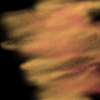
Ok, I created this texture.... I created a new 100x100 image, filled it with black then played with oranges and reds with whispy airbrush. Duplicated that and set it to overlay to get this:
Pasted it over the icon and set it to overlay at 15% for a nice glow
This is what we have:
Step 7
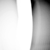
Now we get into the fun stuff! Emma has beautiful brown eyes but I hate them in this picture. She looks like a creature out of Aliens or something. So I decided she is going to have a greenish glimmer to them. So I took this graidant here:
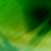
I used this area here :
I pasted this over the icon we have (over her eye) and erased it all around the eye. Then I set it to screen at 72%
This is what is looks like:
Dont worry, Im not turning her into Harry Potter. I just have a thing for green eyes today!
Now, you can either leave this as it is or you can duplicate this thread and set it to hue(legacy) for a bit more green. I think I did that... perhaps...
Step 8
Now we I see this is a bit light so I add this dandy little brush I swiped from fizzy_tea.
I set it to saturation at 72%
You can go a bit lighter or darker if you want. I hate my icons light.
Step 9
Go Back down to the base layer, duplicate it, drag it to the top and set it to soft/hard light somewhere in the 70%'s.
Then I went and added a 2pt white brush and some text.
And we're done!
Learn to make this on PSP
to
Step 1
Crop you base to 96x96
Looks like this:
Use your softening tool at about 60% (or less) and smooth out her forhead, cheaks, nose and above her lip. Wherever the lovely Emma looks a little pixely or rough. This picture really didnt do much to hide blemishes.
Step 2
Duplicate this twice. Set them both to soft light at 100%
Desaturate the middle layer 100%
We have this :
Go in again with your softening tool and smooth out whatever is rough. I attacked the hair a bit and sharpening the lips and the eyes.
Step 3
Like my last tutorial set up a new raster layer between the 2nd and 3rd layer and flood fill it to #01082b
Looks like this:
Set it to exculsion at 100% but you can fiddle around with it if you want. I'd personally now go a tinge darker.
What we have:
Step 4
Go to the top now and create another new raster layer. Flood fill it with #eaa688
Looks like this:
Set this to soft light at 70% ... for more intense try overlay or hardlight
What we have:
Step 5
Go back to the base image and duplicate it and drage it to the top. Set it to hard light at 57%.
What we have:
Step 6:
Ok, I created this texture.... I created a new 100x100 image, filled it with black then played with oranges and reds with whispy airbrush. Duplicated that and set it to overlay to get this:
Pasted it over the icon and set it to overlay at 15% for a nice glow
This is what we have:
Step 7
Now we get into the fun stuff! Emma has beautiful brown eyes but I hate them in this picture. She looks like a creature out of Aliens or something. So I decided she is going to have a greenish glimmer to them. So I took this graidant here:
I used this area here :
I pasted this over the icon we have (over her eye) and erased it all around the eye. Then I set it to screen at 72%
This is what is looks like:
Dont worry, Im not turning her into Harry Potter. I just have a thing for green eyes today!
Now, you can either leave this as it is or you can duplicate this thread and set it to hue(legacy) for a bit more green. I think I did that... perhaps...
Step 8
Now we I see this is a bit light so I add this dandy little brush I swiped from fizzy_tea.
I set it to saturation at 72%
You can go a bit lighter or darker if you want. I hate my icons light.
Step 9
Go Back down to the base layer, duplicate it, drag it to the top and set it to soft/hard light somewhere in the 70%'s.
Then I went and added a 2pt white brush and some text.
And we're done!