Tutorial #3
From 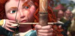
+
To
Note:
twinstrike requested a tutorial for this Brave icon over at icon_talk's Ask the Maker meme. :)
Tools:
I use GIMP, layer masks, and curves. Pretty easily translatable to other programs.
STEP 1: The base
When I was making this batch, I was trying out various blending techniques I hadn't tried before (using tutorials like this one by absolutelybatty and the four blending tutorials she linked at the bottom of that post). So, while normally I just take a black or white canvas and put things on top without any special settings, this time, I used a dark red fill layer (#64000e) as the background:

(Background)
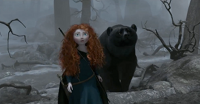
And then I placed the close-up image above that on Screen and then the picture of Merida with the bear above that on Hard Light. Like so:

(Three layers)
Doing it this way is what gives a reddish tint to the image.
STEP 2: Cleaning up the blend
As a first step, I needed to soften the edges of the blend. On the top layer, I added a layer mask (right-click on the layer -> Add Layer Mask), then took a black-to-white (or transparent) linear gradient and applied it like so:

The result is this and an icon that looks like this:

The second thing I wanted to fix was that, because the top layer is on Hard Light and not on Normal, things show up that I didn't like, such as Merida's arrow and her fingers. So what I did is use the Smudge tool on the middle layer (the close-up) to smooth the colors beneath and remove undesired details. The layer by itself ended up looking like this:

And with the stuff on top:

Finally, the last thing I wanted to clean up was the left edge of the top image (you can see a hard line where the layer on top ends) and I wanted to be able to see more of the large Merida's face where possible. So I took a large, soft black airbrush to the layer mask of the top layer and used that to erase bits of it on the side and top. Here's the result (the layers) and the icon:

STEP 3: Coloring
Now that we're done with that base, copy visible (Edit -> Copy Visible) and paste as a new layer. CURVES TIME (Colors -> Curves):
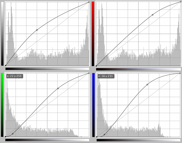
(Ignore the random numbers on the bottom two.) The result after doing that is brighter colors, more red, and darker reddish shadows (because both green and blue are pulled down on the left end).
Note: For GIMP users who want to load the actual settings, you can download my curves file here.

Then above that, I added light blobs using a large, soft white airbrush to a layer set on Hard Light. I sometimes also blur it to make the edges softer (Filters -> Blur -> Gaussian Blur -> 10-25 pixel radius) The layer is like this (open it in a graphics program since it's just white and transparent). Result:

Finally, I made another layer on top with this gradient and set it to Soft Light (colors are #cdb691 -> #c192cd).

I'm not even sure why I did that or how I picked those colors, but the result looks nice:

STEP 4: Text
After fiddling with the text for like an hour, here's what I ended up with:
All the text is located under the top layer (the gradient from the last step) and above the white blob layer. Fonts used are Futura and Utopia (plus bold/italic variations), colors are various pale pinks, and modes are either Hard Light or Grain Merge. More detailed breakdown:
"if you had the"
Color: #f6cdd2
Font: Futura
Size: 6 px
Mode: Hard Light
"chance"
Color: #f6cdd2
Font: Utopia Bold Italic
Size: 10 px
Mode: Hard Light
"to"
Color: #f6cdd2
Font: Futura
Size: 13 px
Mode: Grain Merge
"CHANGE"
Color: #e5b2b9
Font: Utopia Bold
Size: 14 px
Mode: Hard Light
"YOUR"
Color: #f3b4bd
Font: Futura
Size: 9 px
Mode: Grain Merge
"FATE"
Color: #f6cdd2
Font: Utopia
Size: 14 px
Mode: Hard Light
FINAL RESULT
:)

Ask The Maker || My Thread
+
To
Note:
twinstrike requested a tutorial for this Brave icon over at icon_talk's Ask the Maker meme. :)
Tools:
I use GIMP, layer masks, and curves. Pretty easily translatable to other programs.
STEP 1: The base
When I was making this batch, I was trying out various blending techniques I hadn't tried before (using tutorials like this one by absolutelybatty and the four blending tutorials she linked at the bottom of that post). So, while normally I just take a black or white canvas and put things on top without any special settings, this time, I used a dark red fill layer (#64000e) as the background:
(Background)
And then I placed the close-up image above that on Screen and then the picture of Merida with the bear above that on Hard Light. Like so:
(Three layers)
Doing it this way is what gives a reddish tint to the image.
STEP 2: Cleaning up the blend
As a first step, I needed to soften the edges of the blend. On the top layer, I added a layer mask (right-click on the layer -> Add Layer Mask), then took a black-to-white (or transparent) linear gradient and applied it like so:
The result is this and an icon that looks like this:
The second thing I wanted to fix was that, because the top layer is on Hard Light and not on Normal, things show up that I didn't like, such as Merida's arrow and her fingers. So what I did is use the Smudge tool on the middle layer (the close-up) to smooth the colors beneath and remove undesired details. The layer by itself ended up looking like this:
And with the stuff on top:
Finally, the last thing I wanted to clean up was the left edge of the top image (you can see a hard line where the layer on top ends) and I wanted to be able to see more of the large Merida's face where possible. So I took a large, soft black airbrush to the layer mask of the top layer and used that to erase bits of it on the side and top. Here's the result (the layers) and the icon:
STEP 3: Coloring
Now that we're done with that base, copy visible (Edit -> Copy Visible) and paste as a new layer. CURVES TIME (Colors -> Curves):
(Ignore the random numbers on the bottom two.) The result after doing that is brighter colors, more red, and darker reddish shadows (because both green and blue are pulled down on the left end).
Note: For GIMP users who want to load the actual settings, you can download my curves file here.
Then above that, I added light blobs using a large, soft white airbrush to a layer set on Hard Light. I sometimes also blur it to make the edges softer (Filters -> Blur -> Gaussian Blur -> 10-25 pixel radius) The layer is like this (open it in a graphics program since it's just white and transparent). Result:
Finally, I made another layer on top with this gradient and set it to Soft Light (colors are #cdb691 -> #c192cd).
I'm not even sure why I did that or how I picked those colors, but the result looks nice:
STEP 4: Text
After fiddling with the text for like an hour, here's what I ended up with:
All the text is located under the top layer (the gradient from the last step) and above the white blob layer. Fonts used are Futura and Utopia (plus bold/italic variations), colors are various pale pinks, and modes are either Hard Light or Grain Merge. More detailed breakdown:
"if you had the"
Color: #f6cdd2
Font: Futura
Size: 6 px
Mode: Hard Light
"chance"
Color: #f6cdd2
Font: Utopia Bold Italic
Size: 10 px
Mode: Hard Light
"to"
Color: #f6cdd2
Font: Futura
Size: 13 px
Mode: Grain Merge
"CHANGE"
Color: #e5b2b9
Font: Utopia Bold
Size: 14 px
Mode: Hard Light
"YOUR"
Color: #f3b4bd
Font: Futura
Size: 9 px
Mode: Grain Merge
"FATE"
Color: #f6cdd2
Font: Utopia
Size: 14 px
Mode: Hard Light
FINAL RESULT
:)
Ask The Maker || My Thread