.019
TUTORIAL: MUTED COLORING
requested by twistedbones

>>>
>>>
using Adobe Photoshop CS
ONE
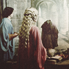
so that you guys can see better, I'm putting this on a bigger canvas. so this is the original cap:

again prep the cap by duplicating it three times and set it to Multiply > Screen > Screen. Stamp the result into a new layer and set that to Soft Light. and you get this:

TWO
Create a new color fill layer #EAE7DA and set it to Multiply, 100%

THREE
Make light blobs and put them where the light sources are. In this image it's on the upper left by the windows this is what the blobs look like on black

FOUR
stamp the image into a new layer and set it to multiply 20% this is to recover some of the color

FIVE
Stamp the image again into a new layer, desaturate and sharpen it and then set it on Hard Light, 20%

SIX
so that the shadows are not so black I create a new color fill layer #452424 and set it to lighten, 50%

SEVEN
I want to bring the color up a bit more so I stamp the image into a new layer and apply Filter > gaussian blur, 1.0px set it to Soft Light, 50%

EIGHT
I want to get deeper colors at the bottom so I create a new gradient #FF7124 to transparent, set it to linear burn, 100%. I rasterize it, transform and move it around until I'm satisfied. this is what the gradient looks like on white

NINE
I'm finally happy with the coloring so I create a brightness/contrast layer on 10/-5

TEN
and then I decide it needs a little more texture so I stamp the image into a new layer and apply the film grain filter and then set it to Screen, 20%

this is basically the coloring of the 2nd icon on the preview. It works by itself but it's not the icon we want to make. Since our goal here is to make something with muted coloring, it's time to desaturate things!
ELEVEN
i take this blurred texture (I can't remember whom it's from since it's blurred, sorry) and put it on Soft Light, 50%. I find that the richer/deeper the colors you start out with, the nicer your icon looks when you desaturate it

TWELVE
create a new white fill layer and set it to saturate, 50%

THIRTEEN
we're basically done! make a brightness/contrast layer set at +10/-10

I stamp the image into a new layer and sharpen it a little more using Filter > Sharpen > Fade Sharpen, 50% and that's it!

More questions/clarifications? Ask away...

Ask The Maker || My Thread
profile | resources | tags | old icons | watch | request
requested by twistedbones
>>>
>>>
using Adobe Photoshop CS
ONE
so that you guys can see better, I'm putting this on a bigger canvas. so this is the original cap:
again prep the cap by duplicating it three times and set it to Multiply > Screen > Screen. Stamp the result into a new layer and set that to Soft Light. and you get this:
TWO
Create a new color fill layer #EAE7DA and set it to Multiply, 100%
THREE
Make light blobs and put them where the light sources are. In this image it's on the upper left by the windows this is what the blobs look like on black
FOUR
stamp the image into a new layer and set it to multiply 20% this is to recover some of the color
FIVE
Stamp the image again into a new layer, desaturate and sharpen it and then set it on Hard Light, 20%
SIX
so that the shadows are not so black I create a new color fill layer #452424 and set it to lighten, 50%
SEVEN
I want to bring the color up a bit more so I stamp the image into a new layer and apply Filter > gaussian blur, 1.0px set it to Soft Light, 50%
EIGHT
I want to get deeper colors at the bottom so I create a new gradient #FF7124 to transparent, set it to linear burn, 100%. I rasterize it, transform and move it around until I'm satisfied. this is what the gradient looks like on white
NINE
I'm finally happy with the coloring so I create a brightness/contrast layer on 10/-5
TEN
and then I decide it needs a little more texture so I stamp the image into a new layer and apply the film grain filter and then set it to Screen, 20%
this is basically the coloring of the 2nd icon on the preview. It works by itself but it's not the icon we want to make. Since our goal here is to make something with muted coloring, it's time to desaturate things!
ELEVEN
i take this blurred texture (I can't remember whom it's from since it's blurred, sorry) and put it on Soft Light, 50%. I find that the richer/deeper the colors you start out with, the nicer your icon looks when you desaturate it
TWELVE
create a new white fill layer and set it to saturate, 50%
THIRTEEN
we're basically done! make a brightness/contrast layer set at +10/-10
I stamp the image into a new layer and sharpen it a little more using Filter > Sharpen > Fade Sharpen, 50% and that's it!
More questions/clarifications? Ask away...
Ask The Maker || My Thread
profile | resources | tags | old icons | watch | request