Tutorial #4
Icon Tutorial # 4
Today we will be going from this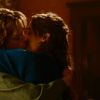
to this
.
Made with GIMP 10.2.2 Might be translatable not sure and you should have some basic-medium knowledge of The GIMP.
1. Sharpen your base with 30 power. I find that with darker images sharpening with a little higher power helps with the detail in the end result.
Result=
2. Duplicate your base once. You want to set your duplicated base to Equalize. Layer->Colors->Auto->Equalize. Set to Normal at 50%.
Result=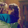
3. Duplicate your base again and drag it to the top. You will want to set this layer to color Color Enhance. Layer->Colors->Auto->Color Enhance. Set this layer to screen 100%.
Result=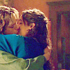
4. Make a new layer and fill it with #94c8f9. Set this layer to Burn at 50%.
Result=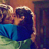
5. Merge all layers down to one. You will now only have one image in your layers dialog box.
Result=
(looks exactly the same as step 4 image)
6. Duplicate your base one time. We are going to use Color Levels on this layer. Layer->Colors->Levels.
The only color that you are going to change is the red. Select red from drop down menu on the top left of this dialog box.
Input Levels are
Red=left slider at 48, and right slider leave at 255.
Output Levels are
Red=Left Slider leave at 0, and right slider at 168.
Once you have these levels hit okay. Set this layer to Overlay 40%.
Result=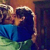
7. Make another new layer and fill with #121c6d. Set this layer to Subtract 60%.
Result=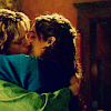
8. Make another new layer and fill with the same color as before (#121c6d) and set this layer to Screen 60%.
Result=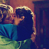
9. Make another new layer and fill with #ffbe96 and set this layer to Soft Light 100%.
Result=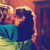
10. Make another new layer and Fill with this pattern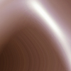
(I don't remember who made it). Set this layer to Saturation 80%.
Result=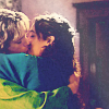
11. Make yet another new layer and use this brush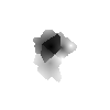
(I think that I got it off of one of the GIMP help web sites. I don't think that it was made by anyone special person) make a few strokes to make the white portion of the icon. Leave this layer at Normal 100%.
Result=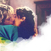
12. Now for the text. I used Rebecca font at 15px in this color #b78c73.
13. Make another new layer and in this layer I used this brush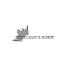
made by amethystia using the same color as my text #b78c73.
14. Flatten all of your layers together and sharpen it one more time at 20 power.
Finished icon. Tada
*to make it look a little more vibrant....after you sharpen in step 14 you can then duplicate you base and set it to Overlay 50%.
Result=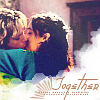
I hope that you found some of this useful. Feed back is always welcome but is not a must, and I'd love to see what you end up with.
I have found that some of the earlier steps help with lightening up very dark screen caps.
Good Luck:)