Tutorial #5
Tutorial # 5
Today we will be going from this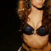
to this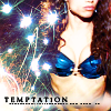
Made with GIMP 10.2.2 You should have some knowledge of GIMP to make this and I am unsure if it is translatable in other programs.
I have been on such a Rent kick lately and so yet another Rent Tutorial is born:)
1. Crop your image to 100x100 px. This
is my base.
2. Sharpen your bas at 20 power. Filters->Enhance->Sharpen.
Result=
3. Duplicate your base. Equalize this base. Layer->Colors->Auto->Equalize. Once Equalized set this layer to Screen 50%.
Result=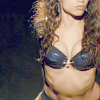
4. Duplicate your base again and drag it to the top of your other 2 layers. Set this layer to Overlay 100%.
Result=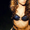
5. Add a new transparent layer and flood it with #89dec9. Set this layer to Divide 50%.
Result=
6. Add another new transparent layer and flood it with #f9e6cd. Set this layer to Divide 70%.
Result=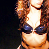
7. Add another new transparent layer. In this layer I wanted her bikini top to 'pop' Color that is. So I took a dark blue color #043c58 and used the 3 px circle brush to paint over her bikini. Increasing your viewing size to 400% helps with the harder details when you are brushing. I then set this layer to Color 100%.
Result=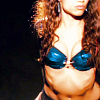
8. Add another layer and fill with this pattern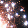
(made by me). Set this layer to Lighten Only100%
Result=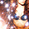
9. Working with layer 8, I didn't like how the sparks covered major parts of her body. So I just erased some of the areas on her body and ended up with this.
Result=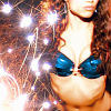
10. Add another transparent layer and fill with this pattern
(made by dews.......I think...I could be wrong) Set this layer to Soft Light 100%
Result=
11. Add another new layer and flood with #13a7de and set this layer to Burn 60%.
Result=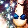
12. Add yet another transparent layer. I toyed with a lot of ways to make my text visible. *for some reason I have this hang up with being able to read text no matter how small it is. Anyway...because there are so many color differences in the icon as it is right now not a whole lot of colors would show up when I used certain text. Some parts were visible while other parts would just blend right in with the icon colors and would become unreadable. So....to fix this problem select the 17 px fuzzy circle brush. Now select your airbrush tool. Go from one side of your icon to the other. Repeat the same path twice to get a more defined blurry line. I did mine in white. You can choose any color that you want. Leave this layer at normal 100%
Result=
13. Now add another new transparent layer. I PROMISE we are almost done. In this layer I used this Tiny Text Brush
(made by wonderland) I placed it over the fuzzy line that I made in the previous step. I used black for the brush color.
Once you have your brush placed flatten your image and you are done:)
End result=
Hope you had fun. Comments welcome but as usual not a must. Please do not copy exactly make it your own. Credit me other my graphics journal if you use. As always I'd love to see what you make.
Have fun:)