Icon Progression 2019
Here's my progression post for 2019! (click here for: [ 2018 LJ | 2018 DW ] [ 2017 LJ | 2017 DW ] [ 2016 LJ | 2016 DW ])
Every icon post is linked separately, by clicking on the icon if the link is not within the text. But you can also click on the month names for that month's calendar with links to all my posts. The links go to LJ if the post was made to a challenge on LJ, and to DW if the challenge was on DW or if it was an icon drop post.
->

->
January
There was a single icon post in January, rounding up favorite fandoms from 2018. But I also did my progression post of 2018 (already linked above), and then I made a Snowflake post about my iconing process. As usual, January was quite retrospective.


February
February was very creative: The Bingo round at @monthlyinspo.lj, an iconbattle with @novindalf.lj and @nightbulbs.lj, a colorful challenge at @20muses. Such a good month! It produced a lot of happy and vibrant icons. Then I started the Guardian icon battle (no results yet), and participated in @icons10in20.
Looking back, I really still like the vibrant ones. The muted ones have gone a bit stale. ;) There are a lot of close crops, and only few complex compositions, but 20muses brought out the best in me - that set still is way above average.





March
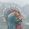
March saw many icon posts, as well: an icon drop, and more inspiring challenges at @20muses.lj and @monthlyinspo.lj : more complex icons resulted fom those. I am still very proud of the movie poster icons (the last two linked here). The other challenges I did that month were all pretty coherent: soft pastels for Shen Wei and Luo Fusheng, pinks for cozy icons of people in sweaters, but no new trends or techniques.







April
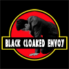
Five posts in April: not bad! The first ten eps for the Guardian battle were a wonderful Weilan showcase in a pastel rainbow, and they were pretty complex in comparison. Forced to concentrate on the best thing per episode, the text came naturally to me, too. I also had a lot of fun with the Black Cloak Envoy and polka dots. :D The style of the @icons10in20 set was unremarkable, the Detective L icons were the first icons in ages that I made because I was inspired by a show and not because I wanted to enter a challenge.
I experimented with colors, and tried to replicate that "spray" style that starkwars used a lot the year before (icon 5). Most of the icons in that month's drop post were plain and textless, with a soft gradient background, but I picked unusual ones that I liked here: two painted-looking ones, and a contrasty Zhu Yilong (icons 6-8). The last post of the month was a very incoherent set, but it had interesting lighting, like the Xiaoman icon (which got second place in my bestof 2019 voting).





May
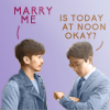
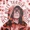
There were three icon posts in May, but the drop post contains at least three posts worth of icons, so actually you could say there are five: 1) the song sets for @icontalking, which were an incredible amount of fun (and not only for me), maybe the most fun icons I made all year, 2) the second part of the Guardian battle, which was just as good as the first one - lots of favorites and icons with meaningful text and 3) some unsortable and surprisingly vibrant icons complete that drop post. (icons 1-4)
The rest: a post for @icons10in20, which is always fun to participate in, but it's the second one in a row that I notice that there aren't any masterpieces in it, hmmm. :/ And then a set for @monthlyinspo.lj, which was less inspired than previous sets for that comm, too.
Basically, it's still all relatively simple vibrant/pastel with gradient lighting and without text.



June
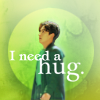
June is always "Ask The Maker" time. I made a tutorial for the previously mentioned Xiaoman icon. Obviously, everyone liked that icon. *g* And then a set of flaming orange icons for @monthlyinspo - this one looks better again to my eyes, but maybe it's just because it's coherently orange. They're not especially inventive or complex. It does contain my winning icon of 2019, though (linked below).
There are also a number of (non-orange) HIStory3 icons in that post - another show that inspired me without needing any challenges. I'm not actually very happy with those icons, though. They're blocky and weirdly cropped, I don't know. The third post of that month is my extremely late remake post from the 2018 bestof_icons remake activity. It only contains five new icons, but I am happy with how those turned out.
Half a year done and I can't see any specific trends. I can tell that all my best icons were made for inspiring challenges, so that is a good thing to keep in mind, I guess.



July
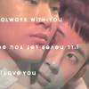
Three posts again in July. A Pride Month-themed set that got a lot of positive comments and made me icon some fandoms I hadn't iconed much before, but the quality could be better. The third part of the Guardian battle: still okay, but not as complex as the first two parts. Lots of textless ones in there again. But I think that's because those were the emotionally most powerful eps for me, so I went for facial expressions and mood more than descriptive. And it contains my favorite icon of the year (icon 2).
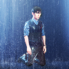
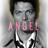
And a huge icon drop (icons 3-6), which is overwhelmingly vibrant. Lots of different fandoms (which all ended up in my 100fandoms table), an SPN set for a battle, which has the same positive aspects as the Guardian battle icons had: having to condense down things into an icon seems to be good for my process. In this case, it was even one icon per season, and the decision was very hard.




August
I made three icon posts. Vintage icons for the challenge at @fandom10in30 (icons 1+2), which is a look I rarely go for, so that was a fun exercise and I like how those turned out. The majority were for Before We Get Married, another show that spoke to me emotionally, so there are lots of close crops and no text. Then there was an Emotions set for the big battle at @itsabattlefield.lj (icons 3+4). It's the only time I ever participated in a big battle there, I think, and it had been a while since I'd made a set of 20 icons. I intentionally kept those simple, with single-color backgrounds. They're good, I like all of them, but nothing interesting happened style-wise. Last but not least, 10 complex icons for @monthlyinspo.lj (icons 5+6), and those were hard! I'd been making overwhelmingly simple icons all year, and then I had to stretch my muscles and make a whole set of complex icons. I guess this proves that can do it if I want to - I just usually don't want to. ;)
Icon 5, btw, is the one I *thought* would win bestof. It came in third.





September
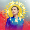
September had a themed challenge at @monthlyinspo.lj, which was inspiring, but I am not very happy with the results (icon 1), and a surprisingly coherent "rich and decadent" set for @fandom10in30, which is also something I don't usually focus on and which turned out nicer than I expected (icon 2).
Then I am counting the big drop post for July and the fourth and last part of the Guardian battle into September. The Guardian battle set was specifically done with words (i.e. Chinese Hanzi) in mind (icons 3+4), and I collected a lot of new Chinese fonts for it. I like them, but I had to throw away most of them again, because they're huge and they slowed down my computer too much. :(
The July drop post was the first one with a noticeable number for @iconcolors (second row: icons 5-8). That community turned out to be very important for my progress this year, because it requires a different approach - even choosing caps depends on the palette, and I had to figure out how to do my usual lighting and coloring process without veering from the exact palette colors (much). And I did a lot of gradient map coloring! I'd known how to do it before, even wrote a tutorial on it (only works on lj, i didn't upload the images to my image host yet), but I learned a lot of new stuff about coloring this year!






October
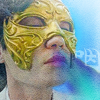
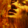
Three posts: I actually really like this set for @icons10in20, it's vibrant and has interesting coloring and there's a lot of swirly curly wavy text (icons 1-2). The smallish icon drop from August again contains lots of specifically colored icons for @iconcolors. I am especially proud of the unusual dark palette (icons 3+4). Icon 4 in particular doesn't even look like I made it. New style ftw! The LGBT set for @monthlyinspo.lj was done as a rainbow, which I had a lot of fun assembling and which turned out nicely coherent (icons 5+6).






November
Only a single icon post, because I was busy with the Guardian bingo and already starting the final stretch on my @100fandomicons table. But the icons in that single post aren't bad. Not a set, really, but every single one is nice, and still looks good to me now (icons 1-3). To spread out the load a little, I'm counting the drop posts for October and November here. Again, I specifically picked out the ones done with gradient map coloring (icons 4-6). It's also interesting that I started to combine my favorite painted look with gradient map coloring, because I realized that it looks even more 'painted' that way.



December
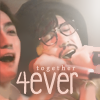
An unremarkable set for @icons10in20, but I really like the Shen Wei & Ye Zun one (which nobody else seemed to like) (icon 1). Then I finished the @100fandomicons table just in time (on December 23), and actually managed to fill every single slot with an icon from a different fandom. \o/ (icon 2).
I made a set for @monthlyinspo.lj which is remarkable insofar as I concentrated on one specific look (sparkly :)) that I also don't do often (icons 3+4). Lots of hair painting in that set, too. (I really need to practice that and develop a style for that at some point. I am not happy with it yet.)
Last but not least, the icon drop for December, which also contains the Guardian character icons I made for @iconbattles (icon 5). Again: narrowing down a specific thing (here: characters) to one representative look: inspiring! I should do that more often. (Even though I had to icon characters I never iconed before and also am not keen on iconing again.) Also: more dark/low-contrast-palette icons for @iconcolors (icons 6+7).



Closing Thoughts and Resolutions
I basically kept wallowing in my Guardian obsession and made mostly easy, beautiful (to me) pastel and glowy icons of people's faces. But I also did complex compositions and text when I had to. I realized this year that this happened much more often with English source materials than Chinese. So maybe my textless phase is not really a sign of laziness, after all, but more of a language barrier thing. (I hope.)
Most importantly: it was fun, and I had a good time. I didn't really have the energy to improve anything on purpose, but the gradient map coloring - especially combined with a painted look - snuck up on me through my participation in @iconcolors. I'm happy that there was some progress, unintentional as it was.
The number of icons in 2019 is pretty much equal to last year, around 1000. I made a graph again, because *everyone loves this graph* :D

It's immediately visible that almost 80% of my 2019 icons are from Chinese fandoms! O_O A third of them, over 400 (!) are Guardian. It's impressive - and not surprising (considering I consciously decided to watch only Chinese things).
The next third are Zhu Yilong and his various dramas, mostly Dreamlike and My True Friend (about 155), and Bai Yu and his dramas, mostly Detective L (about 145). It's noticeable that Bai Yu's total number is much closer to Zhu Yilong's total number than it was last year, where Zhu Yilong was leading 92 to 30. It's not like I am warming to Bai Yu, actually, but he made the much better dramas. Always has. Let's see if Zhu Yilong finally makes a good drama this year. (I'm looking at you, Tomb Raider Restart!)
Of the whole rest, Stumptown is the only non-Chinese show I actually watched in 2019. It's not even listed separately with only 16 icons. The remaining "Other" icons were made for older things, for your_favourites and similar challenges, like my @100fandomicons table.
My resolutions are:
- again: try more different and more complex compositions
- again: try new techniques
- Keep working on my text skills
- Develop a technique for hair painting
And last but not least, a wish:
I hope the iconmaker community will continue to hold on to its little corner of LJ and DW and keep making beautiful miniature pieces of art for many years to come.
Previous icon posts:


x-posted from dw (comments:
)
Every icon post is linked separately, by clicking on the icon if the link is not within the text. But you can also click on the month names for that month's calendar with links to all my posts. The links go to LJ if the post was made to a challenge on LJ, and to DW if the challenge was on DW or if it was an icon drop post.

->

->

January
There was a single icon post in January, rounding up favorite fandoms from 2018. But I also did my progression post of 2018 (already linked above), and then I made a Snowflake post about my iconing process. As usual, January was quite retrospective.


February
February was very creative: The Bingo round at @monthlyinspo.lj, an iconbattle with @novindalf.lj and @nightbulbs.lj, a colorful challenge at @20muses. Such a good month! It produced a lot of happy and vibrant icons. Then I started the Guardian icon battle (no results yet), and participated in @icons10in20.
Looking back, I really still like the vibrant ones. The muted ones have gone a bit stale. ;) There are a lot of close crops, and only few complex compositions, but 20muses brought out the best in me - that set still is way above average.


March
March saw many icon posts, as well: an icon drop, and more inspiring challenges at @20muses.lj and @monthlyinspo.lj : more complex icons resulted fom those. I am still very proud of the movie poster icons (the last two linked here). The other challenges I did that month were all pretty coherent: soft pastels for Shen Wei and Luo Fusheng, pinks for cozy icons of people in sweaters, but no new trends or techniques.


April
Five posts in April: not bad! The first ten eps for the Guardian battle were a wonderful Weilan showcase in a pastel rainbow, and they were pretty complex in comparison. Forced to concentrate on the best thing per episode, the text came naturally to me, too. I also had a lot of fun with the Black Cloak Envoy and polka dots. :D The style of the @icons10in20 set was unremarkable, the Detective L icons were the first icons in ages that I made because I was inspired by a show and not because I wanted to enter a challenge.
I experimented with colors, and tried to replicate that "spray" style that starkwars used a lot the year before (icon 5). Most of the icons in that month's drop post were plain and textless, with a soft gradient background, but I picked unusual ones that I liked here: two painted-looking ones, and a contrasty Zhu Yilong (icons 6-8). The last post of the month was a very incoherent set, but it had interesting lighting, like the Xiaoman icon (which got second place in my bestof 2019 voting).


May
There were three icon posts in May, but the drop post contains at least three posts worth of icons, so actually you could say there are five: 1) the song sets for @icontalking, which were an incredible amount of fun (and not only for me), maybe the most fun icons I made all year, 2) the second part of the Guardian battle, which was just as good as the first one - lots of favorites and icons with meaningful text and 3) some unsortable and surprisingly vibrant icons complete that drop post. (icons 1-4)
The rest: a post for @icons10in20, which is always fun to participate in, but it's the second one in a row that I notice that there aren't any masterpieces in it, hmmm. :/ And then a set for @monthlyinspo.lj, which was less inspired than previous sets for that comm, too.
Basically, it's still all relatively simple vibrant/pastel with gradient lighting and without text.


June
June is always "Ask The Maker" time. I made a tutorial for the previously mentioned Xiaoman icon. Obviously, everyone liked that icon. *g* And then a set of flaming orange icons for @monthlyinspo - this one looks better again to my eyes, but maybe it's just because it's coherently orange. They're not especially inventive or complex. It does contain my winning icon of 2019, though (linked below).
There are also a number of (non-orange) HIStory3 icons in that post - another show that inspired me without needing any challenges. I'm not actually very happy with those icons, though. They're blocky and weirdly cropped, I don't know. The third post of that month is my extremely late remake post from the 2018 bestof_icons remake activity. It only contains five new icons, but I am happy with how those turned out.
Half a year done and I can't see any specific trends. I can tell that all my best icons were made for inspiring challenges, so that is a good thing to keep in mind, I guess.


July
Three posts again in July. A Pride Month-themed set that got a lot of positive comments and made me icon some fandoms I hadn't iconed much before, but the quality could be better. The third part of the Guardian battle: still okay, but not as complex as the first two parts. Lots of textless ones in there again. But I think that's because those were the emotionally most powerful eps for me, so I went for facial expressions and mood more than descriptive. And it contains my favorite icon of the year (icon 2).
And a huge icon drop (icons 3-6), which is overwhelmingly vibrant. Lots of different fandoms (which all ended up in my 100fandoms table), an SPN set for a battle, which has the same positive aspects as the Guardian battle icons had: having to condense down things into an icon seems to be good for my process. In this case, it was even one icon per season, and the decision was very hard.


August
I made three icon posts. Vintage icons for the challenge at @fandom10in30 (icons 1+2), which is a look I rarely go for, so that was a fun exercise and I like how those turned out. The majority were for Before We Get Married, another show that spoke to me emotionally, so there are lots of close crops and no text. Then there was an Emotions set for the big battle at @itsabattlefield.lj (icons 3+4). It's the only time I ever participated in a big battle there, I think, and it had been a while since I'd made a set of 20 icons. I intentionally kept those simple, with single-color backgrounds. They're good, I like all of them, but nothing interesting happened style-wise. Last but not least, 10 complex icons for @monthlyinspo.lj (icons 5+6), and those were hard! I'd been making overwhelmingly simple icons all year, and then I had to stretch my muscles and make a whole set of complex icons. I guess this proves that can do it if I want to - I just usually don't want to. ;)
Icon 5, btw, is the one I *thought* would win bestof. It came in third.


September
September had a themed challenge at @monthlyinspo.lj, which was inspiring, but I am not very happy with the results (icon 1), and a surprisingly coherent "rich and decadent" set for @fandom10in30, which is also something I don't usually focus on and which turned out nicer than I expected (icon 2).
Then I am counting the big drop post for July and the fourth and last part of the Guardian battle into September. The Guardian battle set was specifically done with words (i.e. Chinese Hanzi) in mind (icons 3+4), and I collected a lot of new Chinese fonts for it. I like them, but I had to throw away most of them again, because they're huge and they slowed down my computer too much. :(
The July drop post was the first one with a noticeable number for @iconcolors (second row: icons 5-8). That community turned out to be very important for my progress this year, because it requires a different approach - even choosing caps depends on the palette, and I had to figure out how to do my usual lighting and coloring process without veering from the exact palette colors (much). And I did a lot of gradient map coloring! I'd known how to do it before, even wrote a tutorial on it (only works on lj, i didn't upload the images to my image host yet), but I learned a lot of new stuff about coloring this year!


October
Three posts: I actually really like this set for @icons10in20, it's vibrant and has interesting coloring and there's a lot of swirly curly wavy text (icons 1-2). The smallish icon drop from August again contains lots of specifically colored icons for @iconcolors. I am especially proud of the unusual dark palette (icons 3+4). Icon 4 in particular doesn't even look like I made it. New style ftw! The LGBT set for @monthlyinspo.lj was done as a rainbow, which I had a lot of fun assembling and which turned out nicely coherent (icons 5+6).


November
Only a single icon post, because I was busy with the Guardian bingo and already starting the final stretch on my @100fandomicons table. But the icons in that single post aren't bad. Not a set, really, but every single one is nice, and still looks good to me now (icons 1-3). To spread out the load a little, I'm counting the drop posts for October and November here. Again, I specifically picked out the ones done with gradient map coloring (icons 4-6). It's also interesting that I started to combine my favorite painted look with gradient map coloring, because I realized that it looks even more 'painted' that way.


December
An unremarkable set for @icons10in20, but I really like the Shen Wei & Ye Zun one (which nobody else seemed to like) (icon 1). Then I finished the @100fandomicons table just in time (on December 23), and actually managed to fill every single slot with an icon from a different fandom. \o/ (icon 2).
I made a set for @monthlyinspo.lj which is remarkable insofar as I concentrated on one specific look (sparkly :)) that I also don't do often (icons 3+4). Lots of hair painting in that set, too. (I really need to practice that and develop a style for that at some point. I am not happy with it yet.)
Last but not least, the icon drop for December, which also contains the Guardian character icons I made for @iconbattles (icon 5). Again: narrowing down a specific thing (here: characters) to one representative look: inspiring! I should do that more often. (Even though I had to icon characters I never iconed before and also am not keen on iconing again.) Also: more dark/low-contrast-palette icons for @iconcolors (icons 6+7).


Closing Thoughts and Resolutions
I basically kept wallowing in my Guardian obsession and made mostly easy, beautiful (to me) pastel and glowy icons of people's faces. But I also did complex compositions and text when I had to. I realized this year that this happened much more often with English source materials than Chinese. So maybe my textless phase is not really a sign of laziness, after all, but more of a language barrier thing. (I hope.)
Most importantly: it was fun, and I had a good time. I didn't really have the energy to improve anything on purpose, but the gradient map coloring - especially combined with a painted look - snuck up on me through my participation in @iconcolors. I'm happy that there was some progress, unintentional as it was.
The number of icons in 2019 is pretty much equal to last year, around 1000. I made a graph again, because *everyone loves this graph* :D

It's immediately visible that almost 80% of my 2019 icons are from Chinese fandoms! O_O A third of them, over 400 (!) are Guardian. It's impressive - and not surprising (considering I consciously decided to watch only Chinese things).
The next third are Zhu Yilong and his various dramas, mostly Dreamlike and My True Friend (about 155), and Bai Yu and his dramas, mostly Detective L (about 145). It's noticeable that Bai Yu's total number is much closer to Zhu Yilong's total number than it was last year, where Zhu Yilong was leading 92 to 30. It's not like I am warming to Bai Yu, actually, but he made the much better dramas. Always has. Let's see if Zhu Yilong finally makes a good drama this year. (I'm looking at you, Tomb Raider Restart!)
Of the whole rest, Stumptown is the only non-Chinese show I actually watched in 2019. It's not even listed separately with only 16 icons. The remaining "Other" icons were made for older things, for your_favourites and similar challenges, like my @100fandomicons table.
My resolutions are:
- again: try more different and more complex compositions
- again: try new techniques
- Keep working on my text skills
- Develop a technique for hair painting
And last but not least, a wish:
I hope the iconmaker community will continue to hold on to its little corner of LJ and DW and keep making beautiful miniature pieces of art for many years to come.
Previous icon posts:


x-posted from dw (comments:
)