& you won't look back
Yay, another tutorial :D Now including 3 other examples of the technique, as all my tutorials will from now on~ This one was actually pretty simple to write, so I hope it's as simple to follow!
Go from
to
, as per the poll results :3 Should be translatable with PSP9 and up; uses Color Balance and Radial Blur.
So here's our pretty base (obtained from vgvisual):

I love the artwork, but it could use some sprucing up! So let's start off easy and duplicate the base, setting it to Overlay, 100%.

Now for some fairly simple fill layers.
☆ #001A98, Exclusion, 100% DUPLICATED ONCE (so there are two exclusion layers) gives you this
☆ #F6E9CF, Multiply, 100% gives you:

I know it leaves something to be desired still, because with Mumpo, there is never a dull icon (read: blinding liekwhoa) 8) Duplicate your base again and drag it to the top at Overlay, 100%.

It doesn't look much different from the first Overlay, but we're laying a foundation here~ Now we'll get a little more complicated! Make a Color Balance... adjustment layer with the following settings:
Midtones: -40, 0, +40
Highlights: +60, 0, 0
Leave the layer as-is and we get this:

Yay, shiny! But a little too bright, so duplicate that Multiply layer from earlier and drag it to the top.

That should add a creamier colour to your icon. At this point, I couldn't help but notice how the right half of the icon is so busy... so let's bring in a pretty radial blur! :D This may be a little hard for those of you who've never done it before, so I'll lay it out in steps:
☆ Edit > Copy Merged. if you're making this in Photoshop, you may need to do a Select All (control/apple A) before this option will show up.
☆ Paste. Now you should have your entire icon up until now on one layer~ Handy, amirite?
☆ Filter > Blur > Radial Blur. Move the focal point so it's roughly over your character's face; make sure the blur mode is set to Spin (instead of Zoom) and input a value of around 30. Quality doesn't really matter.
☆ Take a very soft brush and erase the part over your character's face and shoulders, if you so wish... whatever looks the best :D Make sure the blur roughly retains its circular shape.
So, in short: copy, paste, blur, erase! It kinda rhymes %D This is what I came up with:

There, now all the business is gone from the icon! I really like how this technique gives the icon a certain... atmosphere, if you will. But I didn't like how light the bottom right corner turned out, so I just took a soft brush again and went over the corner + right side of the icon in black. This is, again, personal preference, so you may not need it at all.

And then, a line of tinytext, since the composition is a little lacking. You should all know how to do this by now; if not, you can reference my previous tutorials :P

If you want a clean look, you can stop here, but I like a little texture on my icons sometimes. So I added this texture by toybirds, IIRC (rest of the set here), inverted it (using Image > Adjustments > Invert) and set it to Screen, 100%. As you can see, I moved it around in some places and erased bits that covered the character's face.

And there you have it!
Other icons made using this tutorial (with slight changes):
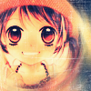

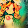
Now that you have far more of Mumpo's secrets, lawl, I encourage you to go play around a lot and show me your finished icons! DOOO IIIIIIT, I always wanna see what you guys come up with~ srsly, the main reason I write these things is to see all your results, so please indulge me! xD
If you like what you see, why not friend tacticons for future updates?
Go from

to

, as per the poll results :3 Should be translatable with PSP9 and up; uses Color Balance and Radial Blur.
So here's our pretty base (obtained from vgvisual):

I love the artwork, but it could use some sprucing up! So let's start off easy and duplicate the base, setting it to Overlay, 100%.

Now for some fairly simple fill layers.
☆ #001A98, Exclusion, 100% DUPLICATED ONCE (so there are two exclusion layers) gives you this
☆ #F6E9CF, Multiply, 100% gives you:

I know it leaves something to be desired still, because with Mumpo, there is never a dull icon (read: blinding liekwhoa) 8) Duplicate your base again and drag it to the top at Overlay, 100%.

It doesn't look much different from the first Overlay, but we're laying a foundation here~ Now we'll get a little more complicated! Make a Color Balance... adjustment layer with the following settings:
Midtones: -40, 0, +40
Highlights: +60, 0, 0
Leave the layer as-is and we get this:

Yay, shiny! But a little too bright, so duplicate that Multiply layer from earlier and drag it to the top.

That should add a creamier colour to your icon. At this point, I couldn't help but notice how the right half of the icon is so busy... so let's bring in a pretty radial blur! :D This may be a little hard for those of you who've never done it before, so I'll lay it out in steps:
☆ Edit > Copy Merged. if you're making this in Photoshop, you may need to do a Select All (control/apple A) before this option will show up.
☆ Paste. Now you should have your entire icon up until now on one layer~ Handy, amirite?
☆ Filter > Blur > Radial Blur. Move the focal point so it's roughly over your character's face; make sure the blur mode is set to Spin (instead of Zoom) and input a value of around 30. Quality doesn't really matter.
☆ Take a very soft brush and erase the part over your character's face and shoulders, if you so wish... whatever looks the best :D Make sure the blur roughly retains its circular shape.
So, in short: copy, paste, blur, erase! It kinda rhymes %D This is what I came up with:

There, now all the business is gone from the icon! I really like how this technique gives the icon a certain... atmosphere, if you will. But I didn't like how light the bottom right corner turned out, so I just took a soft brush again and went over the corner + right side of the icon in black. This is, again, personal preference, so you may not need it at all.

And then, a line of tinytext, since the composition is a little lacking. You should all know how to do this by now; if not, you can reference my previous tutorials :P

If you want a clean look, you can stop here, but I like a little texture on my icons sometimes. So I added this texture by toybirds, IIRC (rest of the set here), inverted it (using Image > Adjustments > Invert) and set it to Screen, 100%. As you can see, I moved it around in some places and erased bits that covered the character's face.

And there you have it!
Other icons made using this tutorial (with slight changes):


Now that you have far more of Mumpo's secrets, lawl, I encourage you to go play around a lot and show me your finished icons! DOOO IIIIIIT, I always wanna see what you guys come up with~ srsly, the main reason I write these things is to see all your results, so please indulge me! xD
If you like what you see, why not friend tacticons for future updates?