& you are everything, you are nothing at all
h-holy snap, tacticons passed the 100-watchers mark! ahfdjhalshflashfasda Have I ever told you guys how awesome you are? xD I'm overwhelmed! After my exams, I'll make a big icon post to celebrate!
Today, we're going from this to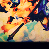
, as per the poll results again. Is not translatable because it uses Selective Color, sorry! ^^; Maybe you could improvise?
Because of the orientation of this image, I picked a rather unorthodox crop:
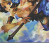
As you can see, it's not 100x100 but is still in a 100x100 frame. The parameters of this tutorial allow you to do this, so have fun cropping~ Since it's really dark as is, duplicate the base twice. Set the first to Screen, 100% and the second to Overlay, 100%.
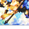
Much better, right? Okay, now for a couple adjustment layers~ First, whip out the awesome Hue/Saturation... adjustment layer and set Saturation to 16.
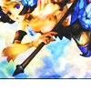
Not much different here, but it might change your image more. I had tried to set it higher, but the lightness of the image blew it out too much. See what works best for your icon :D Next, a Color Balance... adjustment layer, with these settings:
Midtones: -45, 0, +41
Highlights: +35, 0, 0
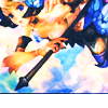
This brings out the best of the colour without blowing it out too much. It's still kinda blah, so what do we need? Let me hear an EXCLUSION LAYER, people 8) #000051 on Exclusion, 100% gives you this:
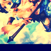
You can see how it covered up the transparency of the bottom bit. This will work to our advantage soon enough~ The colours kind of went blah again though, so duplicate your base, drag it to the top and be all Overlay, 100% again.
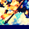
See, now the whites are more of a cream colour, and it just looks more pleasant... But wait, there's more! #E5D5C3 on Multiply, 100%:
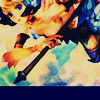
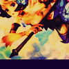
Again, creamier colour was what I was looking for. Selective Color... adjustment layer time! This is where all the PSP folks are going to hate me;;; I randomly came up with these settings by messing around one day, and it really helps bring out the reds in your image. Since this image was kind of blue to begin with, especially~
Neutrals: -26, +9, +28, +7
Leave the layer as-is to get this:
Hey hey PSP users, tip for that last step from cestina:
The psp users can use channel mixer on a new adjustment layer. Slide the sliders left to right to get the similar creamy color that you used. Playing around with the blend mode of the channel mixer helps as well.
And another Color Balance... adjustment layer ftw! This will brighten up the image some more.
Midtones: -53, +16, +22
Highlights: +37, 0, 0
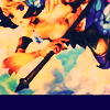
Only one more step guys, aren't you excited? %D I bet you were wondering about the bottom of the icon~ Take this awesome texture by peachinparis (rest of the set here which I highly recommend downloading) and set it to Multiply, 100%. Depending on your cropping, you may need to rotate or move the texture. I didn't have to, but I did take a soft brush and erased the grainy parts over the image; it just didn't look as good with them there :[ Anyway, that's that!

*confetti*
Other examples:
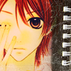

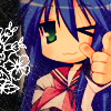
(On the Haruhi one, you can kinda see how the texture is a little transparent, right? You may need to duplicate it and play around with the opacity if you want a true black on the bar there.)
Now that you have far more of Mumpo's secrets, lawl, I encourage you to go experiment and show me your finished icons! DOOO IIIIIIT, I always wanna see what you guys come up with~
If you like what you see, why not friend tacticons for future updates?
Today, we're going from this to

, as per the poll results again. Is not translatable because it uses Selective Color, sorry! ^^; Maybe you could improvise?
Because of the orientation of this image, I picked a rather unorthodox crop:

As you can see, it's not 100x100 but is still in a 100x100 frame. The parameters of this tutorial allow you to do this, so have fun cropping~ Since it's really dark as is, duplicate the base twice. Set the first to Screen, 100% and the second to Overlay, 100%.

Much better, right? Okay, now for a couple adjustment layers~ First, whip out the awesome Hue/Saturation... adjustment layer and set Saturation to 16.

Not much different here, but it might change your image more. I had tried to set it higher, but the lightness of the image blew it out too much. See what works best for your icon :D Next, a Color Balance... adjustment layer, with these settings:
Midtones: -45, 0, +41
Highlights: +35, 0, 0

This brings out the best of the colour without blowing it out too much. It's still kinda blah, so what do we need? Let me hear an EXCLUSION LAYER, people 8) #000051 on Exclusion, 100% gives you this:

You can see how it covered up the transparency of the bottom bit. This will work to our advantage soon enough~ The colours kind of went blah again though, so duplicate your base, drag it to the top and be all Overlay, 100% again.

See, now the whites are more of a cream colour, and it just looks more pleasant... But wait, there's more! #E5D5C3 on Multiply, 100%:

Again, creamier colour was what I was looking for. Selective Color... adjustment layer time! This is where all the PSP folks are going to hate me;;; I randomly came up with these settings by messing around one day, and it really helps bring out the reds in your image. Since this image was kind of blue to begin with, especially~
Neutrals: -26, +9, +28, +7
Leave the layer as-is to get this:

Hey hey PSP users, tip for that last step from cestina:
The psp users can use channel mixer on a new adjustment layer. Slide the sliders left to right to get the similar creamy color that you used. Playing around with the blend mode of the channel mixer helps as well.
And another Color Balance... adjustment layer ftw! This will brighten up the image some more.
Midtones: -53, +16, +22
Highlights: +37, 0, 0

Only one more step guys, aren't you excited? %D I bet you were wondering about the bottom of the icon~ Take this awesome texture by peachinparis (rest of the set here which I highly recommend downloading) and set it to Multiply, 100%. Depending on your cropping, you may need to rotate or move the texture. I didn't have to, but I did take a soft brush and erased the grainy parts over the image; it just didn't look as good with them there :[ Anyway, that's that!

*confetti*
Other examples:


(On the Haruhi one, you can kinda see how the texture is a little transparent, right? You may need to duplicate it and play around with the opacity if you want a true black on the bar there.)
Now that you have far more of Mumpo's secrets, lawl, I encourage you to go experiment and show me your finished icons! DOOO IIIIIIT, I always wanna see what you guys come up with~
If you like what you see, why not friend tacticons for future updates?