& what's a voice without a song?
Last poll tutorial ftw! I'm starting to put together my next icon post, since I just finished my final exam (YES); I may open up regular tutorial requests after that post goes up, or I may use another poll to decide. We'll see 8)
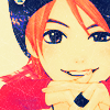
Today, we're going from this to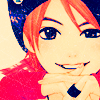
, as per the poll results for the third time. I was originally going to make two tutorials from that poll, yes, but I had decided I would make one of this icon anyway so it wouldn't have mattered how it placed xD
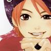
You can see from this icon post that I experimented with several different crops with this picture, but I liked this one the best, so it gets a tutorial 8) I'll say this right now: DON'T pick an image that has too many dark colours. Make sure there's a lot of lightness and white like in a manga image, otherwise you'll want to gouge out your eyes by the end of this thing. Trust me on this one :') Now that that's out of the way~ Duplicate your base and set it to Overlay, 100%, then desaturate it (Image > Adjustments > Desaturate). Make sure to merge these two layers now; it'll come in handy later.
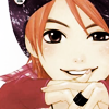
Next - you guessed it, fill layers %D I'm running out of good ways to introduce them
☆ #042673, Exclusion, 100% gives you this
☆ #AEEEF9, Color Burn, 100% gives you this
☆ #F3B8B8, Soft Light, 100% gives you:
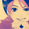
It looks horribly muted, but that will be fixed... right now! Pull out the ever-famous Hue/Saturation... adjustment layer and set Saturation to a cool 75. I know it sounds crazy, and it will surely not work that high for most images (maybe 50-55 would be better in that case), but here's what it got for me:
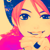
Okay, maybe I went a little overboard, but again, it'll be fixed! Head over to oulan's really pretty Tsubasa tutorial and use step 6's Channel Mixer... adjustment layer settings. Then, make sure to set the layer to Multiply, 50%.
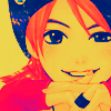
That was the step that would have broken your dark image into ugly little pieces, srsly;;; You may want to skip this altogether; but wait to take it out until you finish all these steps or it might mess everything up. What we'll do next will lighten up the image quite a bit, so~ Duplicate the base, drag it to the top and set it to Screen, 40%.
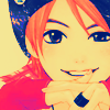
Duplicate the duplicate you just made, as odd as that sounds, and change the blend mode to Overlay. Same opacity, so it turns out like this:
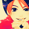
Starting to look normal, thank goodness! Now for a few little tweaks to make it look all the better. Take this texture by toybirds (rest of the set here, v. pretty scratch textures btw, the ones I use all the time) and, predictably, set it to Screen, 50%. If you left it at 100, it would be too strong.
It just makes the flat colours look more interesting~ Next, a fun Color Balance... adjustment layer!
Midtones: -34, 0, +32
Highlights: +23, 0, 0
Leave as-is for this:

I figured this would turn out too light after going through compression and Photobucket, so I added a Brightness/Contrast... adjustment layer. Move Brightness to -18 and Contrast to 14, and we're finished!

Other examples:
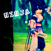
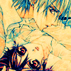

On these, I had to do a lot of editing to make them look decent, especially the Sheena one xD So you should play around with settings a lot until you like the result~ Remember, dark images will be killed with this technique!
Now that you have far more of Mumpo's secrets, lawl, I encourage you to go experiment and show me your finished icons! DOOO IIIIIIT, I always wanna see what you guys come up with~
If you like what you see, why not friend tacticons for future updates?
Today, we're going from this to

, as per the poll results for the third time. I was originally going to make two tutorials from that poll, yes, but I had decided I would make one of this icon anyway so it wouldn't have mattered how it placed xD

You can see from this icon post that I experimented with several different crops with this picture, but I liked this one the best, so it gets a tutorial 8) I'll say this right now: DON'T pick an image that has too many dark colours. Make sure there's a lot of lightness and white like in a manga image, otherwise you'll want to gouge out your eyes by the end of this thing. Trust me on this one :') Now that that's out of the way~ Duplicate your base and set it to Overlay, 100%, then desaturate it (Image > Adjustments > Desaturate). Make sure to merge these two layers now; it'll come in handy later.

Next - you guessed it, fill layers %D I'm running out of good ways to introduce them
☆ #042673, Exclusion, 100% gives you this
☆ #AEEEF9, Color Burn, 100% gives you this
☆ #F3B8B8, Soft Light, 100% gives you:

It looks horribly muted, but that will be fixed... right now! Pull out the ever-famous Hue/Saturation... adjustment layer and set Saturation to a cool 75. I know it sounds crazy, and it will surely not work that high for most images (maybe 50-55 would be better in that case), but here's what it got for me:

Okay, maybe I went a little overboard, but again, it'll be fixed! Head over to oulan's really pretty Tsubasa tutorial and use step 6's Channel Mixer... adjustment layer settings. Then, make sure to set the layer to Multiply, 50%.

That was the step that would have broken your dark image into ugly little pieces, srsly;;; You may want to skip this altogether; but wait to take it out until you finish all these steps or it might mess everything up. What we'll do next will lighten up the image quite a bit, so~ Duplicate the base, drag it to the top and set it to Screen, 40%.

Duplicate the duplicate you just made, as odd as that sounds, and change the blend mode to Overlay. Same opacity, so it turns out like this:

Starting to look normal, thank goodness! Now for a few little tweaks to make it look all the better. Take this texture by toybirds (rest of the set here, v. pretty scratch textures btw, the ones I use all the time) and, predictably, set it to Screen, 50%. If you left it at 100, it would be too strong.

It just makes the flat colours look more interesting~ Next, a fun Color Balance... adjustment layer!
Midtones: -34, 0, +32
Highlights: +23, 0, 0
Leave as-is for this:

I figured this would turn out too light after going through compression and Photobucket, so I added a Brightness/Contrast... adjustment layer. Move Brightness to -18 and Contrast to 14, and we're finished!

Other examples:


On these, I had to do a lot of editing to make them look decent, especially the Sheena one xD So you should play around with settings a lot until you like the result~ Remember, dark images will be killed with this technique!
Now that you have far more of Mumpo's secrets, lawl, I encourage you to go experiment and show me your finished icons! DOOO IIIIIIT, I always wanna see what you guys come up with~
If you like what you see, why not friend tacticons for future updates?