Blending Guide
A Blending Guide
As requested by spiderlin at Ask the Maker @ icon_talk


I was actually kind of surprised (and flattered) to receive this question because I actually don't break out the blending for too many icons. With that said, I also haven't changed my process in years (I also have a pattern when working with composition if y'all can tell).


This is going to be a real general guide since I'm not sure how much my Paint.net steps will translate to other people's programs. My process isn't real complicated and for me it just comes down to cap choices so I think I end up discussing more of why I choose the caps that I do.
If I'm using two different screencaps I try to pick them from the same scene. Mostly, I do this to make things easier on myself. The coloring and lighting are going to be similar to begin with so I can go directly to composition and then color afterwards. Personally, I feel I'm also drawn to using a close-up and a wide-shot just to give some visual interest.
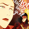
For example these images I used of Asami for the icon at the top:
1 2.
If I want to use caps from two different scenes, I find its best to color the caps separately and try to match them as best as possible. Like the two caps of Sokka below. As you can see one is pretty dark and yellow and the other a whole lot of blue/purple.

&
Here I adjusted the colors in the yellow cap to a more blueish tone to match the first cap a little better. My favorite technique these days is curves for coloring. For this particular icon I bumped up the blues a little more than I usually would have.

>>
For me, personally, its about making sure the two images look like they "belong" either by similar colors or lighting. The final coloring I'm going to do after I have the images blended together to try to bring the images even more together.
Also, the less busy the background, the better. I find this gives the icon a cleaner look and less cluttered look if the eye isn't distracted by everything else going in the icon especially if you're already adding more than a single image.
For example, I actually smudged out most of the writing behind Amon when I had my final composition decided on.

When blending I find it easiest to pick one of the images to be the background image and once I have that placed I can fit my second image in around that. I'll usually do this step in a larger 300x300px canvas so I can see what I'm doing (mistakes also tend to disappear when they're re-sized to the final icon size).
As far as the actual blending goes I don't rely too much on the actual 'blending/gradient tool'. I find that it leaves too many unfinished edges and the added image always looks too dull. I'll use the gradient tool to get a rough idea of where I want my images to end up. Once I know what I want the final composition to look like and there's not a lot of extra bits I'll simply use an eraser to get rid of anything I don't want. Other times I won't even bother with the 'blending/gradient tool' and just cut the image out completely before copying/pasting onto my base image. After this I use the "feather" feature set on 1px to soften the edges or sometimes some well placed light blobs will help cover up the harsh cut outs.
Final steps include re-sizing to icon size and to finalize the coloring of the icon and anything else I feel it needs. I'll skip my coloring process (especially since it consists of throwing textures and gradients like spaghetti at a wall to see what sticks) and just say that I try to further connect the two images with textures and lighting in strategic places.

>>
>>
I'm not completely convinced that my guide was quite useful, but I do hope that it at least gave a little insight into how I use blending.

Ask The Maker || My Thread
As requested by spiderlin at Ask the Maker @ icon_talk

I was actually kind of surprised (and flattered) to receive this question because I actually don't break out the blending for too many icons. With that said, I also haven't changed my process in years (I also have a pattern when working with composition if y'all can tell).
This is going to be a real general guide since I'm not sure how much my Paint.net steps will translate to other people's programs. My process isn't real complicated and for me it just comes down to cap choices so I think I end up discussing more of why I choose the caps that I do.
If I'm using two different screencaps I try to pick them from the same scene. Mostly, I do this to make things easier on myself. The coloring and lighting are going to be similar to begin with so I can go directly to composition and then color afterwards. Personally, I feel I'm also drawn to using a close-up and a wide-shot just to give some visual interest.
For example these images I used of Asami for the icon at the top:
1 2.
If I want to use caps from two different scenes, I find its best to color the caps separately and try to match them as best as possible. Like the two caps of Sokka below. As you can see one is pretty dark and yellow and the other a whole lot of blue/purple.

&

Here I adjusted the colors in the yellow cap to a more blueish tone to match the first cap a little better. My favorite technique these days is curves for coloring. For this particular icon I bumped up the blues a little more than I usually would have.

>>

For me, personally, its about making sure the two images look like they "belong" either by similar colors or lighting. The final coloring I'm going to do after I have the images blended together to try to bring the images even more together.
Also, the less busy the background, the better. I find this gives the icon a cleaner look and less cluttered look if the eye isn't distracted by everything else going in the icon especially if you're already adding more than a single image.
For example, I actually smudged out most of the writing behind Amon when I had my final composition decided on.

When blending I find it easiest to pick one of the images to be the background image and once I have that placed I can fit my second image in around that. I'll usually do this step in a larger 300x300px canvas so I can see what I'm doing (mistakes also tend to disappear when they're re-sized to the final icon size).
As far as the actual blending goes I don't rely too much on the actual 'blending/gradient tool'. I find that it leaves too many unfinished edges and the added image always looks too dull. I'll use the gradient tool to get a rough idea of where I want my images to end up. Once I know what I want the final composition to look like and there's not a lot of extra bits I'll simply use an eraser to get rid of anything I don't want. Other times I won't even bother with the 'blending/gradient tool' and just cut the image out completely before copying/pasting onto my base image. After this I use the "feather" feature set on 1px to soften the edges or sometimes some well placed light blobs will help cover up the harsh cut outs.
Final steps include re-sizing to icon size and to finalize the coloring of the icon and anything else I feel it needs. I'll skip my coloring process (especially since it consists of throwing textures and gradients like spaghetti at a wall to see what sticks) and just say that I try to further connect the two images with textures and lighting in strategic places.

>>

>>

I'm not completely convinced that my guide was quite useful, but I do hope that it at least gave a little insight into how I use blending.

Ask The Maker || My Thread