Stock icon tutorial.
I needed to redeem myself after doing that tutorial that had Harry Potter on it. It was awful. So he's another one. Let's hope this one sells.
STOCK ICON TUTORIAL.
Made in Photoshop CS.
In about 11 steps. Not translatable. Involves selective coloring, color balance and loads of layers.
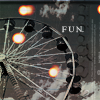
this to this:
1. I first cropped then prepped my base. I desaturated my base then duplicated it. I set the duplicated layer to soft light. I then desaturated both layers.
2. I made a new selective color layer:
Reds: 50/15/100/-25
Yellows: -55/15/-100/20
Whites: 100/-35/-100/-45
Blacks: 35/0/0/10
(It's from a tutorial I did a while ago, here.
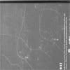
3. I pasted a texture;
by damnicons and set it to multiply.
4. I made a new color balance layer:
shadows: 35/0/20. I set the opacity on this layer to 40%
5. I pasted another texture;
by pildas I set this one to soft light.
6. I took this banner kind of texture;
by graphic_sl and selected a part of it, pasted it to my icon and set it to lighten.
7. I pasted another texture;
by dusty_memories, that I rotated to fit the icon well and pasted it. I set it to multiply.
8. Then for fun, I added text in Times New Roman font.
And you're done!
comment are appreciated.
Jessa wants you to JOIN/WATCH screenprints