The Oil Paint Effect
The Oil Paint Effect
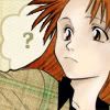
Preview:
In this tutorial:
*'Realilistic' Coloring Style
*Textures as Fills
*Stroking the Old Fashioned Way
*Transparency
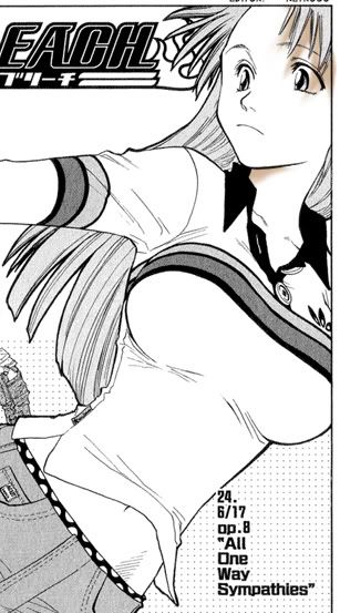
So here's the usual stuff. Our base image is from the manga Bleach by Tite Kubo.
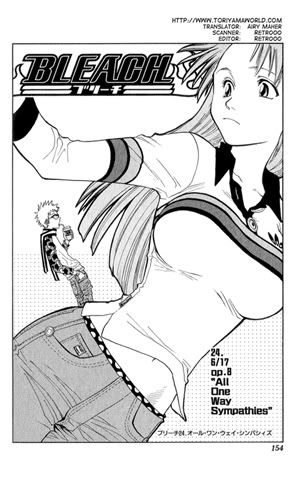
Coloring
In an attempt to expand my horizons and try a new coloring style, I stumbled across examples of what I consider to be a more 'realilistic' approach. It kind of reminds me of an oil painting, only with photoshop. I, in no way, consider myself to be an expert at this style, but I personally found it pretty easy to do. If you can grasp the idea behind shading, you should have no problem with this technique. If you're concerned, search for an actual photo of a human face and load it in photoshop to consult as a reference. Ok, let's get started.
Leave your image full sized. It's easier to get more depth and variation if you color first, crop second rather than vice versa. Change your line art layer to multiply. Create a new layer and put it underneath the line art. Select your brush and lay down a base color. This is essentially the skin color you want the character to have. Don't worry about being sloppy, it's all going to get messy but we'll clean it up later.
Color: #FFF0D7 Brush Size: 19px hard
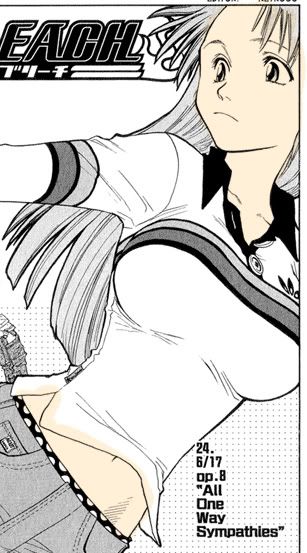

Ok, first round of shading. In a new layer, lay down the color where you think it needs to be shaded. Consult your reference picture if you need to. Common places include cheeks, eye sockets, the upper forehead, under hair on the forehead, around the nose, and the neck. It's ok to be messy, because we're going to be smearing it around with the smudge tool. A word about color choice. We're going to be 'stepping down' on the color picker with each new selection a little darker and richer. I try to stay roughly in the same color family. For instance, I don't give someone with peach coloring pink-purple shading. It will just look too drastic. However, some people do go to extremes and incorporate colors like blue, green, and purple into their image. I don't, because I suck at pulling it off, but if you can, go for it!
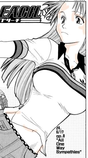
Zoom in. I was at between 400% and 600%. Use whatever you find is comfortable. When I was coloring this image, my smudge tool was set to Normal, 50% and I used a 9px hard brush. Now, start smearing it. The more you smear, the fainter it will get. Most importantly, make sure you don't have any hard edges. Even though most manga art is limited on facial features, drag the color into crevices that you know are there. Again, consult your reference photo if you need to. Work with the base color turned on so you can get an idea of how well it's blending and if it's still to stark. Click and push the color away from places where you don't want in(the tip of her nose for instance), and click and drag it to where you want it(in her eye sockets).
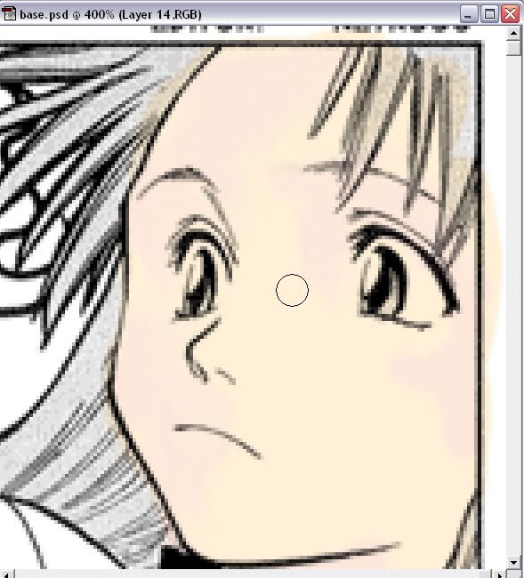
Color:#FEE8DB Brush Size: 9px hard
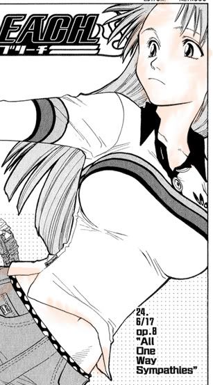


I do this with four more colors, getting progressively darker, and more limited on where the color is placed.
Color:#F5E5C9
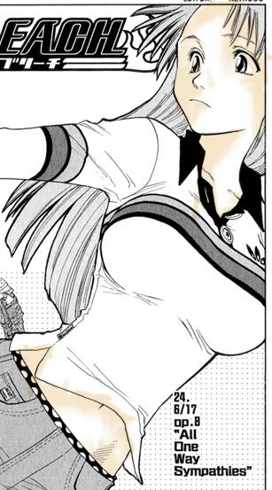


Color:#F5DFC9
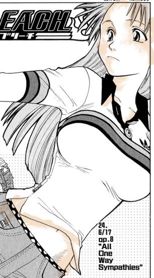


Color:#EFD6BE
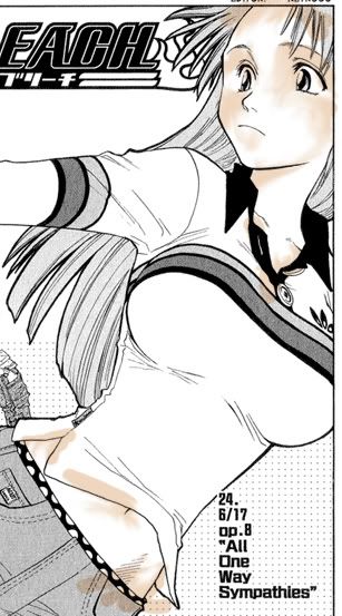
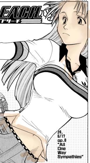

Color:#DFC3A9
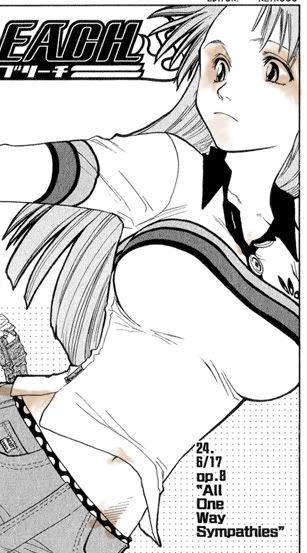


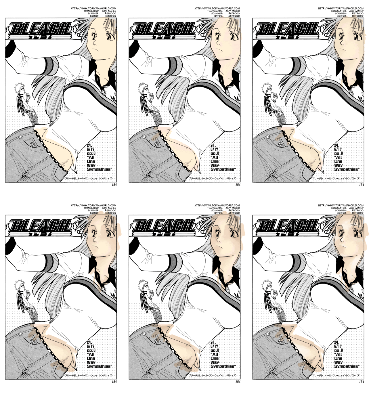
We'll have one more layer of color, but this will have the biggest impact. It's our highlight layer. Good places for highlight include right above the eyebrows, the lower forehead, the tip of the nose, right above the lips, the point of the chin, and on the neck.
Color:#FDF7F1
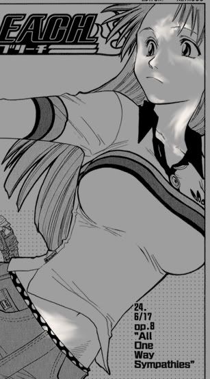
the first image is grey so you can see where I put the highlight :P


Now I want her bangs to have a shadow effect. Make a new layer and paint in rough shadows for the bangs. Smudge in downward strokes, trying to mimic reall shadows. The color is #D4B59A


A .gif, because it makes the world a better place.
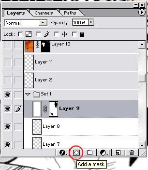
That's it for the coloring. I created a new layer and flood filled it with white. Put this above all your coloring, but below the line art. We're going to create a layer mask. That way, we can clean up the coloring without having to flatten it. While having this flood filled layer selected, click on the 'add a mask' button. It looks like grey rectangle with a white circle in it. On the layer palete, a new rectangle will appear next to the rectangle on the white flood fill layer. If you move your mouse over it, it will say 'layer mask thumbnail'. Click on it. You will notice that the foreground and background icons on the tool bar turn to black and white. Select a paintbrush in the size you want. Anything you paint black will 'erase' the white layer, and anything you paint in white will make it come back. Well, I hope I made that easy to understand. If I didn't, comment and I'll try to explain it better.
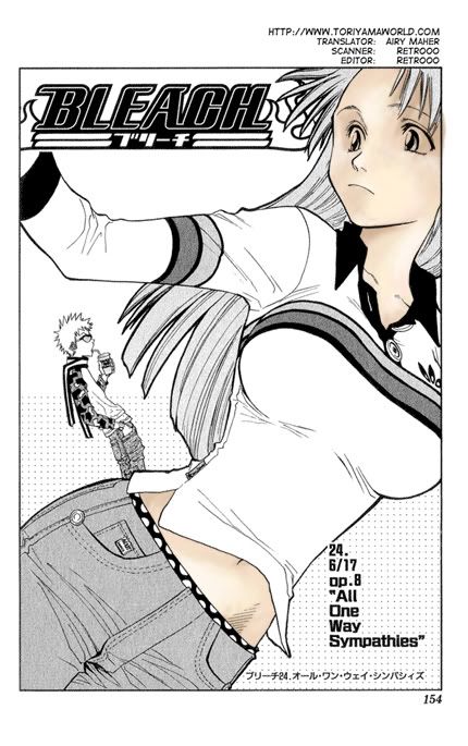
Well, now her skin is painted, and cleaned up. Make a new layer above all the skin stuff. Take a somewhat small brush, and with the color white, paint in her eyes.

Another new layer, and we'll give the irises some color. Zoom in, because they're kind of small. Paint away. I gave them a bit of shading, but nothing too fancy, because it won't be that noticable.

Time to give her some hair color. I'm going to be doing this via texture artwork and patterns by inxsomniax
First, I fill a new layer with a pattern. I set this layer on multiply.
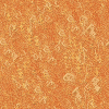
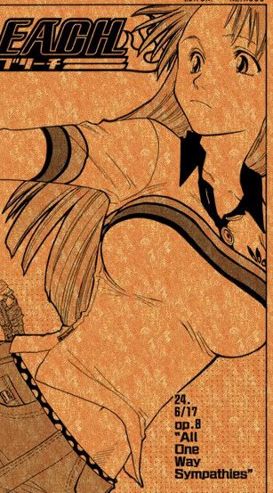
Then I paste this texture art into a new layer. Make sure this layer is under the pattern layer. As you can see, it's in there twice and I've rotated it to try and get some of the darker parts under her hair.
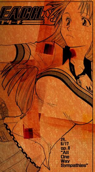
Use the masking function again to 'cut out' her hair.
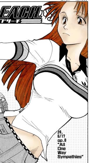
After all that work, we're ready to crop, so crop away!

I went ahead and painted out what was left of the Bleach logo.
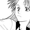
I pick a texture from inxsomniax that has a nice plaid that I want to use for her shirt. However, the plaid's not where I want it to be, so I rotate it(Ctrl-T) 90 degrees to the left so that the plaid is where her shirt's supposed to be. I use the masking function to cover everything but the shirt area.
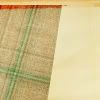
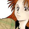
I do the same with another texture from inxsomniax. This time it's rotated 90 degrees to the right and I use it for the background. Mask it also.
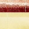
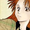
I make a little thought bubble. It's under the Custom Shape Tool. The color I use is white.

I want it to stand out a little better on the cream colored background, so I want to do a darker colored stroke on it. However, the stroke function annoys me to no end, so I elect to do it by hand. Make a new layer under the bubble. Choose your darker color. I'm using #A49869. Use the Polygonal Lasso Tool, and draw your own stroke around it. While the area's still selected, flood fill it with your color. Because I want to make this bubble transparent, merge the two together.


Go ahead and drop the opacity down to about 45%.

Erase the parts that are covering Orihime.
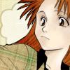
Finally, I do the little question mark. The font's Bullpen at 18pt. The color's #A49869.
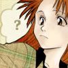
I do an exclusion in #000203 because I'm a slave to exclusion layers.

It took a while to get there, but hopefully you learned something?
Questions? Comments? Fire away!
Preview:

In this tutorial:
*'Realilistic' Coloring Style
*Textures as Fills
*Stroking the Old Fashioned Way
*Transparency
So here's the usual stuff. Our base image is from the manga Bleach by Tite Kubo.

Coloring
In an attempt to expand my horizons and try a new coloring style, I stumbled across examples of what I consider to be a more 'realilistic' approach. It kind of reminds me of an oil painting, only with photoshop. I, in no way, consider myself to be an expert at this style, but I personally found it pretty easy to do. If you can grasp the idea behind shading, you should have no problem with this technique. If you're concerned, search for an actual photo of a human face and load it in photoshop to consult as a reference. Ok, let's get started.
Leave your image full sized. It's easier to get more depth and variation if you color first, crop second rather than vice versa. Change your line art layer to multiply. Create a new layer and put it underneath the line art. Select your brush and lay down a base color. This is essentially the skin color you want the character to have. Don't worry about being sloppy, it's all going to get messy but we'll clean it up later.
Color: #FFF0D7 Brush Size: 19px hard


Ok, first round of shading. In a new layer, lay down the color where you think it needs to be shaded. Consult your reference picture if you need to. Common places include cheeks, eye sockets, the upper forehead, under hair on the forehead, around the nose, and the neck. It's ok to be messy, because we're going to be smearing it around with the smudge tool. A word about color choice. We're going to be 'stepping down' on the color picker with each new selection a little darker and richer. I try to stay roughly in the same color family. For instance, I don't give someone with peach coloring pink-purple shading. It will just look too drastic. However, some people do go to extremes and incorporate colors like blue, green, and purple into their image. I don't, because I suck at pulling it off, but if you can, go for it!

Zoom in. I was at between 400% and 600%. Use whatever you find is comfortable. When I was coloring this image, my smudge tool was set to Normal, 50% and I used a 9px hard brush. Now, start smearing it. The more you smear, the fainter it will get. Most importantly, make sure you don't have any hard edges. Even though most manga art is limited on facial features, drag the color into crevices that you know are there. Again, consult your reference photo if you need to. Work with the base color turned on so you can get an idea of how well it's blending and if it's still to stark. Click and push the color away from places where you don't want in(the tip of her nose for instance), and click and drag it to where you want it(in her eye sockets).

Color:#FEE8DB Brush Size: 9px hard


I do this with four more colors, getting progressively darker, and more limited on where the color is placed.
Color:#F5E5C9


Color:#F5DFC9


Color:#EFD6BE


Color:#DFC3A9


We'll have one more layer of color, but this will have the biggest impact. It's our highlight layer. Good places for highlight include right above the eyebrows, the lower forehead, the tip of the nose, right above the lips, the point of the chin, and on the neck.
Color:#FDF7F1
the first image is grey so you can see where I put the highlight :P


Now I want her bangs to have a shadow effect. Make a new layer and paint in rough shadows for the bangs. Smudge in downward strokes, trying to mimic reall shadows. The color is #D4B59A


A .gif, because it makes the world a better place.

That's it for the coloring. I created a new layer and flood filled it with white. Put this above all your coloring, but below the line art. We're going to create a layer mask. That way, we can clean up the coloring without having to flatten it. While having this flood filled layer selected, click on the 'add a mask' button. It looks like grey rectangle with a white circle in it. On the layer palete, a new rectangle will appear next to the rectangle on the white flood fill layer. If you move your mouse over it, it will say 'layer mask thumbnail'. Click on it. You will notice that the foreground and background icons on the tool bar turn to black and white. Select a paintbrush in the size you want. Anything you paint black will 'erase' the white layer, and anything you paint in white will make it come back. Well, I hope I made that easy to understand. If I didn't, comment and I'll try to explain it better.


Well, now her skin is painted, and cleaned up. Make a new layer above all the skin stuff. Take a somewhat small brush, and with the color white, paint in her eyes.

Another new layer, and we'll give the irises some color. Zoom in, because they're kind of small. Paint away. I gave them a bit of shading, but nothing too fancy, because it won't be that noticable.

Time to give her some hair color. I'm going to be doing this via texture artwork and patterns by inxsomniax
First, I fill a new layer with a pattern. I set this layer on multiply.


Then I paste this texture art into a new layer. Make sure this layer is under the pattern layer. As you can see, it's in there twice and I've rotated it to try and get some of the darker parts under her hair.

Use the masking function again to 'cut out' her hair.

After all that work, we're ready to crop, so crop away!

I went ahead and painted out what was left of the Bleach logo.

I pick a texture from inxsomniax that has a nice plaid that I want to use for her shirt. However, the plaid's not where I want it to be, so I rotate it(Ctrl-T) 90 degrees to the left so that the plaid is where her shirt's supposed to be. I use the masking function to cover everything but the shirt area.


I do the same with another texture from inxsomniax. This time it's rotated 90 degrees to the right and I use it for the background. Mask it also.


I make a little thought bubble. It's under the Custom Shape Tool. The color I use is white.

I want it to stand out a little better on the cream colored background, so I want to do a darker colored stroke on it. However, the stroke function annoys me to no end, so I elect to do it by hand. Make a new layer under the bubble. Choose your darker color. I'm using #A49869. Use the Polygonal Lasso Tool, and draw your own stroke around it. While the area's still selected, flood fill it with your color. Because I want to make this bubble transparent, merge the two together.


Go ahead and drop the opacity down to about 45%.

Erase the parts that are covering Orihime.

Finally, I do the little question mark. The font's Bullpen at 18pt. The color's #A49869.

I do an exclusion in #000203 because I'm a slave to exclusion layers.

It took a while to get there, but hopefully you learned something?
Questions? Comments? Fire away!