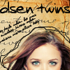
FULL ICON TUTORIAL
How i made this icon?
A lot of people asked me about it, these new style and how I choose the brush, crop, texture, text.... I´ll try to help but forgive me if I make any mistake! English isn´t my primary language.
*To understand this tut, you have to know the basic about PS, ok? But feel free to ask me anything!
Using: PHOTOSHOP CS2, Textures, brushes, blend mode, selective colours (optional).
THE IDEA: First of all you have to think about "what I want to do?" Sometimes just looking at the pic you have the inspiration.... BTW, For this icon, I wanna use some textures and wanna try a new style.
----------------------------------------------------
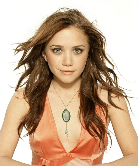
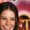
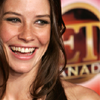
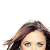
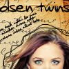
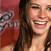
THE PICTURE : I prefer high resolution pics! I love Photoshoot pics ´cause they have good resolution and light, color (you usually don´t have much "work" to do hehehe!). I chose this pic (source: hires_hotties). PICS WITH A BLANK BACKGROUND ARE PERFECT TO USE TEXTURES!
GOOD RESOLUTION SAMPLE
BAD RESOLUTION SAMPLE
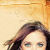
I usually create a new blank document and drag and drop the pic. To resize I use the FREE TRANSFORM (CTRL + T). But you can crop the image and resize 100X100
------------------------------
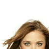
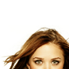
CROP:
I don´t like to make CENTRAL CROP (you focus in the middle). Central crop is BORING in my opinion. I´m seeing a lot of set with avvys with central crops. One or two is good but you don´t need to make 100 avvys croping the same way! Be creative.
BAD CROP >>
GOOD CROP>>
*As you can see, do you have a lot of ways to crop one pic. Just think about it! ;)
------------------------------------------------------
COLOURING *THIS STEP IS OPTIONAL! But if you wanna see my results, I made THIS SET, with this colouring*
*Do you have a lot of options to colouring your pic. Choose yours and have fun!!
My colouring:
Base 100x100 >>
Duplicate the layer, set it to SOFTH LIGHT opacity 100%
>>
Selective colour 1 (Method: relative)
REDS:
Cyan: - 44%
Magenta: 16%
Yellow: 65%
Black: 0%
YELLOWS:
Cyan: - 47%
Magenta: 0%
Yellow: -31%
Black: -22%
NEUTRAL:
Cyan: - 17%
Magenta: -11%
Yellow: -18%
Black: -17%
Selective Colour 2 (method relative):
REDS:
Cyan: - 70%
Magenta: -30%
Yellow: -27%
Black: 100%
YELLOWS:
Cyan: - 60%
Magenta: -27%
Yellow: -27%
Black: -28%
NEUTRAL:
Cyan: -25%
Magenta: -12%
Yellow: -22%
Black: 5%
>>
After the colouring, merge all the visible layers (SHIFT +CONTROL + E)
REMEMBER TO PLAY WITH THE OPACITIES!!!
-----------------------------------------------------------------------------
TEXTURES
do you have to think about the style. Choose the texture and match with the pic! I´m always searching and downloading good textures!!
I used this texture >>
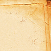
by
ytiralc
Drag and drop the texture to the top, creating another layer. SET THIS LAYER TO MULTIPLY, opacity 100%.
Erease the part at the Ashely´s (I think, lol!) face and hair.>>
>>
>>
Open this texture>>
by
ytiralc
Drag and drop the texture to the top, creating another layer. SET THIS LAYER TO MULTIPLY, opacity 100%. Erease the part at the Ashely´s (I think, lol! I´m not sure about it) face and hair.
>>
>>
-----------------------------------------------------------------------
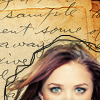
USING THE BRUSHES.
Create a new blank layer on the top
Use rounded and small brush. I used a black color. Make the border around the Olsen´s girl. hehe
>>>
Now we have a lot of "free" spaces.
I use these brush >>>
by iiokua
Drag this layer to the top and set it to MULTIPLY, opaicty 100%
*As you can see, I don´t used all the brush*
>>
>>
BRUSH TIP
When you use a "black" brush with a white background, you usually set the layer to MULTIPLY
When you use a "white" brush with a black background, you usually set the layer to SCREEN
-----------------------------------------------
USING THE TEXT
Here you have a problem! hehehe! A lot of people can´t use good the text. DO NOT USE YOUR TEXT IN LIGHT COLORS WITH A LIGHT BACKGROUND PLEASEEE!
LOL! You can use some shadow if you want.
I usually use "handwriting" fonts and download them at www.dafont.com
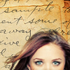
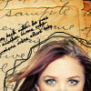
I define the text according the style that i want for the icon. I chose the "Jerkins" font and put in the "free" space at the top. I croped the pic to use some text.
>>
-------------------------------------------------------------------------------------------
OTHER STUFF
Sharpen: I didn´t sharpen this icon. It wasn´t necessary. See what I think about "sharpen".
GOOD >>
(shapened once)
BAD >>
(more than one time)
Some people use the "sharpen tool" just in the eyes, lips, or hair... BE CAREFUL!
GOOD >>
BAD >>
---------------------------------------------
It´s done! I hope you like it! Feel free to request, ask me and show me what you got! What kind of help do you need??
MY RULES:
- DON´T HOTLINK!! Save the avvys in your computer!
- Comment, please!! I love comments!! :)
- Dont share the avvys/the tuto as yours. It´s MY WORK, huh?
CHECK IT OUT:
MY MARY-KATE AND ASHLEY OLSEN SET
MY AWARDS
MY TUTORIAL LIST