Tutorial 02
Since a lot of you commented on how much you liked the colouring style of my huge batch of HP icons from a little while back, I thought I'd share the gist of my colouring technique. Cause I'm charitable like that.
Today, I will be showing you how to get from...
This base >>
...to...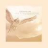
<< this icon.
Warning: This tutorial IS image-heavy, and is for use in Photoshop 7.
First things first... I started with this picture here, courtesy of the mighty MuggleNet.
(Note: high-res is your BFF.)
We crop (using the crop tool:
) the picture with the following settings...
Width: 75 pixels
Height: 75 pixels
Resolution: 72 pixels/inch
…to get this base:
In case you don’t already have your Layers window open, go to Window > Layers to bring it up.
Once you have the Layers window open, you should see your base layer. Now, duplicate that layer (Layer > Duplicate Layer), and sharpen it twice, to get this:

I know, it looks over-sharpened, but once we're finished, it'll smooth itself out.
Set the twice-sharpened base duplicate layer to Screen:

Select these two colours -- #D2AC77 and #BD7D77 -- so your colour selection boxes look as follows:

Next, click this button in the Layers window (
), and select Gradient to create a new gradient layer:
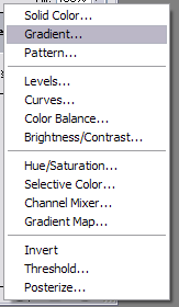
This menu will come up:
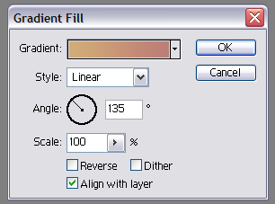
Fill it in with the settings shown above (dual colour gradient at a 135 degree angle).
The icon should now look like this:

Set the gradient layer to Color. The icon now looks like this:

Next, select these two colours -- #FFDF9B and #FFB89A -- so your selection boxes look like this:

Now, create another new gradient layer with these colours selected, and also rotate it at a 135 degree angle. The icon now looks as follows:

Set this gradient layer to Soft Light. The icon should look like this:

Select these two colours -- #FCECD8 and #FBCA92 -- next, so your selections are as follows:

Create one more gradient layer (this is the last one, I swear!), so the icon looks like this:

Set this last gradient layer to Screen at 50% opacity. The icon should look like this:

Next, select this colour -- #FEEAD1 -- for your foreground colour. Then, go to Image > Canvas Size, and fill in the menu that pops up with the following settings:
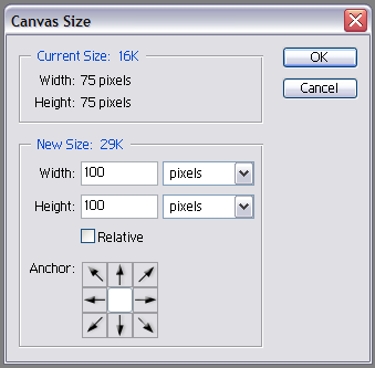
Because you already selected the background colour you wanted for the border, it should expand with that colour preset. So, the icon should now look like this:
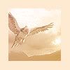
So, as a side note, for the border of these icons, I always choose a colour that's already present somewhere in the icon itself. Looks better overall, I think.
Now, this next step is a personal choice, but in this batch of icons, I tried to go for a slightly transparent look, so I select the 75x75 picture, and (still using the same colour that was selected for the border), created a new solid colour layer:
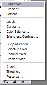
Set this 75x75 solid colour layer to Screen at 30% opacity (this will vary depending on your picture and the colour you choose). The icon now has a slightly more transparent look:

Same thing as above colour choice goes for text colour choice -- if it's a dark icon, I usually go with white, but if it's light, I pick a darker colour from the icon itself.
So, aside from that babble, for this icon, I chose #988978 for my text colour, and used the following text settings (for the slightly larger text):
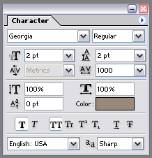
Now, since both sets of text are pretty much unreadable (and I won't get into a debate on this -- I find small text decorative), it doesn't really matter what you type here. I usually pick an actual word for the larger text, and just type gibberish for the tiny tiny text. In this case, the larger text reads "freedom."
The only difference between the small text and the really small text is size: I change it to 1 instead of 2, and keep all the other settings the same.
Anyway, here we finally are, with the finished product:

Note: The reason I got into such detail about creating the gradient layers, rather than just having you copy and paste the ones I used, is so you can experiment with different colours as they fit with different pictures. As you can see from the icon batch that I used this style on, I got really wild with colours, and that's the best part. So I hope the extra detail helped a bit. :)
Also, for a style like this, it's fun to download as many different gradients as you can (though in this case, I just picked colours I liked and made my own) and play around with different colour mixes. Try crumblingwalls’ journal for a bunch of gradients for download, or some of the others listed under Gradients in my Resource Post. As another tip -- sometimes, if you’re working with a picture that has warm colours (oranges, yellows, reds, &c.), the coolest look can come from trying cool gradients (greens, blues, purples). The more you experiment, the more interesting works you can create.
I hope this tutorial was at least somewhat helpful. Enjoy. ♥
Today, I will be showing you how to get from...
This base >>

...to...

<< this icon.
Warning: This tutorial IS image-heavy, and is for use in Photoshop 7.
First things first... I started with this picture here, courtesy of the mighty MuggleNet.
(Note: high-res is your BFF.)
We crop (using the crop tool:

) the picture with the following settings...
Width: 75 pixels
Height: 75 pixels
Resolution: 72 pixels/inch
…to get this base:

In case you don’t already have your Layers window open, go to Window > Layers to bring it up.
Once you have the Layers window open, you should see your base layer. Now, duplicate that layer (Layer > Duplicate Layer), and sharpen it twice, to get this:

I know, it looks over-sharpened, but once we're finished, it'll smooth itself out.
Set the twice-sharpened base duplicate layer to Screen:

Select these two colours -- #D2AC77 and #BD7D77 -- so your colour selection boxes look as follows:

Next, click this button in the Layers window (

), and select Gradient to create a new gradient layer:

This menu will come up:

Fill it in with the settings shown above (dual colour gradient at a 135 degree angle).
The icon should now look like this:

Set the gradient layer to Color. The icon now looks like this:

Next, select these two colours -- #FFDF9B and #FFB89A -- so your selection boxes look like this:

Now, create another new gradient layer with these colours selected, and also rotate it at a 135 degree angle. The icon now looks as follows:

Set this gradient layer to Soft Light. The icon should look like this:

Select these two colours -- #FCECD8 and #FBCA92 -- next, so your selections are as follows:

Create one more gradient layer (this is the last one, I swear!), so the icon looks like this:

Set this last gradient layer to Screen at 50% opacity. The icon should look like this:

Next, select this colour -- #FEEAD1 -- for your foreground colour. Then, go to Image > Canvas Size, and fill in the menu that pops up with the following settings:

Because you already selected the background colour you wanted for the border, it should expand with that colour preset. So, the icon should now look like this:

So, as a side note, for the border of these icons, I always choose a colour that's already present somewhere in the icon itself. Looks better overall, I think.
Now, this next step is a personal choice, but in this batch of icons, I tried to go for a slightly transparent look, so I select the 75x75 picture, and (still using the same colour that was selected for the border), created a new solid colour layer:

Set this 75x75 solid colour layer to Screen at 30% opacity (this will vary depending on your picture and the colour you choose). The icon now has a slightly more transparent look:

Same thing as above colour choice goes for text colour choice -- if it's a dark icon, I usually go with white, but if it's light, I pick a darker colour from the icon itself.
So, aside from that babble, for this icon, I chose #988978 for my text colour, and used the following text settings (for the slightly larger text):

Now, since both sets of text are pretty much unreadable (and I won't get into a debate on this -- I find small text decorative), it doesn't really matter what you type here. I usually pick an actual word for the larger text, and just type gibberish for the tiny tiny text. In this case, the larger text reads "freedom."
The only difference between the small text and the really small text is size: I change it to 1 instead of 2, and keep all the other settings the same.
Anyway, here we finally are, with the finished product:

Note: The reason I got into such detail about creating the gradient layers, rather than just having you copy and paste the ones I used, is so you can experiment with different colours as they fit with different pictures. As you can see from the icon batch that I used this style on, I got really wild with colours, and that's the best part. So I hope the extra detail helped a bit. :)
Also, for a style like this, it's fun to download as many different gradients as you can (though in this case, I just picked colours I liked and made my own) and play around with different colour mixes. Try crumblingwalls’ journal for a bunch of gradients for download, or some of the others listed under Gradients in my Resource Post. As another tip -- sometimes, if you’re working with a picture that has warm colours (oranges, yellows, reds, &c.), the coolest look can come from trying cool gradients (greens, blues, purples). The more you experiment, the more interesting works you can create.
I hope this tutorial was at least somewhat helpful. Enjoy. ♥