Tutorial 03
So the lovely artistbynight requested a tutorial for this icon, but unfortunately, while I did save the .psd file for it, I cannot find the base picture or the base of the icon (you'll see what I mean once I get into the process). So I decided to pick another picture, and imitate the colouring technique, and write the closest tutorial I could.
Today, I will be showing you how to get from...
This base >>
...to...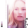
<< this icon.
Warning: This tutorial IS very image-heavy because I tend to babble, and is for use in Photoshop 7.
ETA: I have never used ANY version of PSP in my life, and therefore know nothing about it. If you have a question regarding how to transfer this tutorial over to that program, I'm afraid I can't be of any assistance. The best I can offer is to try over at icon_tutorial.
Note: I will be using grey background tables near the end of this tutorial, since a majority of the icon in the final steps is white. Just remember the grey is not a part of the icon.
First things first... I started with this DVD cap of the lovely Kate Warner from Season 2 of 24, courtesy of me and my mad capping skillz.
We Sharpen it twice (Filter > Sharpen > Sharpen), and, using the Crop Tool (
), crop it down to 200x200 pixels. Normally I'd immediately size down to 100x100, but with close ups like this, I prefer smoothing the skin out before we go that small. Here's how we're looking thus far:
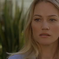
The best skin smoothing technique I've found is to use the Blur Tool (
) with the following settings:

These settings are basically Strength at 40%, and a soft, round brush at size 4.
It helps to zoom in close to the picture (I go to 600%, personally) to make sure you blur properly (remember your kindergarten skills, guys, stay inside the lines!) Also, it's best to leave hair, lips and eyes alone, and the darker bits of the nose as well. Here's how mine looks once I'm done smoothing her out:
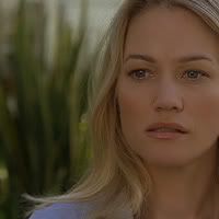
Now, probably against your better judgement, we Sharpen once more. But not to worry! Now is the time to size down to 100x100 pixels. (Image > Image Size). This gives us our base:

Duplicate this base layer (Layer > Duplicate Layer), and set it to Screen at 100% opacity:

Duplicate the Screen layer, and keep it at 100% as well:

I know it looks too light, but we fix that. Now, create a new layer (Layer > New > Layer or Ctrl + Shift + N), and then hold down Ctrl + Alt + Shift + E. This creates a merged copy of all your layers so far into the new blank layer. Next, hit Ctrl + Shift + U. This desaturates the layer. Now set this layer to Soft Light at 100% opacity:

Now, it's still a bit too bright for my liking, so I go back and select the second Screen layer, and drop it down to 60% opacity:

Now, go back up and create another new layer on top of everything. Create another merged copy of all the layers into it (Ctrl + Alt + Shift + E). Set this layer to Soft Light at 100% opacity as well. However, this layer we need to save for later, but we also don't want it in the way. So, in the Layers menu, which you should already have open, click the little eye (
) next to this layer to make it Invisible.
So, go back and select the layer underneath the Invisible one. Starting here, I follow a sizeable chunk of the great calixa's lovely base prep tutorial, but I'll repost the parts I follow of it here for ease's sake.
Copy this reddish gradient underneath the Invisible layer. Set it to Screen at 100% opacity:

Next, copy this bluish gradient on top of the red one, and set it to Lighten at 60% opacity:

Next, copy this brownish gradient on top of the blue one, and set it to Soft Light at 100% opacity:

Now is when we make the Invisible layer visible again, so click on the blank space where the eye was, and it will be visible again (make sure you've already set it to Soft Light at 100%):

Now, paste the same blue gradient from before on top of this layer, and set it to Overlay at 100% opacity:

Next, paste the same blue gradient (again) on top of that one, and set this one to Soft Light at 100% opacity:

The result we get is the base I was talking about above -- the one of Snape that I couldn't find. Well, the reason I couldn't find it is I didn't save it. So, what we do now is select the Selection Tool (
), and pick the following settings:

This basically means that whenever you click the selection tool, it will automatically select a rectangle that is 65x100 pixels. Once you've done that, move the selection around until you find the part you'd like to be used in the finished icon.
Now, (making sure the top-most layer is selected) make a merged copy of this selected area (Ctrl + Shift + C), and paste it into a brand new (100x100) document.
In your new document, you want to move the pasted image around on the blank icon. Smack dab in the center = OMG DON'T. See?
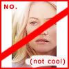
v.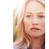
(I know my angry red scribblings are kind of distracting, but you get the idea.)
So, get the picture where you want it. I usually choose depending on how I cropped from the base -- if the lightness is on the left side, I leave more white to the left, right? Just be sure, in this case, that you leave enough room on the side with less white for the overlapping text.
Create a new layer. This time, using the selection tool, set it to Fixed Size at 5x5 pixels. Then, click somewhere near the bottom corner, and the little square will pop up. Select a dark colour from within the icon itself (in this case, I used #322127). Fill the little square with it.
Create two more little squares above the first, choosing medium (#AB8788) and light (#D4C2CA) colours from the icon as well, and fill them. Try and stay within similar hues, so it doesn't look totally whacked. Also, bear in mind the colours you choose now should match the gradients you use later (you want to have an overall colour cast to the whole icon, not clashing colours here and there:
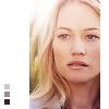
Create a new layer, and choose the Selection Tool again. Reset it to Normal mode, and choose a 2 pixel thick border line on the left side of the picture. Using the darkest square colour, fill it in:
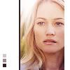
Using a soft, round brush (size 17) for your eraser, erase a bit off the top of the dark line. Try to make angular strokes, so it looks like a gradual fade to white. Then duplicate this layer, and keep it set to Normal at 100%. Believe it or not, this actually makes a slight difference, and I am anal retentive.
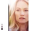
Create another new layer, and make the same size selection (2x100) to the immediate right of the dark line you just made. Fill this one in with white (#FFFFFF):
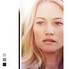
Then do the same erasing trick, only this time angled strokes from the bottom. And yeah, it helps to duplicate this one, too. By now, I'm sure you're thinking I'm crazy, but that's fine, because I technically am.
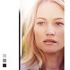
Another new layer, this time a 2x100 selection on the far right side of the picture. Fill it with white. I'm going to show you how it looks, but since it's white next to white, you probably can't see it. (In other words, if you can't see it, you put it in the right place.)
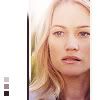
This time, we erase much more of the white line (from the bottom), and we don't make a duplicate of the layer (gasp!):
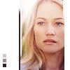
Create a new layer, but select the same area again from the layer below it. This time, choose the medium square color from before, and fill it:

Set the layer to Color Burn at 80%:
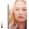
Now we're done mucking about with the tiny little subtleties that you're probably wondering what the hell they're there for. Answer: They're there because I like them. *cackle*
So, we're going to start working on making the entire icon more purple, to go along with our little squares of colour.
Select the entire picture area (including our silly little borders, so the selection should be 65x100), and click the New Fill/Adjustment Layer option (
) in your Layers window, and pick Gradient to make a new gradient layer.
Since we're going for a purple cast here, I use a purple gradient, angled at 130 degrees:
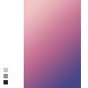
Set this gradient layer to Screen at 60% opacity:
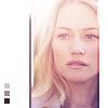
Create a new layer, and make a merged copy of all layers (Ctrl + Alt + Shift + E), and set it to Soft Light at 50% opacity:
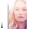
Make a new, darker purple gradient layer, rotated at 130 degrees:

Set this gradient layer to Color Burn at 25% opacity:
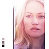
Another new, light purple gradient layer, rotated to 130 degrees:

Set this layer to Color at 15% opacity:
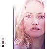
New layer, with a merged copy of all layers (Ctrl + Alt + Shift + E), set to Soft Light at 70% opacity:
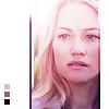
Make a new layer, this time for text. It will be tiny text. I will not get into the politics of this, people. It's just tiny text. It's not hurting anyone.
These are the text settings I used:
Font: Georgia. Size: 1. Weight: Bold, All Caps. Kerning: 1000. Quality: Sharp. Type whatever you like; something meaningful or plain gibberish. If it’s gibberish, I’d still recommend adding some spaces here and there. Pick a colour for the text from within the icon somewhere. Always do that. (In this case, I used #994761).
Now, click once on the text layer, to get out of typing mode. Then, hit Ctrl + T to rotate the text. Flip it this way or that so that it's vertical; it doesn't matter, as no one can read it anyway. If it's still not dark enough to suit your fancy, make a duplicate of the layer and set it to Soft Light, and muck about with the opacity. Here's where I settled:

Now, it's time for the text we can actually read. Use these settings:
Font: Crayon. Size: 25. Weight: Bold, Small Caps. Kerning: 0. Quality: Sharp. For the colour, I picked the one we used for the darkest little square again. I usually type just the name of the character, or something short like that -- the text is pretty large. Then, rotate the text 90 degrees CW (clockwise):
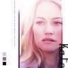
Duplicate this text layer, but change the text colour to white (#FFFFFF):
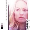
To get the "half-tone" look on the text, get out of typing mode on the white text layer, and choose the Selection Tool. Select the area of the text that is hanging over into the white area. Making sure you're working on the white text layer, take the eraser tool and erase the selected area. Before you can actually erase, a window will pop up and ask you if you want to rasterize the text first, but just click OK, and it will let you erase.
And that's it! You're (finally) done! Here is our end result:

I hope this tutorial was at least somewhat helpful, and not completely inane and impossible to understand. Enjoy. ♥
Today, I will be showing you how to get from...
This base >>

...to...

<< this icon.
Warning: This tutorial IS very image-heavy because I tend to babble, and is for use in Photoshop 7.
ETA: I have never used ANY version of PSP in my life, and therefore know nothing about it. If you have a question regarding how to transfer this tutorial over to that program, I'm afraid I can't be of any assistance. The best I can offer is to try over at icon_tutorial.
Note: I will be using grey background tables near the end of this tutorial, since a majority of the icon in the final steps is white. Just remember the grey is not a part of the icon.
First things first... I started with this DVD cap of the lovely Kate Warner from Season 2 of 24, courtesy of me and my mad capping skillz.
We Sharpen it twice (Filter > Sharpen > Sharpen), and, using the Crop Tool (

), crop it down to 200x200 pixels. Normally I'd immediately size down to 100x100, but with close ups like this, I prefer smoothing the skin out before we go that small. Here's how we're looking thus far:

The best skin smoothing technique I've found is to use the Blur Tool (

) with the following settings:

These settings are basically Strength at 40%, and a soft, round brush at size 4.
It helps to zoom in close to the picture (I go to 600%, personally) to make sure you blur properly (remember your kindergarten skills, guys, stay inside the lines!) Also, it's best to leave hair, lips and eyes alone, and the darker bits of the nose as well. Here's how mine looks once I'm done smoothing her out:

Now, probably against your better judgement, we Sharpen once more. But not to worry! Now is the time to size down to 100x100 pixels. (Image > Image Size). This gives us our base:

Duplicate this base layer (Layer > Duplicate Layer), and set it to Screen at 100% opacity:

Duplicate the Screen layer, and keep it at 100% as well:

I know it looks too light, but we fix that. Now, create a new layer (Layer > New > Layer or Ctrl + Shift + N), and then hold down Ctrl + Alt + Shift + E. This creates a merged copy of all your layers so far into the new blank layer. Next, hit Ctrl + Shift + U. This desaturates the layer. Now set this layer to Soft Light at 100% opacity:

Now, it's still a bit too bright for my liking, so I go back and select the second Screen layer, and drop it down to 60% opacity:

Now, go back up and create another new layer on top of everything. Create another merged copy of all the layers into it (Ctrl + Alt + Shift + E). Set this layer to Soft Light at 100% opacity as well. However, this layer we need to save for later, but we also don't want it in the way. So, in the Layers menu, which you should already have open, click the little eye (

) next to this layer to make it Invisible.
So, go back and select the layer underneath the Invisible one. Starting here, I follow a sizeable chunk of the great calixa's lovely base prep tutorial, but I'll repost the parts I follow of it here for ease's sake.
Copy this reddish gradient underneath the Invisible layer. Set it to Screen at 100% opacity:

Next, copy this bluish gradient on top of the red one, and set it to Lighten at 60% opacity:

Next, copy this brownish gradient on top of the blue one, and set it to Soft Light at 100% opacity:

Now is when we make the Invisible layer visible again, so click on the blank space where the eye was, and it will be visible again (make sure you've already set it to Soft Light at 100%):

Now, paste the same blue gradient from before on top of this layer, and set it to Overlay at 100% opacity:

Next, paste the same blue gradient (again) on top of that one, and set this one to Soft Light at 100% opacity:

The result we get is the base I was talking about above -- the one of Snape that I couldn't find. Well, the reason I couldn't find it is I didn't save it. So, what we do now is select the Selection Tool (

), and pick the following settings:

This basically means that whenever you click the selection tool, it will automatically select a rectangle that is 65x100 pixels. Once you've done that, move the selection around until you find the part you'd like to be used in the finished icon.
Now, (making sure the top-most layer is selected) make a merged copy of this selected area (Ctrl + Shift + C), and paste it into a brand new (100x100) document.
In your new document, you want to move the pasted image around on the blank icon. Smack dab in the center = OMG DON'T. See?

v.

(I know my angry red scribblings are kind of distracting, but you get the idea.)
So, get the picture where you want it. I usually choose depending on how I cropped from the base -- if the lightness is on the left side, I leave more white to the left, right? Just be sure, in this case, that you leave enough room on the side with less white for the overlapping text.
Create a new layer. This time, using the selection tool, set it to Fixed Size at 5x5 pixels. Then, click somewhere near the bottom corner, and the little square will pop up. Select a dark colour from within the icon itself (in this case, I used #322127). Fill the little square with it.
Create two more little squares above the first, choosing medium (#AB8788) and light (#D4C2CA) colours from the icon as well, and fill them. Try and stay within similar hues, so it doesn't look totally whacked. Also, bear in mind the colours you choose now should match the gradients you use later (you want to have an overall colour cast to the whole icon, not clashing colours here and there:

Create a new layer, and choose the Selection Tool again. Reset it to Normal mode, and choose a 2 pixel thick border line on the left side of the picture. Using the darkest square colour, fill it in:

Using a soft, round brush (size 17) for your eraser, erase a bit off the top of the dark line. Try to make angular strokes, so it looks like a gradual fade to white. Then duplicate this layer, and keep it set to Normal at 100%. Believe it or not, this actually makes a slight difference, and I am anal retentive.

Create another new layer, and make the same size selection (2x100) to the immediate right of the dark line you just made. Fill this one in with white (#FFFFFF):

Then do the same erasing trick, only this time angled strokes from the bottom. And yeah, it helps to duplicate this one, too. By now, I'm sure you're thinking I'm crazy, but that's fine, because I technically am.

Another new layer, this time a 2x100 selection on the far right side of the picture. Fill it with white. I'm going to show you how it looks, but since it's white next to white, you probably can't see it. (In other words, if you can't see it, you put it in the right place.)

This time, we erase much more of the white line (from the bottom), and we don't make a duplicate of the layer (gasp!):

Create a new layer, but select the same area again from the layer below it. This time, choose the medium square color from before, and fill it:

Set the layer to Color Burn at 80%:

Now we're done mucking about with the tiny little subtleties that you're probably wondering what the hell they're there for. Answer: They're there because I like them. *cackle*
So, we're going to start working on making the entire icon more purple, to go along with our little squares of colour.
Select the entire picture area (including our silly little borders, so the selection should be 65x100), and click the New Fill/Adjustment Layer option (

) in your Layers window, and pick Gradient to make a new gradient layer.
Since we're going for a purple cast here, I use a purple gradient, angled at 130 degrees:

Set this gradient layer to Screen at 60% opacity:

Create a new layer, and make a merged copy of all layers (Ctrl + Alt + Shift + E), and set it to Soft Light at 50% opacity:

Make a new, darker purple gradient layer, rotated at 130 degrees:

Set this gradient layer to Color Burn at 25% opacity:

Another new, light purple gradient layer, rotated to 130 degrees:

Set this layer to Color at 15% opacity:

New layer, with a merged copy of all layers (Ctrl + Alt + Shift + E), set to Soft Light at 70% opacity:

Make a new layer, this time for text. It will be tiny text. I will not get into the politics of this, people. It's just tiny text. It's not hurting anyone.
These are the text settings I used:
Font: Georgia. Size: 1. Weight: Bold, All Caps. Kerning: 1000. Quality: Sharp. Type whatever you like; something meaningful or plain gibberish. If it’s gibberish, I’d still recommend adding some spaces here and there. Pick a colour for the text from within the icon somewhere. Always do that. (In this case, I used #994761).
Now, click once on the text layer, to get out of typing mode. Then, hit Ctrl + T to rotate the text. Flip it this way or that so that it's vertical; it doesn't matter, as no one can read it anyway. If it's still not dark enough to suit your fancy, make a duplicate of the layer and set it to Soft Light, and muck about with the opacity. Here's where I settled:

Now, it's time for the text we can actually read. Use these settings:
Font: Crayon. Size: 25. Weight: Bold, Small Caps. Kerning: 0. Quality: Sharp. For the colour, I picked the one we used for the darkest little square again. I usually type just the name of the character, or something short like that -- the text is pretty large. Then, rotate the text 90 degrees CW (clockwise):

Duplicate this text layer, but change the text colour to white (#FFFFFF):

To get the "half-tone" look on the text, get out of typing mode on the white text layer, and choose the Selection Tool. Select the area of the text that is hanging over into the white area. Making sure you're working on the white text layer, take the eraser tool and erase the selected area. Before you can actually erase, a window will pop up and ask you if you want to rasterize the text first, but just click OK, and it will let you erase.
And that's it! You're (finally) done! Here is our end result:

I hope this tutorial was at least somewhat helpful, and not completely inane and impossible to understand. Enjoy. ♥