TIPS FOR ICONMAKING
LAST UPDATE: June 6th, 2009.
Image Selection- Cropping - Text - Coloring - Black and White
Textures and Patterns - Layers - Do Not Do These - Beginner Resources
IMAGE SELECTION
Image selection can make or break your icon. It’s very important to be aware of what makes a good cap or picture and what doesn’t.
You need to make sure that the picture is of a quality you can reasonably work with. Anything too grainy, pixilated or already overly saturated won’t work well if you are just starting out. Look for a smooth surface to your icon (thinking of it like a canvas), and look for a proper aspect ratio.
Do not know what an aspect ratio is? Well here’s a scenario: does your cap look slightly off? Is Sam Winchester’s face longer than it usually is? Slightly smushed? How about a lot smushed? That is your bad aspect ratio. Here are some guides to help you:
CNET’s Technical Guide
Aspect Ratio For Dummies (not you of course) by dtissagirl
Aspect Ratio can be scary and technically hard to understand but what it comes down to if it doesn’t look quite right, it probably isn’t and you should move on to another resource.
Another helpful tip is to find someone who already makes good icons and look at their resource list. Typically this will lead you to the good screencap resources for your fandom of choice.
CROPPING
Some keys to cropping:
Techniques
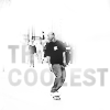
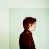
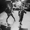
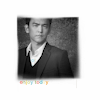
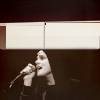
Offsetting your image by cropping to the corners: like Frank Iero in this icon. See how Frank is situated in the corner of the icon? With all that blank (or "negative") space surrounding him? That is cropping to the corner. Another way to do this is to put the focus of a close crop at the corner, like in this Gerard icon.
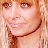
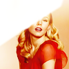
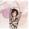
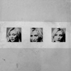
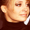
Cropping dead center can make your image even more dramatic by utilizing negative space or by bringing the image to the immediate view of your eye: Kristen Bell is in bottom center leaving a ton of pink negative space. Another example using a closer crop is this Nicole Richie icon. Her face is in the middle but it's still a close crop.
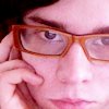
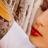
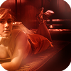
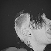
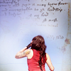
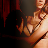
Cropping closeup can help add freshness to oft icon-ed image. Don't be afraid to only show the nose, the hair, the mouth, the arm etc. of your subject: Frank's face is the immediate focus. All you can see this woman's chest and arms. A crop like this can add mood to an icon. Experiment with taking a larger picture and pasting it onto a 100x100 canvas and moving it around to see what is being framed and then resize if necessary.
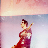
Being aware of negative space is really important. Negative space refers to the empty areas of your canvas, places that the subject of your icon does not occupy. Moving the image around the canvas can help create negative space like in this Kristen Bell icon: In this Chris Pine icon everything surrounding him is the negative space and it "frames" him in the image.
Tutorials:
Using texture to fill negative space by iconseeyou
Doctor Who by lilyrose_icons (Good for negative space/placement)
Cropping Guide by driftedfar
TEXT
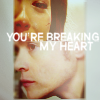
If you aren't comfortable with text, and it does take awhile, sometimes it helps to start with text brushes, which can show you how text can work together with a icon and some of the different ways to format your text: Like here in this John Cho icon. Or this Gerard Way icon.
Don't be afraid to make your text go off the page, or cut it in half or erase 3/4ths of it all together. The image is what's most important (unless it's a text only icon of course.), text is a plus. "Helm" is actually cut off but Star Trek fans can finish it automatically because they recognize the characters. Keeping the text relevant to the icon is what makes it readable and acceptable.
One word, two words, three words. Sometimes you don't need full paragraphs to get your point across.
Quotes make great text! If you're working with a movie or a tv show, try to think of relevant and interesting quotes from the scenes.

Lyrics are a great resource! What is you favorite band? Your favorite artist? A song you really love? How about a song that matches the mood of the icon? A sad song? A happy song? What about the title of the song?
For text only icons I recommend a brightly colored base with a lighter font and a light drop shadow to make it pop: Like in this Psych icon.
Where to find free fonts:
The site I prefer to use is Dafont.com.
Font Guide (my own):
Here. More of a Favorite Fonts.
Font guides I like:
Font guide (no icon examples) by neversince (A lot of handwriting fonts)
Font guide (with icon examples) by myrasis (A lot of clear easy to read fonts)
Font guide (no icon examples) by _excentric_ (A lot of grunge fonts)
COLORING
The best advice I can give for coloring is experiment. That's all it is. Try different settings on curves, mess around with different fill layers, try different settings on your brightness/contrast setting and set textures on different modes. When you find something you like save it as a PSD and use it on other icons/caps and see what happens.
Curves
Curves, for me, is all about experimentation. Figuring out what does what.
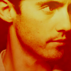
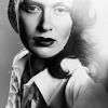
To explain some of the finer points of curves, I'll be giving you several examples of how a curves setting can change a picture. I'll be using this picture of Greta Salpeter.

Moving the circle upwards creates more light or brightness. This is at the very very top. Moving the circle to the top and left will make the picture whiter and whiter. Notice the gradients on the side and bottom, it shows you where you are going.

Dragging the circle to the bottom makes it darker. Going to the bottom and to the right, the picture will become more and more black.

This shows a more balanced setting for curves. Notice that it enhances the contrast of the image and adds some pop to the coloring. The full image.
Curves has different settings for different colors, Red, Green, Blue (+RGB, the combination of the colors.)
Using the blue as an example:

Pay attention to the gradients on the side, they're showing you where you're going. In this I went up and in the middle, creating a lot of blue light.

This time I went down, creating less blue, essentially taking the blue out of the image.

A balanced blue curve. The full image.
Color Balance
Color balance is another adjustment layer that can be quite helpful with experimentation. The different settings for this are: Cyan, Magenta, Yellow on one side; Red, Green, Blue on the other with a toggle in the middle that slides back and forth.
Example:

Color Balance is pretty self explanatory, going towards one side will create more of that particular color. In this case, this is full Cyan.

The other option with Color Balance is at the bottom. You have Shadows, Midtones, Highlights. This is an example of the setting on full Cyan and on Shadows, the previous was on Midtones which is the default setting.

This is the Color Balance setting on Highlights and full Cyan. As you can see, the setting focuses on light.
Color Fills
1. Like I've been saying with this whole section: EXPERIMENT EXPERIMENT EXPERIMENT. There is no set way to do this at all. There are ENDLESS ways to color an icon and endless colors to color an icon with.
2. Know your different settings.

Normal, Darken, Lighten, Hue, Hue (Legacy), Saturation, Saturation (Legacy), Color, Color (Legacy), Luminance, Luminance (Legacy), Multiply, Screen, Dissolve, Overlay, Hard Light, Soft Light, Difference, Dodge, Burn, Exclusion.
The settings I use the most are: Soft Light, Screen, Burn, Normal all at varying levels of opacity depending on the image and the hue.
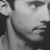
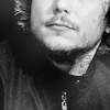
3. Taking a picture of Frank Iero.
Filling a new raster layer with a light tan and then setting it to soft light:

>
Notice how much it brightens up the icon. Screen will do this at a much higher level.
The same color but set on burn:
>
Burn is great for adding contrast. Obviously it darkens the image quite a bit and should be used in conjunction with another lighter setting.
Two layers in conjunction with each other. A dark brown set on burn and a light tan set on soft light:

TADA!
4. Again this is just one brief example on how you can use just TWO of the settings and TWO colors. There are endless possibilities. There is no set or RIGHT way to color, it's all about experimenting and trying new things.
Tutorials:
Chris Pine and John Cho If you're interested in my own coloring methods, these are two examples on how I go about it.
Red icons by stars_scream
Stock Image (very vibrant coloring) by syncedaffairs
GRADIENTS/LIGHT TEXTURES
A gradient (color flowing into another color(s), one color going from light to dark) can enhance the color of your icon, it can add color to your icon, it can create new moods to an image.
For icon makers just starting out, avoid gradients that have too many colors in them. Start with a two color gradient and move up from there. More than three will confuse your image and you'll get some ugly color combinations.
Unless you are going for a monochromatic look, avoid using too many gradients in the same hue range.
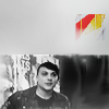
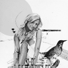
Light textures are a great way to add dramatic lighting or highlight something on your icon, like in this fashion icon. They can also add depth to textures in negative space: Like in this Joe Crede icon.
Light textures and gradients are also great for adding strong colors to an icon. Set on hard light (with varying levels of opacity), colorful gradients and light textures can add a variety of new hues to a black and white icon or a natural color icon.
Tutorials:
Tutorial by defaultsettings (Good use of light here, detailed process.)
BLACK AND WHITE
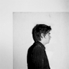
Making a black and white icon is more than just desaturating a image and calling it done. It's about adding or subtracting light to make or take away shadows and creating depth without color. It's an exercise in levels, brightness/contrast, curves and texture.
Try coloring your icon before desaturating it all together. It's a bit more work but it helps to get your image to a different place and can also help to show you what colors are influencing all the different levels in a black and white icon.
>
>
Lowering the contrast and brightening your icon can create an interesting look.
Alternatively you can up the contrast and lower the brightness which can create a very moody look. You can also make your icon very contrasted (curves is a great tool to aid you in this!)
Adding a dash of color can help really make your black and white image pop.
Adding blobs of light or light textures can also really help a black and white icon stand out.
Tutorials:
A good compilation of tutorials dealing with Black and White icons.
BSG icon by lucide_icons
TEXTURES AND PATTERNS
Textures do exactly they say on the box, it adds texture. You can use textures in whatever way you see fit.
Textures are great for overlaying or multiplying over a plain bit of negative space to give it more, wait for it, texture.
Textures are a great resource for coloring your icons. Set to multiply, burn, soft light or dodge and hard light (at a lower opacity) can add nice depth to your icon:

Recommended texture makers:
For an extended list see my resources page.
Looking for a community for good texture makers? Try freshmakers which has moderated membership and frequent posting.
Tutorials:
Texture Guide by virtuosities
Creating your own texture by distractiions
LAYERS
Keep track of your layers by clicking on them and titling them.
Merge as often as possible, as long as it won't affect your image.
Seems simple but: never, ever, ever work on the background. Always duplicate your base.
NEVER UNDER ANY CIRCUMSTANCES
Use a blurry unsaveable image. Sharpening too many times will cause lines to become ragged and harsh. Attempting to soften those lines will cause the image to become confused. Move on to finding a better quality image or drop the idea at all.
Use an image that is too small. You cannot make it larger in photoshop without it becoming pixelated. Take pictures that you can crop down or make smaller therefore not losing quality.
ALWAYS avoid filters as much as possible. Do not convert the image to charcoal, mosaic or any of the other filters in your program unless you have some idea of what you're doing.
BEGINNER RESOURCES
Looking for somewhere to start? Try these first:
icon_tutorial, good_tutorial, texturize (great FAQ)
Tutorials
John Sheppard in video format by blimey_icons (appears to have exceeded bandwidth, but the video is still useful and available.)
Creating space 1 and 2 by skiescancrack
Graphic Tutorials for beginners by bethyj_graphics
Other recommended tutorials can be found here.
I work with PSP but am also comfortable with PS. Almost all of the tutorials are either with PSP and are translatable or are PS tutorials but are translatable to PSP.
Feel free to ask questions. If you feel you have good advice to give to me or another commenter who has asked a question, feel free to jump in and do so. However please remember to be polite and kind to one another in my journal or you will be banned.
Feel free to recommend any tutorial you found helpful, whether general or specific. I'd love to see it!
All icons are made by me and are shareable with credit.
Image Selection- Cropping - Text - Coloring - Black and White
Textures and Patterns - Layers - Do Not Do These - Beginner Resources
IMAGE SELECTION
Image selection can make or break your icon. It’s very important to be aware of what makes a good cap or picture and what doesn’t.
You need to make sure that the picture is of a quality you can reasonably work with. Anything too grainy, pixilated or already overly saturated won’t work well if you are just starting out. Look for a smooth surface to your icon (thinking of it like a canvas), and look for a proper aspect ratio.
Do not know what an aspect ratio is? Well here’s a scenario: does your cap look slightly off? Is Sam Winchester’s face longer than it usually is? Slightly smushed? How about a lot smushed? That is your bad aspect ratio. Here are some guides to help you:
CNET’s Technical Guide
Aspect Ratio For Dummies (not you of course) by dtissagirl
Aspect Ratio can be scary and technically hard to understand but what it comes down to if it doesn’t look quite right, it probably isn’t and you should move on to another resource.
Another helpful tip is to find someone who already makes good icons and look at their resource list. Typically this will lead you to the good screencap resources for your fandom of choice.
CROPPING
Some keys to cropping:
Techniques
Offsetting your image by cropping to the corners: like Frank Iero in this icon. See how Frank is situated in the corner of the icon? With all that blank (or "negative") space surrounding him? That is cropping to the corner. Another way to do this is to put the focus of a close crop at the corner, like in this Gerard icon.
Cropping dead center can make your image even more dramatic by utilizing negative space or by bringing the image to the immediate view of your eye: Kristen Bell is in bottom center leaving a ton of pink negative space. Another example using a closer crop is this Nicole Richie icon. Her face is in the middle but it's still a close crop.
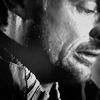
Cropping closeup can help add freshness to oft icon-ed image. Don't be afraid to only show the nose, the hair, the mouth, the arm etc. of your subject: Frank's face is the immediate focus. All you can see this woman's chest and arms. A crop like this can add mood to an icon. Experiment with taking a larger picture and pasting it onto a 100x100 canvas and moving it around to see what is being framed and then resize if necessary.
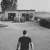
Being aware of negative space is really important. Negative space refers to the empty areas of your canvas, places that the subject of your icon does not occupy. Moving the image around the canvas can help create negative space like in this Kristen Bell icon: In this Chris Pine icon everything surrounding him is the negative space and it "frames" him in the image.
Tutorials:
Using texture to fill negative space by iconseeyou
Doctor Who by lilyrose_icons (Good for negative space/placement)
Cropping Guide by driftedfar
TEXT
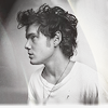
If you aren't comfortable with text, and it does take awhile, sometimes it helps to start with text brushes, which can show you how text can work together with a icon and some of the different ways to format your text: Like here in this John Cho icon. Or this Gerard Way icon.
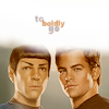
Don't be afraid to make your text go off the page, or cut it in half or erase 3/4ths of it all together. The image is what's most important (unless it's a text only icon of course.), text is a plus. "Helm" is actually cut off but Star Trek fans can finish it automatically because they recognize the characters. Keeping the text relevant to the icon is what makes it readable and acceptable.
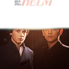
One word, two words, three words. Sometimes you don't need full paragraphs to get your point across.
Quotes make great text! If you're working with a movie or a tv show, try to think of relevant and interesting quotes from the scenes.
Lyrics are a great resource! What is you favorite band? Your favorite artist? A song you really love? How about a song that matches the mood of the icon? A sad song? A happy song? What about the title of the song?
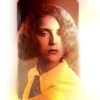
For text only icons I recommend a brightly colored base with a lighter font and a light drop shadow to make it pop: Like in this Psych icon.
Where to find free fonts:
The site I prefer to use is Dafont.com.
Font Guide (my own):
Here. More of a Favorite Fonts.
Font guides I like:
Font guide (no icon examples) by neversince (A lot of handwriting fonts)
Font guide (with icon examples) by myrasis (A lot of clear easy to read fonts)
Font guide (no icon examples) by _excentric_ (A lot of grunge fonts)
COLORING
The best advice I can give for coloring is experiment. That's all it is. Try different settings on curves, mess around with different fill layers, try different settings on your brightness/contrast setting and set textures on different modes. When you find something you like save it as a PSD and use it on other icons/caps and see what happens.
Curves
Curves, for me, is all about experimentation. Figuring out what does what.
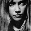
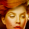
To explain some of the finer points of curves, I'll be giving you several examples of how a curves setting can change a picture. I'll be using this picture of Greta Salpeter.
Moving the circle upwards creates more light or brightness. This is at the very very top. Moving the circle to the top and left will make the picture whiter and whiter. Notice the gradients on the side and bottom, it shows you where you are going.
Dragging the circle to the bottom makes it darker. Going to the bottom and to the right, the picture will become more and more black.
This shows a more balanced setting for curves. Notice that it enhances the contrast of the image and adds some pop to the coloring. The full image.
Curves has different settings for different colors, Red, Green, Blue (+RGB, the combination of the colors.)
Using the blue as an example:
Pay attention to the gradients on the side, they're showing you where you're going. In this I went up and in the middle, creating a lot of blue light.
This time I went down, creating less blue, essentially taking the blue out of the image.
A balanced blue curve. The full image.
Color Balance
Color balance is another adjustment layer that can be quite helpful with experimentation. The different settings for this are: Cyan, Magenta, Yellow on one side; Red, Green, Blue on the other with a toggle in the middle that slides back and forth.
Example:
Color Balance is pretty self explanatory, going towards one side will create more of that particular color. In this case, this is full Cyan.
The other option with Color Balance is at the bottom. You have Shadows, Midtones, Highlights. This is an example of the setting on full Cyan and on Shadows, the previous was on Midtones which is the default setting.
This is the Color Balance setting on Highlights and full Cyan. As you can see, the setting focuses on light.
Color Fills
1. Like I've been saying with this whole section: EXPERIMENT EXPERIMENT EXPERIMENT. There is no set way to do this at all. There are ENDLESS ways to color an icon and endless colors to color an icon with.
2. Know your different settings.
Normal, Darken, Lighten, Hue, Hue (Legacy), Saturation, Saturation (Legacy), Color, Color (Legacy), Luminance, Luminance (Legacy), Multiply, Screen, Dissolve, Overlay, Hard Light, Soft Light, Difference, Dodge, Burn, Exclusion.
The settings I use the most are: Soft Light, Screen, Burn, Normal all at varying levels of opacity depending on the image and the hue.
3. Taking a picture of Frank Iero.
Filling a new raster layer with a light tan and then setting it to soft light:
>
Notice how much it brightens up the icon. Screen will do this at a much higher level.
The same color but set on burn:
>
Burn is great for adding contrast. Obviously it darkens the image quite a bit and should be used in conjunction with another lighter setting.
Two layers in conjunction with each other. A dark brown set on burn and a light tan set on soft light:
TADA!
4. Again this is just one brief example on how you can use just TWO of the settings and TWO colors. There are endless possibilities. There is no set or RIGHT way to color, it's all about experimenting and trying new things.
Tutorials:
Chris Pine and John Cho If you're interested in my own coloring methods, these are two examples on how I go about it.
Red icons by stars_scream
Stock Image (very vibrant coloring) by syncedaffairs
GRADIENTS/LIGHT TEXTURES
A gradient (color flowing into another color(s), one color going from light to dark) can enhance the color of your icon, it can add color to your icon, it can create new moods to an image.
For icon makers just starting out, avoid gradients that have too many colors in them. Start with a two color gradient and move up from there. More than three will confuse your image and you'll get some ugly color combinations.
Unless you are going for a monochromatic look, avoid using too many gradients in the same hue range.
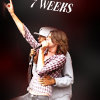
Light textures are a great way to add dramatic lighting or highlight something on your icon, like in this fashion icon. They can also add depth to textures in negative space: Like in this Joe Crede icon.
Light textures and gradients are also great for adding strong colors to an icon. Set on hard light (with varying levels of opacity), colorful gradients and light textures can add a variety of new hues to a black and white icon or a natural color icon.
Tutorials:
Tutorial by defaultsettings (Good use of light here, detailed process.)
BLACK AND WHITE
Making a black and white icon is more than just desaturating a image and calling it done. It's about adding or subtracting light to make or take away shadows and creating depth without color. It's an exercise in levels, brightness/contrast, curves and texture.
Try coloring your icon before desaturating it all together. It's a bit more work but it helps to get your image to a different place and can also help to show you what colors are influencing all the different levels in a black and white icon.
>
>
Lowering the contrast and brightening your icon can create an interesting look.
Alternatively you can up the contrast and lower the brightness which can create a very moody look. You can also make your icon very contrasted (curves is a great tool to aid you in this!)
Adding a dash of color can help really make your black and white image pop.
Adding blobs of light or light textures can also really help a black and white icon stand out.
Tutorials:
A good compilation of tutorials dealing with Black and White icons.
BSG icon by lucide_icons
TEXTURES AND PATTERNS
Textures do exactly they say on the box, it adds texture. You can use textures in whatever way you see fit.
Textures are great for overlaying or multiplying over a plain bit of negative space to give it more, wait for it, texture.
Textures are a great resource for coloring your icons. Set to multiply, burn, soft light or dodge and hard light (at a lower opacity) can add nice depth to your icon:
Recommended texture makers:
For an extended list see my resources page.
Looking for a community for good texture makers? Try freshmakers which has moderated membership and frequent posting.
Tutorials:
Texture Guide by virtuosities
Creating your own texture by distractiions
LAYERS
Keep track of your layers by clicking on them and titling them.
Merge as often as possible, as long as it won't affect your image.
Seems simple but: never, ever, ever work on the background. Always duplicate your base.
NEVER UNDER ANY CIRCUMSTANCES
Use a blurry unsaveable image. Sharpening too many times will cause lines to become ragged and harsh. Attempting to soften those lines will cause the image to become confused. Move on to finding a better quality image or drop the idea at all.
Use an image that is too small. You cannot make it larger in photoshop without it becoming pixelated. Take pictures that you can crop down or make smaller therefore not losing quality.
ALWAYS avoid filters as much as possible. Do not convert the image to charcoal, mosaic or any of the other filters in your program unless you have some idea of what you're doing.
BEGINNER RESOURCES
Looking for somewhere to start? Try these first:
icon_tutorial, good_tutorial, texturize (great FAQ)
Tutorials
John Sheppard in video format by blimey_icons (appears to have exceeded bandwidth, but the video is still useful and available.)
Creating space 1 and 2 by skiescancrack
Graphic Tutorials for beginners by bethyj_graphics
Other recommended tutorials can be found here.
I work with PSP but am also comfortable with PS. Almost all of the tutorials are either with PSP and are translatable or are PS tutorials but are translatable to PSP.
Feel free to ask questions. If you feel you have good advice to give to me or another commenter who has asked a question, feel free to jump in and do so. However please remember to be polite and kind to one another in my journal or you will be banned.
Feel free to recommend any tutorial you found helpful, whether general or specific. I'd love to see it!
All icons are made by me and are shareable with credit.