Bright light, blue skies
A few more Madeira snapshots...
It wasn't all grey skies when I was in Funchal. I got to spend a few sunny days in the capital, as well, and they were very pleasant. Funchal is a lovely place when the sun is out.
( Read more... )
Comments 13
(The comment has been removed)
Reply
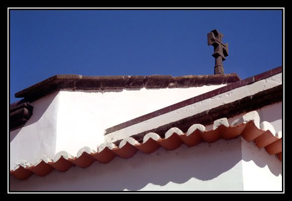
i think i like the top one best, just the pure geometry of the shapes and the bright bold color. the second one i actually like cropped square, just about at the top edge of the shrub in the planter. the third one is my least fave because the "chunk" of the building thrusts into the scene in a disruptive manner. [all of course, being only my opinions, and worth what you paid for them].
Reply
I see what you mean about the square crop on the second one. It could certainly work that way (and would probably result in a very appealing geometrical composition), but it would rob the photo of its most distinctly Portuguese element: the blue-and-white azulejos tiles. They were the main reason I took the photo, so I opted to keep them in when I edited the photo. I may try a square version, though, at some point. Thanks for the suggestion.
As for the other two photos, I've been wondering whether they would work in black and white, since they're all about lines and contrast rather than colour. I think I'll give black and white a shot at some point.
I see what you mean about the building ruining the third photo. It's not a very pretty building, is it? For me, though, that's exactly what the photo is about: the contrast between the vaguely elegant, old-fashioned vane on the left and the ugly, modern shape on the right. It's not pretty per se, but I sort of like the contrast in styles.
Reply
i'm cool with your reasoning on the last one. it also raises another old photo issue...captioning. you can have a photo of almost anything, but you may have to caption it if you want everyone to see the same thing in it that you see. sometimes, its obvious what the point of the photo was; sometimes not.
hey, by the way. i remembered my password. i'm born again.
Reply
Captions may be a good idea. I usually try to convey some idea of what a photo is all about for me in my subject line or introduction, but when I lump several photos together in one post, I may have to think of captions. Thanks for the suggestion.
As for "taotianone", is that taotian as in "heinous", "monstrous"? Interesting username...
Reply
this logging in thing is quite cool. your comment came in an email; i didn't have to go digging for it. wish i'd thought of in-logging a long time ago.
Reply
Being logged in is completely cool. There's a reason why so many people like it. :-)
I've added your journal to my friends list. I look forward to seeing more of your black and whites!
Reply
the crop in the 1st one is very good. beautiful geometry, and colour, of course. i love blue skies & white houses.
i like a lot the second one. as it is. i like the portuguese azulejos, and i think it works great as a whole. it's a beautiful spot & view (i know i'm explaining myself very badly).
i see what you like in the last one (specially since i've read the previous comment ^__^v) i think the problem with it is that the building isn't straight. if it was it'd be a really awesome picture.
*sighs* it's awful when real life isn't as it should be. specially when there's no straight lines *i'm so nice*
Reply
Yes, white houses and blues skies are a great combination. They're one of my favourite things about Mediterranean countries -- and China. I love white Chinese houses. It's a pity so many of them are being tiled over. White Chinese houses with tiles on the walls look rather like... bathrooms.
I agree the third picture would have been better if the building had been straight, but I don't really mind it not being straight. Normally that sort of thing does bother me, but in this picture, it somehow doesn't. Interesting.
Reply
Leave a comment