Tut #2
From 
to
Okay, so today, we're going from
to
First, start with your base image. If it's in colour, desaturate it to make it black and white.
(You may also want to pump up the contrast, but that's your choice.)
At this point, I decided my image was a little too dark, so I duplicated it, and set the duplicate to screen, opacity 90% (Fiddle with this number).

{This is optional.. And I know it looks a little too bright, but you'll need it bright later on.)
Next, add a new color balance adjustment layer. (Layers->New Adjustment Layer->Color Balance)
Settings
Midtones: -25, 0, 25
Shadows: -25, 0, 25
Here's how it should look:
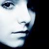
Add a new raster layer, set it to exclusion, opacity 70%, and fill it with
(#0B2E55)

Next, duplicate your base, drag it to the top, and set it to Luminance (Opacity 100%)

And now to finish it off, add a new raster layer, set it to burn, opacity 52%, and fill it with
(#95DDF5)
(Add brushes/text or whatever you want now)
And there you have it!
If you have any problems, let me know.
I love comments/feedback, and seeing what you guys came up with XD
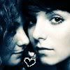
Other icons made using the same technique:


to
Okay, so today, we're going from
to
First, start with your base image. If it's in colour, desaturate it to make it black and white.
(You may also want to pump up the contrast, but that's your choice.)
At this point, I decided my image was a little too dark, so I duplicated it, and set the duplicate to screen, opacity 90% (Fiddle with this number).
{This is optional.. And I know it looks a little too bright, but you'll need it bright later on.)
Next, add a new color balance adjustment layer. (Layers->New Adjustment Layer->Color Balance)
Settings
Midtones: -25, 0, 25
Shadows: -25, 0, 25
Here's how it should look:
Add a new raster layer, set it to exclusion, opacity 70%, and fill it with
(#0B2E55)
Next, duplicate your base, drag it to the top, and set it to Luminance (Opacity 100%)
And now to finish it off, add a new raster layer, set it to burn, opacity 52%, and fill it with
(#95DDF5)
(Add brushes/text or whatever you want now)
And there you have it!
If you have any problems, let me know.
I love comments/feedback, and seeing what you guys came up with XD
Other icons made using the same technique: