#42. Ask the Maker: Part 2
Requested by fouroux
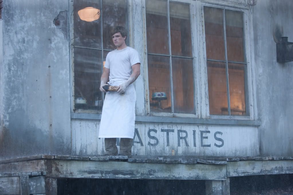
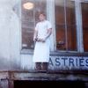
→
1. Crop
Open a 100x100px canvas and drag and drop the screencap on it. Resize it Ctrl+T and play around a little bit until you find a good placement for it. I chose a center crop because I love how those look especially when they have also negative space.

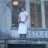
→
2. Coloring: Gaussian Blur
Because the cap is already very blue, I decided to follow that direction and make a soft blue icon out of it. The first thing I made and one of my MUST steps was duplicating the base and gaussian blur softlight it.
Duplicate the base.
Filter → Blur → Gaussian Blur.
Set the Radius to 3,5 and click OK.
Now set the layer to Soft Light 100% opacity.

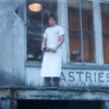
→
3. Gradient fest
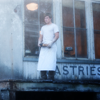
It looks really nice but I think that the lighting is really poor. Gradients are my crack and I always use them in case I'm having trouble.
Layer → New Fill Layer → Gradient Fill: Black and White.
Linear style, 120º angle, 100% scale and aligned with the layer.
Set it to Soft Light Opacity: 100%.
Duplicate the gradient and set the opacity to 70%.

→
4. I'm blue
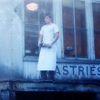
Now it looks so much better. As I said, I was going for a blue-ish coloring so I added a fill layer in a soft but powerful blue.
Layer → New Fill Layer → Full Color → #4c7fdb.
Set it to Soft Light, 60% opacity.

→
5. Sharp
The icon so far is looking good in terms of coloring but it looks too blurry because of the gaussian blur and the gradients. That's not nice, so let's fix it.
Filter → Sharpen → Sharpen
Lower the opacity of this layer set to normal to 50%.

→
6.Color Balance
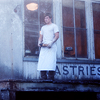
As I said, in terms of color the icon so far looks nice but I think that the blues are too obvious. To make them look softer and natural but still have a blue icon, I used the Color Balance tool, it is always super useful and one of my favorites.
Layer → New Adjustment Layer → Color Balance
Midtones: +15, -20, -20
Shadows: +10, +5, -15

→
7. Moar gradients
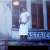
I think that it looks really nice but that the contrast and lights are a bit unbalanced. Once again, favorite too ever: Black and White gradient!
Layer → New Fill Layer → Gradient Fill: Black and White.
Linear style, -120º angle, 100% scale and aligned with the layer.
Set it to Soft Light Opacity: 60%.

→
8. Natural
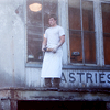
I still think it looks nice BUT I believe that the icon would be more powerful with softer and more natural colors. This way I wanted to reflect somehow the feelings I got from reading how life was in District 12. To achieve that natural look but still make the blues remain a little bit I added a yellow layer fill.
Layer → New Fill Layer → Full Color → #bca774.
Set it to Soft Light, 75% opacity.

→
8. Final touch
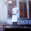
It's done but in my opinion, it needs a final touch of deepness and softness. Once again le's gaussian blur it, and we're done with this icon!
Filter → Blur → Gaussian Blur.
Set the Radius to 2 and click OK.
Now set the layer to Soft Light 45% opacity.

→
That's everything you need to know about this icon. I hope it helps ;)
I'm open to more requests at my thread!

Ask The Maker || My Thread

→

1. Crop
Open a 100x100px canvas and drag and drop the screencap on it. Resize it Ctrl+T and play around a little bit until you find a good placement for it. I chose a center crop because I love how those look especially when they have also negative space.

→

2. Coloring: Gaussian Blur
Because the cap is already very blue, I decided to follow that direction and make a soft blue icon out of it. The first thing I made and one of my MUST steps was duplicating the base and gaussian blur softlight it.
Duplicate the base.
Filter → Blur → Gaussian Blur.
Set the Radius to 3,5 and click OK.
Now set the layer to Soft Light 100% opacity.

→

3. Gradient fest
It looks really nice but I think that the lighting is really poor. Gradients are my crack and I always use them in case I'm having trouble.
Layer → New Fill Layer → Gradient Fill: Black and White.
Linear style, 120º angle, 100% scale and aligned with the layer.
Set it to Soft Light Opacity: 100%.
Duplicate the gradient and set the opacity to 70%.

→

4. I'm blue
Now it looks so much better. As I said, I was going for a blue-ish coloring so I added a fill layer in a soft but powerful blue.
Layer → New Fill Layer → Full Color → #4c7fdb.
Set it to Soft Light, 60% opacity.

→

5. Sharp
The icon so far is looking good in terms of coloring but it looks too blurry because of the gaussian blur and the gradients. That's not nice, so let's fix it.
Filter → Sharpen → Sharpen
Lower the opacity of this layer set to normal to 50%.

→

6.Color Balance
As I said, in terms of color the icon so far looks nice but I think that the blues are too obvious. To make them look softer and natural but still have a blue icon, I used the Color Balance tool, it is always super useful and one of my favorites.
Layer → New Adjustment Layer → Color Balance
Midtones: +15, -20, -20
Shadows: +10, +5, -15

→

7. Moar gradients
I think that it looks really nice but that the contrast and lights are a bit unbalanced. Once again, favorite too ever: Black and White gradient!
Layer → New Fill Layer → Gradient Fill: Black and White.
Linear style, -120º angle, 100% scale and aligned with the layer.
Set it to Soft Light Opacity: 60%.

→

8. Natural
I still think it looks nice BUT I believe that the icon would be more powerful with softer and more natural colors. This way I wanted to reflect somehow the feelings I got from reading how life was in District 12. To achieve that natural look but still make the blues remain a little bit I added a yellow layer fill.
Layer → New Fill Layer → Full Color → #bca774.
Set it to Soft Light, 75% opacity.

→

8. Final touch
It's done but in my opinion, it needs a final touch of deepness and softness. Once again le's gaussian blur it, and we're done with this icon!
Filter → Blur → Gaussian Blur.
Set the Radius to 2 and click OK.
Now set the layer to Soft Light 45% opacity.

→

That's everything you need to know about this icon. I hope it helps ;)
I'm open to more requests at my thread!

Ask The Maker || My Thread