002 Guide: Greyscale, Hue/Sat, & Levels
Alrighty, so I've wanted to do a guide/min-tutorial type thing reguarding PSP for a while. This isn't a case where I'll go in depth into each and every thing PSP can do, I'll just be covering certain techniques that I think may be helpful. There's a lot of these for PS users around, so I figured I'd put in my two cents with PSP. However, these tips can easily be used in both programs. Outside of PS and PSP, I have no clue. Some of this may have been mentioned before, but I do hope you find at least one thing that you didn't know before. So, on to what we'll be covering. Oh, one more thing. I am by far not an icon-genuis. I don't want to give the impression that I am, and have this whole "my icons are the bananas, and yours sux. die" mentality. No, not by a long shot. Really, this is just so I have something to do for the next however long it takes me.
Greyscaling
Hue/Saturation
Levels
Note: When I first started this I had intended to do Greyscale, Hue/Sat, Levels, Color Balance, and Scripts. But seeing as it's this long already and I've only done the first three, I'll leave the others for another time (assuming there's an intrest in them).
Not that Image Heavy
VERY! Text Heavy (Xenia = Rambler)
If you have any questions, please ask.
FRIEND ME to keep up with updates.
GREYSCALING;
Greyscale is ♥. That's it, moving on. No, but seriously, I have a softspot for greyscale. I swear, there are more people that know I love greyscale then there are who know my real name. Generally in my icons, if the entire icon isn't Greyscaled, more than likely at least a part of it is.
As far as I know there are 4 ways (in PSP) to make an image Black and White.
01: Adjust >> Hue / Saturation >> Colorize >> Settings: Hue: XX (number does matter) Saturation: 0. (Shift + L)
02. Adjust >> Hue / Saturation >> Hue/Saturation/Lightness >> Settings: Master - Saturation: -100. (Shift + H)
03. Layers >> New Raster Layer >> Flood fill with Black or White >> Set Mode to Color.
04. Image >> Greyscale
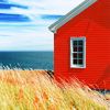
In this example, I used options number 1, 3, and 4. I didn't use 2, because has the exact same outcome as 1.
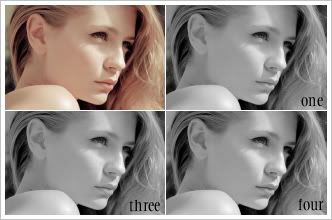
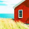
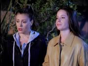
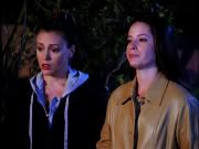
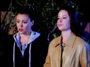
Now, in an unaltered image (like the one shown), doing any of these options is fine. You hardly see a difference at all. However, maybe I'm the only one that does this, but I usually do my greyscaling after I have already done my coloring. Sounds weird, I know. But it's just the way I do it. I do all my coloring, and then if I don't like the way it turns out (or I know I only want a part of it black/white), I make it greyscaled. Here's were you'll notice a difference.
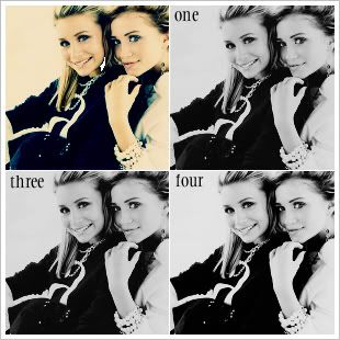
Call me crazy, but there's a different ... right? Using Option 1 (/2), it darkens it up, as well as makes it pretty flat. Sure, this can be fixed by messing with Brightness/Contrast, but we shouldn't have to do that in the first place. Using Option 3, it doesn't darken it up as much, but it still does, as well makes it lose contrast. Then there's Option 4, maybe I'm biased and I just choose to see prettyness ... but really, you can at least tell there's a different. Looking at the background alone, and the contours of the face. The other options flattened out the image, whereas going Image >> Greyscale, leaves the contrast that is already there.
Notes: For those that didn't know, using Option Four, it does make the entire Image (and all it's layers) Greyscaled. Meaning, you can only work with grey/black/white tones. Which is why CTRL+SHIFT+C and CTRL+Z and CTRL+L are my favorite commands ever. Doing the first will copy exactly what you see (does the same as if were you to go Layers >> Merge >> Flatten), the second Undos the Greyscaling you just did, and then the last pastes it on to a new layer. Doing it this way is good for a few reasons, the main one being it pastes the copy of the merge on to a new layer, and you'll still have all of your adjustment under that layer. So if you want to make any changes, you can just delete the Greyscaled layer, and make your changes and repeat. If you know all along you want your image to black and white, then just Flatten your image (while still in Greyscale Mode), and then go Image >> Increase Color Depth >> 16 Million Colors (24 bit). Now you can continue playing with color, while still having your pretty Black/White image.
There's a couple more things I want to talk about Greyscaling, but I'll get to those later on in this. So this is all for now. What have we learned, besides my weird obsession with Greyscale? Always make your image greyscaled by Image >> Greyscale. Pretty pretty Greyscale.
HUE/SATURATION;
When it comes to Hue/Saturation (found by going Adjust >> Hue and Saturation >> Hue/Saturation/Lightness or Layers >> New Adjustment Layer >> Hue/Saturation/Lightness), people often forget that there's more that can be done than just upping the Saturation of all the colors. I know in PS there's a nifty option called Selective Color, almost makes me want to open PS CS and work with it instead of PSP ... almost. While it doesn't work as nicely as SC, it comes sort of close.
Here's your Palette.
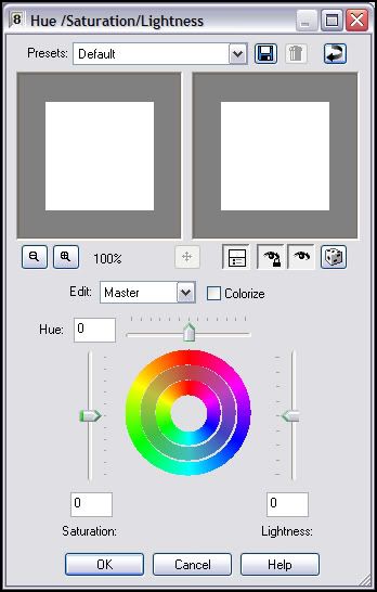
Clicking where it says Edit : Master (the little arrow) you get the following:
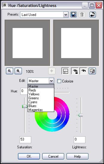
Depending on your picture, whatever color you want to pop, raise the slider up. For example, if you're working with a picture with grass in the background or a sky/ocean in the background (think Lost caps), you would want those to stand out. So you would choose Greens and then bring the slider up, choose Blues and bring the sliders up. Then if you want all of the image to pop, go to Master and slide that up.
Let's take this tutorial by brasaremean over at _sinelina. I'm using this tutorial because it's the first tutorial (that I know of) that ever mentioned Selective Colors. Plus it's a great tutorial and already happened to be saved. Anyway. I followed the tutorial up until the Selective Coloring stage, then realized I was screwed. But not exactly, I had to use Hue/Saturation instead. (Hope it's okay I'm using the same base/your tutorial as an example brasaremean, if not let me know.)
Layers >> New Adjustment Layers >> Hue/ Saturation/Lightness
I put in the following settings (Only used the Saturation option, I didn't use Lightness).
Master: 0
Reds: 45
Yellows: 20
Greens: 30
Cyans: 13
Blues: 100
Magenta: 0
Then I did what she suggested and put it under the Curves layer. Now obviously our outcomes are different, her sky is a nicer shade of blue. But you work with what you're given, and it really does beat just skipping a tutorial because PSP doesn't have Selective Coloring like I have read some people have done.
Her Outcome:
>>
My Outcome:
>>
While this works great in "upping" a certain colors, it works just as well if you want to decrease a certain color. Say your icon has too much Magenta and Yellow, but not enough Cyan and Blue. So bring the slider down under Magenta and Yellow, and bring it up in the Cyan and Blue. Just play.
LEVELS;
Levels can be found at: Adjust >> Brightness/Contrast >> Levels or Layers >> New Adjustment Layer >> Levels
Levels are great if you just want to lighten an image as well as give it contrast.

>>
Settings:
RGB: Input: 40, 1.6, 203
But it does so much more.
Layers >> New Adjustment Layer >> Levels
Settings:
RGB: Input: 40, 1.6, 203
Layers >> New Adjusmtne Layer >> Levels
Settings:
RGB: 0, 1, 255
Red: 86, 1.4, 255
Green: 36, 1.37, 245
Blue: 43, .83, 214
Duplicate current Levels Layer, set to 50% Opacity.
You know where Levels really come in handy? You know how in tutorials it usually goes Base >> Screen Layer >> Screen Layer >> Screen Layer >> Softlight Layer. Well, a lot of times, if you're just duplicating your base layer, bringing to the top and setting it to softlight, it darkens up the cap all over again, dispite however many Screen Layers you use. And the more Screen Layers you use, the more it washes out the icons! However! Levels can help that. If your cap is really dark, once you get to the "Duplicate base, drag to top, set to soft light" step, go to Adjust >> Brightness/Contrast >> Levels. And then slide the middle slider (the grey one) towards the left, as well as the one on the left (the white one). To keep the contrast, slide the left slider (the black one) towards the grey one. This'll lighten up the cap, keep the contrast, and all will be good.
In action:
++
++
The first one it goes Base >> Screen Layer >> Screen Layer >> Screen Layer.
The second one it goes Base >> Screen Layer >> ScreenLayer >> Screen Layer >> Softlight Layer.
The third one it goes Base >> Screen Layer >> Screen Layer >> ScreenLayer >> Softlight Layer Altered w/Levels.
Levels Setting:
RGB: 16, 3.12, 190
Final Levels tip: Levels work GREAT for greyscale images! It darkens up parts where it should be darkend (black point), lightens what should be lightened (white point), and can make the entire image lighter or brighter (greypoint). 9 times out 10, if I have a greyscale layer, I use Levels to add contrast, instead of Brightness/Contrast option.
And that is it. I know, I really should work on keeping things shorter. I tried, really I did! Hopefully something was of use for someone. If any one has any questions, or would like me to talk more about a certain area (or another area all together), please feel free to ask. Oh, and if by chance this did help you, a comment telling me would be very very appreciated. 'Nuff stallin', off to do some cleaning.
Note: When I first started this I had intended to do Greyscale, Hue/Sat, Levels, Color Balance, and Scripts. But seeing as it's this long already and I've only done the first three, I'll leave the others for another time (assuming there's an intrest in them).
GREYSCALING;
Greyscale is ♥. That's it, moving on. No, but seriously, I have a softspot for greyscale. I swear, there are more people that know I love greyscale then there are who know my real name. Generally in my icons, if the entire icon isn't Greyscaled, more than likely at least a part of it is.
As far as I know there are 4 ways (in PSP) to make an image Black and White.
01: Adjust >> Hue / Saturation >> Colorize >> Settings: Hue: XX (number does matter) Saturation: 0. (Shift + L)
02. Adjust >> Hue / Saturation >> Hue/Saturation/Lightness >> Settings: Master - Saturation: -100. (Shift + H)
03. Layers >> New Raster Layer >> Flood fill with Black or White >> Set Mode to Color.
04. Image >> Greyscale
In this example, I used options number 1, 3, and 4. I didn't use 2, because has the exact same outcome as 1.
Now, in an unaltered image (like the one shown), doing any of these options is fine. You hardly see a difference at all. However, maybe I'm the only one that does this, but I usually do my greyscaling after I have already done my coloring. Sounds weird, I know. But it's just the way I do it. I do all my coloring, and then if I don't like the way it turns out (or I know I only want a part of it black/white), I make it greyscaled. Here's were you'll notice a difference.
Call me crazy, but there's a different ... right? Using Option 1 (/2), it darkens it up, as well as makes it pretty flat. Sure, this can be fixed by messing with Brightness/Contrast, but we shouldn't have to do that in the first place. Using Option 3, it doesn't darken it up as much, but it still does, as well makes it lose contrast. Then there's Option 4, maybe I'm biased and I just choose to see prettyness ... but really, you can at least tell there's a different. Looking at the background alone, and the contours of the face. The other options flattened out the image, whereas going Image >> Greyscale, leaves the contrast that is already there.
Notes: For those that didn't know, using Option Four, it does make the entire Image (and all it's layers) Greyscaled. Meaning, you can only work with grey/black/white tones. Which is why CTRL+SHIFT+C and CTRL+Z and CTRL+L are my favorite commands ever. Doing the first will copy exactly what you see (does the same as if were you to go Layers >> Merge >> Flatten), the second Undos the Greyscaling you just did, and then the last pastes it on to a new layer. Doing it this way is good for a few reasons, the main one being it pastes the copy of the merge on to a new layer, and you'll still have all of your adjustment under that layer. So if you want to make any changes, you can just delete the Greyscaled layer, and make your changes and repeat. If you know all along you want your image to black and white, then just Flatten your image (while still in Greyscale Mode), and then go Image >> Increase Color Depth >> 16 Million Colors (24 bit). Now you can continue playing with color, while still having your pretty Black/White image.
There's a couple more things I want to talk about Greyscaling, but I'll get to those later on in this. So this is all for now. What have we learned, besides my weird obsession with Greyscale? Always make your image greyscaled by Image >> Greyscale. Pretty pretty Greyscale.
HUE/SATURATION;
When it comes to Hue/Saturation (found by going Adjust >> Hue and Saturation >> Hue/Saturation/Lightness or Layers >> New Adjustment Layer >> Hue/Saturation/Lightness), people often forget that there's more that can be done than just upping the Saturation of all the colors. I know in PS there's a nifty option called Selective Color, almost makes me want to open PS CS and work with it instead of PSP ... almost. While it doesn't work as nicely as SC, it comes sort of close.
Here's your Palette.
Clicking where it says Edit : Master (the little arrow) you get the following:
Depending on your picture, whatever color you want to pop, raise the slider up. For example, if you're working with a picture with grass in the background or a sky/ocean in the background (think Lost caps), you would want those to stand out. So you would choose Greens and then bring the slider up, choose Blues and bring the sliders up. Then if you want all of the image to pop, go to Master and slide that up.
Let's take this tutorial by brasaremean over at _sinelina. I'm using this tutorial because it's the first tutorial (that I know of) that ever mentioned Selective Colors. Plus it's a great tutorial and already happened to be saved. Anyway. I followed the tutorial up until the Selective Coloring stage, then realized I was screwed. But not exactly, I had to use Hue/Saturation instead. (Hope it's okay I'm using the same base/your tutorial as an example brasaremean, if not let me know.)
Layers >> New Adjustment Layers >> Hue/ Saturation/Lightness
I put in the following settings (Only used the Saturation option, I didn't use Lightness).
Master: 0
Reds: 45
Yellows: 20
Greens: 30
Cyans: 13
Blues: 100
Magenta: 0
Then I did what she suggested and put it under the Curves layer. Now obviously our outcomes are different, her sky is a nicer shade of blue. But you work with what you're given, and it really does beat just skipping a tutorial because PSP doesn't have Selective Coloring like I have read some people have done.
Her Outcome:
>>
My Outcome:
>>
While this works great in "upping" a certain colors, it works just as well if you want to decrease a certain color. Say your icon has too much Magenta and Yellow, but not enough Cyan and Blue. So bring the slider down under Magenta and Yellow, and bring it up in the Cyan and Blue. Just play.
LEVELS;
Levels can be found at: Adjust >> Brightness/Contrast >> Levels or Layers >> New Adjustment Layer >> Levels
Levels are great if you just want to lighten an image as well as give it contrast.
>>
Settings:
RGB: Input: 40, 1.6, 203
But it does so much more.
Layers >> New Adjustment Layer >> Levels
Settings:
RGB: Input: 40, 1.6, 203
Layers >> New Adjusmtne Layer >> Levels
Settings:
RGB: 0, 1, 255
Red: 86, 1.4, 255
Green: 36, 1.37, 245
Blue: 43, .83, 214
Duplicate current Levels Layer, set to 50% Opacity.
You know where Levels really come in handy? You know how in tutorials it usually goes Base >> Screen Layer >> Screen Layer >> Screen Layer >> Softlight Layer. Well, a lot of times, if you're just duplicating your base layer, bringing to the top and setting it to softlight, it darkens up the cap all over again, dispite however many Screen Layers you use. And the more Screen Layers you use, the more it washes out the icons! However! Levels can help that. If your cap is really dark, once you get to the "Duplicate base, drag to top, set to soft light" step, go to Adjust >> Brightness/Contrast >> Levels. And then slide the middle slider (the grey one) towards the left, as well as the one on the left (the white one). To keep the contrast, slide the left slider (the black one) towards the grey one. This'll lighten up the cap, keep the contrast, and all will be good.
In action:
++
++
The first one it goes Base >> Screen Layer >> Screen Layer >> Screen Layer.
The second one it goes Base >> Screen Layer >> ScreenLayer >> Screen Layer >> Softlight Layer.
The third one it goes Base >> Screen Layer >> Screen Layer >> ScreenLayer >> Softlight Layer Altered w/Levels.
Levels Setting:
RGB: 16, 3.12, 190
Final Levels tip: Levels work GREAT for greyscale images! It darkens up parts where it should be darkend (black point), lightens what should be lightened (white point), and can make the entire image lighter or brighter (greypoint). 9 times out 10, if I have a greyscale layer, I use Levels to add contrast, instead of Brightness/Contrast option.
And that is it. I know, I really should work on keeping things shorter. I tried, really I did! Hopefully something was of use for someone. If any one has any questions, or would like me to talk more about a certain area (or another area all together), please feel free to ask. Oh, and if by chance this did help you, a comment telling me would be very very appreciated. 'Nuff stallin', off to do some cleaning.