guide
Want to go from something like this to 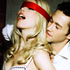
?
Image Heavy in depth guide under the cut. NOT DIAL UP FRIENDLY
Explains curves, color balance, selective color and hue/saturation
Made with Adobe Photoshop 7, non-translatable, sorry.
Now, I understand that a lot of you like to just punch numbers into photoshop from other peoples tutorials, but I PROMISE you, that's not gonna help you learn how to do it yourself. You need to learn the basics, and experiment with them. I'm going to attempt to show you WHY I do what I do.
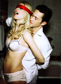
I've picked a photo from a sexy photoshoot of Joseph Gordon-Levitt and Claudia Schiffer from GQ magazine.
Normally with High Quality photos like this I do all of my coloring before resizing and cropping, but for the sake of this tutorial, I'll shrink them a bit.
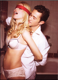
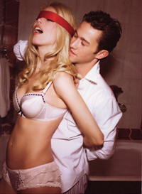
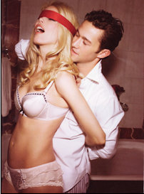
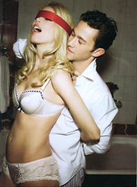
Here is our base:
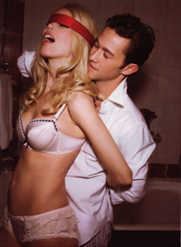
as you can see, it's a bit dark and a bit one-dimensional. it needs some pizzaz.
I already know that it needs to be lighter, and have more contrast, and more color. BUT HOW DO I DO THAT, you may ask. Hopefully I can help you with that.
First off, we need to make this sucker lighter. There are a few different ways to do that. Screen layers, curves, it all depends on your image. I started with a screen layer. Why a screen layer? I always start with a screen layer, and mess with the opacity. Sometimes I need one, sometimes I need several, sometimes I find I don't need any at all. It's all trial and error. That's how we learn what works, and what doesn't.
When I set this particular image to screen at 100% it was far to light. See how a lot of the highlights (middle picture) are kinda blown out? We don't want that, so I lowered the opacity.
>
>
To what? It doesn't matter, because the picture you have isn't going to need the same settings as mine. Just lower it until it looks right to you. Maybe after the screen layer, your picture is still dark. Try duplicating it. Remember you can always go back and change it. That's the beauty of working in layers.
The picture could still use a little lightening, and some contrast (lights lighter, darks darker). You can add contrast by duplicating again and setting to softlight, adding a brightness or contrast layer, or curves. I'll be using curves because with curves I can lighten, add dimension, and fix color all together.
I know a lot of you are scared of curves, but it really is a VERY helpful tool, if you know how to use it. It is true that if you're just plugging in numbers people used on other bases, it probably won't do much for you. I'll try and explain the basics to you.
We'll start with RBG. This lightens and darkens the overall picture.
If you want to make a picture darker with curves, you click anywhere on the line and pull it down and to the right. Go ahead try it.
To make it lighter, you pull it up and to the left. As you know, I wanted to make this base lighter, so I pulled mine up a bit, and to the left an even smaller bit.
>
as you can see, it lightened it more without washing it out too much. now in the same curves layer I fiddled with the colors to make it a little more normal looking.
The basic rule of the color channels in curves is this: Pull the line up, and you'll add more of whatever color you are currently in. Pull it down you'll add more of the complementary color. Moving away from red will add cyan, moving away from green will add magenta, and moving away from blue will add yellow. I moved the red channel down, the green channel up slightly, and the blue channel down. This added more cyan, green and yellow.
>
looks a lot better already doesn't it? Now we can work on the coloring. I almost always start with a color balance layer to set the overall tone of the icon/graphic before working on more specific coloring. Color balance works similarly to curves in that moving away from red gives you cyan, green gives you magenta, etc. You may notice that when you move the slider you might get the color you want in one place, but that messes it up in other places. Do not fear. If you go to the shadows and highlights channels you can fix some of that. Remember just look at YOUR picture. What does it need more of, what does it need less of? Just move the sliders back and forth and find what looks right. That is how I find most of my colorings. I wanted more cyan (less red) so in midtones, shadows, and highlights i moved the cyan-red slider toward cyan, then used slight changes to the magenta-green and yellow-blue
>
Now it's time for fine tuning. This is where I always use selective coloring. I want to bring out the reds, enhance the skintone, and add a little more depth to the picture. Now I could try to explain selective coloring to you, but I would never be able to do it as well as this tutorial by
going_x_crazy. My results:
>
I still feel like we could make it pop a little more so I added a hue/saturation layer. Hue/saturation is pretty self explanatory. With the Saturation slider the master setting affects the whole picture, reds affect the red, etc. Moving the slider to the right increases saturation, moving it to the left decreases saturation. I never touch hue and lightness, because I feel that there are better methods. When I upped the saturation of the whole photo, it made the yellows too saturated, so I went to the yellows and moved the slider to the left. Then I added a little punch to the blindfold/her lips by moving the red and magenta sliders to the right a bit.
>
Subtle difference, but I like it better:) It added a little pop.
Now I felt like I wanted more contrast again, and I wanted to deepen the colors a bit. This is something I do with almost every single one of my icons. I love the effect it has. I add a new gradient map in black and white. If you already have your foreground color as black and your background color as white, all you have to do is go to New Adjustment Layer and click on Gradient Map. Then I put this layer at softlight and lower the opacity to whatever looks best.
>
See how that makes the colors deeper and richer? This is a very simple way of doing it.
And we're done. Now all you need to do is crop it, and that's it.
I have one more thing I wanna show you. If I were to take another image from the same photo shoot with a very similar coloring. Let's say this one:
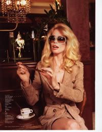
and use the exact numbers i used for my tutorial I'd end up with this:
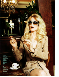
when playing with new numbers could give me something like this:
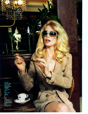
see how the colors are deeper and flatter the image?
The moral of the story is, before you just plug in random numbers without even knowing what they mean, you should try playing around with your photo. How else will you get better?
I know that was really long, but I hope it helps. If any of you have questions PLEASE ASK. I tried to explain the best that i could.
?
Image Heavy in depth guide under the cut. NOT DIAL UP FRIENDLY
Explains curves, color balance, selective color and hue/saturation
Made with Adobe Photoshop 7, non-translatable, sorry.
Now, I understand that a lot of you like to just punch numbers into photoshop from other peoples tutorials, but I PROMISE you, that's not gonna help you learn how to do it yourself. You need to learn the basics, and experiment with them. I'm going to attempt to show you WHY I do what I do.
I've picked a photo from a sexy photoshoot of Joseph Gordon-Levitt and Claudia Schiffer from GQ magazine.
Normally with High Quality photos like this I do all of my coloring before resizing and cropping, but for the sake of this tutorial, I'll shrink them a bit.
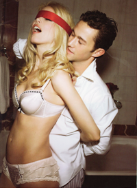
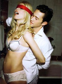
Here is our base:
as you can see, it's a bit dark and a bit one-dimensional. it needs some pizzaz.
I already know that it needs to be lighter, and have more contrast, and more color. BUT HOW DO I DO THAT, you may ask. Hopefully I can help you with that.
First off, we need to make this sucker lighter. There are a few different ways to do that. Screen layers, curves, it all depends on your image. I started with a screen layer. Why a screen layer? I always start with a screen layer, and mess with the opacity. Sometimes I need one, sometimes I need several, sometimes I find I don't need any at all. It's all trial and error. That's how we learn what works, and what doesn't.
When I set this particular image to screen at 100% it was far to light. See how a lot of the highlights (middle picture) are kinda blown out? We don't want that, so I lowered the opacity.
>
>
To what? It doesn't matter, because the picture you have isn't going to need the same settings as mine. Just lower it until it looks right to you. Maybe after the screen layer, your picture is still dark. Try duplicating it. Remember you can always go back and change it. That's the beauty of working in layers.
The picture could still use a little lightening, and some contrast (lights lighter, darks darker). You can add contrast by duplicating again and setting to softlight, adding a brightness or contrast layer, or curves. I'll be using curves because with curves I can lighten, add dimension, and fix color all together.
I know a lot of you are scared of curves, but it really is a VERY helpful tool, if you know how to use it. It is true that if you're just plugging in numbers people used on other bases, it probably won't do much for you. I'll try and explain the basics to you.
We'll start with RBG. This lightens and darkens the overall picture.
If you want to make a picture darker with curves, you click anywhere on the line and pull it down and to the right. Go ahead try it.
To make it lighter, you pull it up and to the left. As you know, I wanted to make this base lighter, so I pulled mine up a bit, and to the left an even smaller bit.
>
as you can see, it lightened it more without washing it out too much. now in the same curves layer I fiddled with the colors to make it a little more normal looking.
The basic rule of the color channels in curves is this: Pull the line up, and you'll add more of whatever color you are currently in. Pull it down you'll add more of the complementary color. Moving away from red will add cyan, moving away from green will add magenta, and moving away from blue will add yellow. I moved the red channel down, the green channel up slightly, and the blue channel down. This added more cyan, green and yellow.
>
looks a lot better already doesn't it? Now we can work on the coloring. I almost always start with a color balance layer to set the overall tone of the icon/graphic before working on more specific coloring. Color balance works similarly to curves in that moving away from red gives you cyan, green gives you magenta, etc. You may notice that when you move the slider you might get the color you want in one place, but that messes it up in other places. Do not fear. If you go to the shadows and highlights channels you can fix some of that. Remember just look at YOUR picture. What does it need more of, what does it need less of? Just move the sliders back and forth and find what looks right. That is how I find most of my colorings. I wanted more cyan (less red) so in midtones, shadows, and highlights i moved the cyan-red slider toward cyan, then used slight changes to the magenta-green and yellow-blue
>
Now it's time for fine tuning. This is where I always use selective coloring. I want to bring out the reds, enhance the skintone, and add a little more depth to the picture. Now I could try to explain selective coloring to you, but I would never be able to do it as well as this tutorial by
going_x_crazy. My results:
>
I still feel like we could make it pop a little more so I added a hue/saturation layer. Hue/saturation is pretty self explanatory. With the Saturation slider the master setting affects the whole picture, reds affect the red, etc. Moving the slider to the right increases saturation, moving it to the left decreases saturation. I never touch hue and lightness, because I feel that there are better methods. When I upped the saturation of the whole photo, it made the yellows too saturated, so I went to the yellows and moved the slider to the left. Then I added a little punch to the blindfold/her lips by moving the red and magenta sliders to the right a bit.
>
Subtle difference, but I like it better:) It added a little pop.
Now I felt like I wanted more contrast again, and I wanted to deepen the colors a bit. This is something I do with almost every single one of my icons. I love the effect it has. I add a new gradient map in black and white. If you already have your foreground color as black and your background color as white, all you have to do is go to New Adjustment Layer and click on Gradient Map. Then I put this layer at softlight and lower the opacity to whatever looks best.
>
See how that makes the colors deeper and richer? This is a very simple way of doing it.
And we're done. Now all you need to do is crop it, and that's it.
I have one more thing I wanna show you. If I were to take another image from the same photo shoot with a very similar coloring. Let's say this one:
and use the exact numbers i used for my tutorial I'd end up with this:
when playing with new numbers could give me something like this:
see how the colors are deeper and flatter the image?
The moral of the story is, before you just plug in random numbers without even knowing what they mean, you should try playing around with your photo. How else will you get better?
I know that was really long, but I hope it helps. If any of you have questions PLEASE ASK. I tried to explain the best that i could.