021.a TUTORIAL {part one}
this is part one
go here for part two
I'm constantly seeing rants over at iconrants, about people abusing selective coloring, and honestly I'm in agreement with them 99% of the time. But I started thinking, "Do people even really know HOW selective coloring works?" Usually when somebody wants to know a coloring technique, the answer given is 'use selective coloring' and that's it. Or when people post tutorials using SC, they just give the input numbers without explaining the reasoning behind using THOSE particular numbers. Honestly, they WILL NOT work the same for every image, so it's pointless. Nobody learns anything from this behavior. So here I am, trying to teach those who are actually interested in knowing what selective coloring is. (though, I only know what I've taught to myself) If my wording is a little confusing to you, feel free to ask me anything. I'll try to re-explain it the best I can.
WARNING: IMAGE HEAVY
First things first, where is the selective coloring located?
There are two places you can go to, to get selective coloring. The first one is under IMAGE > ADJUSTMENTS > SELECTIVE COLOR... Using SC here applies the effect to the layer of the image you are currently working on. You cannot easily go back and alter the SC effect, and so this is not the one I prefer to use.
The other place where you can find SC is under LAYERS > NEW ADJUSTMENT LAYER > SELECTIVE COLOR..., and this creates a new layer on top of your image. You can always go back later to edit your coloring by double clicking on the SC layer in the layers pallet, after it's already been applied. Also you can change the opacity, or the mode (soft light, screen, etc) this way. You can even delete the layer if you decide you don't want it, without having to start all over again.
Next, what does selective coloring do?
Well, SC is split up into nine color groups; reds, yellows, greens, cyans, blues, magentas, whites, neutrals, and blacks. They affect the those colors already in your image. So when you alter the greens section, you do not change the reds at all. This is what makes selective coloring different from tools like hue saturation, levels, or curves.
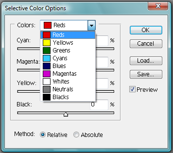
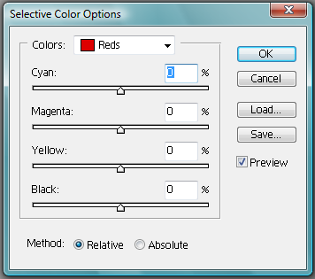
Within those color groups we have four more groups; cyan, magenta, yellow, and black. When you move the slider back and forth -for say the cyan- you change the amount of cyan used in the reds (or whatever color you're working on). Positive cyan is like adding more tealish-blue (cyan). Negative cyan is like adding more red. Positive magenta is like adding more pinkish-red. Negative magenta is like adding a yellowish-green. Positive yellow is like adding... yellow. And negative yellow is like adding blue. The black is kind of like how intense you want the color to be. Negative black makes the color lighter and not as vibrant, and positive black darkens and enriches the color.
Is any of this making sense? If not, here are some visuals to help you out.
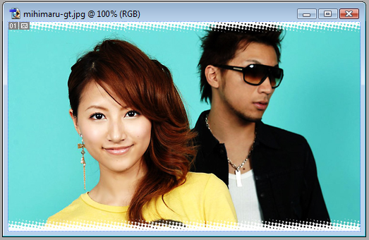
We start with the image we want to edit. (it's a promo pic of the Japanese duo, mihimaru GT. girl=Hiroko, guy=Miyake)
LESS CYAN (= red)

MORE CYAN (= more cyan)

LESS MAGENTA (= yellow-green)
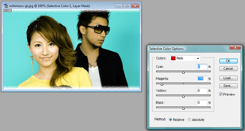
MORE MAGENTA (= pinkish-red)

LESS YELLOW (= blue)
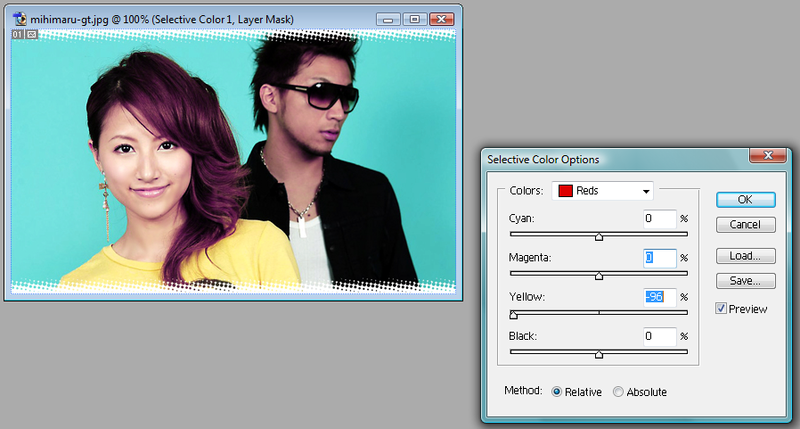
MORE YELLOW (= yellow)

LESS BLACK (= lighter/paler)

MORE BLACK (= darker/richer)
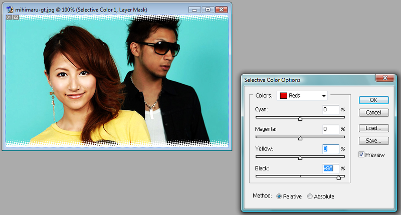
You see how that works now? So I make the reds look how I want by sliding the bar back and forth. I honestly don't pay any attention to the numbers, I'm just going back and forth until I think it looks right. If you are trying this with your own image, your numbers will not be the same as mine. DO NOT COPY NUMBERS EXACTLY. EXPERIMENT. Work with it until you get something you think looks good.
So here's what I have:

I don't remember if I did anything with the yellows (I don't seem to have a screenshot), but I know I didn't do anything to the magentas.
Now, for the cyans we have two ways we can go. We can go with a more greenish-cyan or a blueish-cyan.
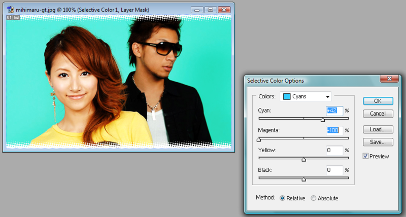

Isn't that cool? If you want to go with the greener of the two, you can further alter the coloring in the greens section. I went with the bluer, and made it a litter more blue in the blue section (sorry, no screencap).
Now at first the whites, blacks, and neutrals all sound like the same thing, right? Well, they're not. Your image is split into lights, darks, and mediums. Obviously white=light, black=dark, and neutral=medium. Now I personally don't use the cyan, magenta, or yellow sliders too often with these last sections. Feel free to experiment with using them. I pretty much just use the black slider.
Here is the white section with negative black

And here is the white section with positive black

As you can see, only the lightest part was effected. In this case that would be the lighting on Hiroko's face, the brightness of Miyake's shirt, and little details in Hiroko's shirt. If you had an image with an area that was supposed to be white, but it wasn't quite there - you can brighten it up with this. In the same token, you can make something that's too white a little less bright. Get it?
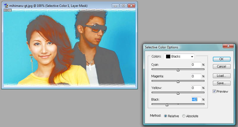
Now, for the blacks, this is the black section with negative black
And this is the black section with positve black
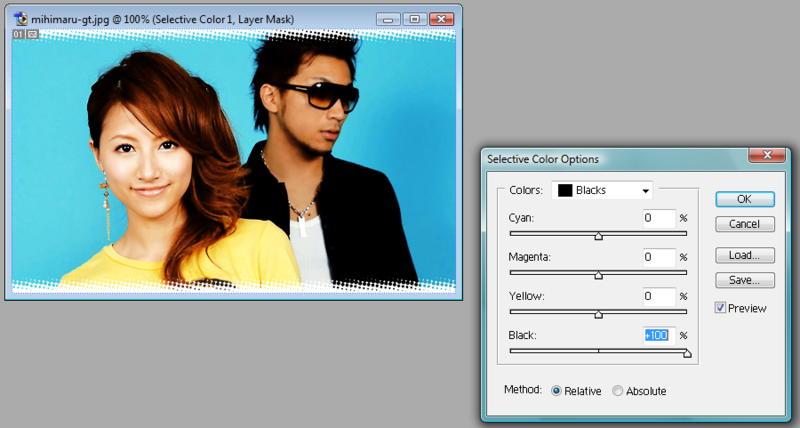
As you can see, by taking the black away we are left with gray, and it looks pretty strange. By adding to the black, I don't know if you can tell, but the black parts are even blacker - uh... darker. If you had an image that was a bit dull, and the black areas were a bit of a gray, you could darken them in this section. Also, if your blacks are too dark, you might be able to lighten them up a little, revealing more details.
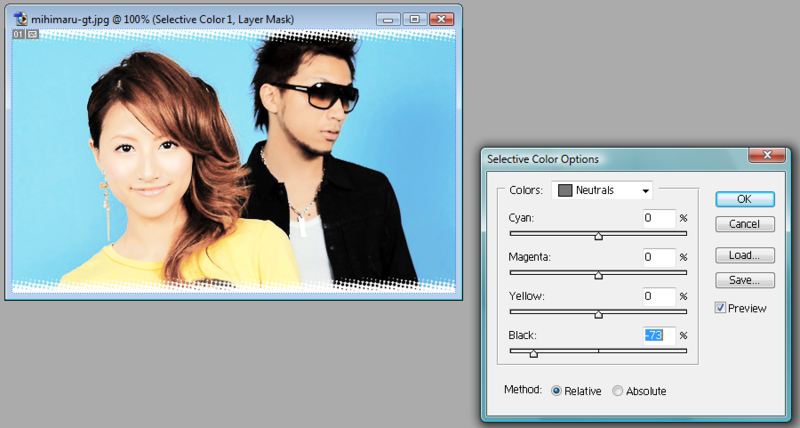
Now onto the neutrals. This is neurals with negative black
And here is neutruals with positive black
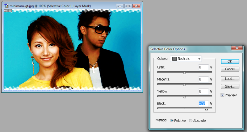
Changing the neutrals makes the medium tones in the image lighter or darker, but it also makes them paler or more vibrant. Your subject could end up looking too washed out, or like they have a really bad sunburn if you aren't too careful!
In the end, this is what I was able to come up with.
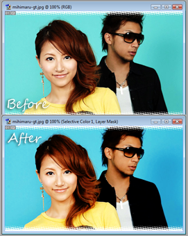
Remember, subtlety can be a good thing! You don't need to have some radioactive insane looking image to be cool ;]
Another good SC tut by cdg can be found here :]