Tutorial 07 ; Miranda Kerr Coloring
From

to

or

USING PS7 - PSP Friendly :)
{Just color layers, color balance & curves}
I haven't done a tutorial in QUITE awhile. So here you go! :)
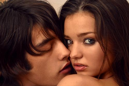
01. I used this image from Miranda Kerr.net. Crop and resize your base to 100x100. Don't sharpen unless you have to. Duplicate your base & set to Screen at 100%.
>

Notice how red/yellowish the icon looks now. It may not look like it matters now, but it's important later on if you want to retain a pink-ish skin tone at the end. So, using Color Balance, increase the Red & Yellow. You can choose to do this now or after the final step. {This depends on your base}.
02. Create a new layer and fill it with a light blue (#83D2FF) and set the blend mode to Soft Light at 100%.

>

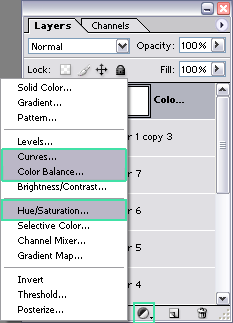
WHERE ARE THE NEW ADJUSTMENT LAYERS? - Screenshot
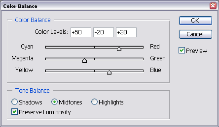
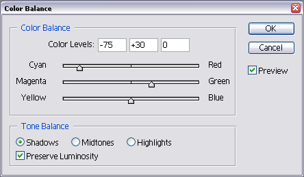
03. Create a new adjustment layer - Color Balance. (Layer > New Adjustment Layer > Color Balance or click on the black/white half-circle on your layers palette and click on Color Balance). Use the following settings:
MIDTONES: +50, -20, +30 // SHADOWS: -75, +30, 0

You can stop here if you want, but why stop the fun?
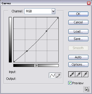
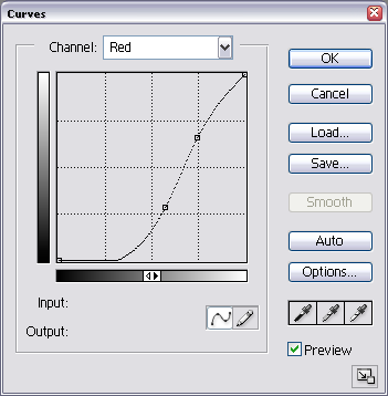
04. Create a new adjustment layer - Curves. I wanted to get some more depth, restore some of the pink, and deepen the green shadows. My settings: RGB RED.
RGB - Point One (I: 188, O: 177); Point Two (I: 74, O: 62)
RED - Point One (I: 190, O: 168); Point Two (I: 146, O: 73)

05. Now, to enhance the colors and make them pop, we add a Hue/Saturation layer. Increase the saturation to +20 or whatever works best with your base.

06. Create a new layer and fill it with a medium blue (#3D5FB9). Set that layer to Soft Light. It made my icon a little too dark and pink, so I lowered the opacity to 30%.

>

07. Create a new layer and fill it with a light yellowish/tan color (#F6EBCE). Set that layer to Multiply. It was a little too harsh and got rid of the blues, so I lowered the opacity to 60%.

>

08. Now depending on your base, it might seem kind of dull. So create another Hue/Saturarion layer. Don't input any numbers and press 'OK'. Set that layer to Soft Light. This step is the equivalent of Select All > Copy Merged and pasting the base on top and setting that to Soft Light.
*STOP HERE OR GO ON TO GET THE SECOND ICON*
09. Merge all. I took a texture by peoplemachines, cropped & resized to my liking and pasted it above the new base. Set that layer to Linear Burn. Then, I pasted a scratchy texture (also cropped to my liking) by lovelamp on top of everything and set that to Lighten AND VOILA!

&

>
I would LOVE to see what ya`ll got! ♥
Examples using this technique:

>


>


>
For My Last Tutorial: