Icons for Dummies 1: Adjustment layers and base prep
Here it is, as promised, the complete beginner's guide to base preparation by moi. I know there are probably a lot of similar tuts floating around online (I know 'cause I learned a lot from them ;)), but I thought I'd write one on my methods, since I've figured out a system that takes bits and pieces from every tutorial I read and smooshes them into a fairly simple procedure I use to prepare 90% of my bases.
This tutorial will be divided up into parts tackling the most common image issues I have dealt with in base preparation, and illustrating techniques on how to fix them in (hopefully) a beginner-friendly manner.
This tutorial is done on Photoshop CS 2 but will probably work on PS 7 and above. Don't know a thing about PSP, sorry. :/ But since this tut is for beginners and doesn't do anything too fancy, it's probably easily translatable. I'm going to assume you have at least a basic knowledge of your program, like how to use brushes, knowledge of layers, etc.
And you will have to excuse the excessive Cordy/Xanderness but I seem to be on a C/X kick lately, which is not a bad kick to be on. ;) Besides, they are very pretty.
Repairing Funktified Colors, and the Wonderful World of Adjustment Layers
A problem I often encounter while working with promos or scans is that many of them are blurry, grainy, and the color is whack. I generally make it a policy to work with HQ pics whenever possible, but sometimes I'll just be dying to icon something I can't find in decent quality for the life of me. Hence this tutorial comes into play.
We're going to use this old promo pic snatched from slayerverse.org as our subject.
As you can see, it suffers from graininess, blurriness and funktified color. I would probably weep and bang my head on my desk if someone asked me to wallpaper it, but it could probably be made into something decent for an icon. So first order of business is to crop it into this here base:
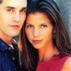
Now the first problem that comes to mind is that it's way too oversaturated. So now we're going to try one of my fave handy-dandy features: the adjustment layer. You can find this feature on the bottom of your layers palette:
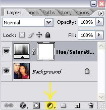
Now, as you can see in the above screenshot, you're going to add a hue/saturation adjustment layer. Do this by clicking the button and selecting... erm... hue/saturation from the dialog box.
When the box pops up, slide the saturation slider down to -24 and leave the rest as is (hue and lightness should both remain on 0).

Better, but still no cigar. We're going to create another adjustment layer. Click the little button and this time, select "color balance." For this particular example, you're going to use the following values. At the botton of the color balance dialog, you should see "shadows, midtones, highlights, etc." Leave "preserve luminosity" ticked (should be by default) and tick "midtones" if it isn't already (shoudl be by default). Now move the sliders to the following values:
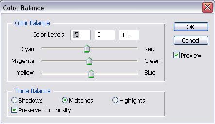
You're going to adjust the shadows now, in much the same way. Tick "shadows" and use the following values: cyan: -25, magenta: -4, yellow: +4. Leave the highlights be this time.
I determine these values mostly by experimentation. I try different values, move back and forth between shadows, midtones, and highlights, adjust and re-adjust till I find something I like. That's the beauty of adjustment layers--very versatile. Anyway, here's a progress report on this here base:
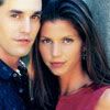
Better, but now the background looks funktified. Enter the miracle of layer masks (well, not a miracle really, but they're quite kewl). On your adjustment layer on the layers palette, you should see a blank white square to the right:

Click on that there square to select it. When selected, a border should appear around it. Now go back to your image, hit "B" to select the brush tool and choose a brush of about 10-13 pixels with soft edges. If the mask is selected, you should notice that your colors in the toolbar have been restored to black and white. Making sure black is your foreground color, brush over the parts of the image that look funky (in this case, the wall by Cordy's head and parts of the hair). When you're done, your icon should look like this:
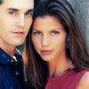
And your layers palette should now look something like this:
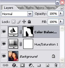
I thought it was still a little too saturated, so I double-clicked on the left-most image on the hue/saturation layer, the one with the funky looking bars and crap, and adusted the saturation to -38. Compare our final product (left, obviously) to the original:


Much better, no? Hopefully you can use these techniques on any other funky-colored images to make them into purdyful icons. :)
Lighten and brighten a dark screencap
The most common issue I have to deal with--dark screencaps. This problem can be solved in a variety of manners, and here I shall share the methods I use most often.
We shall began with a screencap made by moi. I would advise you to use the highest-quality caps you can find, preferably HDTV or DVD. But I often am lazy and make caps from clips I ripped for fan videos. The caps are generally not HQ enough for wallpaper or collage work, but I figure they'll do for icons and banners. Here is one of the aforementioned caps:
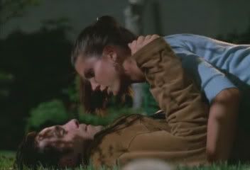
Not a bad cap, except for the darkness and blurriness issue. To resolve some of the darkness issue, I duplicate the background layer and set the copy to lighten:
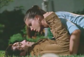
Much better, but it's not quite contrasty enough for me. I whack the opacity of the lighten layer down to about 75%, then merge visible (shift+ctrl+E)
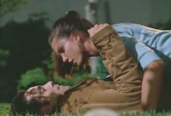
Now for a technique I use so often, I made a photoshop action for it. Duplicate your background layer twice. Whack the second layer to blend mode: overlay, and the third (should be the top) layer to screen. Then select the second (middle) layer and desaturate (shift+ctrl+U). Then whack the screen layer (top) down to about 50% opacity to get:
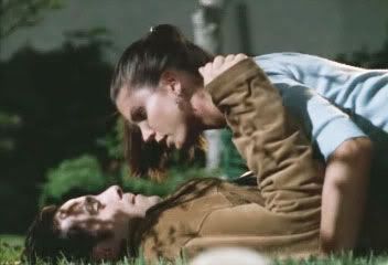
See the pretty contrast? Oh yeah, your layers palette should resemble this:
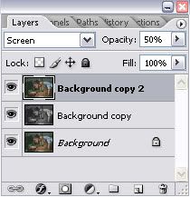
The above technique is extremely versatile and can be used to improve brightness and contrast on almost any screencap. The key is experimentation. Don't slavishly stick to the values I showed you; they won't work on every cap. Move the sliders around, try different opacities, or try desaturating the screen layer instead of the overlay one. Mess with it and see what comes up. Not all experiments work, but it's part of the learning process. You'll get the hang of it in no time. ;)
Now merge all layers, crop your base, and you're ready for fun fun fun sharpening and all that crap. :D
Sharpening and all That Crap
I'm being very lazy again, so I'm going to use the same base from above for this demo.
Now, this should come as a shocker to you, but you're going to use the *gasp* sharpen filter! (Filter >> sharpen >> sharpen for you filter virgins)
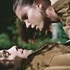
The details are sharper now, but you're gonna wanna smooth the graininess on the skin and some of the background. Duplicate this layer and set the duplicate to 80% opacity, blend mode normal.
Using the blur tool (hit R and make sure the teardrop icon is selected) at about 50% strength, brush over the skin, background and parts of the clothes to remove graininess. I generally use a soft-edged brush of about 10-13 pixels for the less detailed stuff, then change the brush size to about 5 or 6 pixels for detailed work around the eyes, lips, etc.

Sometimes I like to sharpen a bit around the eyes and lips using the sharpen tool (hit R and choose the icon that looks like a triangle). I use a very small, soft-edged brush, usually the same one from the blur step, at 50% strength to lightly brush over the areas in question:

Very subtle, but I notice crap like that, but then I also suspect I might have OCD (OK, not really but I am an obsessive tweaker).
Sometimes I also like to brighten the lips if I'm using a picture of a girl (well, you could do it on a guy but it might look like he's wearing lipstick :p) You can't really do that on the above cap, but if I was going to, I'd select the sponge tool (hit O and choose the icon that looks like, well, a sponge). In the options bar, select "saturate" from the drop-down and use a flow value of about 30%. Then brush lightly over the lips using a tiny brush with soft edges, about 5-10px or so. Here is a base on which I used this technique:
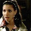
I actually was going to demo that base since it was a little more challenging than the graveyard one, but I forgot to save all the steps on the history palette, so oh well. Maybe next time.
Anyhoo, congrats! You now know how to create a luurrvely base for your iconage. A final word of advice: none of the above techniques are set in stone. I use other lightening techniques occasionally for exceptionally difficult caps, and while the above works on 90% of them, sometimes you just have to improvise. But alas and alack, that is a tutorial for another time. Fortunately, craptacular cappage seems to be a thing of the past due to DVDs and HDTV, so it's likely you won't have to deal with anything *too* gross.
So on that note, here endeth tonight's toturial. Now go whore pics from somewhere and make icons, aiight?