The second tutorial, woooor
Hey kids, I'm bored out of my brains, so looks like I'm making my second tutorial! And I also wanted to say thanks for the positive response to the first! *feels all accomplished like* This one is gonna talk you thru the entire process I use to make an icon, so here's hoping it doesn't turn out looking like crap. This is another one of those fun fun fun multiple images icons.
Oh yeah, and this tutorial is gonna assume you know your way around photoshop (or PSP or whatever program you use) fairly well. I use PS CS2, but I'm going to try and write this tut so you can fairly easily translate it to your program. And as usual, the images in the tut are all saved in .jpg format to expedite loading time and take up less space in my photobucket. But remember to save your final product in .png!
Now let's get on with the show, shall we? First, we start out with a base capped and cropped by yours truly:
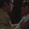
This base is way too dark and blurry, so we're going to do some lightening and sharpening. Duplicate the layer twice and set each duplicate to blend mode: lighten. You should now have 3 layers. Merge visible (shift+ctrl+E)
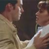
Better, but still a bit dark for my tastes. Duplicate this layer twice. Then desaturate (shift+ctrl+U) the first duplicate, which should be your second layer. Set this duplicate to blend mode: overlay, opacity 50%. Now set the second duplicate (should be your top layer) to blend mode: screen, opacity 64%.
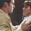
Of course, these values are not set in stone. Unless you're using the exact same cap to follow this tutorial, I would suggest experimenting and adjusting the opacities until you get the desired amount of brightness and contrast. I use this technique often to lighten up my bases, enough that I even made a photoshop action for it. :p
Now we're going to fix the blurriness. Merge visible, then sharpen once (filters >> sharpen >> sharpen)
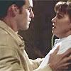
Better, but we have a graininess issue now. Duplicate this layer and set the duplicate to blend mode: normal, opacity 80%. Use the blur tool (hit "B" and make sure the teardrop icon is selected on the toolbar). Some artists use the smudge tool, so you could experiment with that as well, but I find it distorts my image too much, so I use the blur tool instead. Anyway, using a small brush with soft edges, I blurred the skin, the background, and parts of Xander's jacket to get rid of graininess while still preserving the sharpness on the facial features:

A word of advice: when blurring and/or smudging, I often change the brush size (although I ALWAYS use one with soft edges). I usually use a brush size of approximately 10-13 pixels to do the background and the skin, then switch to a smaller size, usually 5 or 6 pixels, to work around the eyes, lips, nose, and other places where it's important to preserve detail. Oh, and this should be filed under "well duh" but zoom in while doing this, unless you enjoy mouse cramp and eyestrain. ;)
Merge visible, and now you have your base. Woot!
Now to make it all purdy like. Make a new layer above your base and whack this brush of mysterious origins onto it:
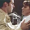
Now we're going to put two little images into the boxes, from bases created using the same procedure as the one above:
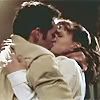
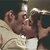
I took both of these bases and pasted them into the original .psd file, between the base layer and the brush layer. Then I shrunk them using the free transform tool (ctrl+T, don't forget to click the little link thingy in the options bar to preserve aspect ratio!) and positioned the parts I wanted inside the little boxes. Then on each layer, I used the rectangular marquee tool to select the part inside the little box, then created a layer mask to remove the excess (you could also erase it, but I'm a layer mask whore)
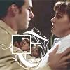
Now for my good friend, the exclusion layer. How I heart thee, exclusion layer. Create a new layer under the brush layer but above all the image layers, fill it with a dark blue color (in this demo, I used #00194c) and set the blend mode to... *drumroll*... exclusion! Oh yeah, whack the opacity to about 70%, adjusting according to your own preferences depending on what cap you used:
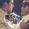
Next, make a new layer above the images and exclusion layer but under the brush. Paste the following gradient of mysterious origins onto this layer at whack it to multipy at 65%
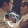
Now take this gradient lifted from ellipsisicons, paste it on a new layer above everything else but under the brush layer (so it should be second layer from the top) and whack that sucka to hard light at 50%:
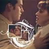
Next I take another texture, also from ellipsisicons, and paste it above everything else but under the brush layer. Whack it to screen at 100%. As you can see below, I used the smudge tool to smudge the corner a bit over Xander's head:
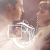
Now comes the slightly tricky part. We're goping to copy all of the image layers--the big Cordy/Xander and two little C/Xs--and paste them above everything except--you guessed it--the brush layer. In PS CS2, I usually select the bottom layer on the layers palette, hold down the shift key, then click the uppermost image layer to select them all. Then I hold down the alt key and drag the selection to the desired place on the layers palette. With the copies still selected, I merge them together. Older versions of PS don't have this feature, so if I were on one of those I'd probably copy each of the three image layers individually and merge the copies together (but leave the originals on their separate layers). There is a reason I didn't just merge to begin with--you're going to need just the little pics later.
Anyway, however you end up doing it, take the merged copy of the image layers, which should now be your second layer from the top, below the brush layer, and set it to soft light at 70%:
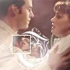
Now we're going to take a base from ellipsisicons paste it above everything but the brush layer, and set to screen at 80%
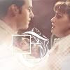
Now for the step I mentioned earlier--we're going to copy the two little pics, merge the layers together, and place the merged copy above everything but the brush layer. Whack this layer to hard light at 65%, then duplicate and set the duplicate to color at 50%
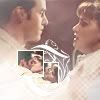
Done! (and it's about freakin' time, too). Now all that's left is texty fun, which I accomplished with a brush by yours truly:
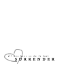
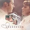
I selected a brownish color from the background using the eyedropper tool and stamped the brush on a layer set above everything, even (gasp!) the boxy brush layer. I created a new layer above this one and, using the same color, switched to a small blurry brush and randomly brushed across the text. I whacked this layer to screen at 50%, then held down the alt-key while left-clicking between this and the text layer to get rid of the excess. Here be the final product:
That's it for now. Hope you enjoyed this tutorial and find it useful. Stay tuned for more! (Hmmm... these are kinda fun..)