Tutorial #1 - Wonderfalls Icons - Light and Colour
The lovely ceemoster and fabala_frock asked me ever so nicely to do a tute on my colouring techniques and I just happen to have a huge essay to write...so I decided to be baaaad and do this instead! ;)
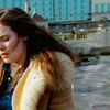
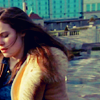
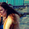
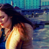
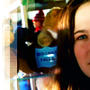
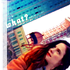
Go from this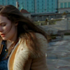
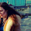
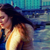
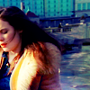
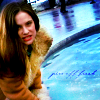
to this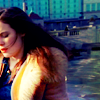
First off I don't use the same colouring techniques for all my icons, it really depends on your screen cap. :) This tutorial is more of a guide than anything else, don't be scared to try different opacities and colours! Also I use Photoshop CS, but any program with curves should be fine. :D
Secondly I use lots and lots of curves and masks, to the point of crazy-ridiculous! So If you're not familiar with them check out these wonderful tutes by herdestiny and unmasked_icons.
For best results I choose a screen cap with good colour and lighting potential. Nothing too dark because when going from really dark to light skin can go all kinds of horrible colours. You're probably safe with a cap of someone outside or near a window or something like that. :)
I chose a cap from Wonderfalls. Why? Because it rocks! ;)
It's pretty grey and dull isn't it?
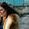
See much better! I can always add more contrast later. :)
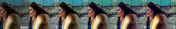
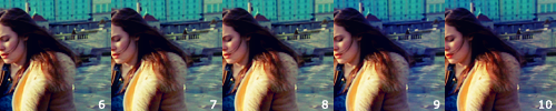
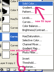
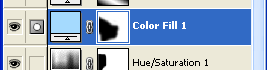
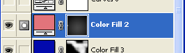
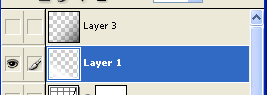
1. Now I don't use one curves layer, I use MANY.
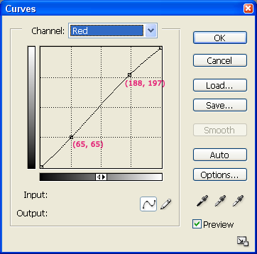
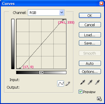
I always start by adding a new curves adjustment layer and fiddling with the RGB channel to brighten up the icon.
Curves really depend on the individual cap, but you can't really go wrong if you use a variation of the above which lightens the midtones and highlights and adds some contrast.
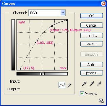
The difference is hard to spot but will be more pronounced later I promise. ;)
2. Now I start fiddling with the colours using a new curve adjustment layer each time. In my opinion the most important thing to watch when colouring with curves is skin. You don't want to end up with a beautiful background featuring a tomato-faced person. ;)
I started with the red/dark green curve layer. Jaye looked a little bit washed out in this cap so I added a bit of red to the lighter areas and added a little dark green to the darker areas which also increased the contrast a little.

Jaye doesn't look so well but the next curves layer will fix that. ;)
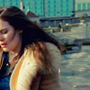
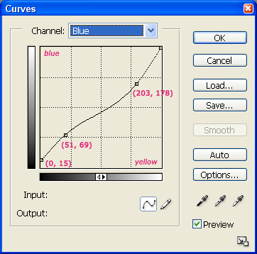
3. Next I mess around with a blue/yellow curves layer. I added blue to the darker sections and yellow to the lighter sections. This functions almost like an exclusion layer.
Much prettier!
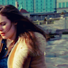
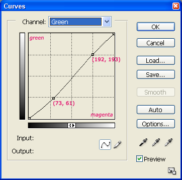
4. Now for my favourite curves layer - green/magenta! Actually I usually don't add any green unless the person in particularly red looking. I put a dot on diagonal line in the highlights section first to stop her face going magenta then added a bit of magenta to the darker areas. Be careful with this one, unlike the others the change is quite dramatic and you don't want to go overboard. :)
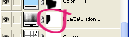
5. Curves are for subtle changes, now for the elephant sized changes. Saturation! Increase the saturation by a nice number like 19. Remember the aim is to enhance the colour not to blind people so don't go for 50 unless the icon sorely needs it. ;)
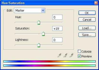
When you make a new adjustment layer a mask for the layer automatically appears. I painted over this mask with a soft round black brush at 100% just over where her face is - saturated faces tend to be a bit on the red side.
Now the background is a nice blue colour not boring grey!
6. Oooo time to go crazy with colour burns! ;) I filled a new layer with #8ADBFF
and set it to colour burn at 20%.
I painted over the mask with a black brush as before to remove the blue burn from her face and white jacket.
Now Jaye has a natural looking streak of warm yellow light across her face and jacket.
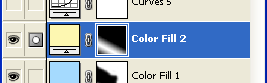
7. Next I filled a new layer with #FFF7AF
and set it to soft light at 40%.
I filled the layer's mask completely with black then placed a white reflected gradient at 100% across the bottom of the mask square.

8. Okay as I said I use many curves layers! They're lovely and subtle - I can't believe I survived without them before! It's about this time that I sit back and look at the icon to see if there is any curve tweaking that I need to do. I make a new curves layer just so if I don't like what I've done later I can always delete it or alter it without losing what I already have. I thought Jaye was a little pale and needed rosier cheeks so I added a tiny amount of red to the lighter areas whilst keeping the darker areas the same by putting a dot on the diagonal line to prevent it moving into the red.
Pretty blue! :)
9. Time for my favourite layer! I filled a new layer with #0004B2
which is a GORGEOUS deep blue set to soft light at 50%. I filled the layer's mask with black then used a soft round white brush at 50% to reveal the blue in the background and on Jaye's shirt. When using coloured blend layers you don't have to colour the whole icon with them, concentrating the colour in certain areas of the icon, like just behind Jaye and at the base of the buildings gives the icon more depth.
Rosey light!
10. Next I filled a new layer with #FF757C
a pinky-red set to colour burn at 90%. I filled the layer's mask with black. Then I placed a white radial gradient set at 20% on the mask where Jaye's shoulder is located. This gave her hair a red glow and darkened some of the shadows. Then I took a tiny hard white brush set at 100% and painted on the mask where her lips are to give them a red glow. (On other caps you will probably have to change the opacity of the brush so the lips look natural)


Nearly done. ;)
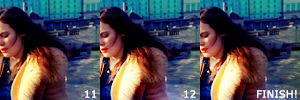
11. Last curve layer I promise! ;) This one is just to add contrast. (If you started with a good quality image not a cap then this is what you'd do instead of the RGB layer in step 1.) I pulled the bottom and top dot horizontally towards the middle in the RGB channel. This makes highlights brighter and shadows darker! Once again don't go overboard because she will look like she's on fire and that's never a good look. ;)
12. On a new layer and using a white reflected gradient at 100% I create a bright slash of light over her chest and part of her face and set this to overlay at 70%.

Finished! Yay! :)
13. Finally on a new layer create a shadow in the bottom right corner by dragging a black gradient over this area and setting it to overlay at 40%

So everyone please experiment with curves! They seem impossible at first but soon it will be like second nature. When making an icon with completely different colours to this icon use the eyedropper tool to select random pretty colours from the cap, brighten them up in the colour picker then try setting them to different blend modes like burn, soft light, overlay, etc.
If you have any questions please don't hesitate to ask. :)
And I'd love to see what you guys make with this tute! :)
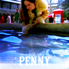
More examples using this technique:
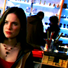
Go from this
to this
First off I don't use the same colouring techniques for all my icons, it really depends on your screen cap. :) This tutorial is more of a guide than anything else, don't be scared to try different opacities and colours! Also I use Photoshop CS, but any program with curves should be fine. :D
Secondly I use lots and lots of curves and masks, to the point of crazy-ridiculous! So If you're not familiar with them check out these wonderful tutes by herdestiny and unmasked_icons.
For best results I choose a screen cap with good colour and lighting potential. Nothing too dark because when going from really dark to light skin can go all kinds of horrible colours. You're probably safe with a cap of someone outside or near a window or something like that. :)
I chose a cap from Wonderfalls. Why? Because it rocks! ;)
It's pretty grey and dull isn't it?
See much better! I can always add more contrast later. :)
1. Now I don't use one curves layer, I use MANY.
I always start by adding a new curves adjustment layer and fiddling with the RGB channel to brighten up the icon.
Curves really depend on the individual cap, but you can't really go wrong if you use a variation of the above which lightens the midtones and highlights and adds some contrast.
The difference is hard to spot but will be more pronounced later I promise. ;)
2. Now I start fiddling with the colours using a new curve adjustment layer each time. In my opinion the most important thing to watch when colouring with curves is skin. You don't want to end up with a beautiful background featuring a tomato-faced person. ;)
I started with the red/dark green curve layer. Jaye looked a little bit washed out in this cap so I added a bit of red to the lighter areas and added a little dark green to the darker areas which also increased the contrast a little.
Jaye doesn't look so well but the next curves layer will fix that. ;)
3. Next I mess around with a blue/yellow curves layer. I added blue to the darker sections and yellow to the lighter sections. This functions almost like an exclusion layer.
Much prettier!
4. Now for my favourite curves layer - green/magenta! Actually I usually don't add any green unless the person in particularly red looking. I put a dot on diagonal line in the highlights section first to stop her face going magenta then added a bit of magenta to the darker areas. Be careful with this one, unlike the others the change is quite dramatic and you don't want to go overboard. :)
5. Curves are for subtle changes, now for the elephant sized changes. Saturation! Increase the saturation by a nice number like 19. Remember the aim is to enhance the colour not to blind people so don't go for 50 unless the icon sorely needs it. ;)
When you make a new adjustment layer a mask for the layer automatically appears. I painted over this mask with a soft round black brush at 100% just over where her face is - saturated faces tend to be a bit on the red side.
Now the background is a nice blue colour not boring grey!
6. Oooo time to go crazy with colour burns! ;) I filled a new layer with #8ADBFF
and set it to colour burn at 20%.
I painted over the mask with a black brush as before to remove the blue burn from her face and white jacket.
Now Jaye has a natural looking streak of warm yellow light across her face and jacket.
7. Next I filled a new layer with #FFF7AF
and set it to soft light at 40%.
I filled the layer's mask completely with black then placed a white reflected gradient at 100% across the bottom of the mask square.
8. Okay as I said I use many curves layers! They're lovely and subtle - I can't believe I survived without them before! It's about this time that I sit back and look at the icon to see if there is any curve tweaking that I need to do. I make a new curves layer just so if I don't like what I've done later I can always delete it or alter it without losing what I already have. I thought Jaye was a little pale and needed rosier cheeks so I added a tiny amount of red to the lighter areas whilst keeping the darker areas the same by putting a dot on the diagonal line to prevent it moving into the red.
Pretty blue! :)
9. Time for my favourite layer! I filled a new layer with #0004B2
which is a GORGEOUS deep blue set to soft light at 50%. I filled the layer's mask with black then used a soft round white brush at 50% to reveal the blue in the background and on Jaye's shirt. When using coloured blend layers you don't have to colour the whole icon with them, concentrating the colour in certain areas of the icon, like just behind Jaye and at the base of the buildings gives the icon more depth.
Rosey light!
10. Next I filled a new layer with #FF757C
a pinky-red set to colour burn at 90%. I filled the layer's mask with black. Then I placed a white radial gradient set at 20% on the mask where Jaye's shoulder is located. This gave her hair a red glow and darkened some of the shadows. Then I took a tiny hard white brush set at 100% and painted on the mask where her lips are to give them a red glow. (On other caps you will probably have to change the opacity of the brush so the lips look natural)
Nearly done. ;)
11. Last curve layer I promise! ;) This one is just to add contrast. (If you started with a good quality image not a cap then this is what you'd do instead of the RGB layer in step 1.) I pulled the bottom and top dot horizontally towards the middle in the RGB channel. This makes highlights brighter and shadows darker! Once again don't go overboard because she will look like she's on fire and that's never a good look. ;)
12. On a new layer and using a white reflected gradient at 100% I create a bright slash of light over her chest and part of her face and set this to overlay at 70%.
Finished! Yay! :)
13. Finally on a new layer create a shadow in the bottom right corner by dragging a black gradient over this area and setting it to overlay at 40%
So everyone please experiment with curves! They seem impossible at first but soon it will be like second nature. When making an icon with completely different colours to this icon use the eyedropper tool to select random pretty colours from the cap, brighten them up in the colour picker then try setting them to different blend modes like burn, soft light, overlay, etc.
If you have any questions please don't hesitate to ask. :)
And I'd love to see what you guys make with this tute! :)
More examples using this technique: