Curves, the wonders of Photoshop
Oh yes, this is a tutorial for curves, the greatest tool ever in Photoshop. I hardly use anything else but them, and from all your questions on icon_tutorial I've decided that why not make a master curves tutorial, just so everyone won't be so lost. I will try my best to explain everything in detail and in easy to follow instructions, but I can't promise anything. As easy as curves are, they are just as difficult to get the hang of. I'm constantly seeing icons that I know for a fact were made using curves that look horrible because they aren't being used correctly.
The Tutorial is under a cut, it is VERY VERY LONG and includes A LOT OF PICTURES SO IT IS NOT DIAL UP SAFE.
Program: Photoshop CS but goes down to 4.0 I believe
Introduction
The RBG Setting
The Red, Green, Blue Settings
Improving Contrast
Drastic Changes (One Point)
Subtle Changes (More Than One Point)
The Finished Product
Other Tips
INTRODUCTION
Alright! Welcome! Sit, take your coat off and stay awhile, you are in for a ride, a reading ride that is. You can't just look at the pictures to understand this tutorial, that's not the way it works, although the pictures help, the words are there to describe everything so you realize what's going on in the picture. Remember a pictures worth a thousand words, and I'm going to give you those thousand words (well, maybe not a thousand, but you get the picture)
The #1 Rule of Curves is this: Curves are meant for small detail changes. Although you can change a whole picture with curves, for better or for worse, the point is to change small things, and to make small movements with the curve, you will see in a minute what happens when you only use one point and make a drastic change, it isn't pretty.
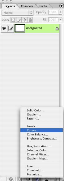
To find curves you can do this: Image > Adjustments > Curves, which gives you the advantage of not making a new layer with the curves on it, which is great when you don't plan on messing up. But we all know we mess up every once and a while. So what I do is make an adjustment layer which can be found by going to your layer pallete (if it isn't open go Window > Layer Pallete) and at the bottom there are tiny icons, click on this one:
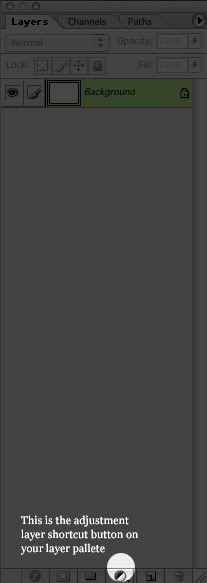
And highlight curves, like so:
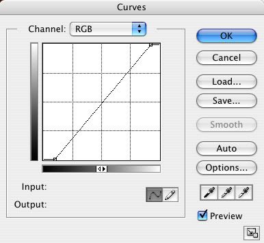
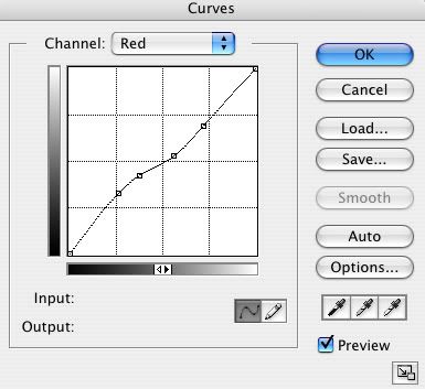
Now a window should pop-up. This is your curves window. Everything you will ever need is in this tiny layer and window. The window should look like this:
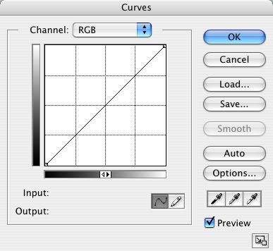
Now do you see the drop-down menu? That holds all of your RBG (Red, Blue, Green) options. The first one is the RBG setting, which basically means the highs and lows (the black and whites) of your image. The Red setting is the reds and greens, the Green is the greens and magentas, and the Blue is the blues and yellows. The most important thing to remember is that there is a counter-color for the primary colors (Red, Blue, Green). Red's counter-colors are Greens. Blue's counter-colors are Yellows. And Green's counter-colors are Magentas.
This basically means that if your image has too much Blue in it, the color you are going to use to get rid of the blue is, Yellow, and vice-versa. Now back to curves. Each Counter-color is the opposite of the high on the color settings. Meaning, if you have the red setting open, the high part (the reds) is counter acted by the Low part (the greens), and vice-versa.
Back to the Top
THE RBG SETTING
How I remember the high part and the low part is I pretend the line in the middle is cutting the space in half, the high part (the part above the line) is where the lighter parts of the image are and the low part (the part below the line) is where the darker parts of the image is. Now mind you, this is only the RBG setting.

This shows that on the RBG setting the dark part is below the white part. The tip-top is the whitest part of the image and the lowest part is the darkest part of the image.
The RBG setting is great for brightening an image, why would you want to set an image on screen three or four times, when you can change the curves settings and automatically make an image brighter? It's very simple. And extremely helpful in saving layer space.
Now that we know the high and low parts of the RBG setting, you are probably wondering what the line is for. Well, it's great that you asked! The line is for your changes! When you click on the line a black dot will take the place of where your mouse just clicked! This is your starting point, move your mouse above or below the high and low parts and watch your image instantly become darker and lighter! It's magic!
Back to the Top
THE RED, GREEN, BLUE SETTINGS
Now comes the interesting part, the coloring! Not only can curves brighten or darken an image, it can also completely change the colors! To get to the different settings, click on the drop-down menu above the workspace, and choose your colors. Each one (Red, Blue, Green) are the colors that represent your image. If you choose Reds you are going to be working with Reds, etc. Here are the images and the high and lows for each setting:
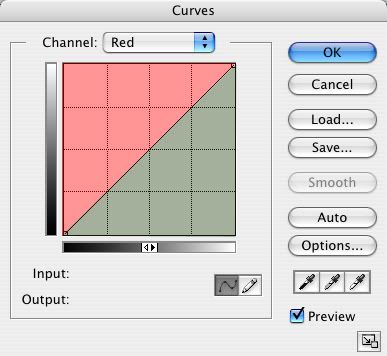
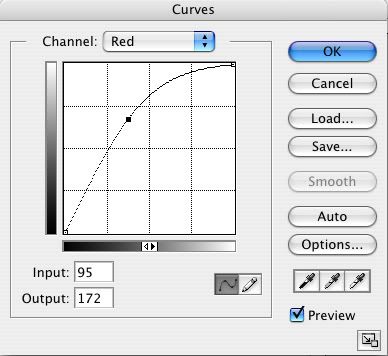
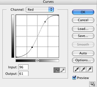
This is your red setting, here you see the red, and the counter-color green. Keep in mind, this green is going to be darker than the other green that is a part of the RBG. Why you ask? Because it's in the low part of the image, silly! Once your line crosses from the red to the green, your image will have a slight change to green, the lower you move it the more drastic the change is. And vice-versa for the red.

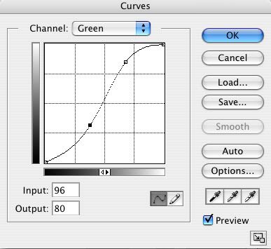
This is your green setting! Here you see the green and the counter-color magenta. Now this green will be lighter than the green in the red setting, because it's on the high part of the workspace! Good job! I knew you knew that! The same rules apply to the green as the red, once you cross the line either above or below the image will get greener (lighter) or more magenta (darker) and the more you move your point down the more drastic the change is.

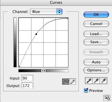
This is your blue setting. Here you see the blue and the counter-color yellow. The same rules apply to the blue as both the red and green, once you cross the line either above or below the image will get bluer (lighter) or more yellow (darker).
You don't have to restrain yourself to one point, you can make as many points as you want! One, two, or three points are good for drastic changes, more than three points are good for more subtle changes. In curves, there really isn't anything you can't do with coloring! :)
Now this is the part where you actually get to see an image change. This is the most fun part and you also get to see the changes that curves does!
Back to the Top
IMPROVING CONTRAST
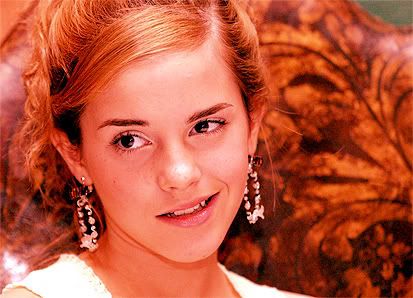
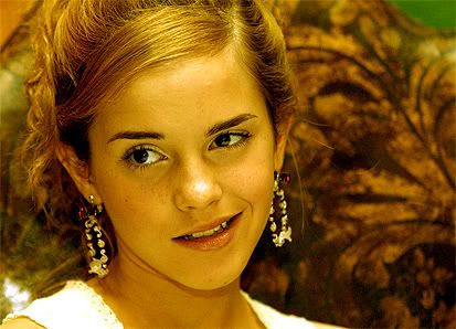
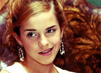
I'm using this picture of Emma Watson, it's a high quality picture, nice lighting, and has nice contrast. A great starting point:

This is what I'm going to call our base. All I did was sharpen once. Nothing else has been done to this image. Now open a new Curves Adjustment Layer and let's get started!
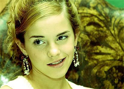
The first thing I notice about this image is that although it looks as if it has nice contrast, to the untrained eye, it's actually not very contrasted at all. So our first curves job is to make the image have more contrast. I completely got this from starlingsby100 so credit goes to them.
On your curves window in the RBG setting, you should see two points one at the top and one at the bottom, these are your complete black and complete white points. Meaning that the point at the bottom represents the darkest point on your image, and the white represents the lightest point on your image. I changed the darkest point to the darker part of the curves window so much so that the image was a little darker and then moved the lightest point to the lighter part of the curves window so much so that the image's white parts became whiter. See the difference?

Back to the Top
DRASTIC CHANGES (ONE POINT)
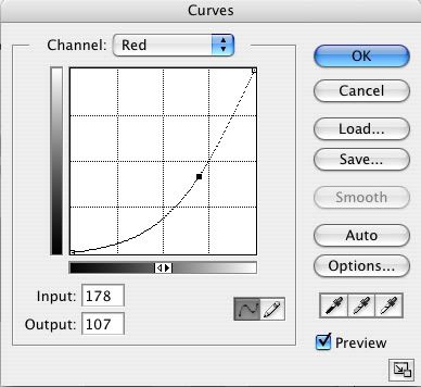
Now we get to play around! I leave the contrast layer alone, and open a new Curves Adjustment Layer and go straight to the red setting.
The setting:
The Effect:
See how it made it brighter and redder? This is just the beginning!
Still on the red setting this is what it looks like when the counter-color is used:
The setting:
The Effect:
See how it's a darker green? I wasn't just kidding!
Now moving onto the green setting, I have just deleted all the points in the red setting. To do this you click on the point which should turn it to black and click delete. Another pointer when you make another point the other points will turn clear, and the point you are currently on will be black. :)
The setting:

The Effect:
Notice the difference between the green in the red/green and the green in the green/magenta.
The setting:
The Effect:
Moving onto the blue setting!
The setting:
The Effect:

The setting:

The Effect:
Phew! Now those are the drastic changes. These can come in handy if an image is almost completely red (you go green) or green (you go magenta or red). Now we are almost done! Now we are going to see what happens when you change an image with more than one point!
Back to the Top
SUBTLE CHANGES (MORE THAN ONE POINT)
The Red Setting:
See how there are two points curving the line so that one point is in the red and one is in the green? Well that means that the lighter parts are going to be redder and the darker parts are going to be greener!
The Effect:

Pretty, pretty!
NOTE: When doing the opposite it usually doesn't come out good, in this case it came out awful, so I didn't do the opposite setting (the lower point being in the red and the higher point being in the green). You can see this for yourself by taking the image and playing with the curves settings.
The Green Setting:
This is the same as the red setting, because again, the other way around looked awful and washed out and gave Emma magenta skin (ick!).
The Effect:
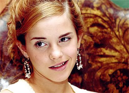
The Blue Setting:
NOTE: The opposite for this setting does look better than having the same setting as the Red and Greens. Most of the time when you do the opposite it gives the skin a gross color that is definietly isn't natural!
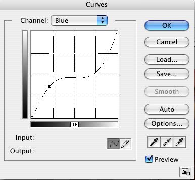
Notice the yellow is in the darker part and the blue is in the lighter. It gives it a dreamy effect.
The Effect:

Back to the Top
The Finished Product:
This is how I got from the contrasted base:
To this:
Here are my curves settings:
RBG
Red
Green

Blue

And your finished product!
Back to the Top
SAVING CURVE PRESETS
The other great thing about curves is that you can save a curves preset just like you would save a brush preset or pattern preset. This comes in handy when you have more than one picture that has the same coloring. Instead of just doing guess work to do it again, you can save the curves (on the side there is a load/save button, it's just like saving a document) and you just load it up again and you have the same preset that can be attached to any picture.
NOTE: Using the same preset for a lot of pictures that aren't the same will result in often times a bad image. Remember not all images are the same and sometimes the smallest mistake can ruin a picture, that's why the #1 rule, really is #1, curves are for small details, but you can use as many curves layers as you want. I can use up to twelve curves adjustment layers on one icon. So there is no stopping you from just using one!
INPUT AND OUTPUT
You will see on the bottom of the curves window two open text boxes one saying Input and the other saying Output. I never truly understood what these meant, so my information is useless, BUT my interpretation of what the input is where you are changing the picture and where it will end up (the output).
THE GRADIENT SHAPE
On the window you see two gradients, that also helps you visualize where the light and darkness are in your picture. The white is the lightest part (wherever the white in the gradient is facing is that's the lightest part) and etc for the dark and grey's.
The Eye Dropper Tool
You will find out that when the curves window is open you can click and find spots on the image that you want to improve. Say you want to improve just the hair, go over to the image with the curves tool open and the eye dropper tool should be present in place of your cursor. If you click on the hair or the part that you want to change, on the curves window a white cirle will pop up and show you where on the line that part of the image is, so you can pin point exactly where you want your points to go. :)
TRIAL AND ERROR
This is a guide, in no way is this an absolute tutorial, telling you what you have to do. I never had a tutorial telling me what to do, how to do it, I just happened to come across the tool a couple of years ago. And in the beginning I was not very optimistic in using them. Once I opened them, I instantly closed the window. Curves were very intimidating and I was scared of using them. But with much trial and error I learned to get around the intimidation. It's a great thing that Photoshop has formulated, there are hundreds of ways to just do one thing and that's what makes the fun of Photoshop. So go play around curves, move the curve around so much that your image is unrecognizable. Have fun with them, that's what they are there for.
STILL HAVING TROUBLE?
Alright, it's very understandable to still be having trouble, curves take a while to get used to. I'm allowing people to download a curves preset. You can download it at this link. Now remember, these won't work on all images. I'm not posting what it looks like and what it looks like badly, because I want you to see first hand what I mean when I say that not one curves preset looks good on everything. :)
LAST COMMENTS
WOW! That was a lot of typing and a lot of work! But it was worth it, if I help at least one person understand curves more, than I've done my job! Remember, don't get frustrated with curves just:
HAVE FUN!!
EDITED: 1/1/2009 I am so, so sorry for having this tutorial down for as long as it was. But I put the images back and tweaked the writing a bit so it makes more sense. :)
Back to the Top
The Tutorial is under a cut, it is VERY VERY LONG and includes A LOT OF PICTURES SO IT IS NOT DIAL UP SAFE.
Program: Photoshop CS but goes down to 4.0 I believe
Introduction
The RBG Setting
The Red, Green, Blue Settings
Improving Contrast
Drastic Changes (One Point)
Subtle Changes (More Than One Point)
The Finished Product
Other Tips
INTRODUCTION
Alright! Welcome! Sit, take your coat off and stay awhile, you are in for a ride, a reading ride that is. You can't just look at the pictures to understand this tutorial, that's not the way it works, although the pictures help, the words are there to describe everything so you realize what's going on in the picture. Remember a pictures worth a thousand words, and I'm going to give you those thousand words (well, maybe not a thousand, but you get the picture)
The #1 Rule of Curves is this: Curves are meant for small detail changes. Although you can change a whole picture with curves, for better or for worse, the point is to change small things, and to make small movements with the curve, you will see in a minute what happens when you only use one point and make a drastic change, it isn't pretty.
To find curves you can do this: Image > Adjustments > Curves, which gives you the advantage of not making a new layer with the curves on it, which is great when you don't plan on messing up. But we all know we mess up every once and a while. So what I do is make an adjustment layer which can be found by going to your layer pallete (if it isn't open go Window > Layer Pallete) and at the bottom there are tiny icons, click on this one:
And highlight curves, like so:
Now a window should pop-up. This is your curves window. Everything you will ever need is in this tiny layer and window. The window should look like this:
Now do you see the drop-down menu? That holds all of your RBG (Red, Blue, Green) options. The first one is the RBG setting, which basically means the highs and lows (the black and whites) of your image. The Red setting is the reds and greens, the Green is the greens and magentas, and the Blue is the blues and yellows. The most important thing to remember is that there is a counter-color for the primary colors (Red, Blue, Green). Red's counter-colors are Greens. Blue's counter-colors are Yellows. And Green's counter-colors are Magentas.
This basically means that if your image has too much Blue in it, the color you are going to use to get rid of the blue is, Yellow, and vice-versa. Now back to curves. Each Counter-color is the opposite of the high on the color settings. Meaning, if you have the red setting open, the high part (the reds) is counter acted by the Low part (the greens), and vice-versa.
Back to the Top
THE RBG SETTING
How I remember the high part and the low part is I pretend the line in the middle is cutting the space in half, the high part (the part above the line) is where the lighter parts of the image are and the low part (the part below the line) is where the darker parts of the image is. Now mind you, this is only the RBG setting.
This shows that on the RBG setting the dark part is below the white part. The tip-top is the whitest part of the image and the lowest part is the darkest part of the image.
The RBG setting is great for brightening an image, why would you want to set an image on screen three or four times, when you can change the curves settings and automatically make an image brighter? It's very simple. And extremely helpful in saving layer space.
Now that we know the high and low parts of the RBG setting, you are probably wondering what the line is for. Well, it's great that you asked! The line is for your changes! When you click on the line a black dot will take the place of where your mouse just clicked! This is your starting point, move your mouse above or below the high and low parts and watch your image instantly become darker and lighter! It's magic!
Back to the Top
THE RED, GREEN, BLUE SETTINGS
Now comes the interesting part, the coloring! Not only can curves brighten or darken an image, it can also completely change the colors! To get to the different settings, click on the drop-down menu above the workspace, and choose your colors. Each one (Red, Blue, Green) are the colors that represent your image. If you choose Reds you are going to be working with Reds, etc. Here are the images and the high and lows for each setting:
This is your red setting, here you see the red, and the counter-color green. Keep in mind, this green is going to be darker than the other green that is a part of the RBG. Why you ask? Because it's in the low part of the image, silly! Once your line crosses from the red to the green, your image will have a slight change to green, the lower you move it the more drastic the change is. And vice-versa for the red.
This is your green setting! Here you see the green and the counter-color magenta. Now this green will be lighter than the green in the red setting, because it's on the high part of the workspace! Good job! I knew you knew that! The same rules apply to the green as the red, once you cross the line either above or below the image will get greener (lighter) or more magenta (darker) and the more you move your point down the more drastic the change is.
This is your blue setting. Here you see the blue and the counter-color yellow. The same rules apply to the blue as both the red and green, once you cross the line either above or below the image will get bluer (lighter) or more yellow (darker).
You don't have to restrain yourself to one point, you can make as many points as you want! One, two, or three points are good for drastic changes, more than three points are good for more subtle changes. In curves, there really isn't anything you can't do with coloring! :)
Now this is the part where you actually get to see an image change. This is the most fun part and you also get to see the changes that curves does!
Back to the Top
IMPROVING CONTRAST
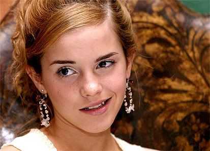
I'm using this picture of Emma Watson, it's a high quality picture, nice lighting, and has nice contrast. A great starting point:
This is what I'm going to call our base. All I did was sharpen once. Nothing else has been done to this image. Now open a new Curves Adjustment Layer and let's get started!
The first thing I notice about this image is that although it looks as if it has nice contrast, to the untrained eye, it's actually not very contrasted at all. So our first curves job is to make the image have more contrast. I completely got this from starlingsby100 so credit goes to them.
On your curves window in the RBG setting, you should see two points one at the top and one at the bottom, these are your complete black and complete white points. Meaning that the point at the bottom represents the darkest point on your image, and the white represents the lightest point on your image. I changed the darkest point to the darker part of the curves window so much so that the image was a little darker and then moved the lightest point to the lighter part of the curves window so much so that the image's white parts became whiter. See the difference?
Back to the Top
DRASTIC CHANGES (ONE POINT)
Now we get to play around! I leave the contrast layer alone, and open a new Curves Adjustment Layer and go straight to the red setting.
The setting:
The Effect:
See how it made it brighter and redder? This is just the beginning!
Still on the red setting this is what it looks like when the counter-color is used:
The setting:
The Effect:
See how it's a darker green? I wasn't just kidding!
Now moving onto the green setting, I have just deleted all the points in the red setting. To do this you click on the point which should turn it to black and click delete. Another pointer when you make another point the other points will turn clear, and the point you are currently on will be black. :)
The setting:
The Effect:
Notice the difference between the green in the red/green and the green in the green/magenta.
The setting:
The Effect:
Moving onto the blue setting!
The setting:
The Effect:
The setting:
The Effect:
Phew! Now those are the drastic changes. These can come in handy if an image is almost completely red (you go green) or green (you go magenta or red). Now we are almost done! Now we are going to see what happens when you change an image with more than one point!
Back to the Top
SUBTLE CHANGES (MORE THAN ONE POINT)
The Red Setting:
See how there are two points curving the line so that one point is in the red and one is in the green? Well that means that the lighter parts are going to be redder and the darker parts are going to be greener!
The Effect:
Pretty, pretty!
NOTE: When doing the opposite it usually doesn't come out good, in this case it came out awful, so I didn't do the opposite setting (the lower point being in the red and the higher point being in the green). You can see this for yourself by taking the image and playing with the curves settings.
The Green Setting:
This is the same as the red setting, because again, the other way around looked awful and washed out and gave Emma magenta skin (ick!).
The Effect:
The Blue Setting:
NOTE: The opposite for this setting does look better than having the same setting as the Red and Greens. Most of the time when you do the opposite it gives the skin a gross color that is definietly isn't natural!
Notice the yellow is in the darker part and the blue is in the lighter. It gives it a dreamy effect.
The Effect:
Back to the Top
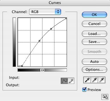
The Finished Product:
This is how I got from the contrasted base:
To this:
Here are my curves settings:
RBG
Red
Green
Blue
And your finished product!
Back to the Top
SAVING CURVE PRESETS
The other great thing about curves is that you can save a curves preset just like you would save a brush preset or pattern preset. This comes in handy when you have more than one picture that has the same coloring. Instead of just doing guess work to do it again, you can save the curves (on the side there is a load/save button, it's just like saving a document) and you just load it up again and you have the same preset that can be attached to any picture.
NOTE: Using the same preset for a lot of pictures that aren't the same will result in often times a bad image. Remember not all images are the same and sometimes the smallest mistake can ruin a picture, that's why the #1 rule, really is #1, curves are for small details, but you can use as many curves layers as you want. I can use up to twelve curves adjustment layers on one icon. So there is no stopping you from just using one!
INPUT AND OUTPUT
You will see on the bottom of the curves window two open text boxes one saying Input and the other saying Output. I never truly understood what these meant, so my information is useless, BUT my interpretation of what the input is where you are changing the picture and where it will end up (the output).
THE GRADIENT SHAPE
On the window you see two gradients, that also helps you visualize where the light and darkness are in your picture. The white is the lightest part (wherever the white in the gradient is facing is that's the lightest part) and etc for the dark and grey's.
The Eye Dropper Tool
You will find out that when the curves window is open you can click and find spots on the image that you want to improve. Say you want to improve just the hair, go over to the image with the curves tool open and the eye dropper tool should be present in place of your cursor. If you click on the hair or the part that you want to change, on the curves window a white cirle will pop up and show you where on the line that part of the image is, so you can pin point exactly where you want your points to go. :)
TRIAL AND ERROR
This is a guide, in no way is this an absolute tutorial, telling you what you have to do. I never had a tutorial telling me what to do, how to do it, I just happened to come across the tool a couple of years ago. And in the beginning I was not very optimistic in using them. Once I opened them, I instantly closed the window. Curves were very intimidating and I was scared of using them. But with much trial and error I learned to get around the intimidation. It's a great thing that Photoshop has formulated, there are hundreds of ways to just do one thing and that's what makes the fun of Photoshop. So go play around curves, move the curve around so much that your image is unrecognizable. Have fun with them, that's what they are there for.
STILL HAVING TROUBLE?
Alright, it's very understandable to still be having trouble, curves take a while to get used to. I'm allowing people to download a curves preset. You can download it at this link. Now remember, these won't work on all images. I'm not posting what it looks like and what it looks like badly, because I want you to see first hand what I mean when I say that not one curves preset looks good on everything. :)
LAST COMMENTS
WOW! That was a lot of typing and a lot of work! But it was worth it, if I help at least one person understand curves more, than I've done my job! Remember, don't get frustrated with curves just:
HAVE FUN!!
EDITED: 1/1/2009 I am so, so sorry for having this tutorial down for as long as it was. But I put the images back and tweaked the writing a bit so it makes more sense. :)
Back to the Top