inquisitory ✭ 57; it's crystal, it's so so clear.
/casts Revive on this comm; subsequently shot for that cheesy joke
This tutorial was requested over a year ago, I am a terrible person T___T "Better late than never" has never been so appropriate; what can I say, I keep my promises even if they're way overdue;;; The technique may be super outdated, but I hope it's still of use to someone!
Request by detectional, who appears to no longer be here; but if you see this, thank you for being so patient ♥
start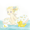
to finish
program Photoshop. Uses Selective Color and Channel Mixer, so not translatable.
✎ abbreviations/terms
AL ➝ adjustment layer
SC ➝ selective color
CM ➝ channel mixer
CB ➝ color balance
L ➝ levels
HS ➝ hue/saturation
BC ➝ brightness/contrast
for example, SC/AL will mean Selective Color Adjustment Layer.
Let's see if I've still got the tutorial bug in me 8D okay, here we have Hagu from Honey and Clover. Gosh, isn't Hachikuro art the cutest? I love this ;A; Tip: use very very light, pale artwork for this tutorial. If it's not light and you really want to use it, either raise the Lightness by way of an HS/AL before you start, or make changes to the Levels layer we use later.

Yeah, unfortunately Hachikuro artwork tends to show up super light, so let's start fixing it with an SC/AL, settings like so:
Reds: -60, 0, 70, 0
Yellows: -100, 40, -60, 0
Blues: 0, -60, -60, 100
Neutrals: 0, 0, 0, 15
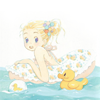
LOL that looks like nothing right now but I promise it makes a difference later! Follow it up with a CM/AL by rockappeal, which adds a slightly blue tint to the icon:
Red: 91, 7, -7
Green: 7, 94, -7
Blue: -2, -2, 102
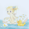
ok cool, but we don't want that blue to take over, so let's mitigate it with a Soft Light duplicate of the base.
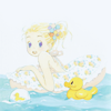
SC/AL again, just because we can! Make two ALs with settings in this order. The first is by hl_upics because I am so in love with those settings it's not even funny. However, you may want to remove that layer if you already feel your icon is too dark/blue because it will darken the icon even more.
Reds: -52, 0, 0, 26
Yellows: -57, -7, 0, 34
Cyans: 48, -44, 0, -27
Whites: 100, 0, -63, 21
Neutrals: 20, 0, 24, 9
Blacks: -1, 0, 0, 32
Reds: 0, 0, 100, 0
Yellows: 0, 0, -50, 0
Cyans: 100, 0, 0, 0
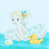
Usually I tend to shy away from using CB/ALs but when I feel like my icon is going in the completely wrong direction chromatically from where I want it to go, there's nothing better to switch things up quickly xD Here I thought the blue was taking over, so I used these settings to undo it with some red and yellow:
Midtones: 100, 0, -44
Highlights: 22, 0, 0
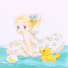
This is one of those completely off-base steps that should not apply to any other image, but here it was apparently necessary to add an HS/AL, +100 to reds (and only reds, or else it would be insaaaaane). idk man, I can't justify what I did over a year ago xD

The colouring is almost done, but before we finish it, let's add a little lighting for interest near the bottom. This subtle texture, which is really a snippet of a much larger texture by cielo_icons, is perfect for that on Screen, 100% \o/ I would also recommend it on Lighten, 100% if you want it to blend into the image more, as is the trend these days.
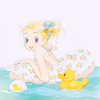
The reason I didn't save the light texture for the end of the icon is because it can overpower the image, as it did here, and I didn't want to decrease its opacity to fix that. Using a L/AL will help cut it back as well as increase the darkness of the overall image:
56, 0.81, 255
This is the layer I suggested changing if you have a darker image, btw; just leave that first number at 0 if you want to do so. After that, I used a HS/AL with Saturation to 22, which gave the colours a much-needed boost.
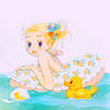
Lastly, I can't bear to finish off any icon these days without a BC/AL for that extra pop. Here Brightness to -12 and Contrast to 38 worked wonders, but feel free to adjust that until you're satisfied with the vibrancy of your icon. And we're done!

✖ other examples
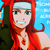
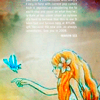
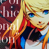
These were altered to make the colouring more applicable to these images and a bit more vibrant (took out the colour balance and red +100 hue/sat layers, and added different ALs) but the overall structure of these icons is the same as the tutorial's.
try it out! then watch us?
This tutorial was requested over a year ago, I am a terrible person T___T "Better late than never" has never been so appropriate; what can I say, I keep my promises even if they're way overdue;;; The technique may be super outdated, but I hope it's still of use to someone!
Request by detectional, who appears to no longer be here; but if you see this, thank you for being so patient ♥
start

to finish

program Photoshop. Uses Selective Color and Channel Mixer, so not translatable.
✎ abbreviations/terms
AL ➝ adjustment layer
SC ➝ selective color
CM ➝ channel mixer
CB ➝ color balance
L ➝ levels
HS ➝ hue/saturation
BC ➝ brightness/contrast
for example, SC/AL will mean Selective Color Adjustment Layer.
Let's see if I've still got the tutorial bug in me 8D okay, here we have Hagu from Honey and Clover. Gosh, isn't Hachikuro art the cutest? I love this ;A; Tip: use very very light, pale artwork for this tutorial. If it's not light and you really want to use it, either raise the Lightness by way of an HS/AL before you start, or make changes to the Levels layer we use later.

Yeah, unfortunately Hachikuro artwork tends to show up super light, so let's start fixing it with an SC/AL, settings like so:
Reds: -60, 0, 70, 0
Yellows: -100, 40, -60, 0
Blues: 0, -60, -60, 100
Neutrals: 0, 0, 0, 15

LOL that looks like nothing right now but I promise it makes a difference later! Follow it up with a CM/AL by rockappeal, which adds a slightly blue tint to the icon:
Red: 91, 7, -7
Green: 7, 94, -7
Blue: -2, -2, 102

ok cool, but we don't want that blue to take over, so let's mitigate it with a Soft Light duplicate of the base.

SC/AL again, just because we can! Make two ALs with settings in this order. The first is by hl_upics because I am so in love with those settings it's not even funny. However, you may want to remove that layer if you already feel your icon is too dark/blue because it will darken the icon even more.
Reds: -52, 0, 0, 26
Yellows: -57, -7, 0, 34
Cyans: 48, -44, 0, -27
Whites: 100, 0, -63, 21
Neutrals: 20, 0, 24, 9
Blacks: -1, 0, 0, 32
Reds: 0, 0, 100, 0
Yellows: 0, 0, -50, 0
Cyans: 100, 0, 0, 0

Usually I tend to shy away from using CB/ALs but when I feel like my icon is going in the completely wrong direction chromatically from where I want it to go, there's nothing better to switch things up quickly xD Here I thought the blue was taking over, so I used these settings to undo it with some red and yellow:
Midtones: 100, 0, -44
Highlights: 22, 0, 0

This is one of those completely off-base steps that should not apply to any other image, but here it was apparently necessary to add an HS/AL, +100 to reds (and only reds, or else it would be insaaaaane). idk man, I can't justify what I did over a year ago xD

The colouring is almost done, but before we finish it, let's add a little lighting for interest near the bottom. This subtle texture, which is really a snippet of a much larger texture by cielo_icons, is perfect for that on Screen, 100% \o/ I would also recommend it on Lighten, 100% if you want it to blend into the image more, as is the trend these days.

The reason I didn't save the light texture for the end of the icon is because it can overpower the image, as it did here, and I didn't want to decrease its opacity to fix that. Using a L/AL will help cut it back as well as increase the darkness of the overall image:
56, 0.81, 255
This is the layer I suggested changing if you have a darker image, btw; just leave that first number at 0 if you want to do so. After that, I used a HS/AL with Saturation to 22, which gave the colours a much-needed boost.

Lastly, I can't bear to finish off any icon these days without a BC/AL for that extra pop. Here Brightness to -12 and Contrast to 38 worked wonders, but feel free to adjust that until you're satisfied with the vibrancy of your icon. And we're done!

✖ other examples


These were altered to make the colouring more applicable to these images and a bit more vibrant (took out the colour balance and red +100 hue/sat layers, and added different ALs) but the overall structure of these icons is the same as the tutorial's.
try it out! then watch us?