inquisitory ✭ 42; make me a shadow in the shape of wonder
Whoa, long time no see, ewidentnie! Reason being that asdkjlfsha I can't for the life of me find these two icons' .psds!!!! AUGH AUGH AUGH I liked that colouring too ;__; but in the meantime, have a tut of an icon I'm quite fond of? xD Completely random but dear god, there are no words for how much I love this song *A*
Request by lolichigorock and almateria ♥
Go from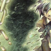
to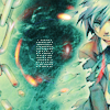
in Photoshop. Uses Selective Color, so not translatable.
Pretty image is pretty! Aaaaand here's our base.

but omg ewwwwwwwwww what is that colouring ;__; So dark and grody it's like he was wallowing around in the sewers or something. LET'S FIX IT QUICK. #3c3c3c on Exclusion, 40% to get rid of a bit of ugly contrast and make the dark areas lighter.

A bit better already! To substitute the sewer-y contrast from earlier with some more shiny contrast, take a Soft Light, 100% duplicate of the base.

See, it's not quite as dark as the base, right? Needs more colour though, so take a Hue/Saturation... adjustment layer and move Saturation up to 30. Colour is goooood~

You all know that Mumpo!tutorials allllways involve Exclusion or SC or a combination of the two xD And this one happens to fulfill both of those, so you can go ahead and add to the cliché! Let's abuse some Selective Color... adjustment layer settings I'm verrrry fond of, step 3 by almateria ♥

Nice, though still not pushed far enough by my standards xD For some reason duplicating that layer makes it look super nice!

Starting to look like a finished icon, yay \o/ Have some textures. Because of the crop and the way Minato's body is dissolving and kinda... turning into the chains (what) I figured something to focus attention on the center would be appropriate. And don't we just all love circle textures these days!!! Try this texture by dusty_memories and this one by gravira, both on Lighten, 100% and rotated/erased a bit to achieve that effect.

I always find it hard to find good circle textures that fit my ridiculous expectations for some reason, but that first one (especially) does quite well here :D Okay, text time~ idk how many people do this, but when I want a good box of tiny text I'll take the type tool and drag it to make a rectangle the approximate size of what I want. Then I'll take my tinytext settings (Arial or Palatino, 1.5, 500 spacing, 2 line spacing, white) and type a bunch of gibberish until it shows up enough in the box xD If the lines keep breaking off and it doesn't work right, then just rasterize the type and erase the part you don't want. rofl long explanation is long, just know that I came up with this xD

We're just about there! But taking all the time to make an icon and then not having the contrast right on Photobucket really bugs me. So that's why I just about always have a Brightness/Contrast... adjustment layer at the very end to ensure that doesn't happen ahaha *perfectionist* Most of the time it'll turn out lighter than what I see in PB, and for this icon, Brightness is -10 and Contrast is 15.

Hooray, all done!
Other examples:
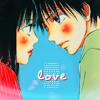

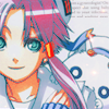
I encourage you to go play around and show me your finished icons! DOOO IIIIIIT, I wanna see what you guys come up with~
If you like what you see, why not friend ewidentnie for future updates?
Request by lolichigorock and almateria ♥
Go from

to

in Photoshop. Uses Selective Color, so not translatable.
Pretty image is pretty! Aaaaand here's our base.

but omg ewwwwwwwwww what is that colouring ;__; So dark and grody it's like he was wallowing around in the sewers or something. LET'S FIX IT QUICK. #3c3c3c on Exclusion, 40% to get rid of a bit of ugly contrast and make the dark areas lighter.

A bit better already! To substitute the sewer-y contrast from earlier with some more shiny contrast, take a Soft Light, 100% duplicate of the base.

See, it's not quite as dark as the base, right? Needs more colour though, so take a Hue/Saturation... adjustment layer and move Saturation up to 30. Colour is goooood~

You all know that Mumpo!tutorials allllways involve Exclusion or SC or a combination of the two xD And this one happens to fulfill both of those, so you can go ahead and add to the cliché! Let's abuse some Selective Color... adjustment layer settings I'm verrrry fond of, step 3 by almateria ♥

Nice, though still not pushed far enough by my standards xD For some reason duplicating that layer makes it look super nice!

Starting to look like a finished icon, yay \o/ Have some textures. Because of the crop and the way Minato's body is dissolving and kinda... turning into the chains (what) I figured something to focus attention on the center would be appropriate. And don't we just all love circle textures these days!!! Try this texture by dusty_memories and this one by gravira, both on Lighten, 100% and rotated/erased a bit to achieve that effect.

I always find it hard to find good circle textures that fit my ridiculous expectations for some reason, but that first one (especially) does quite well here :D Okay, text time~ idk how many people do this, but when I want a good box of tiny text I'll take the type tool and drag it to make a rectangle the approximate size of what I want. Then I'll take my tinytext settings (Arial or Palatino, 1.5, 500 spacing, 2 line spacing, white) and type a bunch of gibberish until it shows up enough in the box xD If the lines keep breaking off and it doesn't work right, then just rasterize the type and erase the part you don't want. rofl long explanation is long, just know that I came up with this xD

We're just about there! But taking all the time to make an icon and then not having the contrast right on Photobucket really bugs me. So that's why I just about always have a Brightness/Contrast... adjustment layer at the very end to ensure that doesn't happen ahaha *perfectionist* Most of the time it'll turn out lighter than what I see in PB, and for this icon, Brightness is -10 and Contrast is 15.

Hooray, all done!
Other examples:


I encourage you to go play around and show me your finished icons! DOOO IIIIIIT, I wanna see what you guys come up with~
If you like what you see, why not friend ewidentnie for future updates?