inquisitory ✭ 43; what's holding up her face
Another tutorial, so soon? lol what is going on here. Also, we have nearly 400 watchers here at ewidentnie alskhjfsal you guys are crazy, thank you!!! *dies*
Request by sashide ♥
Go from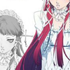
to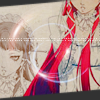
in Photoshop. Uses Selective Color, Curves and Color Balance, so not translatable.
There seem to be a lot of P3 tutorials from me lately 8D Yaaay Chidori, and here we go with my dorky duplicates to fill up space again!

It's a little dark, so take a Screen, 60% duplicate right away /o/
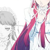
Still darker than we want, so use #b5b37b on Soft Light, 100%. I do love my beige soft light layers, they do wonders to brighten up an image when you don't feel like using Screen again!
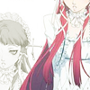
Let's mess with the colour with a Curves... adjustment layer now! 8) idk why I decided to do this, honestly, but this'll add a nice purple tone to your icon. To use these settings, just click anywhere in the big graphy thing and then type in the right numbers to get your point.
Each set corresponds to a point, like [input, output].
RBG: [79, 80] [136, 146]
Red: [105, 108] [154, 173]
Green: [120, 114]
Blue: [85, 112] [150, 174]
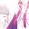
At this point I decided to go in a verrrrrry random direction, just because I could, I suppose! #798ab6 on Multiply, 50% gets us this:
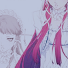
lol what on earth was I thinking xD oh well, we can fix that gross blue tone! If you're thinking what I'm thinking, it's Color Balance... adjustment layer time! Settings:
Shadows: 14, 18, 8
Midtones: 35, 0, -36
Highlights: 11, 0, 0
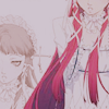
but sadjhflsa washed out base is so very washed out, so use a Soft Light, 100% duplicate to fix it quite handily.
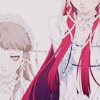
... I like this version better than the final icon :x lol yeah you can just stop here if you want, I like this colouring quite a bit lol! But if you're willing to go on, the ultimate quick mess-with-the-colouring tool is a Selective Color... adjustment layer 8DDD I'm willing to bet that I didn't make the following numbers up myself since I'm a self-proclaimed failure with SC, but I can't find the source of them either so here they are. Let me know if you know~
Reds: -72, 18, 72, 17
Yellows: -48, -54, 44, 21
Cyans: 60, 14, -36, 0
Magentas: 52, 39, -49, 0
Whites: 27, 0, 0, 0
Neutrals: 31, 8, 15, -2

That gets us back into the purple range, but not uncomfortably so xD I have no idea how this layer mode works but let's try it today: a duplicate of the base on Luminosity, 50%. Your icon will likely go wacky if you try to keep it at 100, so just don't xD

Cool beans \o/ Needs moar colour y/y so use a Hue/Saturation... adjustment layer with Saturation to 24. Why that number isn't an even 25, I have no idea 8D
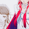
Almost there, isn't that exciting?!?! My favourite grainy texture in the history of ever is coming up~ This one by dusty_memories looks cool on just about everything dalskjfhasl so set it on Multiply, 100%.
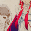
This is one of the few opportunities for me where I can just slap on a circle texture as-is and call it a day, probably because the center of the icon doesn't have a face and can thus be covered with shinies xD This texture by hellodarlling works perfectly on Screen, 100%. I don't always take the risk of using Screen instead of Lighten for light textures like these, but it didn't overpower the icon here so it's fine.

Last things, tinytext and border! Shoving them into one step 'cause they're easy ahaha. Tinytext is super easy, but if you don't know how to do it, reference one of my previous tutorials where I've explained it time and time again, or just use a brush. I took a not-quite-black sort of black colour (which incidentally looks a lot like the one on this community lawl) and Polygonal Lasso'd the slanted borders until the angle was juuust right. And there you go!

Other examples:
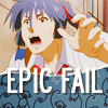
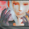
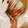
(you can see this colouring can fit a variety of moods haha!)
I encourage you to go play around and show me your finished icons! DOOO IIIIIIT, I wanna see what you guys come up with~
If you like what you see, why not friend ewidentnie for future updates?
Request by sashide ♥
Go from

to

in Photoshop. Uses Selective Color, Curves and Color Balance, so not translatable.
There seem to be a lot of P3 tutorials from me lately 8D Yaaay Chidori, and here we go with my dorky duplicates to fill up space again!

It's a little dark, so take a Screen, 60% duplicate right away /o/

Still darker than we want, so use #b5b37b on Soft Light, 100%. I do love my beige soft light layers, they do wonders to brighten up an image when you don't feel like using Screen again!

Let's mess with the colour with a Curves... adjustment layer now! 8) idk why I decided to do this, honestly, but this'll add a nice purple tone to your icon. To use these settings, just click anywhere in the big graphy thing and then type in the right numbers to get your point.
Each set corresponds to a point, like [input, output].
RBG: [79, 80] [136, 146]
Red: [105, 108] [154, 173]
Green: [120, 114]
Blue: [85, 112] [150, 174]

At this point I decided to go in a verrrrrry random direction, just because I could, I suppose! #798ab6 on Multiply, 50% gets us this:

lol what on earth was I thinking xD oh well, we can fix that gross blue tone! If you're thinking what I'm thinking, it's Color Balance... adjustment layer time! Settings:
Shadows: 14, 18, 8
Midtones: 35, 0, -36
Highlights: 11, 0, 0

but sadjhflsa washed out base is so very washed out, so use a Soft Light, 100% duplicate to fix it quite handily.

... I like this version better than the final icon :x lol yeah you can just stop here if you want, I like this colouring quite a bit lol! But if you're willing to go on, the ultimate quick mess-with-the-colouring tool is a Selective Color... adjustment layer 8DDD I'm willing to bet that I didn't make the following numbers up myself since I'm a self-proclaimed failure with SC, but I can't find the source of them either so here they are. Let me know if you know~
Reds: -72, 18, 72, 17
Yellows: -48, -54, 44, 21
Cyans: 60, 14, -36, 0
Magentas: 52, 39, -49, 0
Whites: 27, 0, 0, 0
Neutrals: 31, 8, 15, -2

That gets us back into the purple range, but not uncomfortably so xD I have no idea how this layer mode works but let's try it today: a duplicate of the base on Luminosity, 50%. Your icon will likely go wacky if you try to keep it at 100, so just don't xD

Cool beans \o/ Needs moar colour y/y so use a Hue/Saturation... adjustment layer with Saturation to 24. Why that number isn't an even 25, I have no idea 8D

Almost there, isn't that exciting?!?! My favourite grainy texture in the history of ever is coming up~ This one by dusty_memories looks cool on just about everything dalskjfhasl so set it on Multiply, 100%.

This is one of the few opportunities for me where I can just slap on a circle texture as-is and call it a day, probably because the center of the icon doesn't have a face and can thus be covered with shinies xD This texture by hellodarlling works perfectly on Screen, 100%. I don't always take the risk of using Screen instead of Lighten for light textures like these, but it didn't overpower the icon here so it's fine.

Last things, tinytext and border! Shoving them into one step 'cause they're easy ahaha. Tinytext is super easy, but if you don't know how to do it, reference one of my previous tutorials where I've explained it time and time again, or just use a brush. I took a not-quite-black sort of black colour (which incidentally looks a lot like the one on this community lawl) and Polygonal Lasso'd the slanted borders until the angle was juuust right. And there you go!

Other examples:


(you can see this colouring can fit a variety of moods haha!)
I encourage you to go play around and show me your finished icons! DOOO IIIIIIT, I wanna see what you guys come up with~
If you like what you see, why not friend ewidentnie for future updates?