Request set of writing icons

Apr 29, 2007 10:27

This set is a request by ksarasara, made in this post, featuring a couple lines from a poem by Richard Siken. Sara, I whipped 'em up kinda fast, so I dunno how well they fit what you were wanting . . .

#1, #2, and #3 use bases by feathered, from obsessiveicons. #4 uses a free About.com pattern, a border brush from quebelly, and another brush by icons_with_love, both from brushaddicts.

1.
Read more... )

quotes, writing, text, poetry

Leave a comment

Comments 8

avian_dryad April 29 2007, 14:43:12 UTC
Pretty. I like them all--the text on the first three is lovely and works well with the picture. The animated one looks nice too--though would slowing down the animation a bit work better?

#3 is my favorite (of course). :)

Have fun,
Ava

Reply

doran_icons April 29 2007, 15:23:16 UTC
Fixed the animation--I agree, it really was too fast. It was OK when I had more frames, but more frames pushed it over the edge on size--apparently my frames are pretty rich (I'd have thought text-only'd be smaller, but I did a lot of stuff with patterns, so . . .)

Thank you! :D :D :D

Reply


judosas April 29 2007, 16:08:31 UTC
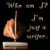
The 'Who am I?' really reminds me of Spiderman. Of course you haven't seen the movie, but the first part starts out like "Who am I? You sure you want to know? The story of my life is not for the faint of heart. If somebody said it was a happy little tale... if somebody told you I was just your average ordinary guy, not a care in the world... somebody lied." I need to hunt that down as an icon somewhere...

Anyway, the icons you made are great! I think I like #1 best. That 'who am I' just brings out the angst for me. *g*

Reply


ksarasara April 29 2007, 16:10:59 UTC
Love, love, love #2! It's just perfect! I'm not sure how I feel about #3 yet. Love the pic and the font, but I'm not sure about the placement. #1 is good - good font, good placement, etc. But (and this is absolutely silly of me) something unnerves me about the picture - I think because of the sharp angles, the pen being exactly perpendicular to the page (told you it was silly *g*). The animated icon is great! I'm snagging that one and number 2, of course.

Thank you, thank you, thank you! :D

Reply

doran_icons April 29 2007, 16:16:44 UTC
Yay! :D I had the last two words on #3 down farther, but then I realized they obscured the road, and that was part of why I chose the base, so I scooted it up a bit farther.

Lol, well, Sas seems to like #1, so that evens it out. :D Different taste for different people works well for me. :)

You're welcome! :D I'm glad you like them! :D :D :D

Reply


elshadye May 2 2007, 03:39:05 UTC
Wow, I like these. ::makes note to look through current icons and determine which can be replaced:: :)

2 is gorgeous. 4 is fun with the multiple text. 3 is haunting. 1...Hm...I can't decide if I agree with Sara or not about the perpendicular pen. I think I like it that way. It's very...agressive. Like, "I *say* I'm "just" a writer, but really, I know what I am...creator of worlds!!!" Yup, I think I like it that way.

Reply

doran_icons May 2 2007, 03:41:48 UTC
:D Thanks for commenting! :D

Reply


annabtg May 6 2007, 00:53:47 UTC
Nice ones. I really like #2. :)

See ya,
Anna.

Reply


Leave a comment

Up