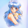
Icon Tutorial 12
Requested bykayable. Sorry this is a bit late!

to
01: Normally an icon starts out with either cropping or extracting and then cropping... however this icon is a little more complex. There are actually some pre-icon steps for this image that are time-consuming... but in this case makes the icon come out far better then if I'd just used the image as it is.
I started with this image, and then extracted it.
Next, I started to recolor the image. I did this because due to my extensive use of Rumiko Takahashi's art I know that the scans tend to wash out easily. This was an experiment to see if recoloring would help with those side effects.
This is what it looked like after I recolored the image. A few things you may want to take note of are the subtle additions of pink hues in Shampoo's hair, and the fact that I didn't just recolor the skin, but the eyes, the eyeliner, and the bells in her hair.
02: The groundwork is done, so we move to cropping and making the icon! I started by placing the image where I wanted it (hardly cropping since most of the image made it on the icon), adding this texture bysongburst(to which I made a quick color-tweak), and this texture by silentvocation on Overlay at about 45.0 Opacity. Then I erased some parts with a fuzzy brush to help it blend more.

03: After that, I used this texture bytwinstrikeon Overlay at about 30.0 Opacity, and this texture on Screen at about 40.0 Opacity to bring out the softness a bit more.

04: I want more lights, so I use this texture (I have no idea who made it) on Screen and placed it over her hair in two areas.

05: The next step is to play with the curves. I wanted to really bring out the brightness, and the pinkness of the skin. I create a New from Visible layer to do that, and this is what it looks like:

That goes down to about 60.0 Opacity.

06: Now, although I love the pink, I don't want this to be a purple/pink icon, so I add this texture (by an unknown source). I use it twice, once on Multiply at about 8.0 Opacity, and once on Overlay at about 70.0 Opacity. I erased some portions of the texture around her skin so it wouldn't ruin the coloration.

07: Okay, now I hide the textures I used in step 06, and take a New from Visible layer from the end of step 05. I put this on top of everything I've done thus far, and then I un-hide the textures. The New from Visible layer goes on Multiply at about 24.0 Opacity. This is to help keep the icon from getting washed out.

08: Now, I want to keep that blended look, so thus the return of this texture! Screen, placed in random places to keep things looking light and airy.

09: I used this texture (no clue who made it), on Overlay at about 45.0 Opacity. I don't want the icon to turn purple, plus it adds a nice gradient~

10: New from Visible layer on Overlay at about 20.0 Opacity. Then I add this texture byinnocent_lexys, with some color changes and erased portions on Hard Light at about 20.0 Opacity.

11: I'm starting to think Shampoo is getting a little washed out. I'd hate to loose all of that hard work recoloring, so I copy the layer of just Shampoo and put it on top. I just put her at about 20.0 Opacity on a Normal Layer.

12: Enter the world of curves. I'm going in and really darkening things up to bring out more richness in colors... as you probably know if you've been reading my tutorials, I create a New from Visible layer and make curves changes on that:

Then this goes down to about 65.0 Opacity.

I then copy my darker curves layer and put it on Overlay at about 42.0 Opacity.

I'm loving this, so I simply slap my old faithful on top. Old faithful was made bysanctuarylight.

In the ~original~ I also added another Overlay layer, but in my opinion it totally ruined the coloration, and washed out her skin a little too much, so skip that. In this case I'd create a New from Visible and do a final color-tweak in Hue-Saturation instead.

I'm very tempted to make this into a wallpaper. Anybody interested?
And if you still want to know how I made something, feel free to check out my...

Ask The Maker || My Thread
to
01: Normally an icon starts out with either cropping or extracting and then cropping... however this icon is a little more complex. There are actually some pre-icon steps for this image that are time-consuming... but in this case makes the icon come out far better then if I'd just used the image as it is.
I started with this image, and then extracted it.
Next, I started to recolor the image. I did this because due to my extensive use of Rumiko Takahashi's art I know that the scans tend to wash out easily. This was an experiment to see if recoloring would help with those side effects.
This is what it looked like after I recolored the image. A few things you may want to take note of are the subtle additions of pink hues in Shampoo's hair, and the fact that I didn't just recolor the skin, but the eyes, the eyeliner, and the bells in her hair.
02: The groundwork is done, so we move to cropping and making the icon! I started by placing the image where I wanted it (hardly cropping since most of the image made it on the icon), adding this texture bysongburst(to which I made a quick color-tweak), and this texture by silentvocation on Overlay at about 45.0 Opacity. Then I erased some parts with a fuzzy brush to help it blend more.
03: After that, I used this texture bytwinstrikeon Overlay at about 30.0 Opacity, and this texture on Screen at about 40.0 Opacity to bring out the softness a bit more.
04: I want more lights, so I use this texture (I have no idea who made it) on Screen and placed it over her hair in two areas.
05: The next step is to play with the curves. I wanted to really bring out the brightness, and the pinkness of the skin. I create a New from Visible layer to do that, and this is what it looks like:
That goes down to about 60.0 Opacity.
06: Now, although I love the pink, I don't want this to be a purple/pink icon, so I add this texture (by an unknown source). I use it twice, once on Multiply at about 8.0 Opacity, and once on Overlay at about 70.0 Opacity. I erased some portions of the texture around her skin so it wouldn't ruin the coloration.
07: Okay, now I hide the textures I used in step 06, and take a New from Visible layer from the end of step 05. I put this on top of everything I've done thus far, and then I un-hide the textures. The New from Visible layer goes on Multiply at about 24.0 Opacity. This is to help keep the icon from getting washed out.
08: Now, I want to keep that blended look, so thus the return of this texture! Screen, placed in random places to keep things looking light and airy.
09: I used this texture (no clue who made it), on Overlay at about 45.0 Opacity. I don't want the icon to turn purple, plus it adds a nice gradient~
10: New from Visible layer on Overlay at about 20.0 Opacity. Then I add this texture byinnocent_lexys, with some color changes and erased portions on Hard Light at about 20.0 Opacity.
11: I'm starting to think Shampoo is getting a little washed out. I'd hate to loose all of that hard work recoloring, so I copy the layer of just Shampoo and put it on top. I just put her at about 20.0 Opacity on a Normal Layer.
12: Enter the world of curves. I'm going in and really darkening things up to bring out more richness in colors... as you probably know if you've been reading my tutorials, I create a New from Visible layer and make curves changes on that:
Then this goes down to about 65.0 Opacity.
I then copy my darker curves layer and put it on Overlay at about 42.0 Opacity.
I'm loving this, so I simply slap my old faithful on top. Old faithful was made bysanctuarylight.
In the ~original~ I also added another Overlay layer, but in my opinion it totally ruined the coloration, and washed out her skin a little too much, so skip that. In this case I'd create a New from Visible and do a final color-tweak in Hue-Saturation instead.
I'm very tempted to make this into a wallpaper. Anybody interested?
And if you still want to know how I made something, feel free to check out my...

Ask The Maker || My Thread