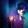
Icon Tutorial 10
Requested by twinstrike, again!

to
This icon started out by extracting the original image. I'm going to assume most people reading this know how to extract an image in one way or another, so I won't get into that.
01: I worked on this icon in two stages, the background, and then the final stage was everything on top.
I sort of knew I wanted to work with a pattern that matched the character's pants, so even though the pants don't really show, I started there.
First I put down a greenish background, and then googled a plaid pattern. That went on Overlay at about 56.0 Opacity.

02: Next I added this texture by colorvary on Hard Light.

03: And this texture by erzsebet on Overlay at about 63.5 Opacity.

04: And yet another texture. This time by defaultsettings on Hard Light at about 56.0 Opacity!

05: It was feeling a little too dark, so I added this colorvary texture on Screen at about 74.0 Opacity.

06: Next I used this texture twice, once on Screen at about 16.0 Opacity, and second on Overlay at about 53.0 Opacity. I have no idea who made the texture...

The background looks like it's merging well with the image, so now I move above the image to start working on the icon as a whole.
07: I start by adding this texture by defaultsettings on Hard Light at about 74.0 Opacity.

08: Now I'm starting to mess with the coloring a bit. First I create a New from Visible, and mess with the colors in Hue-Saturation. It looks like this now...

Then I bring down the Opacity to about 44.0.

09: New from Visible, Gaussian Blur, a little messing with the Curves layers, and then on Overlay at about 35.0 Opacity for some depth.

10: His face looks a bit pale to me, so I mess a bit with the Curves a bit on a New from Visible layer.

And then bring down the Opacity to about 72.5.

11: And then my favorite texture by sanctuarylight on Overlay at about 72.0

12: And lastly, a final adjustment with the Hue-Saturation, and I'm finished!

Having fun reading these? Want to ask a question or requst a tutorial?

Ask The Maker || My Thread
to
This icon started out by extracting the original image. I'm going to assume most people reading this know how to extract an image in one way or another, so I won't get into that.
01: I worked on this icon in two stages, the background, and then the final stage was everything on top.
I sort of knew I wanted to work with a pattern that matched the character's pants, so even though the pants don't really show, I started there.
First I put down a greenish background, and then googled a plaid pattern. That went on Overlay at about 56.0 Opacity.
02: Next I added this texture by colorvary on Hard Light.
03: And this texture by erzsebet on Overlay at about 63.5 Opacity.
04: And yet another texture. This time by defaultsettings on Hard Light at about 56.0 Opacity!
05: It was feeling a little too dark, so I added this colorvary texture on Screen at about 74.0 Opacity.
06: Next I used this texture twice, once on Screen at about 16.0 Opacity, and second on Overlay at about 53.0 Opacity. I have no idea who made the texture...
The background looks like it's merging well with the image, so now I move above the image to start working on the icon as a whole.
07: I start by adding this texture by defaultsettings on Hard Light at about 74.0 Opacity.
08: Now I'm starting to mess with the coloring a bit. First I create a New from Visible, and mess with the colors in Hue-Saturation. It looks like this now...
Then I bring down the Opacity to about 44.0.
09: New from Visible, Gaussian Blur, a little messing with the Curves layers, and then on Overlay at about 35.0 Opacity for some depth.
10: His face looks a bit pale to me, so I mess a bit with the Curves a bit on a New from Visible layer.
And then bring down the Opacity to about 72.5.
11: And then my favorite texture by sanctuarylight on Overlay at about 72.0
12: And lastly, a final adjustment with the Hue-Saturation, and I'm finished!
Having fun reading these? Want to ask a question or requst a tutorial?

Ask The Maker || My Thread