-
MAPS MAPS SO MANY MAPS
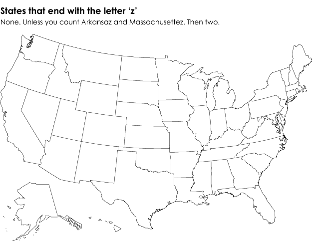
This was quite funny.
http://flowingdata.com/2014/07/07/19-maps-that-will-blow-your-mind/

( Read more... ) -
New York Times: interactive map of ISIS gains in Syria and Iraq
The New York Times published on July 3, 2014, this fascinating, interactive map showing the progress of ISIS in Syria and Iraq. By JEREMY ASHKENAS, ARCHIE TSE, DEREK WATKINS and KAREN YOURISH.

( Read more... ) -
War surplus for police departments.
Cool graphic and story on the New York Times about how surplus military equipment is finding its way to police departments around the country. Clicking on the image below will open a new browser window.

( Read more... ) -
Carnegie Mellon showcases world income inequality through stunning interactive map
Data is cool, and visualizing it is even cooler, especially when it results in interesting maps such as Carnegie Mellon University’s new interactive map about income inequality around the world. Today, the Pittsburgh, Penn.-based university announced the release of an interactive map version of “Capital in the 21st Century,” a book from economist ( Read more... )


