Working With Cartoon Images - Bright/Vivid Colouring
A tutorial inspired by dark_sephy who wanted to know how to create bright, vivid icons using cartoon images. There are probably several ways to do this, but this is the method I've been using lately. I use Photoshop CS2 and have no idea how well this will translate to other programs.
How to make
or
from this original image.
STEP ONE
Select an image and crop it accordingly. This is the base I'll be working with:
STEP TWO: LEVELS
I'm a fan of the Levels tool, so we're going to use it to help get our base started. [IMAGE >> ADJUSTMENTS >> LEVELS] Since a lot of the images I've worked with are generally dark, I always start off with grabbing the arrow on the far-right and moving it to the left. You'll see the base lighten as you do this.
Here are the settings I chose for this base, and you can see how the base (to the left) has already changed:

STEP THREE: BRIGHTNESS/CONTRAST
If you make the base too light it can look washed or faded. I find it easiest to use the Contrast tool to fix this. [IMAGE >> ADJUSTMENTS >> BRIGHTNESS/CONTRAST] I use this tool on a lot of my icons, so this is how I've used it for this base:
STEP FOUR: HUE/SATURATION
You can leave this tool for later if you want, but I usually make slight adjustments at this step before playing with layers and colours. [IMAGE >> ADJUSTMENTS >> HUE/SATURATION]
STEP FIVE: LAYERS AND ADDING COLOUR EFFECTS
This is where creativity takes over. The base is ready to be finished and it's time to decide how we're going to colour this icon. Since we're aiming for a vibrant effect, we don't want to add too many dark or rich colours. The colouring for bright icons, in my own opinion, is pretty simple to create and easy to work with.
My layer palette, including colours, blend modes used, and the opacity:

FINISHED ICON
Here's what the icon should look like now:
VS
(the original)
You can leave it like that, or you can continue to add text, perhaps a brush or border, whatever suits your style best. Or, if you're like me and can't decide if you like it that way or not, you can continue on to one more step.
STEP SIX: VARIATIONS - optional
The Variations tool is a fun way to change the colours of an icon. [IMAGE ADJUSTMENTS >> TOOLS >> VARIATIONS] Here's how this tool can alter an icon further:
(I selected Lighter twice and More Yellow once.)
Which would produce this final product:
Now go have fun experimenting! If you have any questions or concerns, feel free to leave a comment. I'd love to see what you create from this. ♥
How to make
or
from this original image.
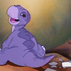
STEP ONE
Select an image and crop it accordingly. This is the base I'll be working with:
STEP TWO: LEVELS
I'm a fan of the Levels tool, so we're going to use it to help get our base started. [IMAGE >> ADJUSTMENTS >> LEVELS] Since a lot of the images I've worked with are generally dark, I always start off with grabbing the arrow on the far-right and moving it to the left. You'll see the base lighten as you do this.
Here are the settings I chose for this base, and you can see how the base (to the left) has already changed:
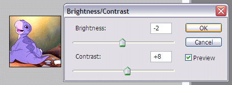
STEP THREE: BRIGHTNESS/CONTRAST
If you make the base too light it can look washed or faded. I find it easiest to use the Contrast tool to fix this. [IMAGE >> ADJUSTMENTS >> BRIGHTNESS/CONTRAST] I use this tool on a lot of my icons, so this is how I've used it for this base:
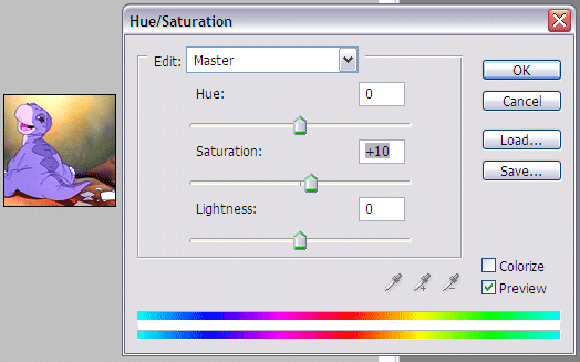
STEP FOUR: HUE/SATURATION
You can leave this tool for later if you want, but I usually make slight adjustments at this step before playing with layers and colours. [IMAGE >> ADJUSTMENTS >> HUE/SATURATION]
STEP FIVE: LAYERS AND ADDING COLOUR EFFECTS
This is where creativity takes over. The base is ready to be finished and it's time to decide how we're going to colour this icon. Since we're aiming for a vibrant effect, we don't want to add too many dark or rich colours. The colouring for bright icons, in my own opinion, is pretty simple to create and easy to work with.
My layer palette, including colours, blend modes used, and the opacity:
FINISHED ICON
Here's what the icon should look like now:
VS
(the original)
You can leave it like that, or you can continue to add text, perhaps a brush or border, whatever suits your style best. Or, if you're like me and can't decide if you like it that way or not, you can continue on to one more step.
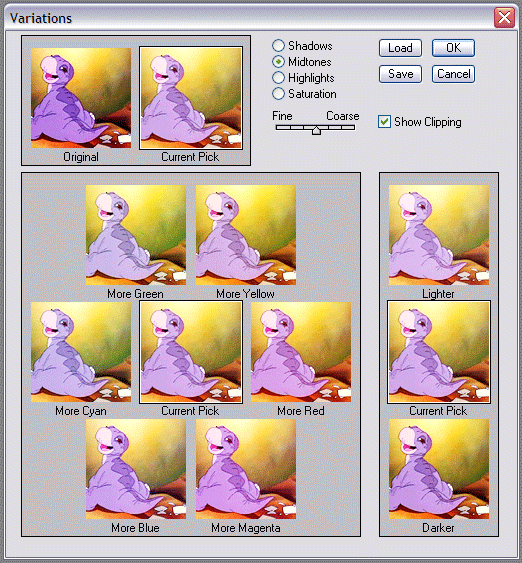
STEP SIX: VARIATIONS - optional
The Variations tool is a fun way to change the colours of an icon. [IMAGE ADJUSTMENTS >> TOOLS >> VARIATIONS] Here's how this tool can alter an icon further:
(I selected Lighter twice and More Yellow once.)
Which would produce this final product:
Now go have fun experimenting! If you have any questions or concerns, feel free to leave a comment. I'd love to see what you create from this. ♥