Anne Hathaway Tutorial
Here we go!
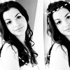
Make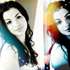
from this
-For Photoshop
-Level: Beginner-Intermediate
-What will it show you: Various layer styles, and how to use them in conjunction with light textures.
--Basic curve layers as well
-Just some helpful tips in general (I hope :P)
Base Prep
So firstly let's prepare our base. I'm remaking the icon here, so it may not be as accurate as the first, but here goes. Firstly let's take out lovely base image of Anne Hathaway.

I get my stock images off various celebrity communities on lj, which guarantees high picture quality than google. The main thing about bases is to make sure they are high quality, otherwise the result will not look as good as it could be. That image is from hires_hotties@lj so props to them.
1. So first you will need to crop your base to 100 pixels by 100 pixels. You will often see people telling you to never have the main focus of any icon in the centre, and this is also the case with this icon. This is also due to the fact that it will be shifted later. So with the cropping it looks like this (crop to 100 pixels by 100):
2. So let's get about preparing our lovely base. First let's desaturate the layer (image>adjustments>desaturate). Then duplicate the layer (layer>duplicate) and set the top layer to screen. Merge the layers together (Ctrl+E) and you should get something like this:
3. Now this is where my favourite part of the icon comes into place. Photoshop has a lovely tool called curves. A full tutorial on this can be found here.
Now as said there, you can use curves to make small colour adjustments, such as smoothing out the black and white and so forth. As well as this you can also make colour adjustments instead of having to add gradients.
So if we go to Layer>New adjustment layer>Curves and stick in the following settings:

Curves just rock way too much. As you can see the result of that curves layer is shown on the left there. Merge down again (Ctrl+E)
4. Now if you duplicate the layer, and position the top one to the right (Often looks better if you cut off the focal point by a little bit). As you can see i've done it like below, I also moved the bottom layer to the left a bit:
Then merge down again (Ctrl+E)
It's relatively simple, but I hope you like the effect.
Making it look pretty
5. So we have a lovely image there so far, however the divide may look a bit strange on some images, so you may want to blur it. For now though, lets add some classic dotted lines. I use the ones from the amazing 77 words which can be found
here.
For this icon I did some lines at the top, and one going down over the divide.
(Note i've switched to my original .psd file so the image looks slightly different in proportions, but the tech is still exactly the same.)
6. So that's some dotted lines added, now for the colouring. Now these effects are achieved by light textures. I obtained these ones via lj. The person who makes them is a goddess of textures, and she rocks way too much her journal can be found here. The set that I am using in particular can be found here.
So firstly I thought that the divide needs a bit more colour to it as well as adding some colour to the side bit. I took this texture here:

I moved that to the side so that the coloured part was over the face and most of the divide. Then I set it to lighten at 100% opacity. The lighten layer setting just takes the lighter parts and imprints it. Great to use with most light textures.
Not too shabby eh?
7. Still could be better though? Take this lovely texture also by the even lovelier colorfilter:

I then rotated it to this:

This was then pasted onto the image, and shifted to the right a bit (so that the black border just verges on the image). Next it was set on colour burn (This has the effect of literally burning the colour onto the image). Finally I erased parts that were still covering Anne on the left, this was due to the fact that the yellow was a bit too over-powering on the image. The result is this:

8. Looking good isn't it?, but it still requires that something extra to fill the left hand side, Anne on the left looks a bit strange still black and white. So I took this texture also by colorfilter:

and rotated it to this:

Then I place it on top of the other layers and put it on lighten, opacity 77%. The white really overpowered the image though, so I moved it to the left so you could only see the blue and a bit of the white on her shoulder.
Our final result?
-Hopefully i've credited everyone, but please let me know if I haven't and i'll change.
-PLEASE PLEASE PLEASE PLEASE add this journal. Icons are posted here (and some better sets than the one first posted) as well as various resources. Take a look for yourself. We love friends, especially to this new journal!
-Copy this exactly if you wish, and just enjoy the tutorial!
-Please comment and show results if you can. :)
Make
from this
-For Photoshop
-Level: Beginner-Intermediate
-What will it show you: Various layer styles, and how to use them in conjunction with light textures.
--Basic curve layers as well
-Just some helpful tips in general (I hope :P)
Base Prep
So firstly let's prepare our base. I'm remaking the icon here, so it may not be as accurate as the first, but here goes. Firstly let's take out lovely base image of Anne Hathaway.

I get my stock images off various celebrity communities on lj, which guarantees high picture quality than google. The main thing about bases is to make sure they are high quality, otherwise the result will not look as good as it could be. That image is from hires_hotties@lj so props to them.
1. So first you will need to crop your base to 100 pixels by 100 pixels. You will often see people telling you to never have the main focus of any icon in the centre, and this is also the case with this icon. This is also due to the fact that it will be shifted later. So with the cropping it looks like this (crop to 100 pixels by 100):
2. So let's get about preparing our lovely base. First let's desaturate the layer (image>adjustments>desaturate). Then duplicate the layer (layer>duplicate) and set the top layer to screen. Merge the layers together (Ctrl+E) and you should get something like this:
3. Now this is where my favourite part of the icon comes into place. Photoshop has a lovely tool called curves. A full tutorial on this can be found here.
Now as said there, you can use curves to make small colour adjustments, such as smoothing out the black and white and so forth. As well as this you can also make colour adjustments instead of having to add gradients.
So if we go to Layer>New adjustment layer>Curves and stick in the following settings:

Curves just rock way too much. As you can see the result of that curves layer is shown on the left there. Merge down again (Ctrl+E)
4. Now if you duplicate the layer, and position the top one to the right (Often looks better if you cut off the focal point by a little bit). As you can see i've done it like below, I also moved the bottom layer to the left a bit:
Then merge down again (Ctrl+E)
It's relatively simple, but I hope you like the effect.
Making it look pretty
5. So we have a lovely image there so far, however the divide may look a bit strange on some images, so you may want to blur it. For now though, lets add some classic dotted lines. I use the ones from the amazing 77 words which can be found
here.
For this icon I did some lines at the top, and one going down over the divide.
(Note i've switched to my original .psd file so the image looks slightly different in proportions, but the tech is still exactly the same.)
6. So that's some dotted lines added, now for the colouring. Now these effects are achieved by light textures. I obtained these ones via lj. The person who makes them is a goddess of textures, and she rocks way too much her journal can be found here. The set that I am using in particular can be found here.
So firstly I thought that the divide needs a bit more colour to it as well as adding some colour to the side bit. I took this texture here:
I moved that to the side so that the coloured part was over the face and most of the divide. Then I set it to lighten at 100% opacity. The lighten layer setting just takes the lighter parts and imprints it. Great to use with most light textures.
Not too shabby eh?
7. Still could be better though? Take this lovely texture also by the even lovelier colorfilter:
I then rotated it to this:
This was then pasted onto the image, and shifted to the right a bit (so that the black border just verges on the image). Next it was set on colour burn (This has the effect of literally burning the colour onto the image). Finally I erased parts that were still covering Anne on the left, this was due to the fact that the yellow was a bit too over-powering on the image. The result is this:
8. Looking good isn't it?, but it still requires that something extra to fill the left hand side, Anne on the left looks a bit strange still black and white. So I took this texture also by colorfilter:
and rotated it to this:
Then I place it on top of the other layers and put it on lighten, opacity 77%. The white really overpowered the image though, so I moved it to the left so you could only see the blue and a bit of the white on her shoulder.
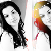
Our final result?
-Hopefully i've credited everyone, but please let me know if I haven't and i'll change.
-PLEASE PLEASE PLEASE PLEASE add this journal. Icons are posted here (and some better sets than the one first posted) as well as various resources. Take a look for yourself. We love friends, especially to this new journal!
-Copy this exactly if you wish, and just enjoy the tutorial!
-Please comment and show results if you can. :)